We've over halfway through the year, and we've already started to analyse the best new logos of 2024. But what about the worst logos? It's only right that we should also take a look at those that don't work quite so well since any of us involved in graphic design or branding can learn just as much from the duds as the winners.
The worst logos of 2024 so far
Alas, while we've seen some superb rebrands and new logo designs in the past six months, there have also been some turkeys, or at least some designs that had the public pulling a collective grimace. One logo redesign even led to a popular campaign to reverse the decision. So here, in all their glory, are the worst logos of 2024 so far.
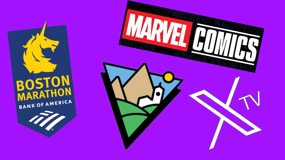
01. X TV logo
pic.twitter.com/PJgxu0AszTApril 29, 2024
Elon Musk has a difficult relationship with logo design. The Tesla logo has an unfortunate likeness to something else, and SpaceX at one point appeared to be using the logo of a small Scottish football club. With Twitter's rebranding to X, it seems he gave up altogether, using a simple unicode character that an imaginative Twitter user claimed he had 'designed'. So the X TV logo was perhaps predictably anticlimactic.
The platform will take on the likes of Netflix sporting an identity that comprises the X 'logo' followed by the letters 'TV' in the blandest font they could find. Musk announced the launch by sharing a video with a cheap AI look showing a pile of old TVs broadcasting static. I can't claim to know what the future of TV will look like, but I don't think this is it.
02. The Visalia logo
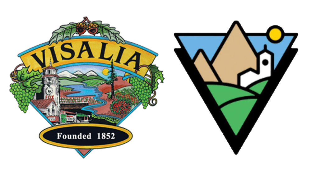
Companies only have shareholders to answer too, but local authorities must face the wrath of residents, who often have opinions about how the place where they live is being represented.
The people of Visalia, California, were not impressed one bit when it was announced that the city's elaborately illustrated logo would be replaced with a flat minimalist design that was described by one person as "so oversimplified it's comedic." People complained that the design "sterilized" the city's personality and rendered its landmarks unrecognisable. So fervent was the response that authorities have tossed out the redesign and reopened submissions to seek a new, new logo.
03. Not the new Canadian Army logo

This logo controversy was as much a case of poor communication as poor design. The image above, which "looks like a Minecraft character milking an elk," according to one member of the public, is not the Canadian Army's new logo design. Rather it's a camouflage pattern that will appear on uniforms and will, for some reason that's not entirely clear, be used as a supplementary logo "in the bottom left-hand corner of certain communications". The Army hadn't made that clear when it initially invited the public to share its opinion on the "revistalized branding" on Twitter.
04. The Boston Marathon logo
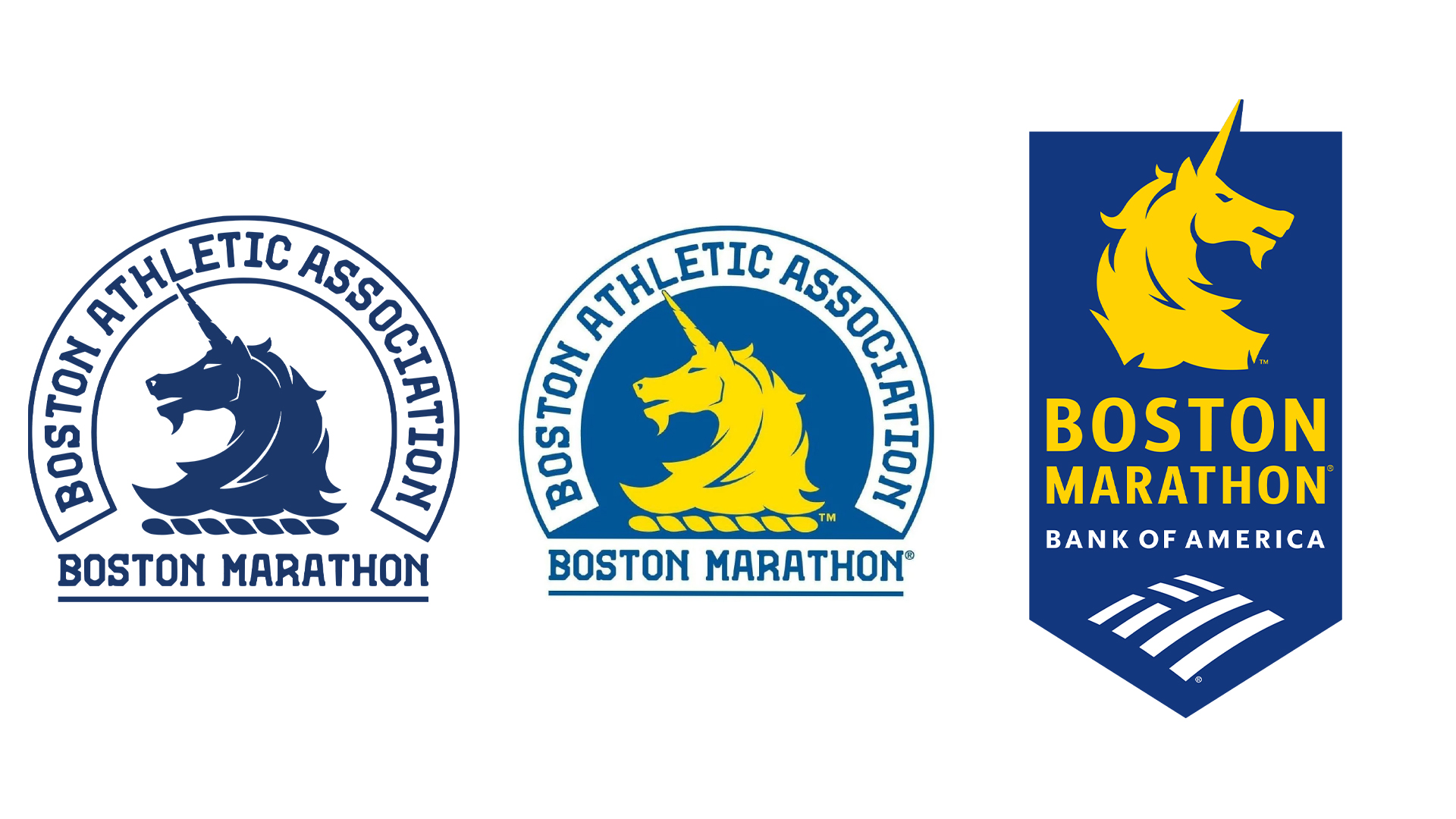
Logo lockups that tag on the identity of corporate sponsors rarely become design classics, and the new Boston Marathon logo is a case in point. The decision to flip the unicorn was one thing, but the addition of the Bank of America's logo had many lamenting the loss of the race's identity to corporate interests. "Just call it the Bank of America Marathon already and be done with it," one person suggested.
05. The Marvel Comics logo
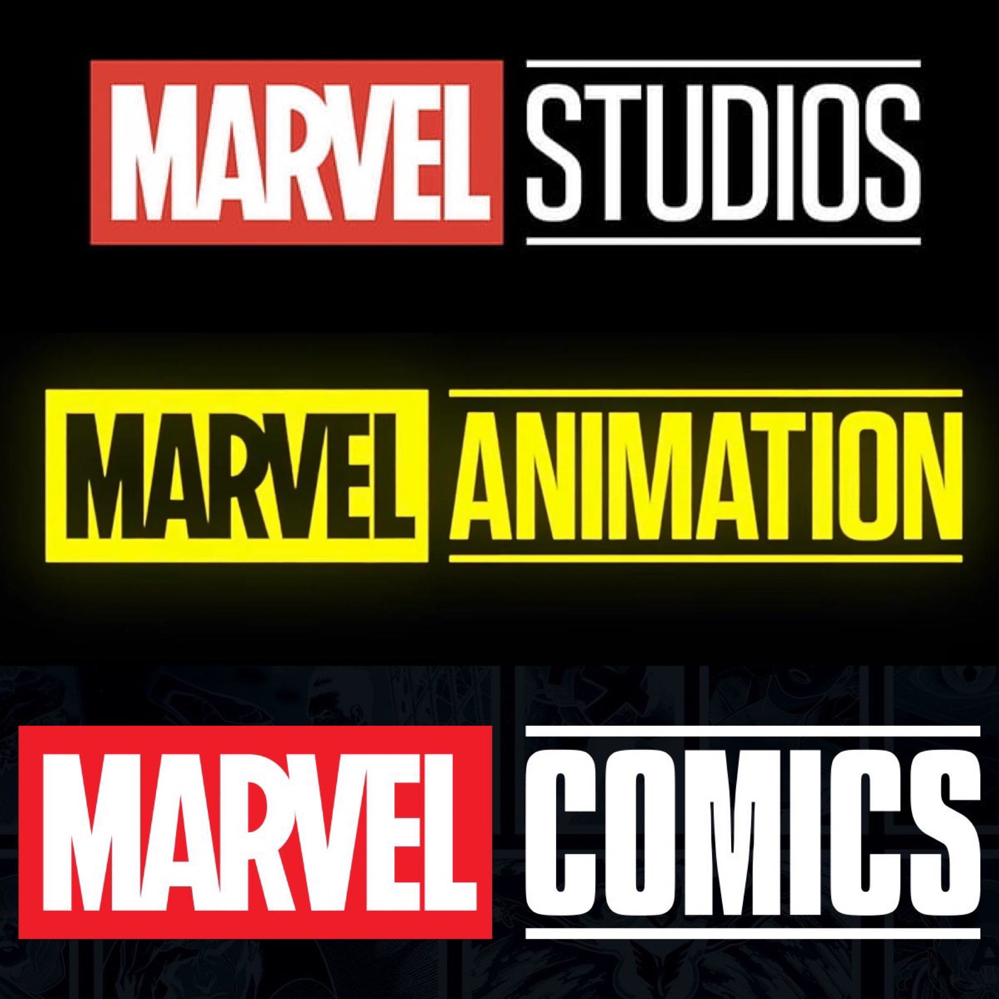
Speaking of corporate influences, brand consistency is all well and good, but can there be too much of it? A lot of comic book fans think so. The Marvel Comics logo has been updated to bring it in line with those of Marvel Studios and Marvel Animation, but gosh is it boring! Back in the 1990s, the logo had a nostalgic handwritten look that made perfect sense of a company that makes comics. Now the brand is just another cog in the Marvel universe.