The Volkswagen logo is one of the most memorable car logos around. Everyone knows what it looks like. And at first glance, it would seem the only changes in recent decades were to make the Volkswagen logo flat and to narrow the lines for a time.
It's a simple and distinctive brand identity. Surely there's nothing to argue about? So I thought, but it seems a furious debate is raging. Some people are adamant that at some point the Volkswagen logo changed in a way not seen on official design documents.
Did the Volkswagen logo change?

The Volkswagen logo comprises the V and the W from the brand name in a circle. The debate is about whether there is – or was – a gap between the two letters.
The design used today shows the V and W clearly separated by a space. But some people are convinced that a previous design used one single shape, with the V and the W joined in the middle.
"I thought it was just a big, weird W because it was connected, I was at least 19 when I went 'Oh duh, V-W! I get it!'," one person writes on Reddit.
Some are dismissing the suggestion as a classic example of the visual Mandela effect, a phenomenon in which people remember seeing an image in a way that never existed.
The Mandela effect is very real. Famous examples include widely held false memories of the Monopoly man wearing a monocle and the Fruits of the Loom logo featuring a cornucopia. There have also been claims of a Ford logo Mandela effect.
But those on the side of the conjoined no-gap VW logo don't believe that they're imagining it. Some have delved into some deep internet archaeology, combing the web for evidence that the logo used to look the way they remember it.
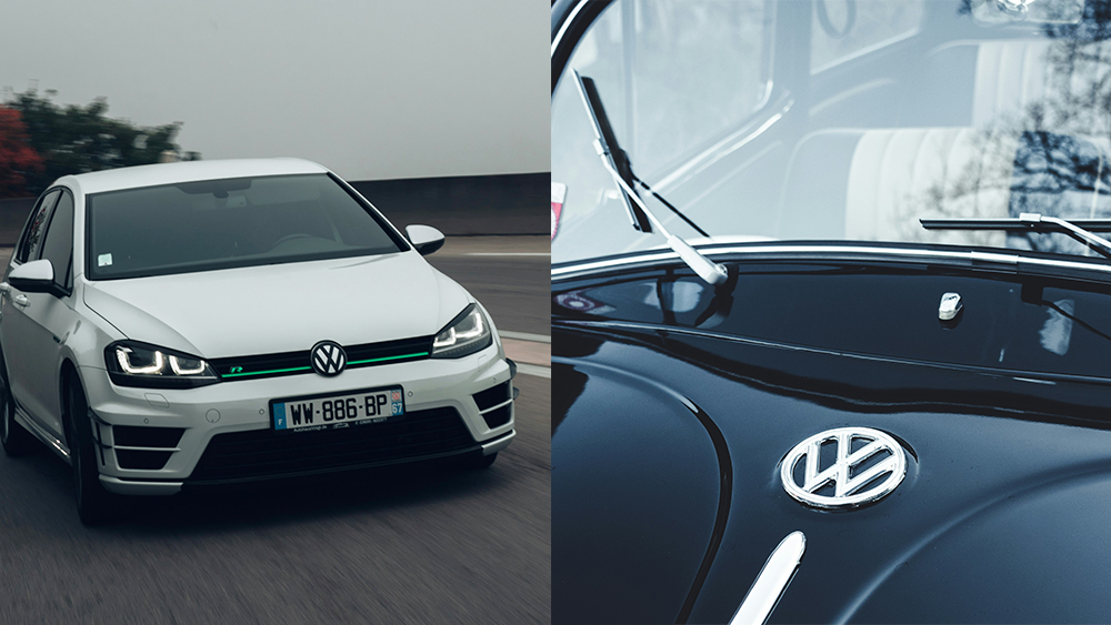
The answer? Even a quick search on a stock photo library suggests that the VW logo has indeed sometimes appeared without a gap on some vehicles in some countries at various times through the brand's history.
Some people have even tracked down appearances by Volkswagens in movies to prove that the conjoined logo design existed.
Residue: No space in the Volkswagen logo in Knocked Up (2007) from r/Retconned
It appears that this was never an official or intentional design decision, though. Even vintage Volkswagen logo design specs show a space between the two letters.
Some of the no-gap logos may have been made by third parties. It may also be that manufacturing plants in some countries decided it was easier to make the badge out of a single piece of chrome. And perhaps at certain times there was less insistence on sticking to the style guide than there is today.
Implementation of the gap has varied over time too. On some cars it was barely a hairline between the two letters, making it invisible at a distance. In other applications, the letters are more clearly separate.
Who designed the Volkswagen logo?
But wait, there's more evidence for the connected VW logo – and even more controversy!
Volkswagen says its logo was designed by an engineer called Franz Reimspiess, who also worked on the engine for the Beetle. He's said to have won a competition to design the identity and to have won 50 Marks for his efforts.
But an Austrian designer called Nikolai Borg claims that he designed the logo in June 1939, directed by the Nazi engineer Fritz Todt. His version of the logo had no gap between the V and the W, which has led to claims that Volkswagen added the gap to avoid paying Borg.
However, in 2005, the Vienna Business Court rejected Borg's copyright claim, ruling that the VW logo had already been trademarked a year before his design. That appears to confirm that the original logo design was the one with a gap.
What was the original Volkswagen logo?
The most surprising part of the Volkswagen logo history is the original design. Today the phrase 'Nazimobile' is associated with a certain low-poly electric pick up (check out the viral anti-Tesla posters), but the OG was the humble Beetle.
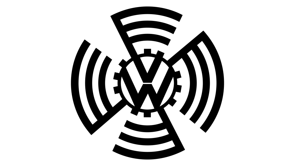
The original Volkswagen logo was surrounded by a cogwheel and an elaborate design that appears to combine a propeller and a swastika, an indication of the company's early connections the Third Reich.
Hitler himself commissioned the manufacture of the first VW and provided state subsidies to support production. The aim was to create an affordable 'people's car', which is what the word Volkswagen means.
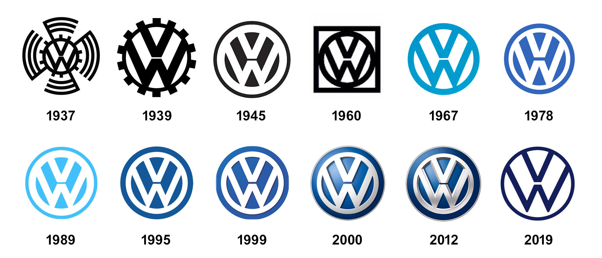
The outbreak of the Second World War caused the people's car project to fail. The Swastika was dropped from the logo, and Volkswagen was repurposed to produce military vehicles. When the company was revitalised after the war by British Army officer Ivan Hirst, the logo was streamlined to a simple VW in a circle, similar to the design we know today.
Want to discover more logo histories? See our Tesla logo history and our pick of the best logos of all time.