At the end of last year, award-winning independent type foundry Colophon announced that after almost 15 years of going solo, it was joining Monotype.
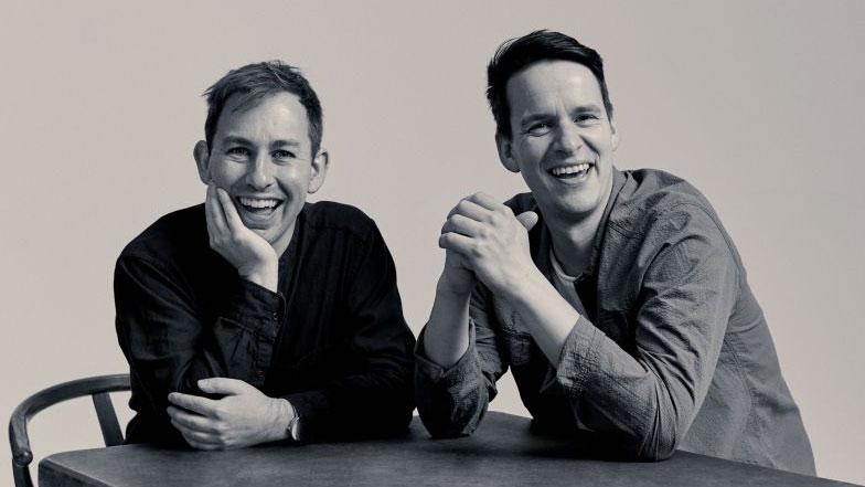
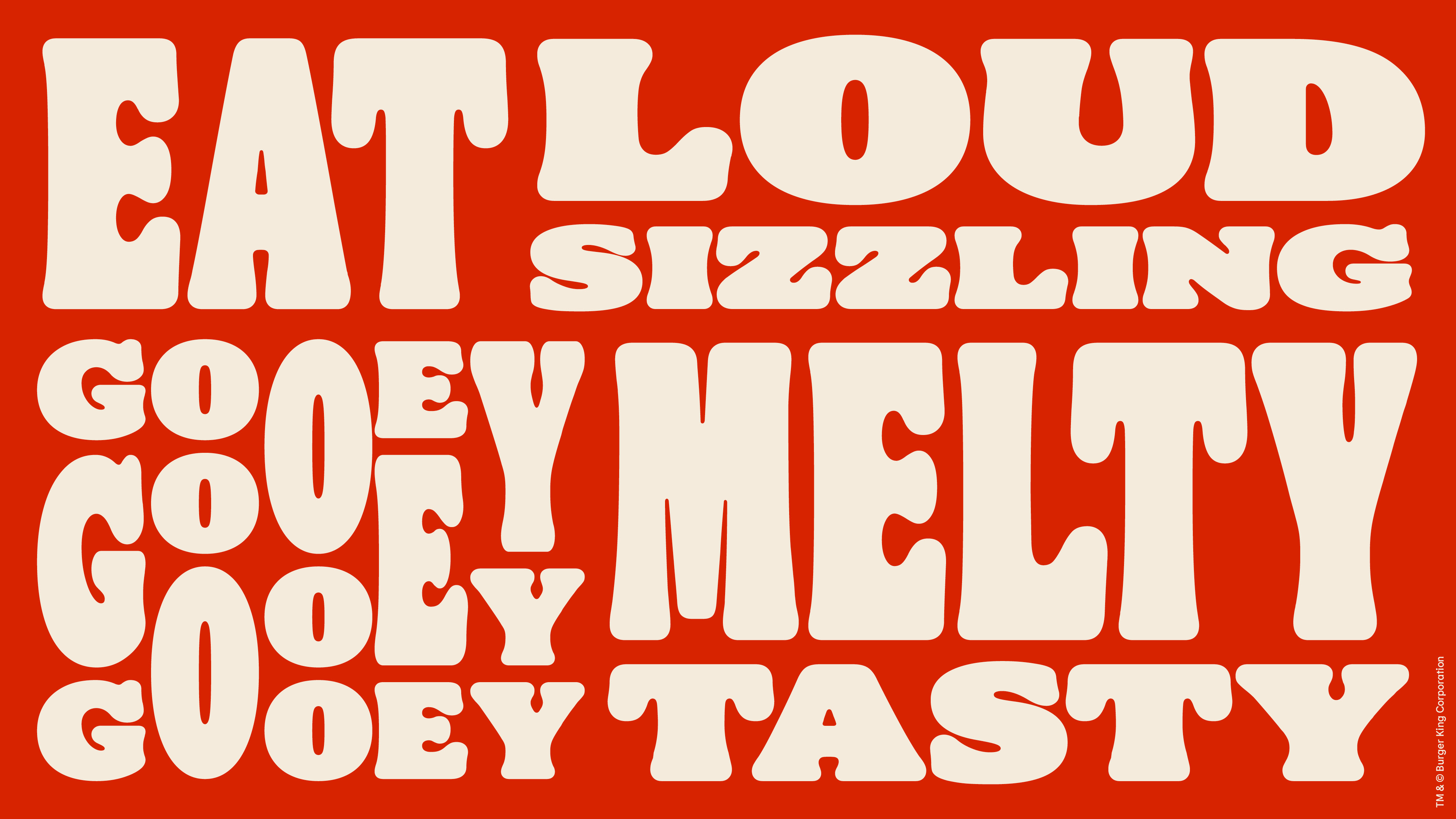
Colophon has created custom type for many notable brands, including Burger King, Instagram, Google, Canva and Central Saint Martins and its library includes 85 font families. To find out more about the merger, as well as chat about the type industry in general, I caught up with Colophon's co-founder Anthony Sheret (above, left).
And if you want more from Monotype, don't miss the foundry's latest type trends report.
Why did you decide to join Monotype?
Edd (Harrington) and I had run Colophon for nearly 15 years and grown from a startup to one of the largest foundries in EMEA, we both felt that there was a lot we still wanted to learn from a commercial perspective that was becoming more challenging under the structure we were working in as an independent company. This new chapter opens up a realm of possibilities, not only professionally but also personally.
What benefits do you expect this will bring to you?
We hope that the benefits will be symbiotic and that we can help bring our own learnings and vision to the table, alongside understanding the inner workings of a larger successful company. It will be a big change for both of our day-to-day and larger working lives, but we are excited about the prospect.
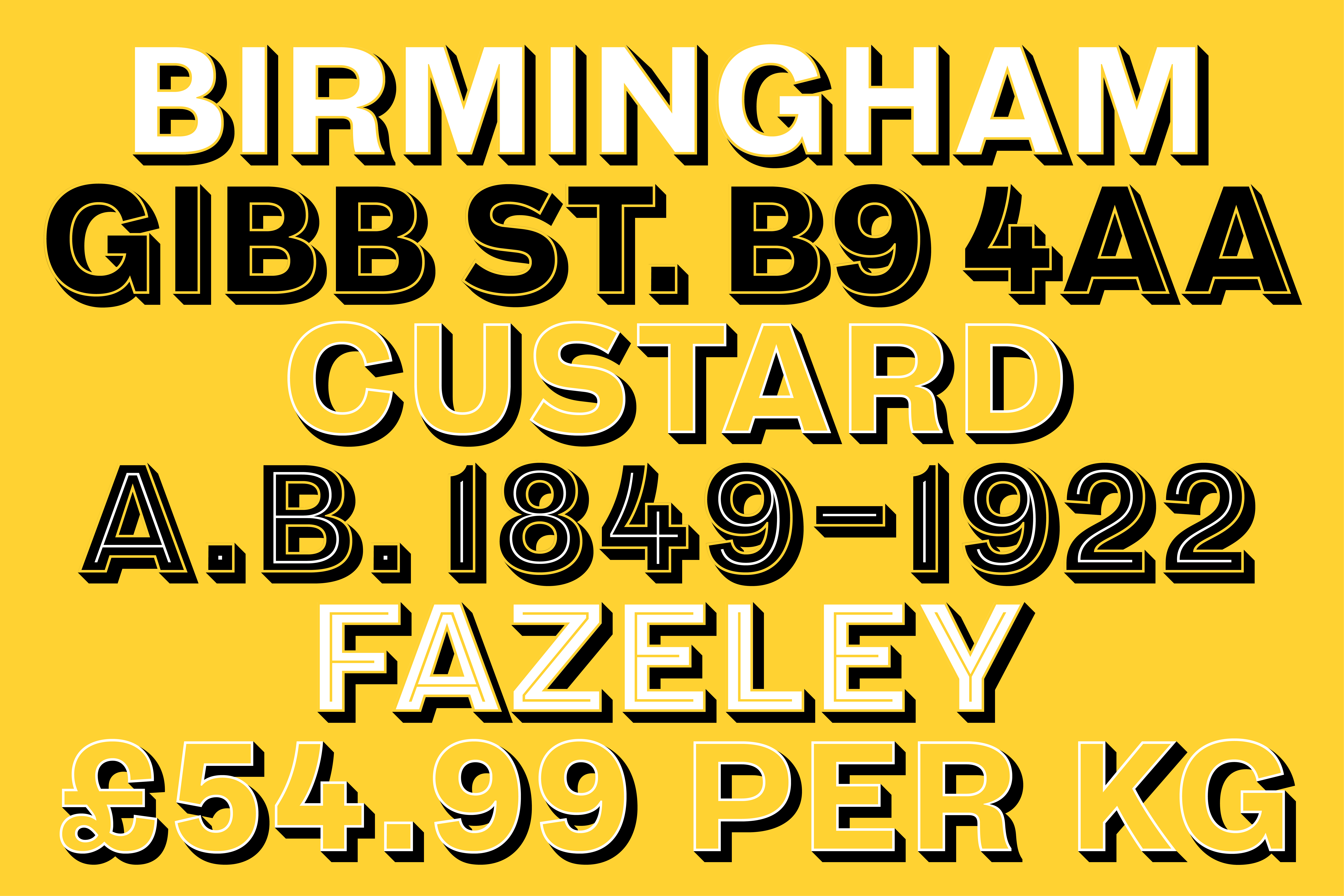
What are the challenges facing the type industry today?
The continued advance of the democratisation of type production brings both positive and negative issues for those that rely on the industry to support their living. On one side, further engagement from a wider audience potentially brings in further adoption and increases the overall market size, but the increase in type production pushes the focus onto helping creatives and customers find the right type. Those that need (or want) to license fonts from reputable vendors or platforms, will have greater choice with higher quality, requiring vendors of all scales to offer USPs to their customers through technology and marketing.
The type industry is at a crossroads with new and exciting opportunities both within technology and its awareness to a broader audience. I have no doubt that it will continue to grow in importance across visual culture, gaining a whole new cohort of type aficionados along the way.
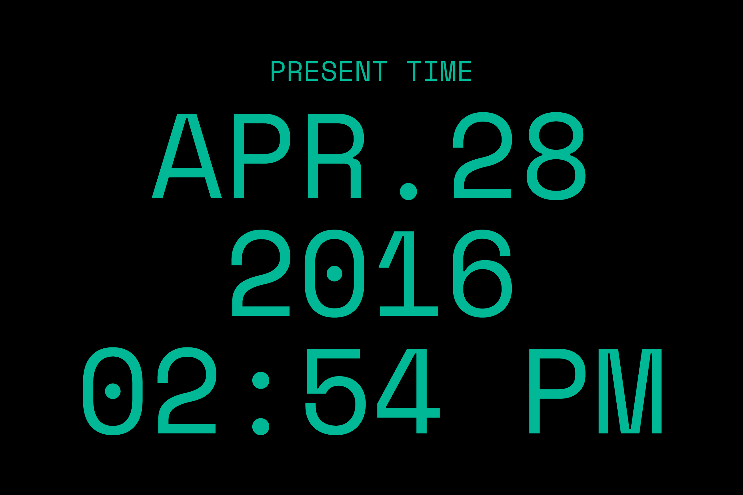
How do you go about creating a custom type?
It starts with detailed conversations with our clients. Understanding what their objectives are and how a custom type can achieve more than an off-the-shelf solution is paramount to defining a creative brief. It’s this brief that then guides us through the process, in close collaboration to ensure that their input is implemented. This conversation we have with our clients enables the project to develop into new and interesting ways in which ultimately enrich the end product. Within our own creative team we speak often about creative possibilities, and have different designers propose new solutions and advice throughout.
For the end client the result is a design that will aid them not only creatively, but also add huge amounts of value to their business, solving issues that they themselves have been able to identify.
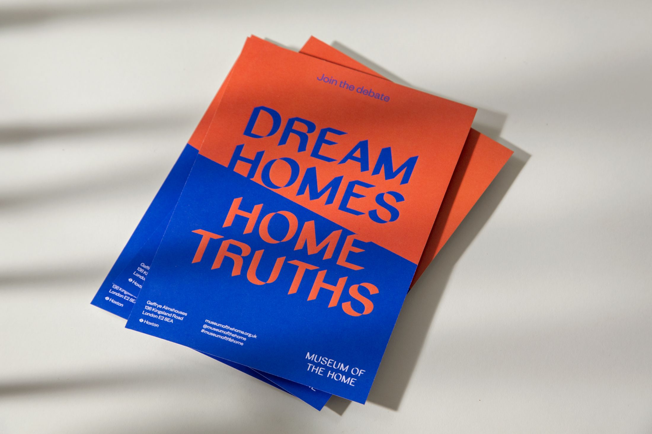
How many of your own typefaces do you interact with on a day-to-day basis outside of work?
The list is so large! It’s great to see them subconsciously and how extensively they touch upon our day-to-day lives. Both our library and custom typefaces help shape the creative landscape around us, and it’s amazing to be a part of that.
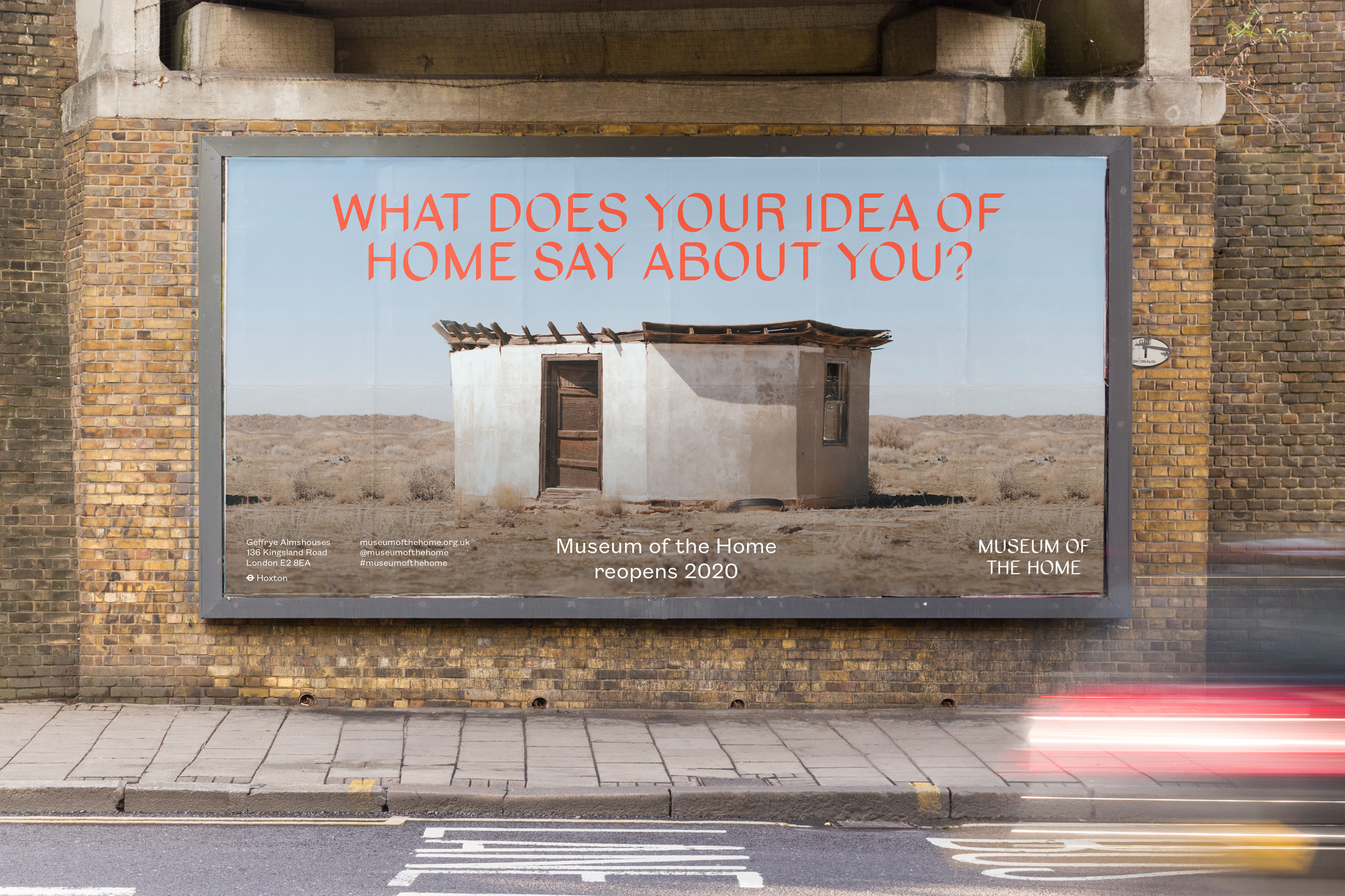
Why is type still so important to branding?
As the world becomes more visually complex and stimulating, the overall quality of the vernacular improves and each piece attempts to garner further attention from its viewer. As this moves to a more visually stimulated world that grows (and is still growing), audiences are now far more visually educated and aware than ever before. As this flywheel continues, true visual differentiation becomes a more complex endeavour, but is still limited to core elements that can be applied to a branding system: colour, typography and form (illustration, photography, shapes, visual devices).
With designers now required to use all the tools at their disposal to create a strong brand across a multitude of touchpoints, type has become a more and more obvious choice to help achieve the best outcome. Type is able to communicate to a viewer on a conscious and subconscious level, and this is a powerful and unique quality.
Type is not binary and through weights, styles, and stylistic features it is able to adapt on some level to its application to ensure optimum results. Its history and deep roots within society show us it will not go anywhere soon, and with the exciting advancements with technology and AI we are confident its power and importance will only grow stronger.
How is AI changing typography?
AI is still somewhat in its infancy in the world of typography, but it has the potential to drastically change and adapt the typographic landscape. The path of continued democratisation will ultimately lead to and merge into AI. Countering this, knowing and understanding what's required to achieve relevant and effective applications, will be a task only experienced and skilled typographers or typographic curators will be able to pull off, especially as trends change and adapt more quickly, due to the increased productivity these tools will bring to the table.
Find out more about Monotype.


