Tourism logos have to do a lot of work to communicate the attractions of an entire region or a country in a single design asset. That can sometimes result in drab, generic designs, or it can result in some of the most creative logos around.
The new logo for Visit Arizona, the 48th US state's tourism office, lands in the latter group, and it bucks the minimalist trend with a design that's delightfully detailed. The logo packs in lots of symbolism in a clever visual device that also links to the state's history.
While Arizona is probably most famous for the Grand Canyon, Visit Arizona was determined that the new design wouldn't be limited to one bucket list landmark but would encourage broader travel across the state. It gave the job to Phoenix-based Heart & Soul Marketing, which undertook a stunning rebrand.
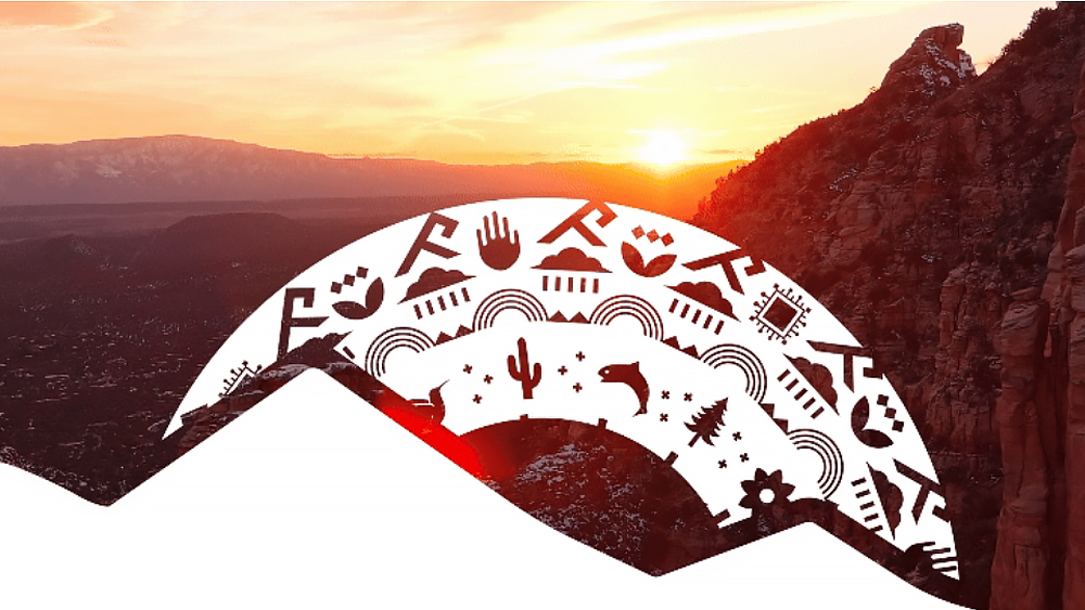
At the centre of the new logo is a motif inspired by Native American mandalas. The circular design created by Hopi and Isleta Pueblo artist Kevin Coochwytewa features an array symbols associated state. The sun is surrounded by icons representing the saguaro cactus, petroglyph hands, rainclouds in reference to the Sonoran Desert monsoon storms, a hummingbird (representing hummingbird capital Sierra Vista) and even a computer chip to represent the semiconductor manufacturing industry.
"Arizona is more than just one famous landmark," says Heart and Soul's associate creative director Hanna Heisler. "It's an accumulation of the countless incredible people, places, ecosystems and cultures that make our state so uniquely vibrant. We wanted to leverage an authentic and meaningful art form that could encapsulate the diverse spectrum of elements that make state 48 truly special."
The mandala is used in a lockup with a turquoise logotype with copper-colour mountains, and the lockup is versatile. There are options to adorn the space in the 'O': a saguaro cactus for Central Arizona, a ponderosa pine for the north and a hummingbird for the south.
The brand colours are new too, with a strong emphasis on turquoise and copper, the former inspired by Native American turquoise jewelry and the latter by the state's copper production and the star on the state flag. Supporting colours include greens as well as sand to recognise that despite the desert, Arizona has lush forests.
Key to the branding project was a discovery phase that involved surveys and online interviews with residents about what icons, textures and colours they felt represented them and their state.
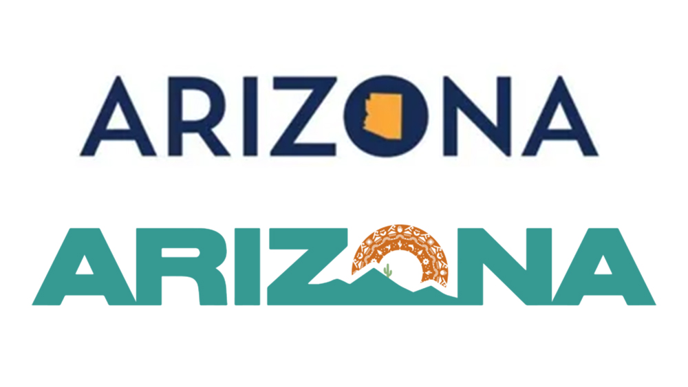
The new logo is a striking improvement on the previous design which was unimaginative to the point of generic: the only reference to the state was the shape of its borders in the 'O'. To an extent, it also bucks the prevailing trends in logo design.
The detailed design of the mandala could limit the interpretation of all the symbols at small sizes, but the overall lockup remains simple enough to work, and it's striking and recognisable even if you don't immediately see the details that make up the 'O' and take it only to represent the sun. There's also an AZ monogram logo in the same colours for smaller applications.
For more news in tourism logo design, see the new Switzerland logo and the ongoing debate around the novel multilingual Dubai logo.


.png?w=600)