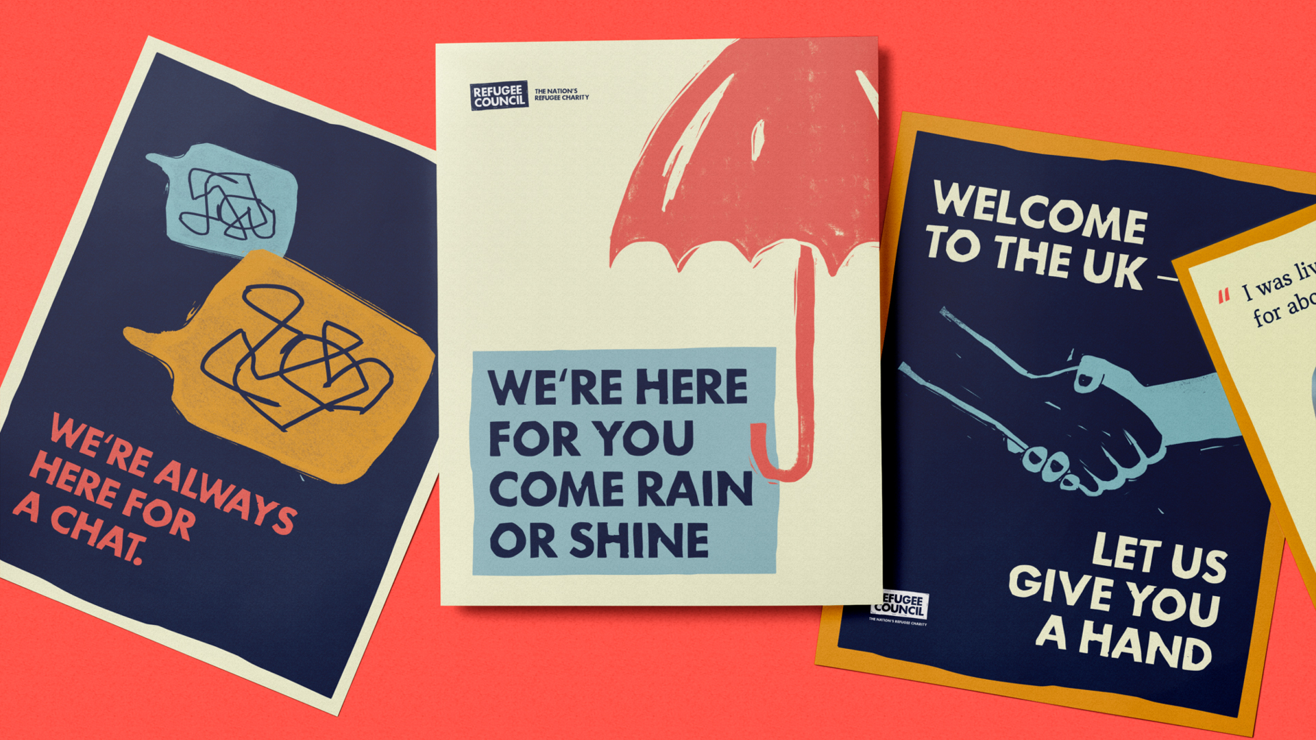
The Refugee Council has been supporting refugees in Britain since the Second World War, but many people were unaware they were a charity. A new rebrand crafted by Shape History, the Refugee Council and refugees aims to change that, elevating the brand to help it reach more people and highlight refugee voices.
The brand needed to be welcoming to both the general public and refugees, and needed to tread carefully so as not to fuel the flames of what has become a polarising topic.
The aim was to bring refugees' role in the fabric of British society to the forefront. To do so, the Refugee Council spoke to refugees and Britons, who co-created the brand together using a process involving research and feedback (in a way that reminds me of how Here worked with prisoners on its Untold rebrand).
The new brand positions the Refugee Council as the Nation's Refugee Charity (and uses this as the new strapline).
Its visual language references British values and heritage and centres around the idea of 'grit and grace' – two elements that are present within many refugees' stories. Grit and Grace is also the name of the custom typeface.
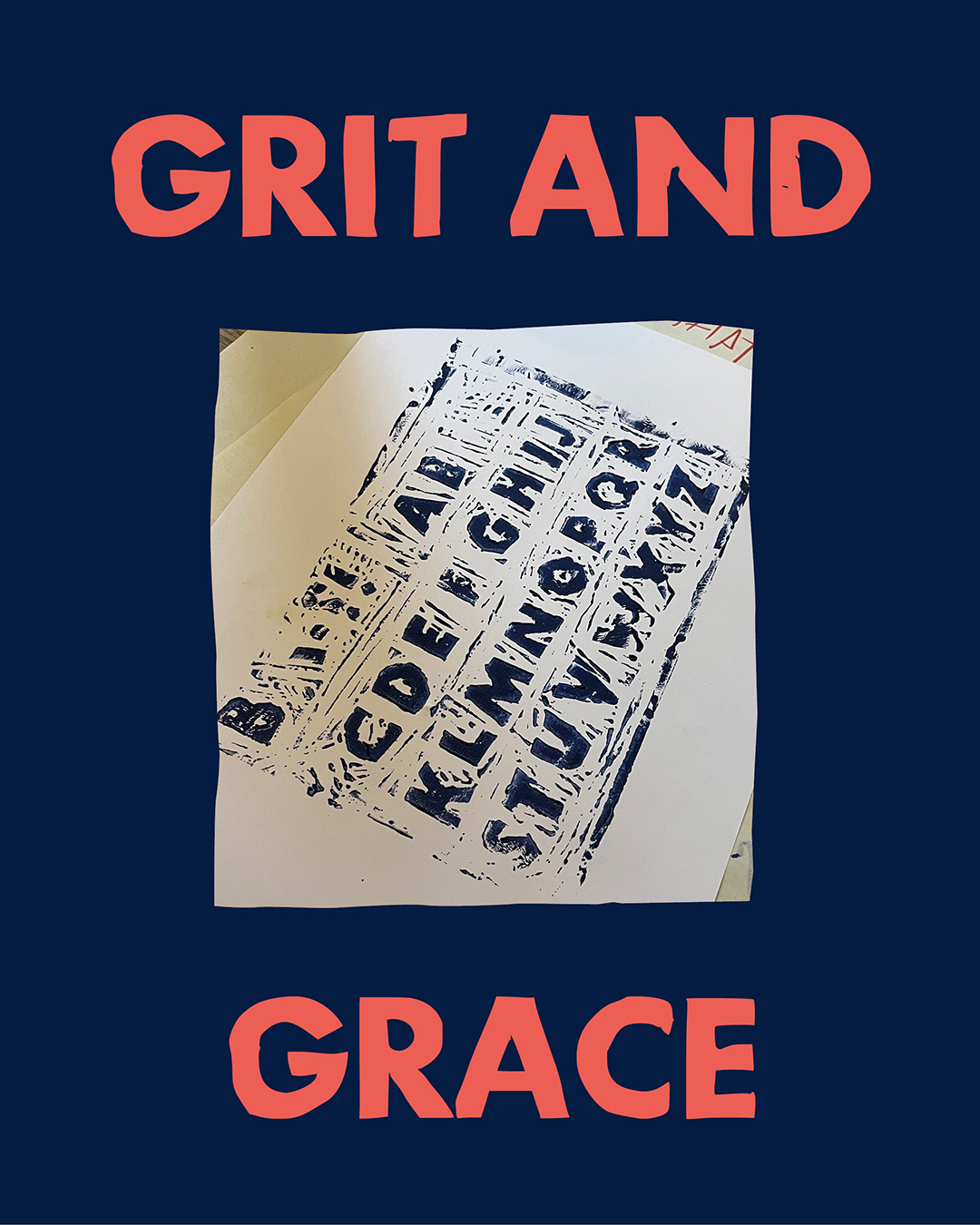
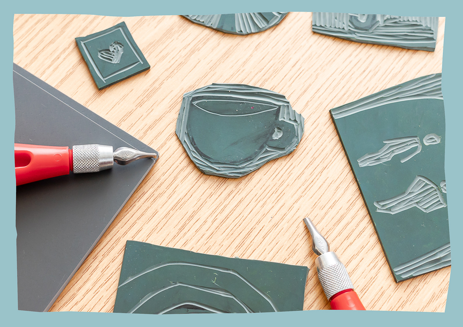
Also central to the brand is lino cutting, a tricky process that embraces imperfection – another nod to many refugees' journeys. Both the logo and the typeface were created in this way, ensuring the brand feels personable as well as textured.
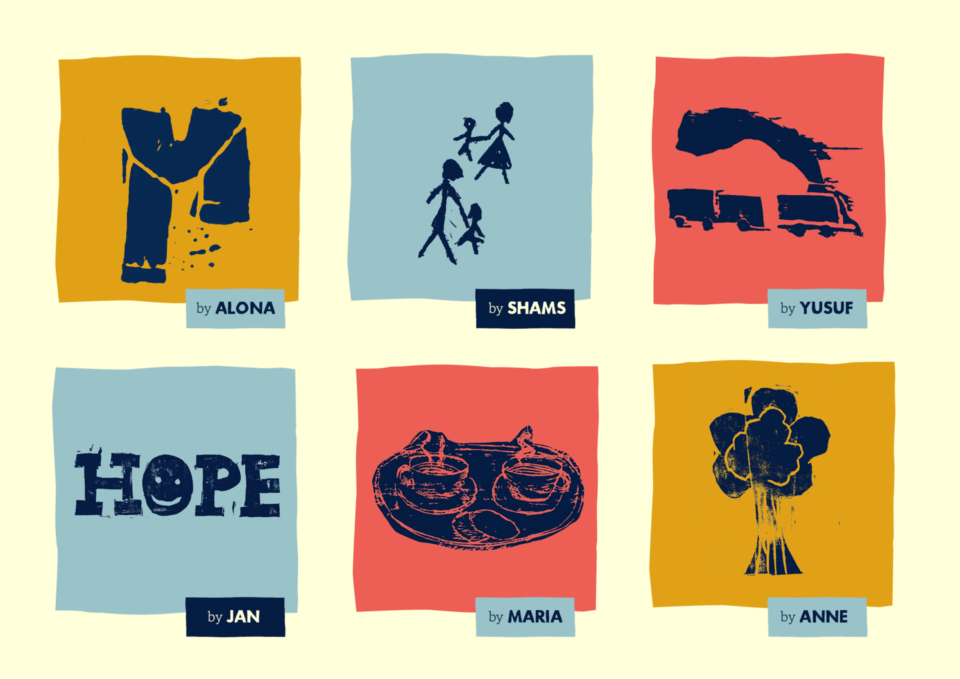
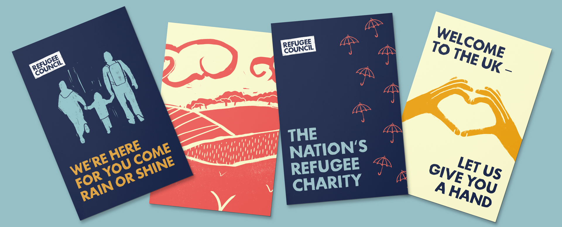
Refugees also created linocuts representing their experiences, and these illustrations are used throughout the brand to great effect.
The brand manages to feel British without being too overtly covered in Union Jacks or obvious references. Instead, it nods to British idioms (e.g keep your chin up), the weather and the feeling of what it's like to be in Britain.
Refugees were asked what says Britain to them, and these representations of cups of tea, dogs and umbrellas have made it into the brand's illustrations, giving the identity a homely and welcoming feel.
Creating a brand that celebrates refugees and attracts non-refugees is no mean feat, and I think Shape History has done a stellar job at bringing the research and feedback they got to life.
The use of lino cut gives the whole identity a handmade and personal feel, creating warmth towards the charity. It feels like this identity will help the Refugee Council achieve their goals, and will help them attract more funding in future.
Find out more about the rebrand on the Shape History website.

