We've seen lots of backlash from sports fans over the years when teams have adopted simpler, more modern logo designs. The trend towards more minimalist designs has sometimes seen much-loved emblems dropped. But this is one case where that was definitely a good thing.
The current Boston Red Sox logo design is almost comically literal: it's a pair of red socks. But when you're named after an item of clothing, perhaps it's better not to try anything clever... like anthropomorphising said garment, for example. That's just what the Red Sox did for a whole decade if we look back at the Red Sox logo history, and the result was quite disturbing. One of the best sports logos it was not.
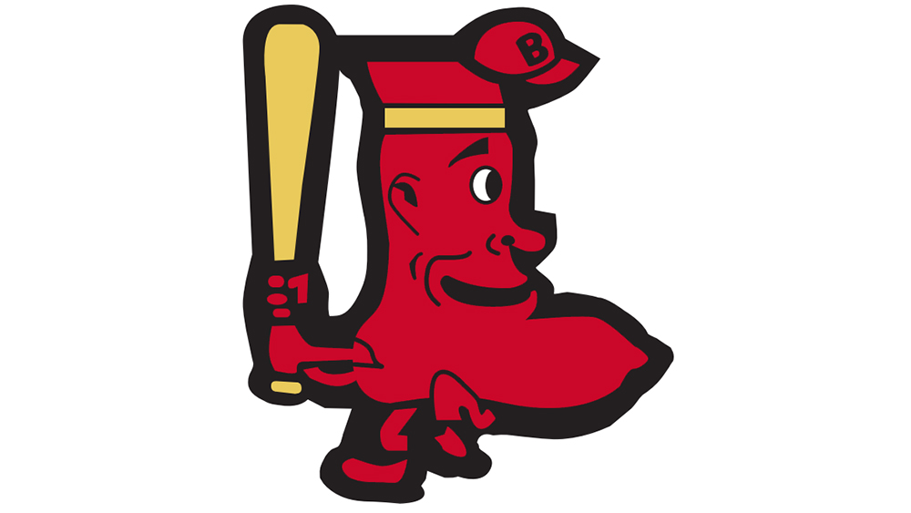
A Red Sox fan recently shared the team's logo history to Reddit, expressing surprise at the design that was used from 1950 until 1960. And it seems a lot of other people are equally amazed.
The design appears to show a humanised sock wearing both a headband and a very small baseball cap. Why it would wear two pieces of headgear isn't clear, but it's been speculated that the headband was intended to make the sock look like a Native American, just to to throw in some more controversy.
However, the design looks more like a person with an enormous chin, leading some to suggest that it may have been the inspiration for the Crimson Chin, the Jay Leno-voiced comedy superhero in The Fairly OddParents. The sock also has feet raising an important question: do socks wear socks?
I'm a Red Sox fan so decided to look up logo history. The 1950s one is disturbing lol from r/CrappyDesign
"All I could see was Jay Leno with a condom for a chin," one person commented on Reddit. "It looks like a sock monster kungfu jedi stepping on and crushing a tiny pedestrian", someone else suggested. Whatever was the intention, I'm glad the Red Sox decided to opt for old-fashioned plain inanimate socks for its later designs.
For more logo inspiration, see our pick of the best and worst national football team logos. And for more recent designs, see the Loewe x On hybrid logo design.