Finding the right paint is always a challenge. There are so many variations, shades, and hues it can be overwhelming. Sometimes we would just like to be told what to do by a paint expert or designer. Enter: Dunn-Edwards.
If you're in the market for a new paint idea, look no further. We've asked the authorities at the renowned paint brand Dunn-Edwards for their expertise on how to use their most popular shade. This steely blue is bang on the pulse in terms of color trends, but it can be an intimidating shade to work with. Here we discover how to incorporate it into your space to instantly uplift your surroundings and breathe new life into your home in 2024.
What is Dunn-Edwards' popular shade right now?
It seems that 2024 color trends have already started to have an impact on Dunn-Edwards sales. 'For 2024, calming blue is bubbling up,' says DeMing Carpenter, Color Expert at Dunn-Edwards. 'Skipping Stones (DET567) encourages moments of reflection and optimism in both residential and commercial design and represents a softer approach to living that encourages optimism and stillness.' This is in line with a general design movement to create a calming and relaxing environment in the home.
It might look like any old blue, but it's actually so much more than that. 'It’s part of the resurgence of blue,' says DeMing, 'and represents a shift away from the bold, warm-toned colors we’ve seen gain popularity over the past few years'. Instead of brash colors, it seems designers are opting for cooler hues that are 'timeless and versatile, fresh and serene'.
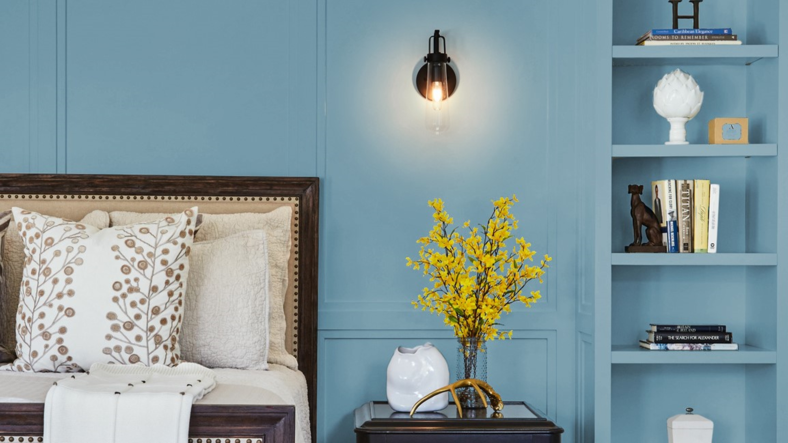
How should you decorate with Skipping Stones?
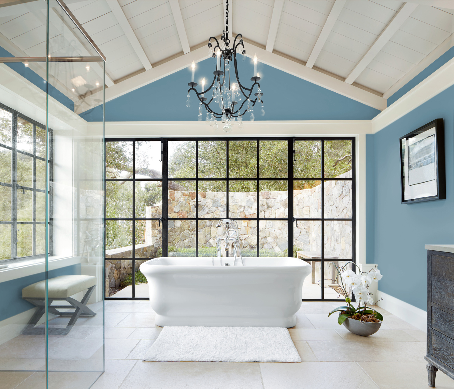
The possibilities are endless with this shade. We love how it has been used above to create a spa-like bathroom and, due to the neutral base of Skipping Stones, it works with a lot of other colors and textures. When looking for the perfect colors that go with blue, you can't go wrong with pairing it with other blues to create a palette.
'Skipping Stones pairs beautifully with various complementary hues and textures, and can work in many spaces,' says DeMing. 'If you can open your mind to blue as a neutral base, the options are endless.' However, if you want an easy life, the shade pairs beautifully with white and will make it look like you put way more effort in than you have. This combination in a bathroom is perfect for creating that coastal chic look. And, if you're feeling extra bold, use it to color drench an office or living room for a super chic feel.
What color pairings work with Skipping stones?
'Skipping Stones pairs beautifully with a range of complementary hues, from seafoam green and navy blue, to soft gray, teal and natural wood tones,' says DeMing.
As hinted at, it sits especially beautifully in a palette with other shades of blue. 'These complementary color palettes not only enhance the mood and style of each concept but also provide a diverse range of options for incorporating Skipping Stones into your design,' she says. 'Whether you seek sophistication, imagination, tranquility, or vibrancy, these palettes offer a versatile selection to suit your design preferences.'
No need to look any further for your perfect hue - this is the shade you should be brushing over your wall in your next project. Guaranteed to elevate your space and introduce an element of tranquility, you can't go wrong with Dunn-Edward's most popular shade, Skipping Stones.