What you need to know
- Google could address a persistent problem with the Pixel Launcher where it cuts off lengthy app names in the app drawer and search results.
- Mishaal Rahman found that the Pixel Launcher in Android 15 Beta 1.2 can display full app names by splitting them into two lines in both the app drawer and search results.
- However, this feature only applies to the app list and search results, not to the apps displayed on the home screen.
Google might soon fix a long-standing issue with the Pixel Launcher where it cuts off long app names in the app drawer and search results.
Android expert Mishaal Rahman, reporting for Android Authority, found clues that the Pixel's native launcher might soon give you the option whether to truncate long app names or not.
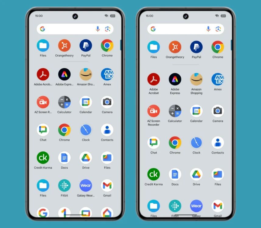
Right now, the Pixel Launcher has to chop off app names if they're too long to make sure everything fits on the screen. It doesn't even give you the option to show the name in two lines, which would be a simpler way to handle apps with more than one word in their name.
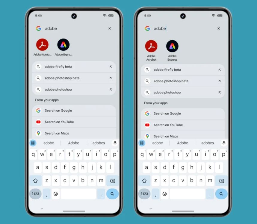
But in Android 15 Beta 1.2, Rahman discovered that the Pixel Launcher can actually show the entire app name by splitting it into two lines in both the app drawer and search results.
Google has been at it since early 2022, as Rahman notes, so it's been a long time in the making.
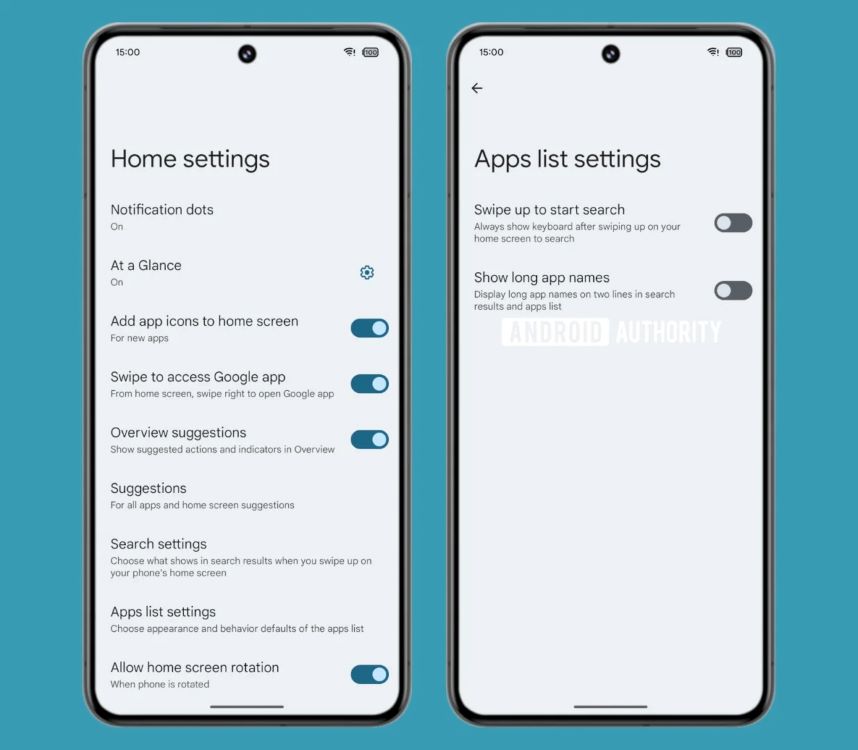
In the latest Android 15 beta release, there are some code strings hinting at a hidden toggle that popped up in the Pixel Launcher settings: "show long app names." The description even gets straight to the point: "Display long app names on two lines in search results and apps list."
However, this tweak would only affect the app list and search results. So, the two-line trick won't extend to the apps that appear on your home screen, as Rahman points out. That said, it's a big improvement for cluttered drawers.


For users with app drawers packed with longer-named apps, even squeezing the app grid doesn't cut it. So, having a toggle to guarantee those full app names are always on display in search results and the app drawer is a solid move.
Although it might seem like a small tweak, this new feature will definitely be a breath of fresh air for Pixel users who've been bugged by shortened app names.


