The Paris Catacombs are the City of Light's darkest tourist attraction: labyrinthine tunnels that house the remains of six million people, which were carted from overflowing cemeteries in the late 18th century.
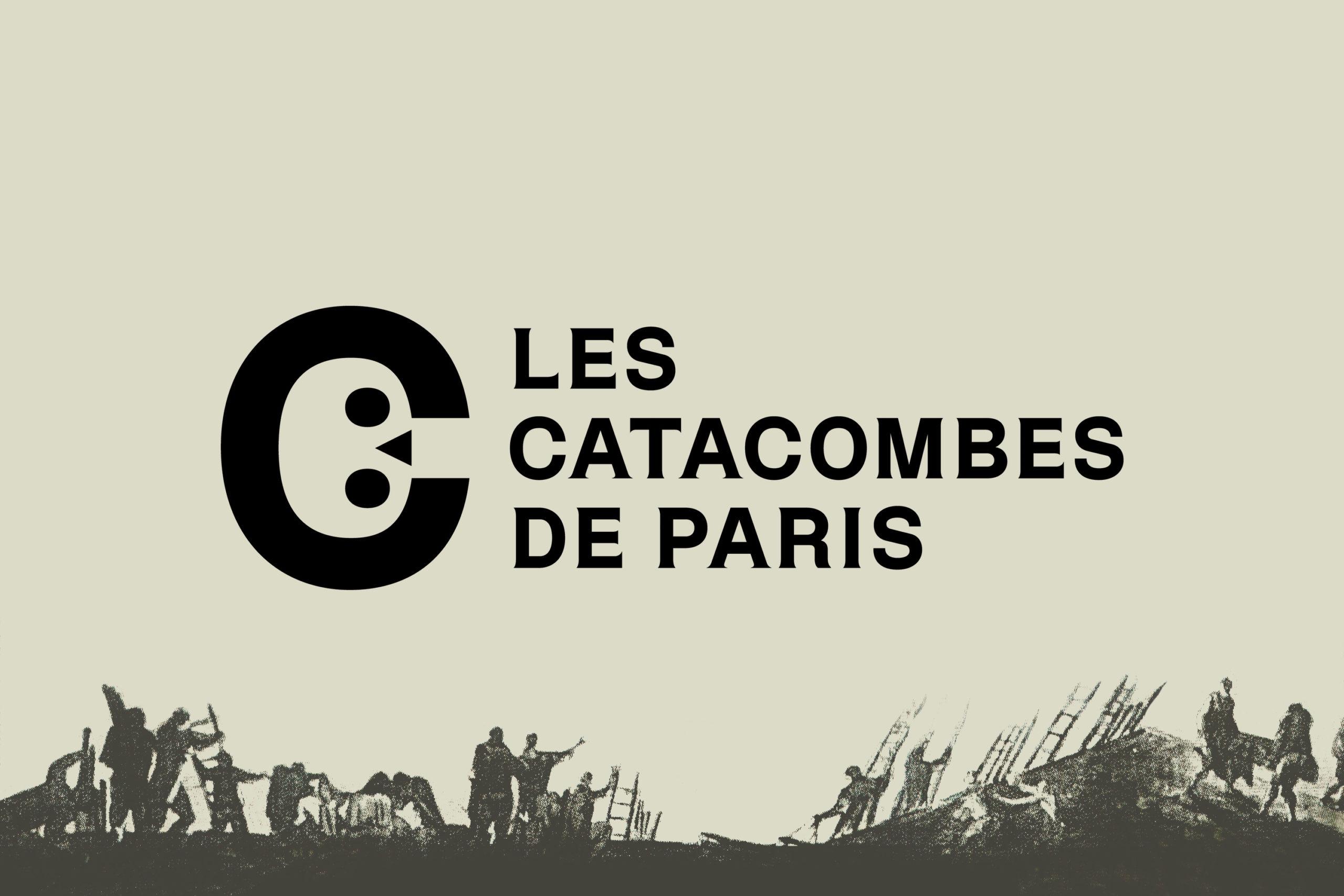
With such a macabre history, you might not expect the enormous complex of ossuaries to have fun branding, but designers are still swooning over how cute the catacombs logo design is thanks to its brilliant example of negative space in design.
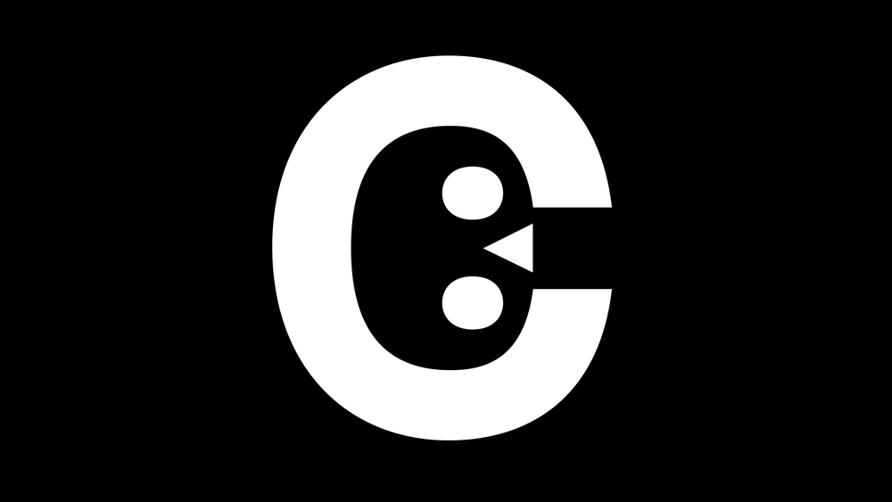
As revisited over on Reddit recently, the Catacombes de Paris logo is a big letter 'C', but peer into the negative pace within and turn your head to the side, and the shape also resembles a human skull, the perfect emblem for a macabre attraction. Even more cleverly, the triangle nose positioned between the gap in the counter of the C appears to form an entrance indicator, inviting visitors to venture into the depths of the city if they dare.
The logo was designed back in 2019 by the studio Mo-To and was the first time the catacombs were given their own proper branding. Mo-To said at the time that the various categories of weights and styles found in the lettering pay homage to the ossuary. The typography also acts as an analogy for the human body, symbolising "a transition from life to death."
At the time, we wondered whether the design wasn't a little bit too playful or disrespectful even. But over five years on, we can perhaps put that down to English sensibilities regarding death. After all the catacombs are now a bit of a quirky tourist attraction, and the logo seems to capture that well.
For less ghoulish logo design inspiration, see the latest development in the Super Bowl logo conspiracy theory and Wieden+Kennedy London's many new logos.