Volkswagen has revealed the updated Golf 'Mark 8.5', which is the final update or facelift before this beloved model is replaced by a purely electric version in the near future.
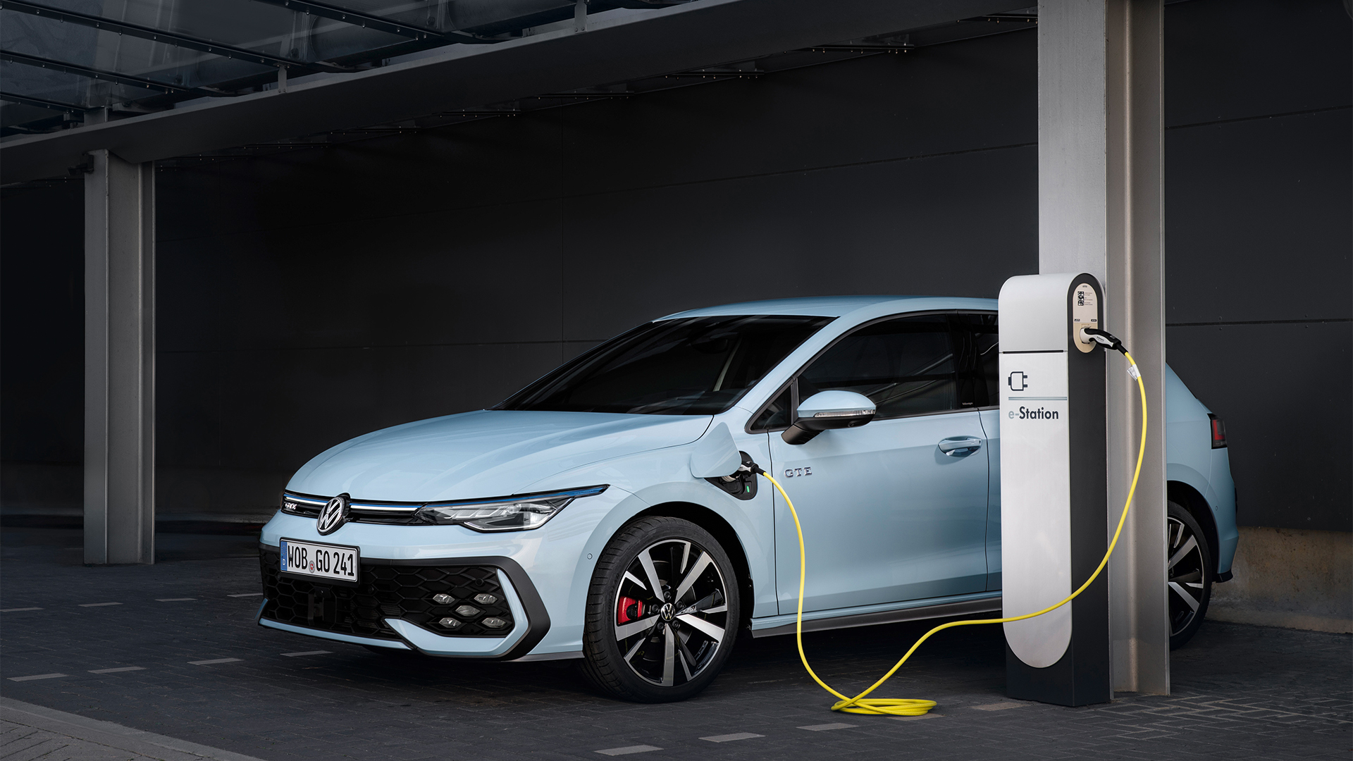
This update to the best-selling hatchback brings with it a hot GTI version and potent Golf R, which is set to arrive later this year in the UK (with pre-orders starting in the Spring). Meanwhile, updates to the hybrid system in GTE-badged models see a much larger battery pack added, allowing for up to 62-miles in all-electric mode and a claimed combined range of 620-miles when the petrol tank is brimmed.
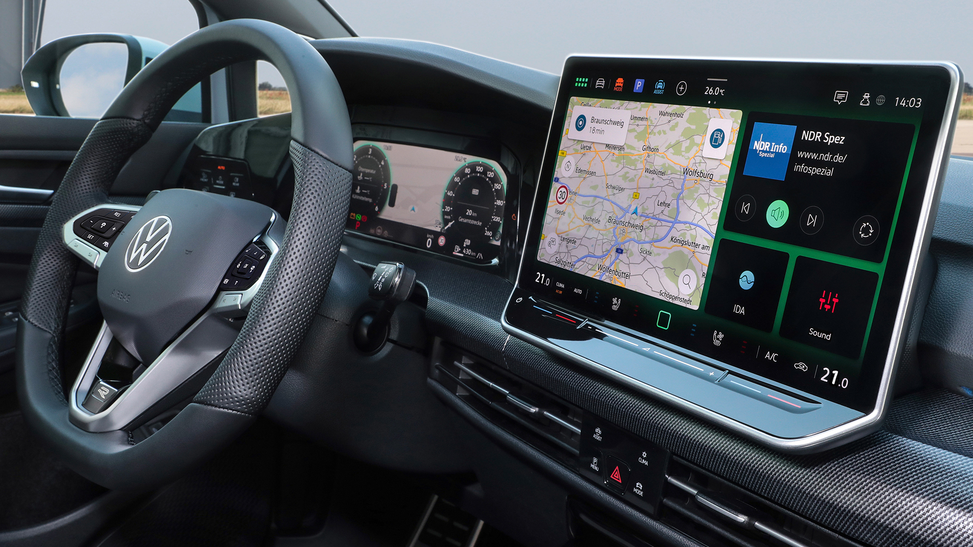
Alongside the fancy new LED headlights, illuminated VW badge and restyled bumpers is the introduction of an all-new and much called-for infotainment system and human machine interface. This scraps the stripped-back and often impossible-to-use approach of previous generations and introduces a much simpler and more customizable way to interact with the car.

Dubbed MIB4, we got hands-on with the faster, slicker sand generally prettier new system during a recent VW ID.7 UK test drive (the same infotainment system is rolling out across numerous VW products), where we took a deep-dive with Marie Puhle, UX and HMI expert at Volkswagen.
With Marie driving the touchscreen, and TechRadar keeping eyes on the road, here's what we found out...
Slider controls now work at night

"In future cars, you will see that we are returning to physical buttons, as this is something we have recognized customers want and need," explains Puhle, mirroring what VW’s interior designer, Darius Watola, said late last year.
Although things like a volume knob and easy reach physical buttons for multimedia are still missing, VW has at least illuminated the haptic sliders positioned just below the new optional 12.9-inch touchscreen display (standard screens run to 10.4-inches) so they can be located and used at night.
Said screen is also now slightly angled towards the driver, unlike the flat, difficult-to-reach touchscreen slabs found in many other ID products.
That said, these sliders are still a bit fiddly and can easily be brushed and activated when interacting with the touchscreen on the move.
Also, the key difference between the ID.7 I have tested and the upcoming Golf is that the pure EV features an augmented head-up display, as well as a small digital cluster behind the steering wheel.
New Golfs will pack a much larger secondary digital screen that displays the instrument binnacles, navigational information and much more.
Order at the bar

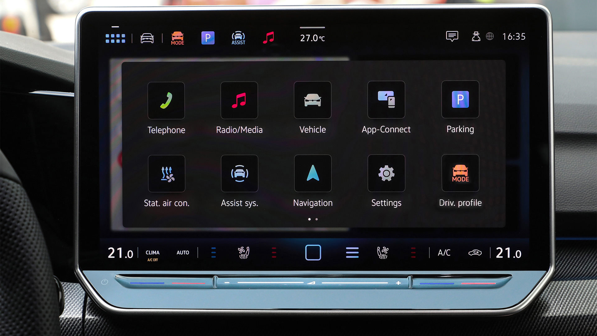
There’s now a fixed menu bar at the bottom of the infotainment screen that houses important functionality, such as climate control, seat warmers and whatnot, which allows much easier access to key menus.
"We have tried to reduce the number of presses where possible," Puhle says. The 'toolbar' can also be modified, so the driver can place the most used menus in the bar for even easier control.
In addition to this, you can now access a sort of 'Control Panel' by sliding down from the top of the screen. Again, this brings with it a list of commonly-used functions that can be quickly activated or turned off with a single press.
A leaf out of the tablet book

As with many modern tablets, Volkswagen's latest MIB4 system features a number of 'swipe-able' pages that house slots or areas that can be customized to your tastes.
For example, page one could include navigation in one area, multimedia and battery or vehicle status, all arranged in one of the several template layouts. This would cover off the key functionality most used when you first hop into a car.
The second page could then dive deeper into comfort features, such as massaging seat options, while the third, fourth and fifth can be configured to pretty much anything you want.
Puhle says users can option up to five of these personal pages, each containing three to five configurable placeholders.
An interactive adventure

It sounds really obvious, but most of VW's new infotainment system is clickable or somehow customizable. In contrast to previous offerings, which have been very staid and for that reason, a bit of a pig to use.
"We have made everything easily accessible. So for example, you can even click on the small icons in the top left or right of the screen and shortcut to their respective settings or menu screens," Puhle explains. From here, these can be customized and pinned to numerous locations (personal pages or the tool bar) for faster future use.
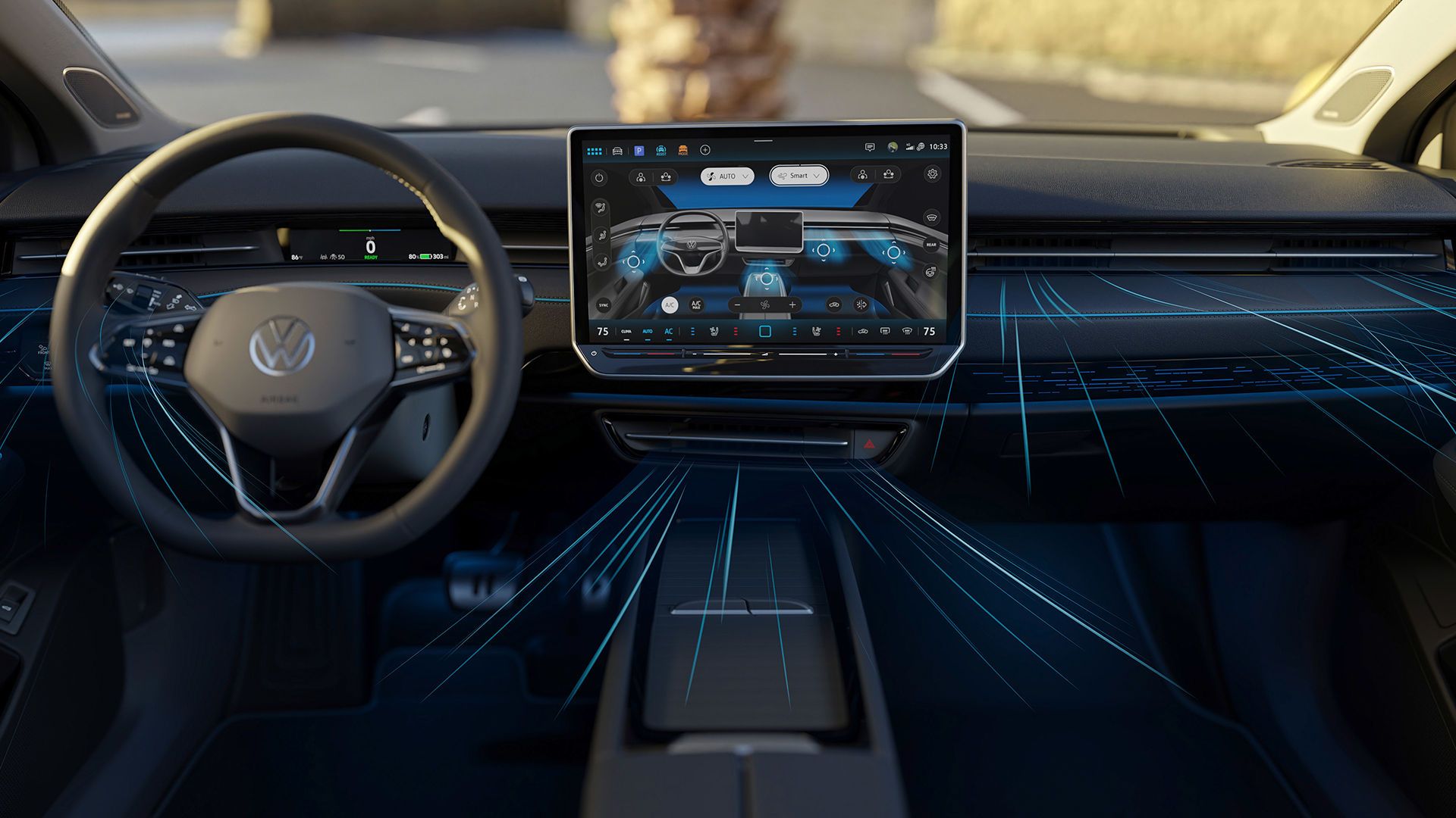
Similarly, a distinct lack of physical air vent controls means you have to dive into the air con menu and drag around a little digital graphic to get the air flowing in the direction you desire. Again, physical knobs are arguably easier, but it allows the driver to control the airflow throughout the entire cabin, without having to reach across.
A clearer voice

VW's Ida voice assistant can now do more, bringing in some of the more conversational prompts that Volkswagen promises with its upcoming ChatGPT integration. Adjusting the temperature in the cabin, turning on the massaging seats and routing to locations is all fairly simple with a few commands.
What's more, it's possible for the owner to set a bespoke activation word, so Ida isn’t accidentally activated when saying your daughter’s name, for example.
Although during this test, I tried to set it to "Hi Bonnie" and the system heard "Hi Bunny". It’s not a huge deal, but more annoying is the fact the voice assistant seems far too eager to butt in during conversations between driver and co-passenger.
It often mishears the activation word during a conversation and starts routing the navigation to Dover, like it did for me during my test drive.
Still, overall VW's new infotainment system is a massive improvement on previous generations, especially those found in some current and previous ID electric models. It’s much faster to respond and more intuitive to use. I can imagine it won’t take long for owners to set up their screens and then be happy with where everything resides.
Regardless, a move back to more physical buttons is certainly welcome and those haptic sliders still leave a lot to be desired. Similarly, the Ida voice assistant has room for improvement – whether an upcoming ChatGPT introduction will aid that is still to be decided.


