Beloved confectionary brand Twix has revealed a brand new visual identity, along with a new $70M campaign designed to focus on unity. Whereas previous marketing has used encouraged customers to "pick a side" when it comes to Twix's two biscuits, now it's all about inviting them to "have it all".
At the centre of the campaign is a hugely fun and action-packed new TV spot titled 'Two is More Than One' (below), which pays homage to classic car chases. Twix has also gained a new logo – and in the process waved goodbye to one of the internet's favourite logo secrets.
“Centered in the human insight that our fans are fostering maximalist living and abundance, we have reimagined our Twix platform from the idea of having to choose (left or right Twix) to one of having it all,” said Rankin Carroll, chief brand officer at Mars Snacking, in a press release. “A repositioning that pairs uniquely with the Twix brand and its two-bar format. ‘Two is more than one’ is so simple, so obvious and we’re really looking forward to showing up in new ways to delight our audiences.”
The new visual identity was designed by JKR. "The ask was simple: give this iconic brand the same love people have for its products," the branding agency announces in an Instagram post (below). So we did what we do best, refreshed, modernised, and dialled up the distinctiveness, while doubling down on the delicious combos that make TWIX, TWIX. Who knew that the secret to future proofing a $1BN brand was to teach its old assets new TWIX?"
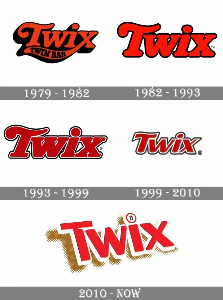
Indeed, the agency does appear to have jumped on the current trend for resurrecting heritage logos with a modern edge. The curly 'T' appears to be a direct homage to previous iterations of the logo from 1979-2010.
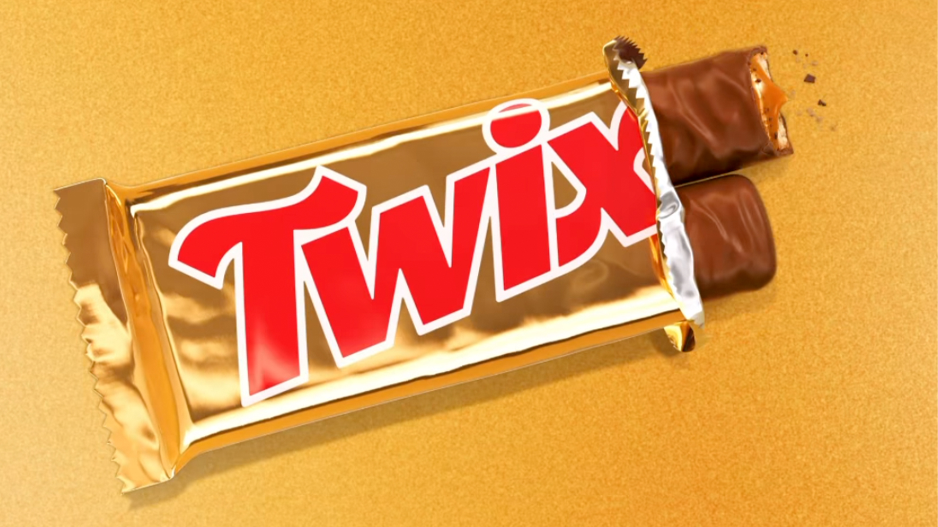
But as is ever the case with a new logo for a beloved brand, it's going to take customers time to get used to. Some have already complained in the comments of JKR's post about the loss of the 'pause' icon in the dot of the 'i'. Previous Twix advertising centred around 'taking a moment' to pause and eat the snack – and of course, the pause icon also resembled the two sticks of the Twix itself.
While it's a shame to lose the clever visual pun, it's pleasing to see a return to the Twix typeface's more rounded style, which feels more in keeping with the playful vintage aesthetic of the new ad. And with everyone from Mountain Dew to Coca-Cola reviving old brand assets lately, Twix certainly isn't alone in going for nostalgia.