We've already seen plenty of major logo redesigns in 2023, and now LG is joining the party, although some people are struggling to tell the difference. The tech brand has revealed a new logo that, at first glance, is basically the same as the old one, just flatter and brighter. But it's the animated logo that really livens up the brand's identity.
The new LG logo comes to life in an animation that turns it into a jaunty, winking emoji-like face in a bid to appeal to a younger audience. But, alas, as ever, the internet has some harsh things to say (see our pick of the best logos and the best animated logos for more inspiration).

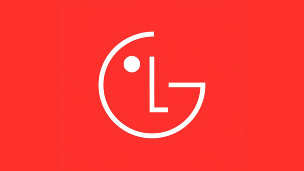
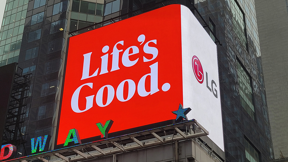
The new LG logo features a flatter version of the LG 'face', dropping the shadow around the symbol and the gradient on the background. The circle surround is gone, with the logo now appearing on a flat background in a colour that the brand is calling 'LG Active Red'. The signature 'Life’s Good' slogan will remain, and will be used more widely in branding and product packaging in a new typeface.
LG says the new look is more “dynamic and youthful”, particularly thanks to that expressive animated logo, which nods, smiles and winks. "Having a strong, consistent brand strategy enables us to better communicate our value proposition and unique identity, which harmonically blends innovation and warmth, CEO William Cho says.
The internet is not unanimously convinced, however. Some prefer the new design, noting that the old logo was looking, well, old. But others think it looks too much like Pac-Man or like an emoji, too much like an app icon – or, more problematically, too much like the Chinese electronics company Oneplus, which uses a similar shade of red. Others simply can't tell the difference.
pic.twitter.com/zBKFR09T7IApril 12, 2023
"Where’s the new one?" one person asked on Twitter. "It looks lifeless and forgettable," someone else said. "Lame and cheap looking," was another of the harsher comments.
As one person notes, replacing skeumorphic/neumorphic designs with flat ones seems to be a trend. We've seen plenty of brands go in that direction, including many car logo rebrands. Personally, I think this one works. The old LF logo worked fine but was looking drab and dated. The new design is brighter and more vibrant, and with the animation, you can't not notice it. If the aim is to appeal to young customers, it seems to be on the right track.