Retro-looking logos seem to be something of a trend at the moment. After Goldman Sachs, the New York Jets and DC Comics turned the clock back on their branding, KitKat has joined the nostalgia party. But in this case, it isn't an old identity making a return. It's a new logo that's designed to look retro while also modernising the brand.
The refresh aims to give KitKat more punch, so it stands out on the shelves while also conveying a nostalgic charm fitting for a brand that's been a household name in the US since the 1970s. The rebrand won't be seen everywhere though: it's exclusively for the US market, where KitKat is owned under licence by Hershey rather than Nestlé.
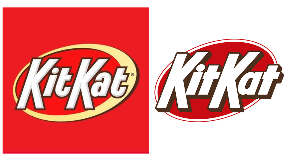
Created with New York City-based Sterling Brands, the new KitKat logo for the US is not unfamiliar, and it will be easily recognised on the shelves, but it's a fairly radical refresh. It's a lot cleaner and sleeker. The typography has sharper straight lines and loses the inner shadow while gaining chunky drop shadows to help it stand out from the red background. The kerning has been reduced, bunching the type closer together, and the ring around the text is thinner too, and now white rather than yellowish, reducing the distraction and making the text pop.
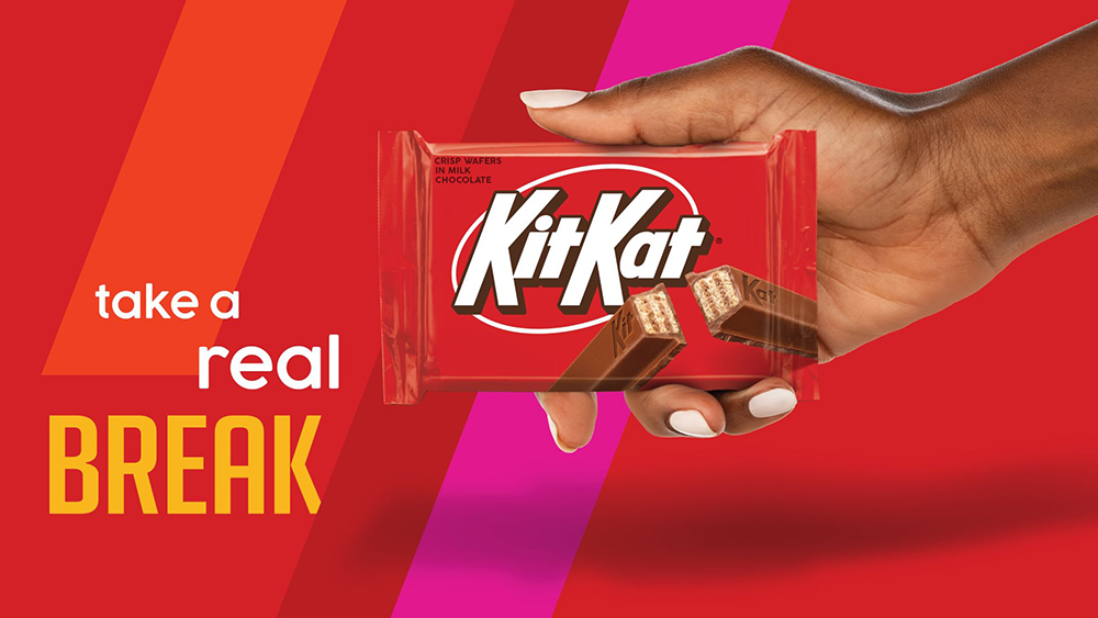
Sterling Brands says the rebrand “celebrates the crispy, creamy taste of KitKat, activating the brand with the upbeat, kinetic energy of KitKat’s iconic ‘break’." To me, it feels like the perfect implementation of the retro modern approach to logo design that we've seen in new logos from brands as diverse as Citroen and Jell-O. It somehow feels cleaner and more contemporary but more classic at the same time, making KitKat feel like a brand that's always been around but remains as relevant as ever today.
For more recent rebrands, see the new Mazda logo and the new Mazda logo and the Las Vegas Raiders logo.