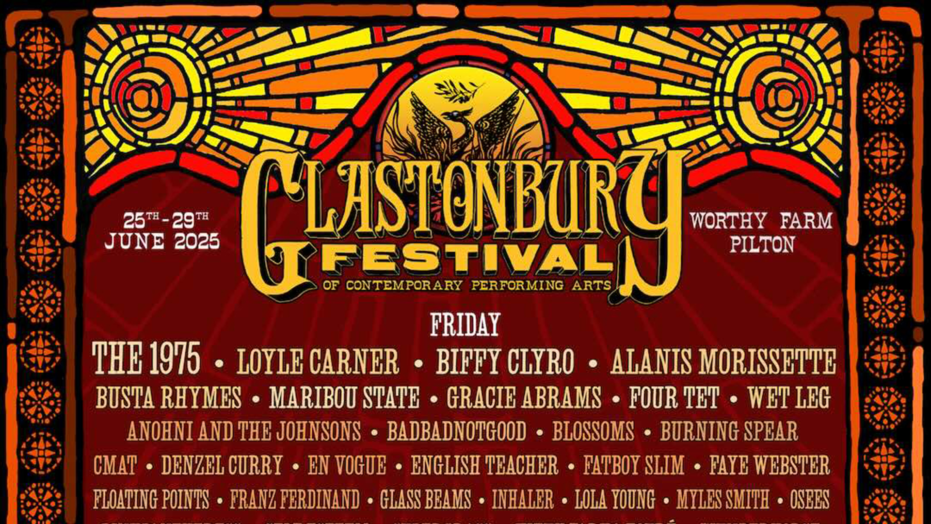
Glastonbury Festival has finally dropped its 2025 lineup via a swanky new poster – say what you want about this year's headliners but it's the design that caught my eye. While there's always a certain retro flair to each year's poster, the latest edition almost feels like it lost its flair, with a flat monochromatic design that feels oddly understated.
Typically Glastonbury Festival posters evoke the spirit of summer with vibrant visuals, playful typography and stylish illustration but to me, the 2025 design lacks this same lustre. While there are no wrong answers when it comes to creating poster designs, Glasto has set a high design standard and this year's is sadly a little underwhelming.
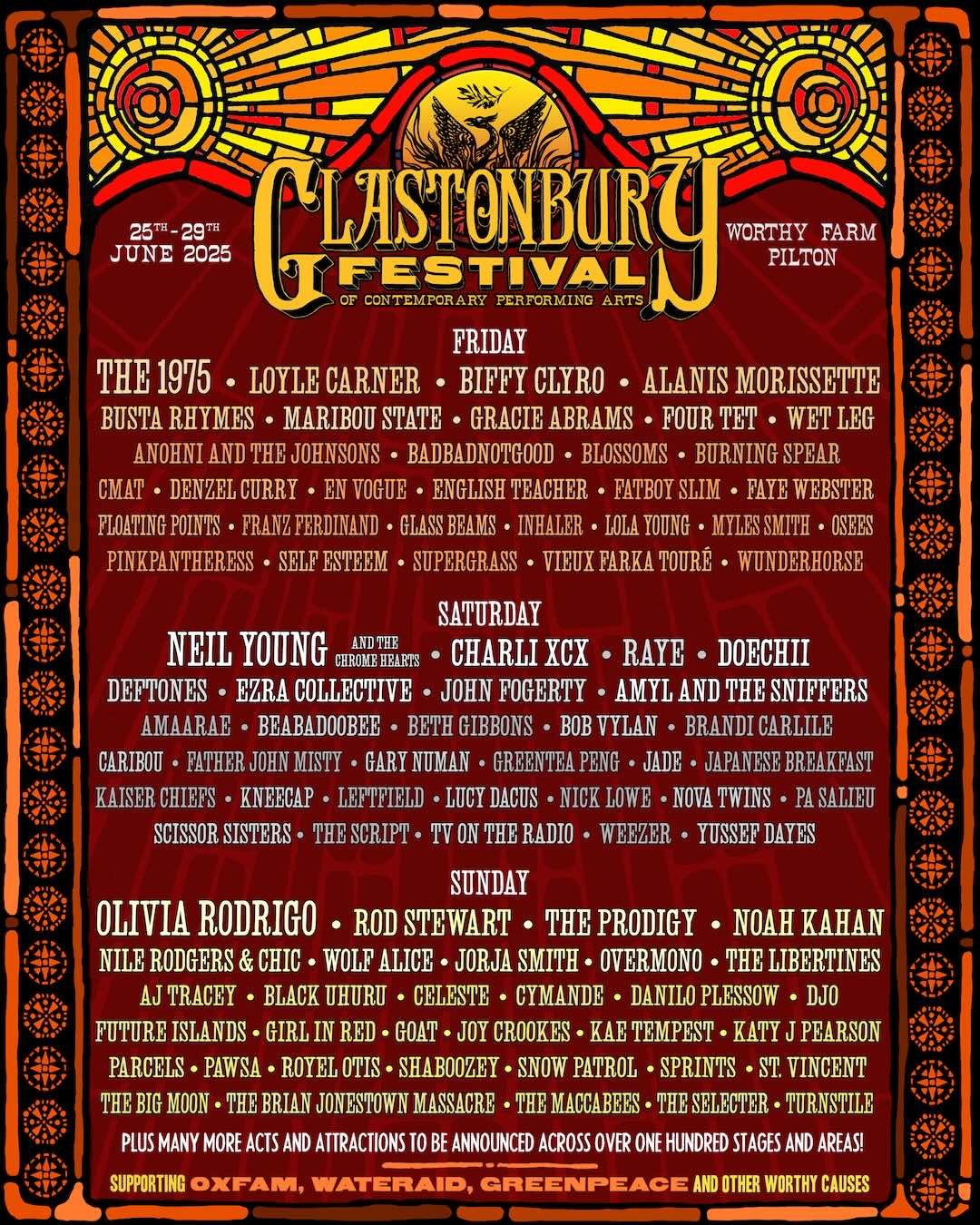
With a stripped-back palette of earth-toned browns, oranges and yellows, the poster has a distinctly neutral theme that dwindles next to past poster designs which typically feature vibrant multicoloured typography and playful illustration. With a suitably rustic stained-glass-window-style sun motif at the top of the poster, the design has a pleasant warmth, complemented by a black border of rounded emblems. While in isolation I'm quite a fan of the retro 70s poster design, it doesn't have the same energetic spirit of past designs, making it regrettably forgetful. Take this as a reminder that retro design doesn't have to be so brown.
For more poster design inspiration take a look at Marvel's minimalist new Fantastic Four artwork that is pure retro perfection. If you're after more design inspiration check out Soho Rep Theatre's unapologetically bold poster art.