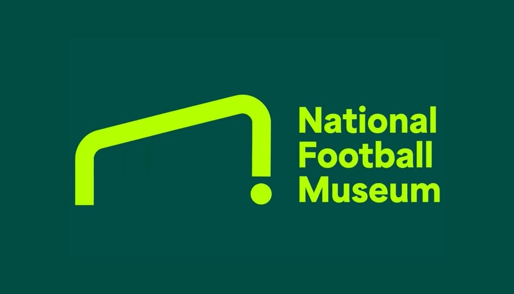
With Euro 2024 in full swing, it's the perfect time for a rebranding of the the UK's National Football Museum. And the new logo design is on goal – literally.
The logo design takes inspiration from the shape of the museum's building inspiration from the shape of the museum building, but also from the two most recognisable objects in the sport: a goal and a football.

Devised by Poke Marketing, the new logo for the museum in Manchester was inspired by makeshift goal posts painted on walls. It can be a challenge to ensure that such a direct reference to a physical object is recognisable, but designers achieved this by using the shape of a goal viewed at an angle rather than face on. And the addition of a dot to represent a football at the base of one of the posts also aids legibility, firmly associating the design with the sport.
The logo forms part of a complete new brand identity, with more visual assets based around the concept of 'Football Matters', including full-colour graphics and one-way vision vinyl at the entrance and exits of the museum.

The colour palette uses vibrant, contrasting colours that communicate energy and diversity while providing flexibility. While the typefaces chosen, Blaze Type and Halyard by Darden Studio, are bold but warm and flexible.
Poke also settled on a photography style that aims for authenticity, highlighting football's significant but complex social role, and a tone of voice that's bold and punchy without being arrogant, with a focus on being easy to understand.


Tim Desmond, CEO at National Football Museum, said: “Our new message of Football Matters is highlighting that football isn’t just about spectating. It’s about being there, being involved, coming together, no matter who you are or why you love it. And that is what people can expect when they come to the National Football Museum.”


