The Museum of Modern Art in Warsaw, which has just been inaugurated to a design by Thomas Phifer and Partners, is a handsome, refined new building; it is also a case study of the wide, international interest in the country's architecture, as well as a scheme that exemplifies through its story, the difficult post-war history of its city.
In 1998, right after the undisputed success of the Guggenheim Museum in Bilbao, Frank Gehry gave an interview to the Polish press in which he expressed his desire to design a new museum in Warsaw – even for free. Gehry's family came from Poland, so it was his dream to build a significant building in the country. He later designed the Camerimage Film Center in Łódź and the Academy of Music in Kraków, but neither was built.
The Museum of Modern Art in Warsaw: the story
In 2007, a broad, open international competition was announced for the design of the new Museum of Modern Art in the Polish capital. It was to be located on a valuable plot in the city's heart, next to the Palace of Culture and Science. Gehry did not take part, but over a hundred teams from around the world submitted designs. The commission was won by Swiss architect Christian Kerez, who proposed a minimalist architecture, contrasting other, more expressive, participating proposals. The project was developed and reached a fairly advanced stage when it was abandoned in 2012.
In 2014, another competition was announced for the same plot, with very detailed guidelines and requirements for designers. Ultimately, 15 teams submitted works, including Foster + Partners, UNStudio and Henning Larsen. This time, the winner was the New York studio Thomas Phifer and Partners; and its project has eventually come to fruition.
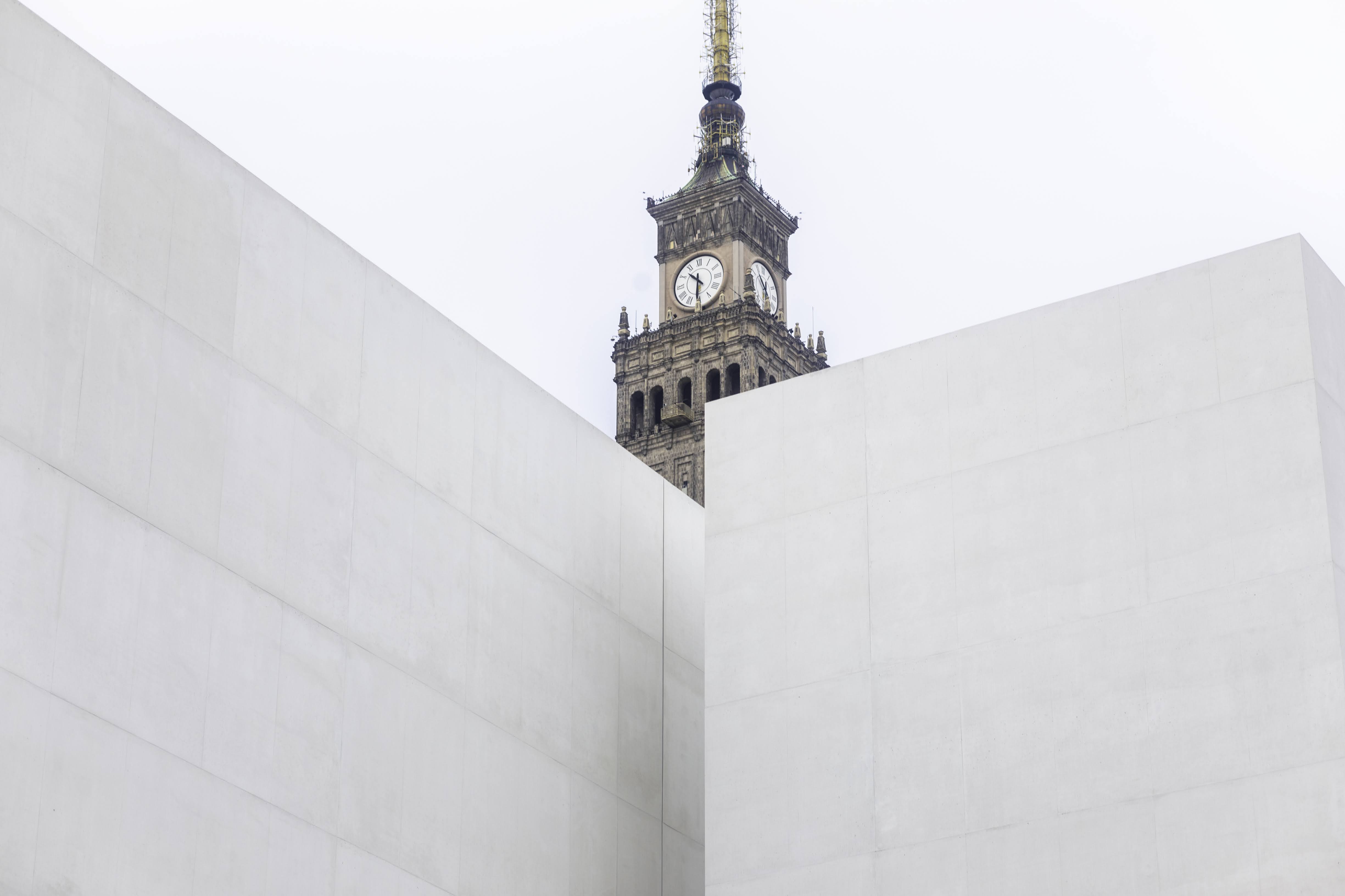
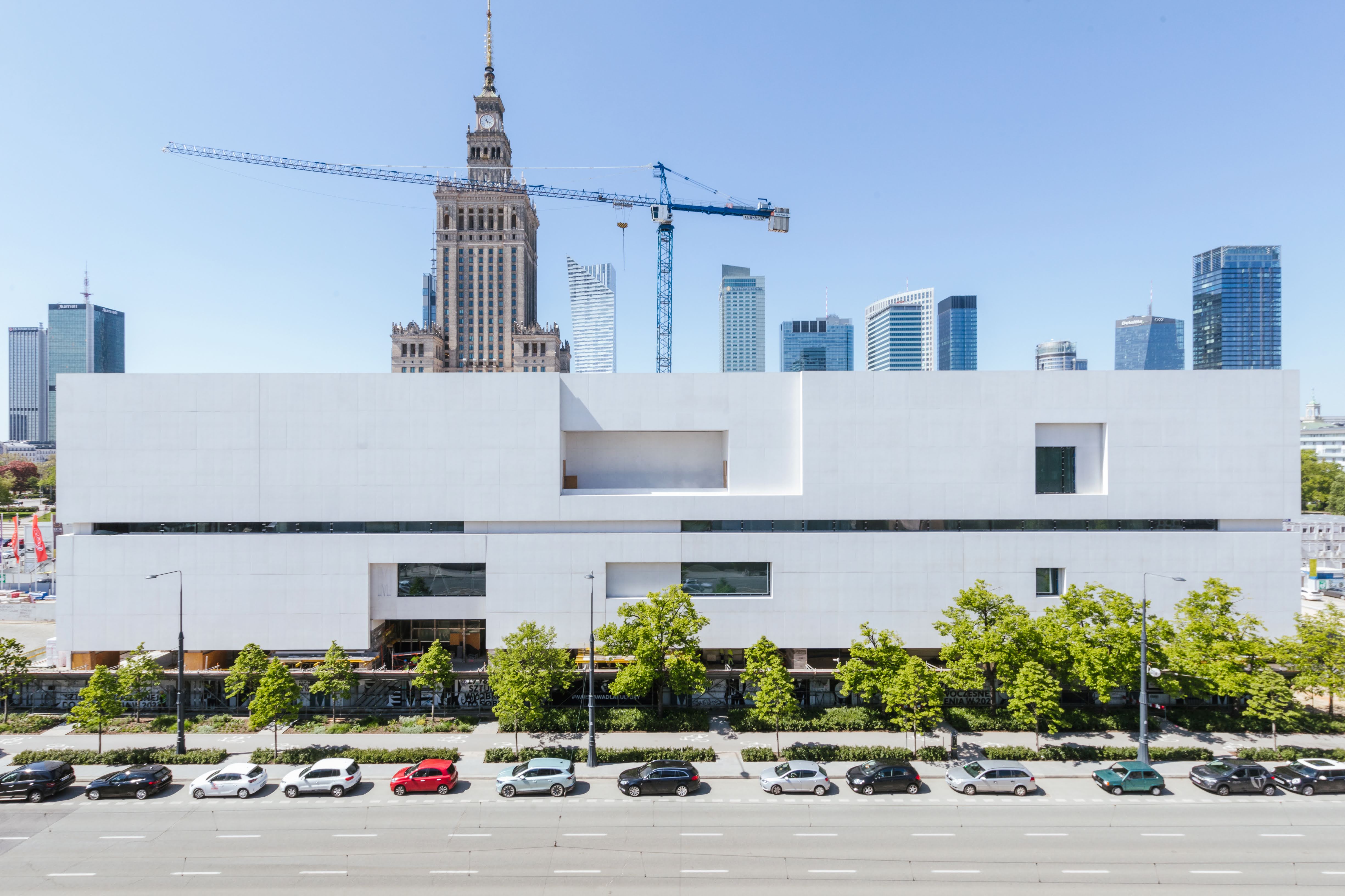
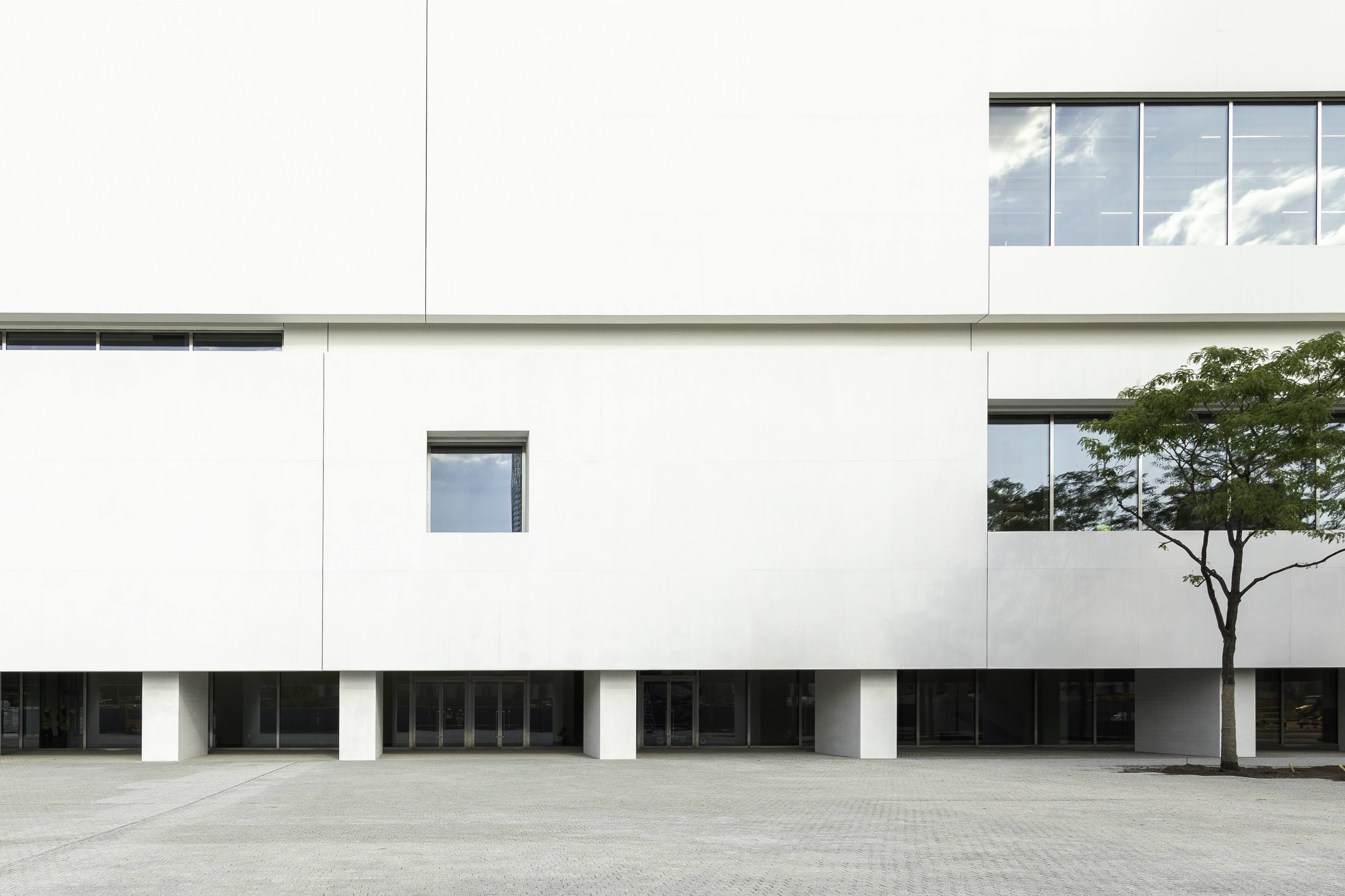
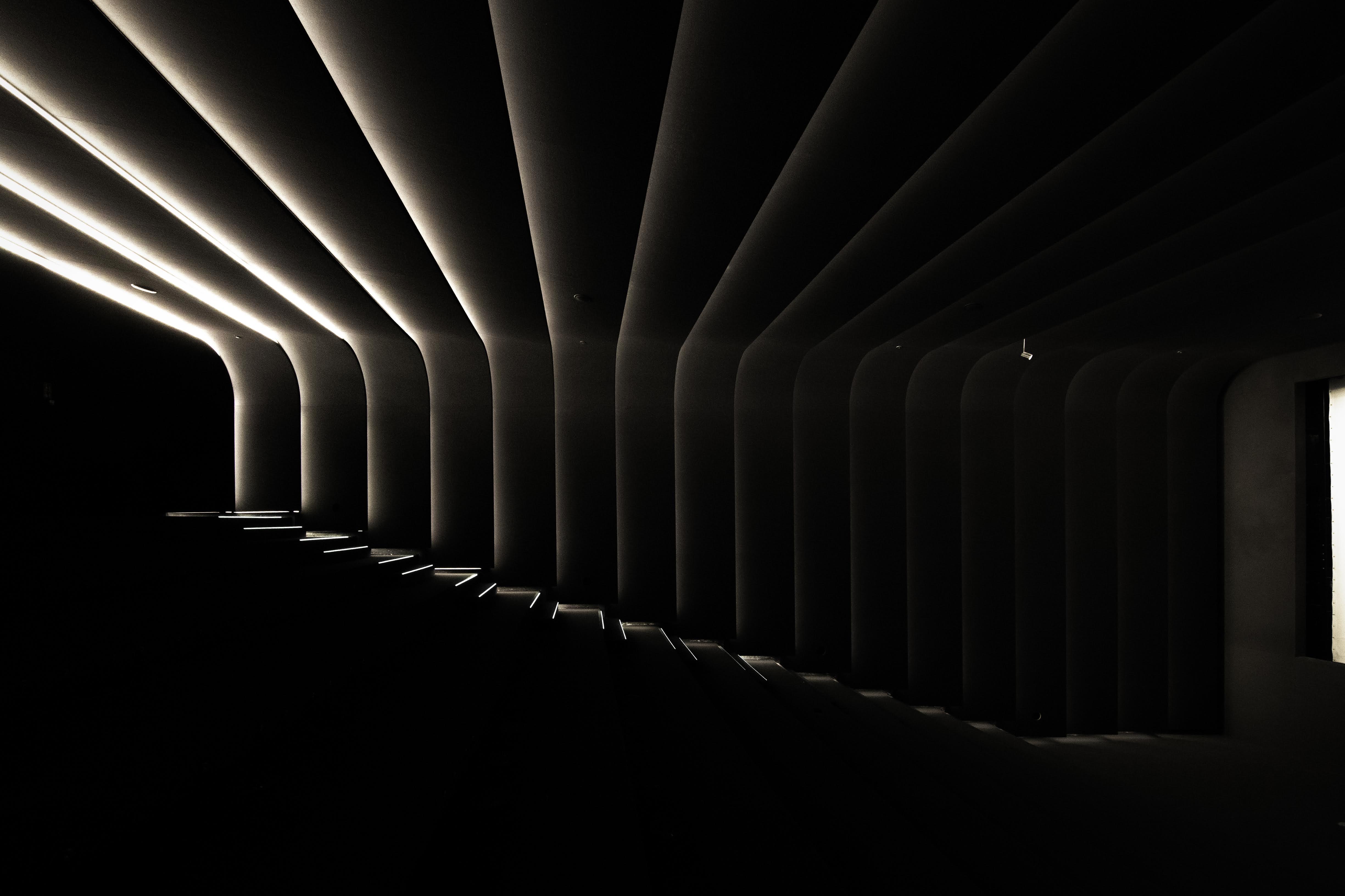
The horizontal, large-scale, almost all-white building strikes a contrast against the glass skyscrapers dominating the skyline of central Warsaw. Right next to the building’s main body, there is a narrow, freestanding tower with a separate entrance to the black auditorium and cinema hall located underground. The ground floor of the main building is completely glazed, opening the museum to the busy pedestrian routes around it and the adjacent, newly renovated square.
This also enables art to be visible from a public space – it will be viewed by hundreds of drivers travelling through the surrounding roads every day. In addition to the temporary galleries, there is a café, a shop, a small auditorium and an educational zone on the ground floor – some functions can be isolated if needed, through the use of curtains.
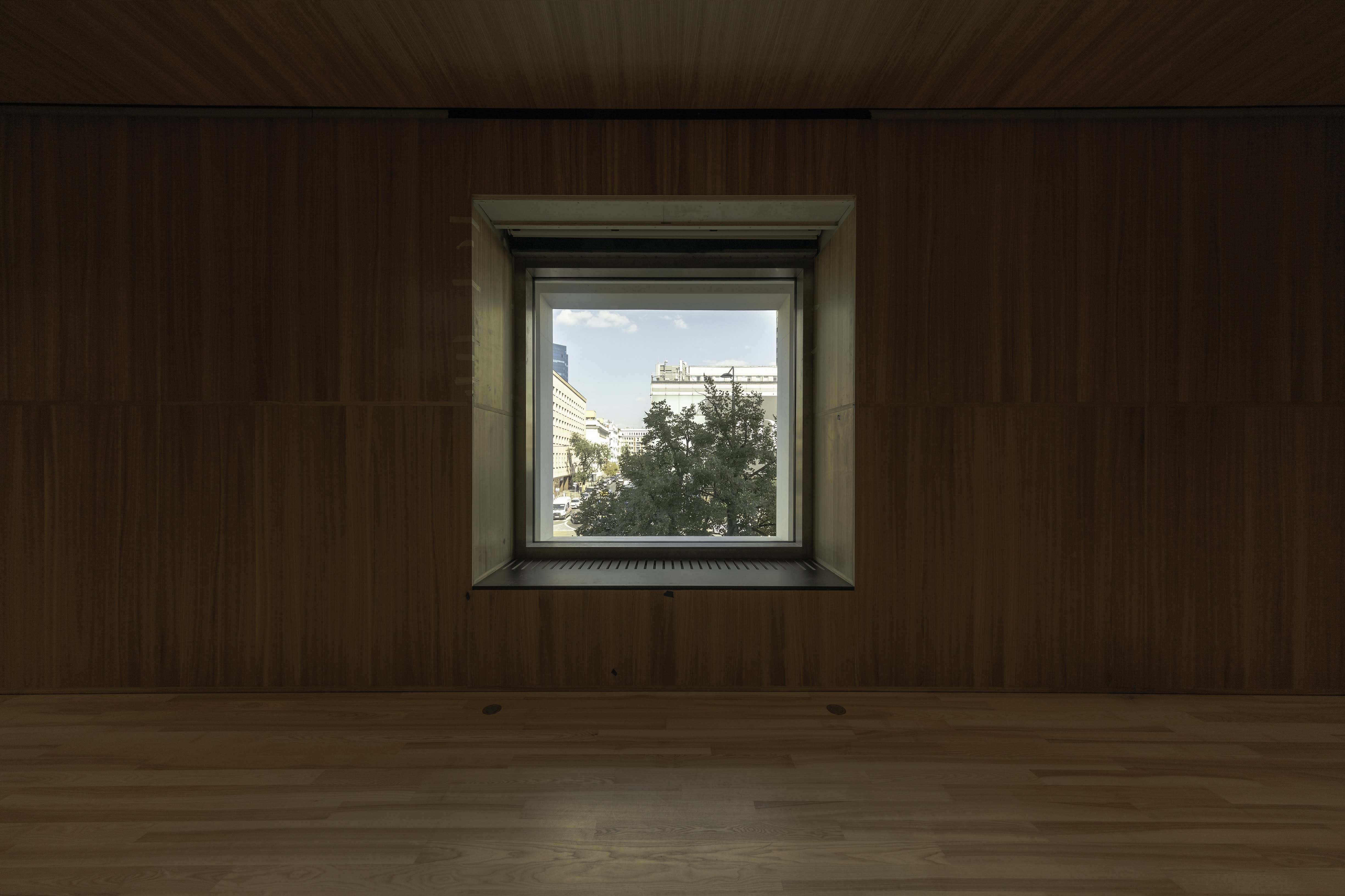
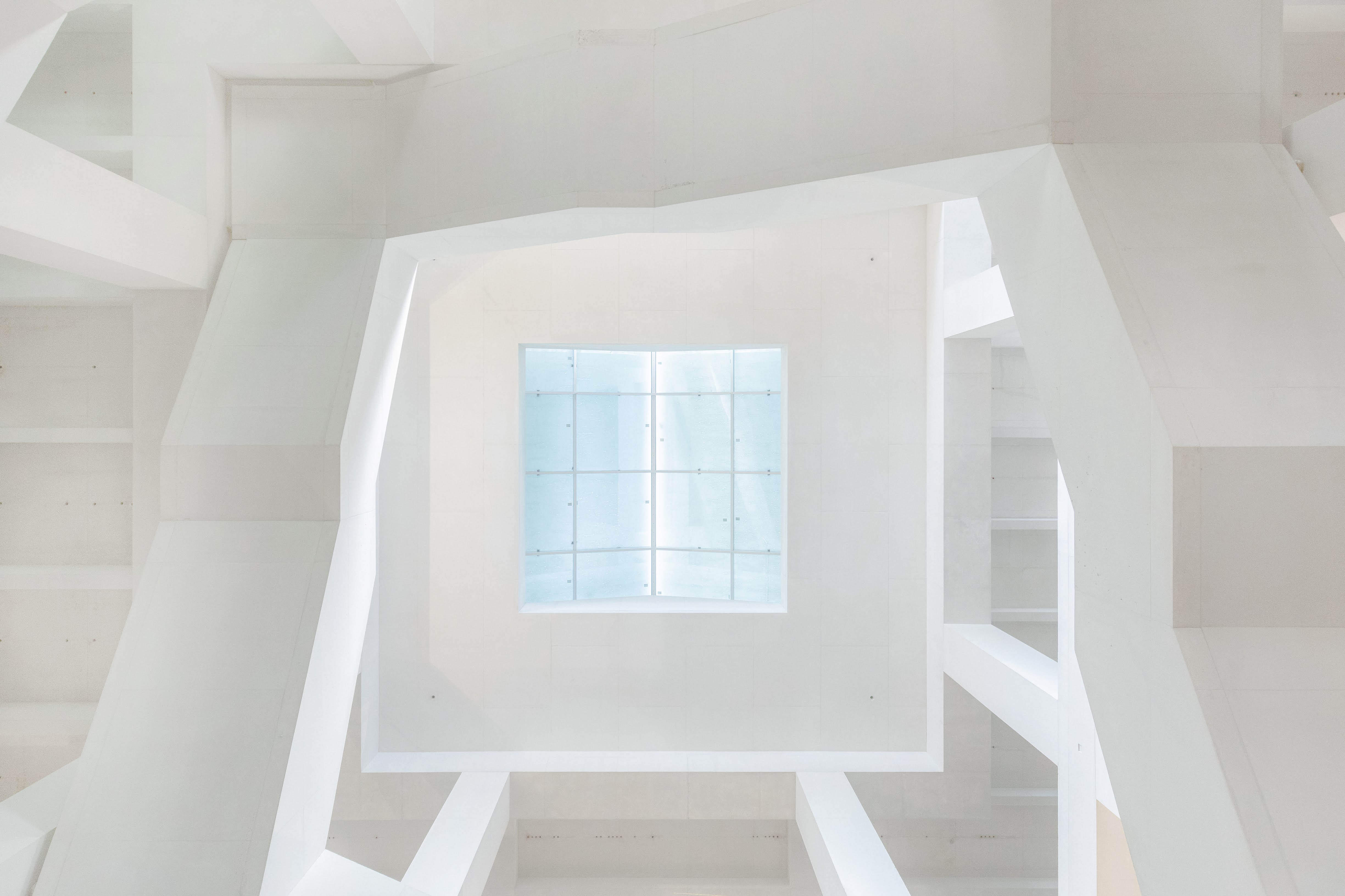
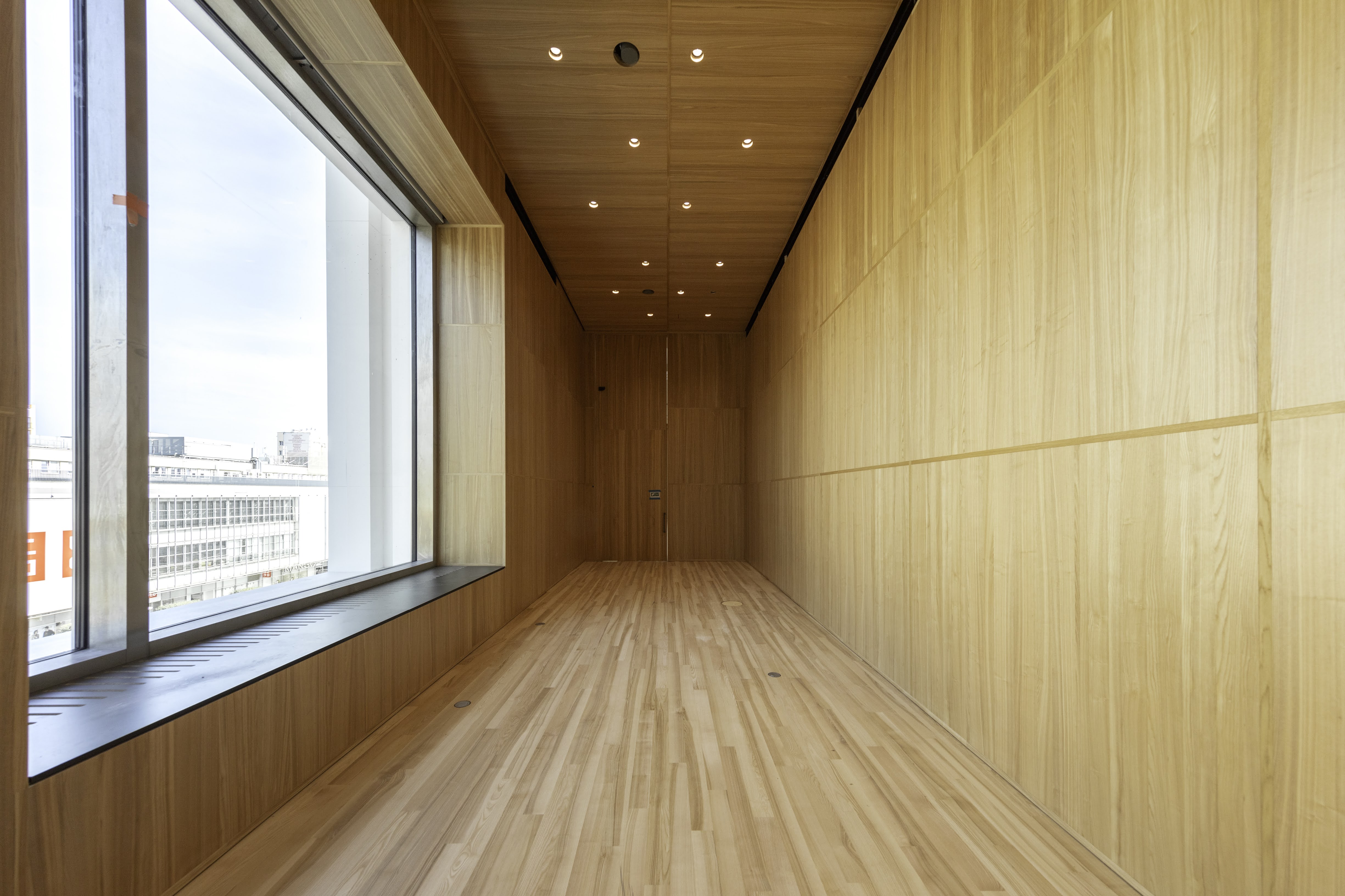
The upper floors contain mainly exhibition rooms in an enfilade arrangement, separated here and there by relaxation zones finished with local ash wood and large windows framing selected parts of the city. On the top floor are the largest exhibition rooms, some over 6m high, naturally illuminated from above thanks to numerous skylights. The names of individual rooms and floor levels are engraved on the concrete walls.
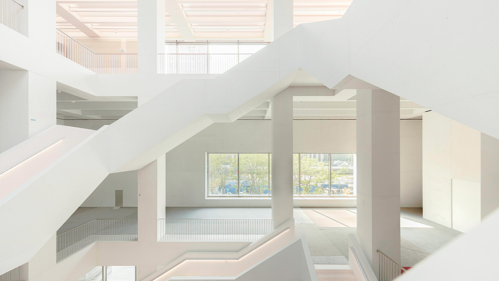
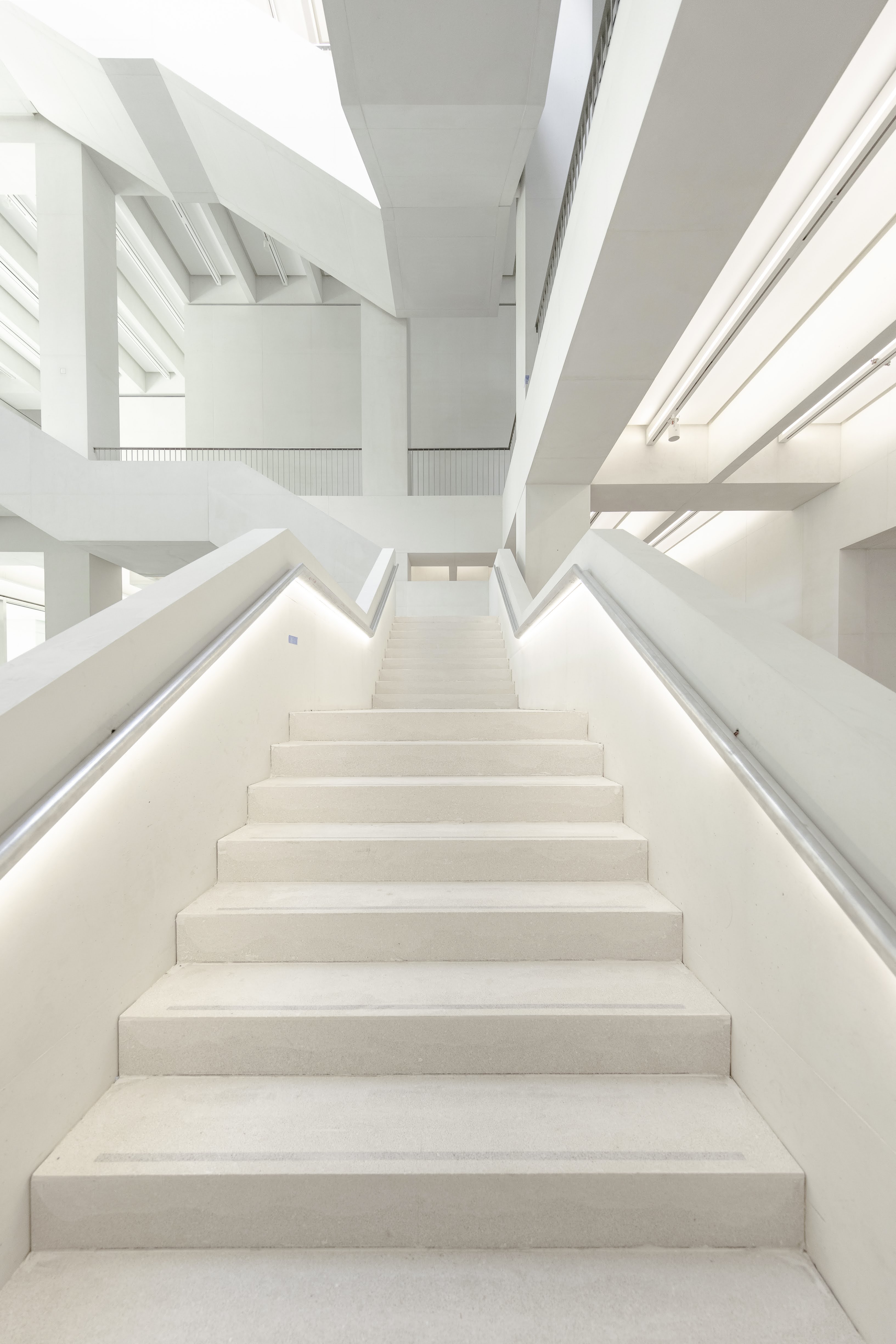
An administration and archive area sits between the exhibition floors, signalled through horizontal glazing on the façades. The different building sections are connected internally by a monumental central staircase – itself, reminiscent of a scaled minimalist artwork. Various design solutions both inside and outside the museum may evoke similar associations. It is an architecture of synthesis, in which appropriate proportions, divisions and materials are of great importance, supported by precise execution.
At first glance, this new museum may seem like a rather literal interpretation of the neutral 'white cube' gallery typology, favoured by many curators and artists around the world. Only upon closer inspection can one notice the sophisticated play of forms, details and colours here – the last of which, unfolding in a range of shades close to, but not quite, white (which appears only in the main exhibition rooms).
