Do you judge a book by its cover? It seems that most of us do, if author Maureen Johnson’s astute observations about gendered book covers are anything to go by. Book covers are generally how we sound out a book’s quality, yet the cover of is rarely the author’s choice. “I do wish I had a dime for every email I get that says, ‘Please put a non-girly cover on your book so I can read it. - signed, A Guy’”, she wrote. “A man and a woman can write books about the same subject matter, at the same level of quality, and that woman is simply more likely to get the soft-sell cover with the warm glow and the feeling of smooth jazz blowing off of it.”
Within minutes, an internet meme was born, whereby Johnson’s readers digitally remastered some literary favourites in order to show the inherent ridiculousness of gendered marketing. Hence we saw Neil Gaiman’s Stardust transformed into what looked like girly romantic fiction, complete with tagline – “love is the greatest magic of all”, and Stephen King’s Carrie revamped as a Nicholas Sparks-esque all-American smushfest, complete with Southern belle.
And yet none of these jarred so much as some of the real-life attempts that I’ve seen produced by genuine designers, some of which are so far off the mark that you wonder whether they had read the book at all. And, unlike publishers such as Pulp the Classics, which recasts classic novels in a pulp style, these designs were actually intended to be taken seriously. Such as:
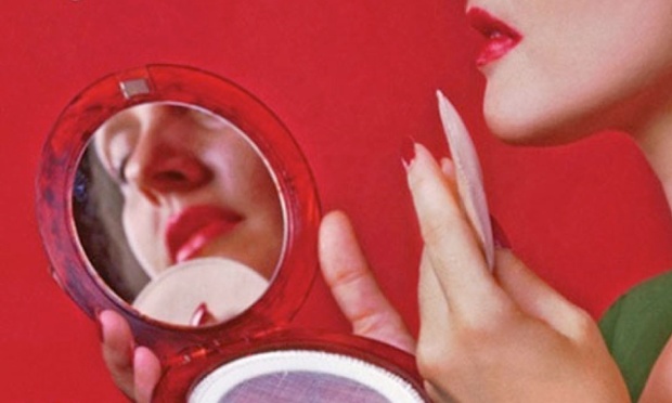
The Bell Jar
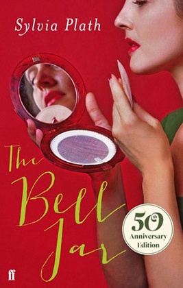
Last year, Faber’s revamping of Plath’s nom de plume sparked internet outrage. This paper called its chick-lit cover “laughably inappropriate for a work tracing a descent into near-suicidal depression”, and they’re not wrong. The whole thing looks like a right old girly romp. Battle with mental illness, attempted rape, and harrowing electric-shock therapy? Pfft, girl problems.
Pride and Prejudice
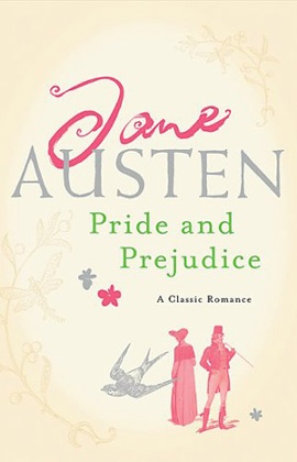
Way to debase and trivialise a literary classic, Headline. Rebranding Austen’s searing social satire as a romantic novel arguably misses the mark, especially as there’s nowhere near enough snogging for it to qualify as part of the genre. It also contains such profound reading group questions as “Did you initially find Mr Darcy attractive?” possibly encouraging a whole new generation of women to grow up fancying fictional characters, something which I know from bitter experience rarely brings fulfilment. Speaking of which …
Wuthering Heights
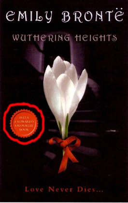
By cashing in on the popularity of Twilight, you could argue that publishers are bringing the gothic novel to a brand new, young audience, but if these readers are expecting a tedious virgin of female protagonist Cathy then they’ll be sorely disappointed. Yes, there’s Sexy Heathcliff, but despite a spot of possible necrophilia, there isn’t a vampire in sight, though I did always imagine him as having rather pouty lips.
Great Classic Series

It’s no wonder this defunct line of books has something of an internet rep, and I genuinely couldn’t choose which one of these was my favourite. Is it the fantasy-inspired Frankenstein or the anachronistic Scarlet Pimpernel cat in a briefcase? Or maybe it’s the literally interpreted Turn of The Screw? No, I think it has to be this bizarre sci-fi rendering of Elizabeth Gaskell’s Cranford.
Anne of Green Gables
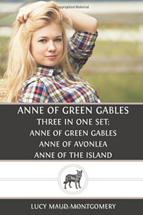
Redhead Anne was mysteriously transformed into a blonde bombshell with "bedroom eyes" for this reissue of the classic novel, causing so much consternation that the book had to be withdrawn. "This book is supposed to be Anne of Green Gables, not Anne does Green Gables", wrote a reader. Quite.
Magic Under Glass
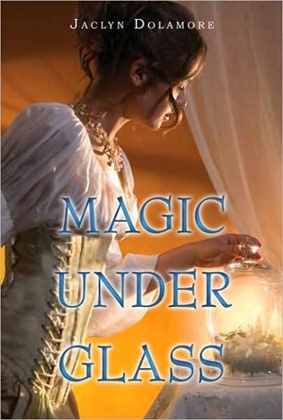
Bloomsbury USA, the publishers of Jaclyn Dolamore’s young adult fiction novel, came under fire for illustrating the novel, which is about a "dark-skinned" girl from the "Far East" with a cover that very clearly showed a white woman. Perhaps even more crass was the fact that this was not the first time that Bloomsbury had come under fire the previous year for whitewashing, having given Justine Larbalestier’s Liar, a novel about a short haired black girl, a cover featuring a light haired white woman.
Herland

Charlotte Perkins Gilman’s 1915 novel about a utopia composed entirely of women has been done the disservice of many a bad book cover. This ultra-pink, sickly monstrosity has been pipped to the post (but only just) by puiblisher Tower Books’ effort, which seems to depict a parallel universe of radioactive Bond girls gone rogue.
Huckleberry Finn
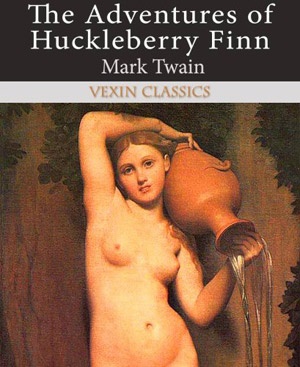
This list wouldn’t be complete without the inclusion of Vexin Classics’ crass use of naked women completely unrelated to the plot in order to sell books. In addition to Mark Twain, the publisher also cheapens the work of Frankenstein (tits), The Three Musketeers (bootylicious arse), Pride and Prejudice (naked horseriding) and Oliver Twist (tits and arse). Surely a winner if ever there was one.
• Think you can do better? For those of you who are Photoshop or Ilustrator savvy (non-Adobe packages are also available …), we'd love to see you rejig your favourite – or least favourite – book covers with your own incongruous designs. You can send them in using GuardianWitness.