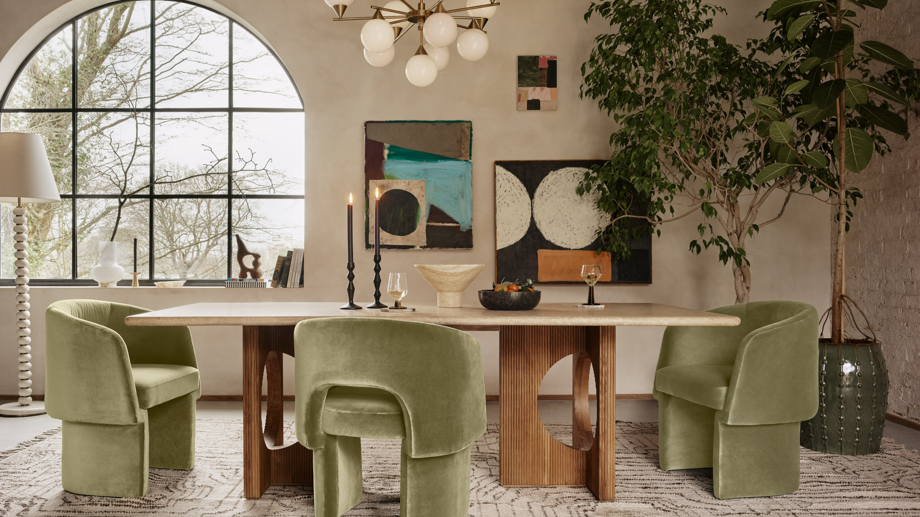
There's a new color trend that's surfacing in 2024, and we're calling it "Magnolia 2.0". While that name might be a bit triggering for some who endured the original magnolia era, it's certainly a return to the more yellow-toned beiges of yesteryear, yet wielded in a new, interesting way.
Decorating with this color requires hues with certain undertones that will match its warmth while providing a welcome contrast, helping to lift it and bring a neutral scheme alive. Luckily, as one of the biggest color trends of 2024, Magnolia 2.0 is a shade interior designers have been experimenting with more than ever — and as a result, they have plenty of ideas for what to pair with it.
From deep reds to inky blues, here’s a versatile mix of ideas to get you started with this exciting new neutral.
1. Deep yellows
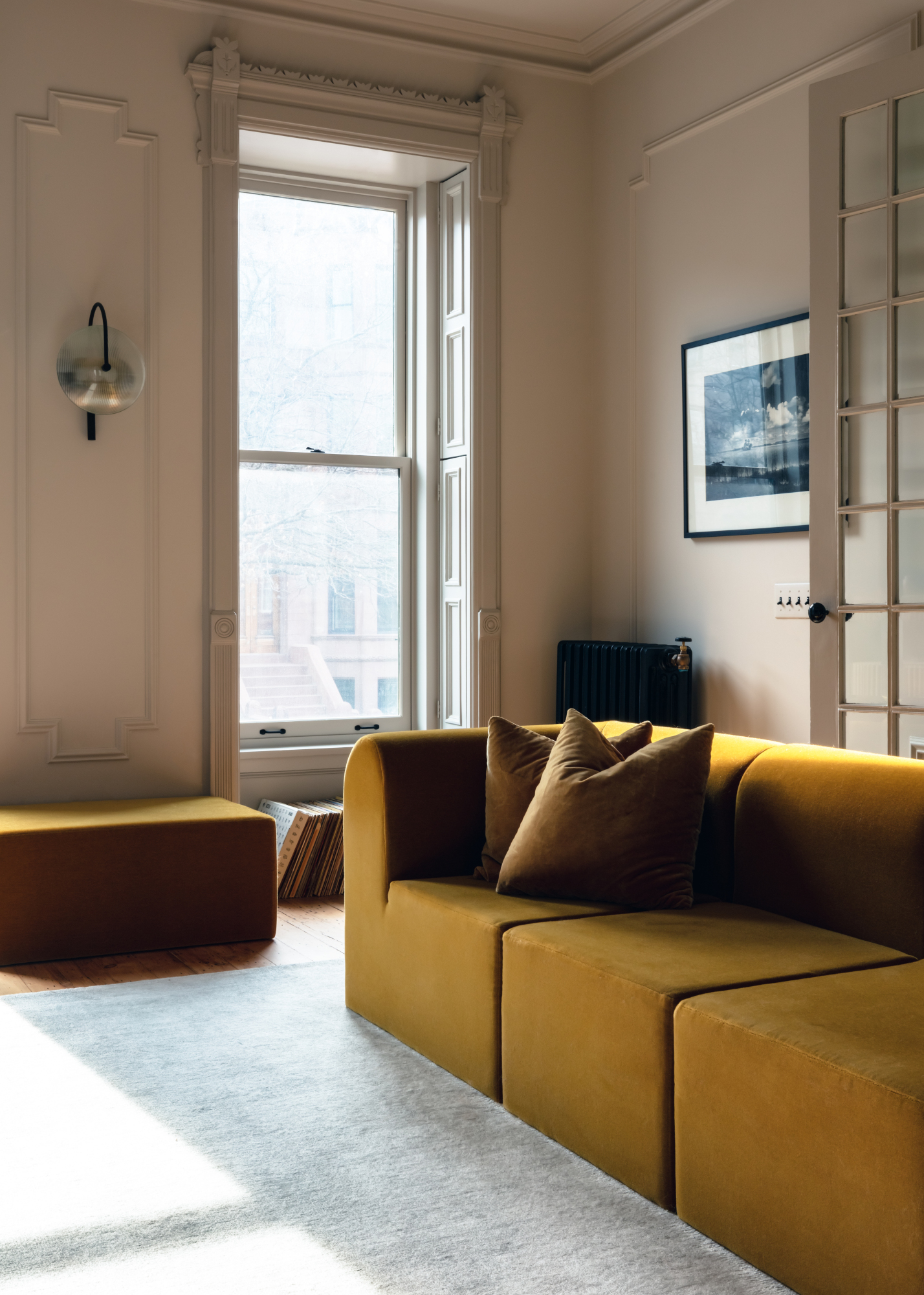
This neutral works well as a color that goes with yellow. Warm, intense hues such as mustard or ochre complement the yellow undertones of Magnolia 2.0, but feel like a step up from a monochrome scheme — perfect for anyone who wants to experiment with color but in a low-level way. In the living room scheme above by Shapeless Studio, this accent color takes the form of a rich velvet sofa against a muted beige backdrop.
‘A warm tone beige can be a really welcoming color to introduce to your home if you tend to gravitate towards earth tones, and if you are thinking of pairing with yellow, stick with a more golden, mustard color variety,’ suggests Samantha Tosti, interior designer at San Diego and Charleston-based practice Tosti Design.
Californian design consultant Amanda Foster agrees, and offers some advice on specific shades to pair with the color – taking Farrow & Ball’s Matchstick as a starting point. ‘Flaxen or dijon yellows pair perfectly with [this] shade,’ she says. ‘The deeper tones create great contrast in a velvety way that blends seamlessly.’
2. Deep oranges and copper

For a cozy, enveloping scheme when decorating with neutrals, pair a magnolia base with accents of burnt umber, rust or copper. ’When using a warm-toned beige, I love to pair it with burnt orange or red toned accent pieces,’ says Katelyn De Spain, founder of San Diego firm Makehouse Design Studio. ‘The combination of these two colors add a vintage feel to the space.’
Melissa Van Zee, SoCal-based interior designer and founder of Van Zee Design Interiors, used copper on a home bar in one of her projects, above, set against a backdrop of new magnolia walls and beige marble backsplash. ‘A warm-toned beige creates a perfect atmosphere for a new breed of modern that upends the cold and impersonal mood that people typically perceive as modern,’ she explains. ‘Warm-toned beiges create the perfect backdrop for an earthy palette of copper, mustard, sable, and taupe.’
3. Dark, muted blues
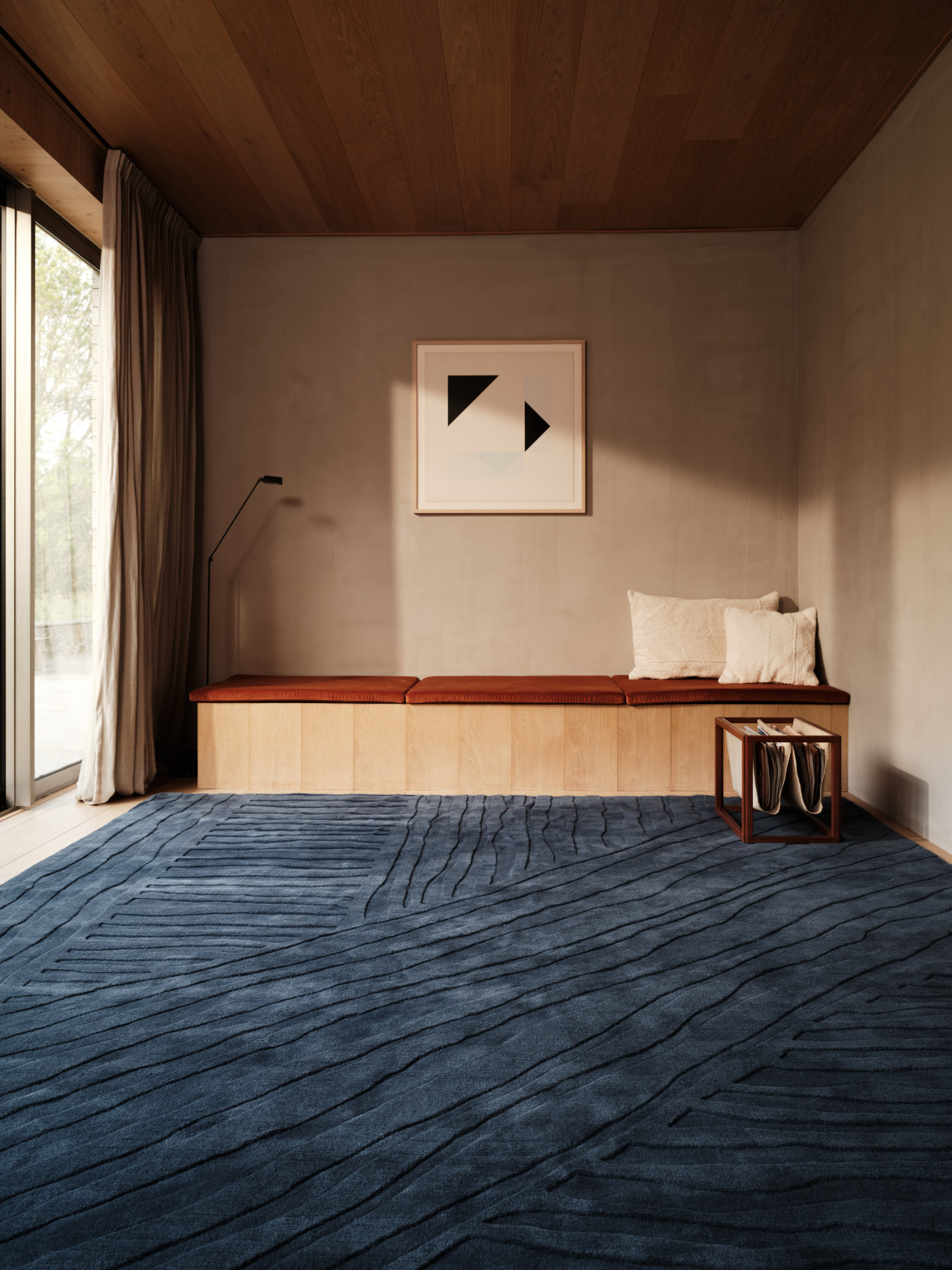
We’ve spotted new magnolia being used successfully with dark, inky blue hues – more muted than navy, with black undertones. Just check out this set-up from The Rug Company as inspiration for beige as a color that goes with blue. ‘Stone or slate blue pairs perfectly with this creamy shade,’ explains Amanda Foster. ‘This is a softer way to compliment the two. For more contrast, try denim or sapphire tones for an instant refreshing feel to the room.’
‘Blues can complement warm-toned beige beautifully by creating a striking contrast that enhances the warmth of the beige,’ adds Isy Runsewe, founder of New York-based design firm Isy's Interiors. ‘They have a calming and balancing effect.’ She also suggests pairing the two with red: ‘Together, they create a harmonious palette that feels both vibrant and inviting against the neutral backdrop of warm-toned beige.’
4. Burgundy and red wine tones
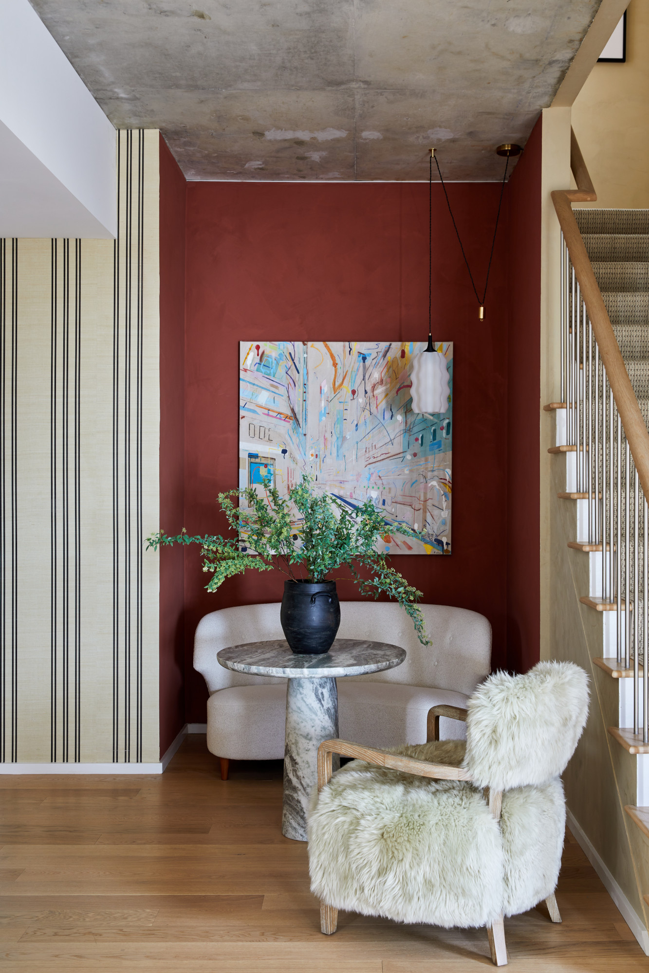
As one of the biggest colors of 2024, burgundy is rightly being celebrated for its surprising versatility – including being used in conjunction with magnolia 2.0.
‘Reds add a sense of richness and depth to this color,’ explains Isy Runsewe. Adding a deep wine color will liven up a beige-based color palette instantly, adds Amanda Foster: ‘Choosing darker shades of red to layer with warm beige shades can add depth and drama to any space.’
There’s also an argument for the 'unexpected red theory' here, as she adds: ‘For more contrast, try lipstick red or apple tones for a bold and unforgettable pop.’
5. Olive green

By far the most popular color pairing among the designers we spoke to, olive green – as well as sage green – is an easy duo to include in a scheme, as evidenced by this Soho Home dining room scheme.
‘Olive green and velvety beiges work hand in hand because they both evoke a grounding feeling of nature,’ says Amanda Foster. ‘These two colors are often seen together in nature and can be easily layered when used in design. If you want to step it up a little try swapping the olive green for jewel tones like emerald or shamrock to give an instant luxury look to any space.’
‘Warm beige can also be paired with sage green, a crisp warm white, and a warm medium gray to provide a balanced palette of different tonal values,’ adds Julia Lauve, co-founder of WORKSHOP | studio headquartered in Dallas. ‘This color palette would also pair well with the warmth of natural woods like white oak or a classic walnut wood finish.’
6. Pale pink
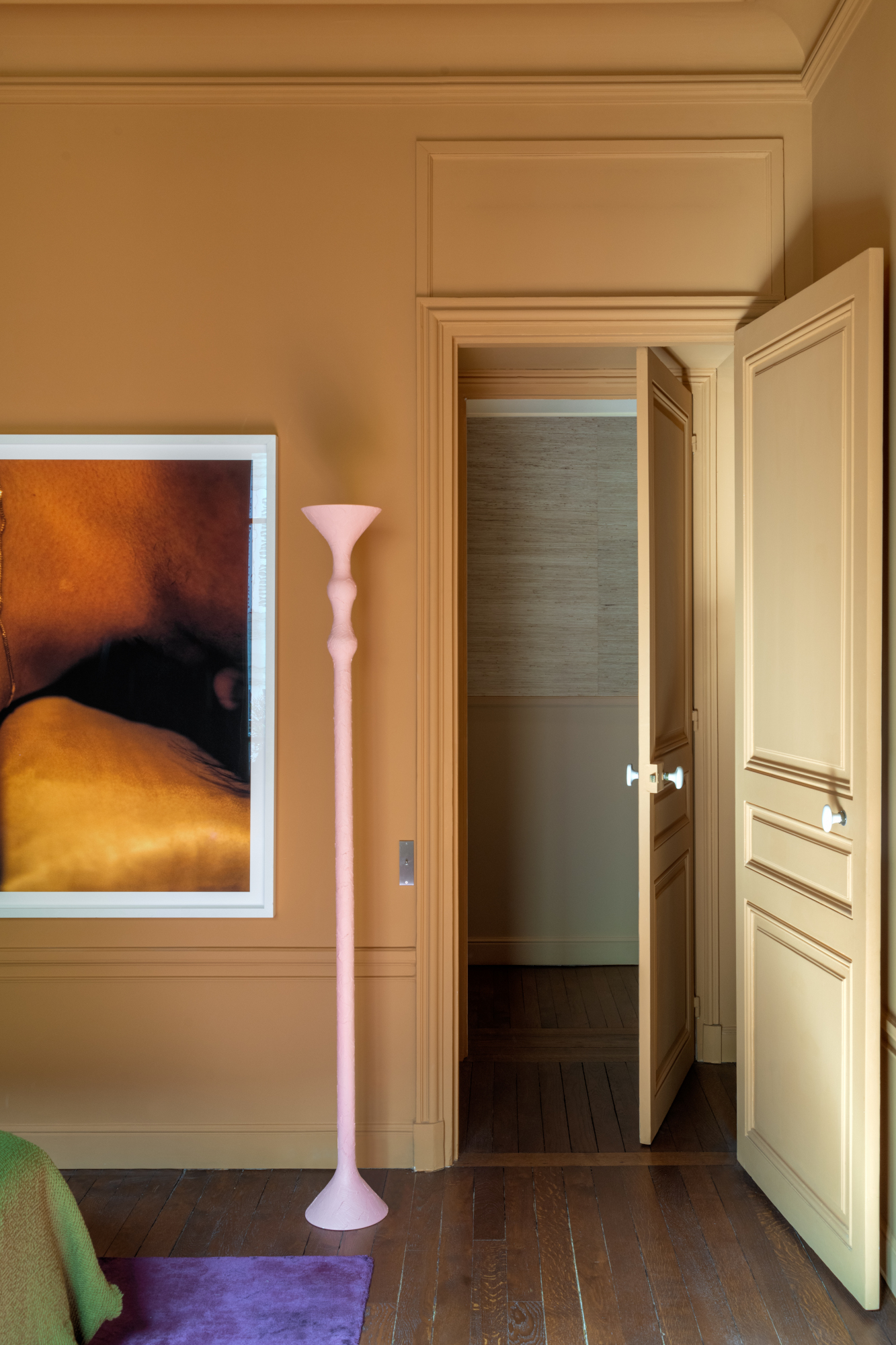
For a subtler color pairing, look to delicate pastel pinks – but, as a color that goes with beige, be picky about the shade you choose to make sure it still pops. ‘Pastel hues, like pinks and creams, need a warm undertone so the warm-toned beige does not overpower them,’ says West Hollywood interior designer Pamela Nast. ‘Subtle touches of color in the same depth as the warm beige create a beautiful monochromatic design.’
‘While pairing a pale pink might be deemed a risk by naysayers, I say go for it,’ adds Samantha Tosti. ‘The classic blush color of Farrow & Ball’s "Potted Shrimp" would be a lovely, romantic color to pair with your earthy, warm tone beige.’
And if you want something a little more unexpected, try delicate purple tones. ‘Mauve or periwinkle pair perfectly with [this] shade,’ says Amanda Foster. ‘This is a rich yet soft way to compliment the two cohesively. For a bolder look try going for deeper shades like eggplant or plum to give a rich and glamorous feel to your space.’
