In a time when some brands seem to change their logo every few years, we can learn something from those who haven't felt the need. The Deutsche Bank logo turned 50 this month, and it still attracts attention with its easily recognisable, clean minimalist design.
When it was introduced back in 1974, the logo design was a radical departure from what came before it, but the German financial institution has had no need to change it since. To mark its anniversary, we look back at the making of a timeless design ( see our pick of the best logos for more inspiration).
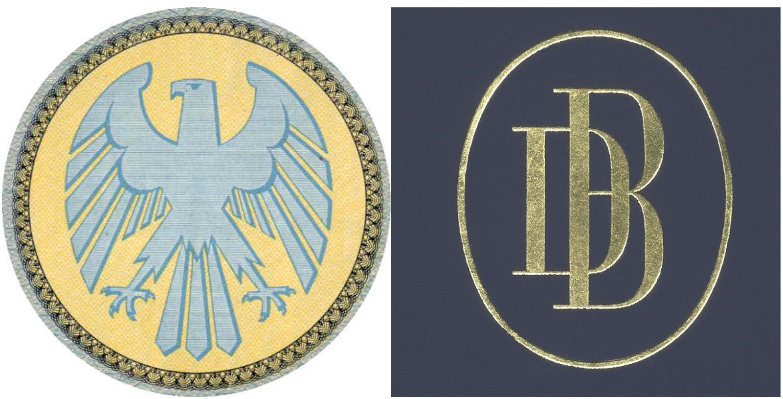
For the first 100 years after it was founded in 1870, Deutsche Bank went through various logos. Initially, there was no identifiable brand identity, with the bank presenting its name in various fonts even in the same document. At the end of the 19th century, it settled on the use of an imperial eagle, which made it feel like a state institution due to the similarity with the German eagle. And then, in the 1930s, it began using its initials, DB, sometimes together with the eagle (the video above also includes the logos of Disconto-Gesellschaft, which merged with DB in 1929 and also the various divisions that Deutsche Bank was split into for a period after the Second World War).
But around the time of its 100th anniversary, the bank realised that it needed a new, more modern identity as it aimed to expand globally. A pictorial symbolic language was rapidly gaining popularity internationally, so this was the natural direction to take. In 1972, it held a logo design competition. Eight graphic design studios to take part, and some 140 designs were submitted.
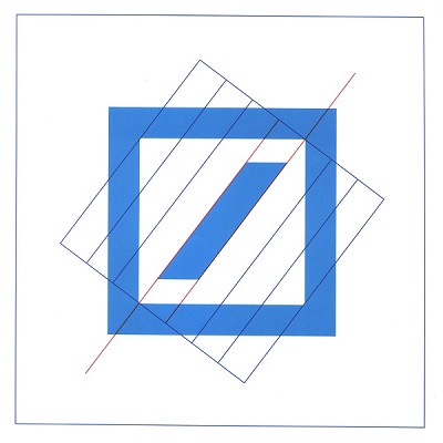
The winner was the slash in a square design that we know today. It was created by Stuttgart-based artist and graphic designer Anton Stankowski, a master of constructivism. In blue to convey trust, the design comprises a forward slash at 53 degrees, with the tips aligned to the inner corners of the surrounding square at the top right and bottom left.
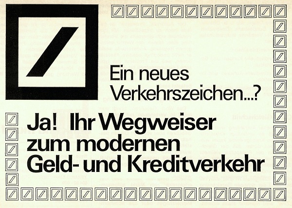
The logo appeared in print for the first time in an advert in the Frankfurter Allgemeine Zeitung on 25 April, 1974. Employees named it 'Wegweiser', or signpost, since they felt this is what it resembled, and the advert played on this idea presenting the new identity as the direction to follow for modern banking.
Fifty years later the logo is still in use, from branches and the bank's website to the roof of the Deutsche Bank Park, the stadium of German Bundesliga club Eintracht Frankfurt. It owes its success to its simplicity. But that simplicity also holds meaning, the brand says.
According to Tim Alexander, Chief Marketing Officer and Chief Experience Officer at Deutsche Bank, the logo "stands for dynamic growth within a stable environment". The slash symbolises growth and the square-shaped frame stands for security and stability.
"The concept behind the logo might be turning 50, but, in a complex and volatile global landscape, it is precisely this stability and resilience that our clients are looking for,” he adds. “It’s not just our services but also our brand that should convey to our clients across the world the security that we offer them as their Global Hausbank.”
The logo’s creator, Anton Stankowski, who died in 1998, once described the design as "the polarity between a solid base and a future-oriented dynamism". He added: "The staggered diagonal seems to be symmetrical but is in fact asymmetrical. The sloping forward slash is arranged in such a way that it does not divide the square diagonally. That is what is so special about it. The attention value of the graphic arrangement consists in this unexpected visual shift.”
The history of the Deutsche Bank logo shows that when a brand gets it right, a logo design can last a long, long time. Some people aren't fans of the perceived current minimalist logo design trend, which has seen many brands simplify or flatten their logos, at least partly due to the use of digital applications, but we can see from Deutsche Bank that minimalism in logo design is nothing new. The design was already simple, that there's little that could be done to strip it down further.
For inspiration for your own work, see our guide to how to design a logo.