Following the Paris 2024 Olympic Games, the Paralympic Games are now underway, providing another week of sporting greatness. But what's the meaning of the Paralympic logo?
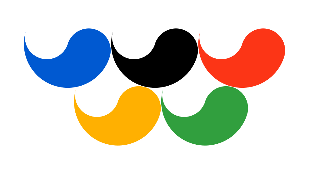
Despite the longstanding link with the Olympics, this sports logo remains less known, and it looks very different to the Olympic rings. But is does share some of the intended symbolism.
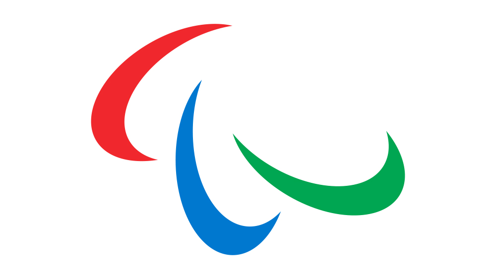
The Paralympics logo is referred to as the Agitos, which means 'I move' in Latin. While the Olympic rings represent the union of five continents, the Agitos also aims to convey the sense of an international gathering. It uses red, blue and green as these are the most widely used colors in national flags. As for the three shapes, the International Paralympic Commitee says they represent the motion of athletes and the "Paralympic values of courage, determination, inspiration and equality."
The logo is intended to symbolise "the role of the Paralympic Movement in bringing athletes together from all corners of the world to compete and achieve sporting excellence" and the fact that Paralympic athletes are "constantly inspiring and exciting the world with their performances: always moving forward and never giving up."
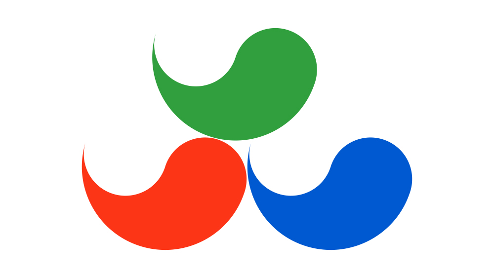
But the Paralympic logo was originally very different. Until 2004, it featured a traditional Korean decorative motif called the Tae-Geuk, which is said to refer to the ultimate reality from which all things and values originate. The first Paralympic logo for the 1988 Paralympic Games in Seoul used five Tae-Geuks in a similar composition to that of the Olympic rings. In 1994, the Tae-Geuks were reduced to three to differentiate the Paralympic Games more from the Olympics.
That design lasted for almost a decade until the IPC commissioned Scholz and Friends to modernise the design. They decided to use the Agitos, which was already used by the Paralympic Movement, but to make it more circular.
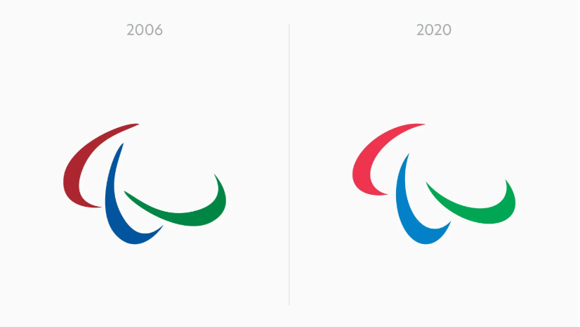
The Paralympic logo design was last refreshed in 2020, when North introduced a more consistent geometry. In the previous design, the three shapes were slightly different, which led to inconsistencies when the logo was used – apparently, it was even sometimes even used backwards.
The hues of the colours were also tweaked to bring them more in line with the Olympic rings, creating greater visual consistency between the branding of the two events. This helps to imply equal standing and a unified goal," when the symbols are seen side-by-side, North's Josef Clinch told us at the time.
For more on Olympic Games branding, see our roundup of the best Olympics logos and the best Olympic Games posters.