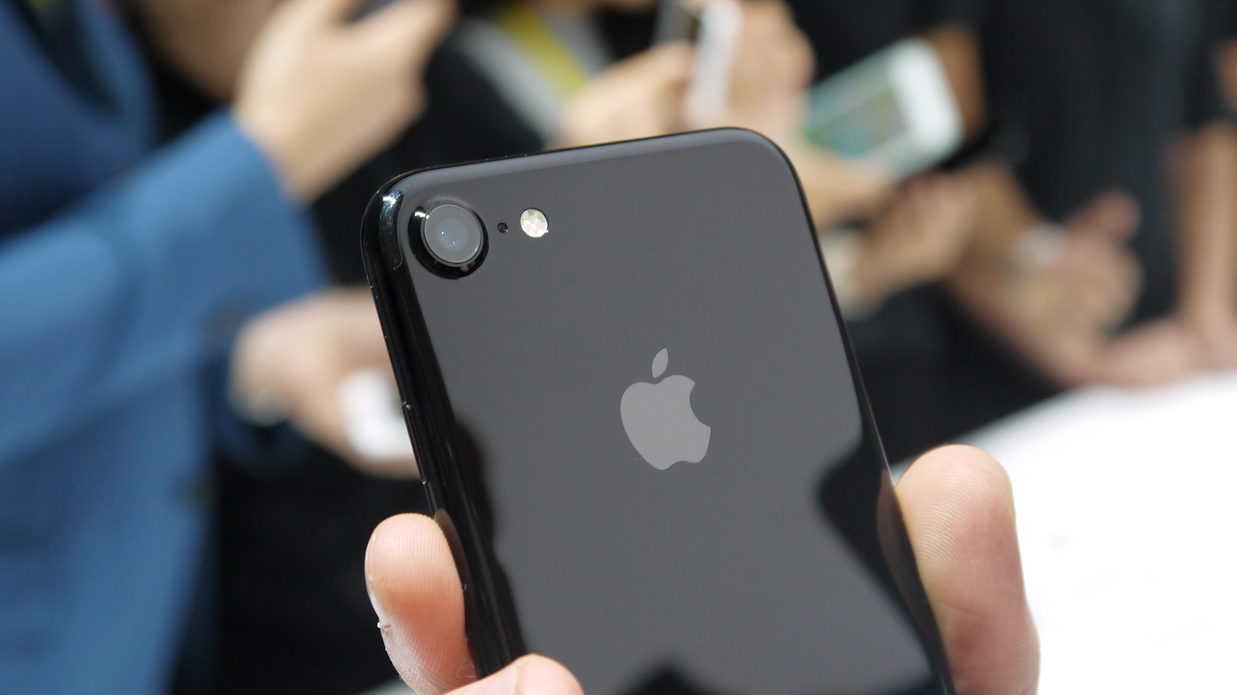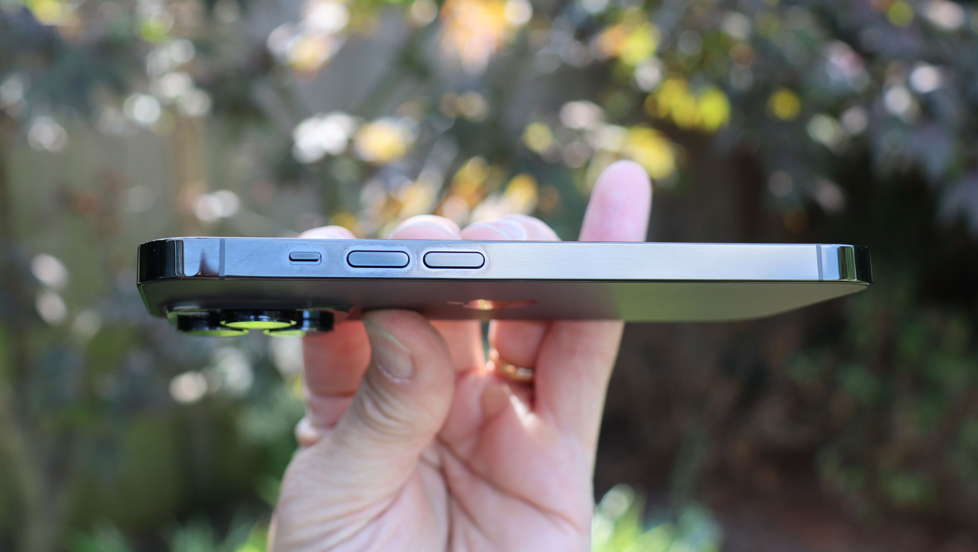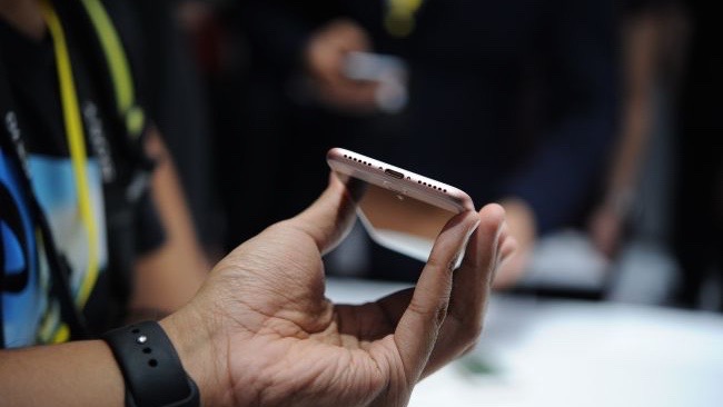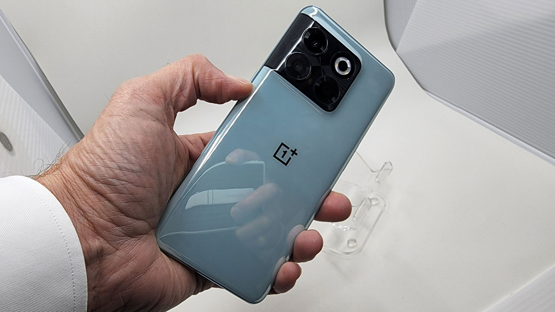
There’s a certain dream aesthetic for the best iPhone that Apple has kept in mind since the first iPhone, and towards which it bends the phone market. There is no doubt some future iPhone beyond the iPhone 15 will have no bezels, no ports, and no switches of any kind. If it drops the physical buttons, the iPhone 15 Pro will represent the dawn of Apple’s nightmarish button-free world.
The iPhone of Apple dreams is a solid sheet of glass with no adornments, nothing to distract you from the elegant simplicity and the content it displays. It is the futuristic phone you imagine patrons of the space station bar holding when they get a call from work that distracts them from the blue glowing liquid in the glass. You don’t hold it so much as let it hover in your hand before your face.

Apple’s iPhone of the future is Schrödinger’s iPhone. It both exists and does not exist. The moment that you observe it is the moment of creation or destruction. Like Schrödinger’s cat, it’s also a useful theory that won’t be worth much in practice. We can be sure the iPhone will be surpassed by Apple Glasses before we ever need a respite from mining water ice from asteroids.
That’s why the button-free iPhone seems almost cruel. Why bother at this point? Why push users towards a terrible interface decision if modern interface designs have a terminal diagnosis already? Apple should let people enjoy phones as they are and save the big changes for the next generation of mobile technology. Losing buttons is just a bad idea all around.
A button-free iPhone still has too many buttons
Even if Apple removes the volume rocker and the power button from future iPhones, the phone will still have too many buttons. Hundreds too many. The entire display is a button, and not just one. Every pixel can be a button. A touch display is a massive, super-sensitive button, for better and for worse.
A touch display is inarguably fantastic for its ability to create buttons and an interface that can change and adapt. It is literally like a fantasy, the way using a touchscreen can feel like casting spells.
A touch display is also unforgivably difficult for people with motor precision issues, visual ability differences, and other needs that have been sidelined by Apple’s aspirational design. Those hundreds of shifting buttons, responding to the slightest brush, are a minefield for all but the most dexterous.
Adding insult to injury, Apple shuns the Back button. Android has always included a way to forgive mistakes. Apple leaves the issue to developers and hopes for the best. That can be very confusing if you need to undo a bad tap.

When did buttons become a bad thing? You’d think Apple would embrace buttons on the iPhone. One of Apple’s signature phone features, copied by only a slim margin of Android phone makers, is the extra mute switch. My Galaxy S23 Ultra only has power and volume buttons. My iPhone 14 Pro gives me those and one extra. The iPhone 15 Pro could also lose this switch. Bad idea. More buttons, Apple, not less.
Instead, there has always been a lingering rumor that Apple would remove this or that button, this or that port. Even as the European Union finally claims victory over the proprietary Apple Lightning port in favor of universal charging with USB-C, Apple is rumored to consider dropping ports entirely in favor of wireless options.
Apple giveth and Apple taketh away
This is unfortunately an essential part of Apple’s DNA. When Steve Jobs returned to Apple in the late 1990s, his first big hit product was the Apple iMac. Besides the stellar design and cool colors, the iMac was most notable for dropping almost every imaginable PC port in favor of simply USB-A.
This was at a time when USB products were just hitting the market, and were unaffordable to many in the education market, one of Apple’s biggest fan bases. I taught in a high school in Boston that had been gifted a brand new complement of iMac machines and I watched students pass around the one USB floppy drive we all shared. Storage on USB sticks wouldn’t be affordable for more than a decade.

Apple’s history is littered with the ports and hardware features that were a foregone conclusion until Cupertino decided they weren’t good enough to mar the surface of its precious devices. I won’t relitigate the decision to drop the 3.5mm headphone port, the oldest and most commonly used port in all of consumer electronics, from the iPhone 7, but it was a bad call. It wasn’t good for everyone, and the people it excluded are the same people who always get excluded by Apple.
For whom would the lack of buttons on an iPhone be a benefit? Nobody. It may be aesthetically pleasing, but it won’t be more usable. It won’t add functionality that had been missing. It will probably be more difficult to use, requiring more instruction.
This could be a good thing if it's a good thing
Samsung will immediately decide that a button-free design is the peak of technology, and it will remove every hint
There could be a benefit that Apple could pass along to owners. If the new iPhone is more durable because there are fewer moving parts, I would support removing buttons for a system that worked just as well. I can’t imagine buttons make a huge difference in durability, since the iPhone is already sealed against splashing and dirt.
If a button-free iPhone were somehow less expensive, that would also be a benefit I could get behind. Whether that means it’s cheaper to buy or cheaper to repair later, as long as removing buttons doesn’t add cost to the iPhone. Nobody is asking for a button-free design, so making buyers pay more for fewer buttons would be a cynical mistake.
The worst part of Apple’s button-free future is knowing that Samsung will follow suit, and then Google and everyone else. If Apple removes buttons from its best phone, Samsung will immediately decide that a button-free design is the peak of technology, and it will remove every hint of a button.

Samsung phones will have a void where the button used to be, with a soft sucking sound as your finger approaches. Google phones will read your intentions as you go to press where the button used to be, and its generative AI will lower the volume. Distant competitors will trip over themselves copying Apple’s design, only better. Bargain phones will use volume buttons as a key selling point.
Thanks, Apple, for the button-free future of my nightmares. I just want a bigger battery and a phone that won’t break. The phone is already gorgeous, I don’t need unnecessary design refinements when there are longstanding hardware inadequacies that could be improved. Let me stay grounded and keep my buttons, and we’ll talk about giving them up when reality goes virtual.


