Slack has become the instant messaging program of choice for many creative teams, often replacing the physical office for those working remotely. But while the platform's been adding more and more new features, its UI design has changed little – until now.
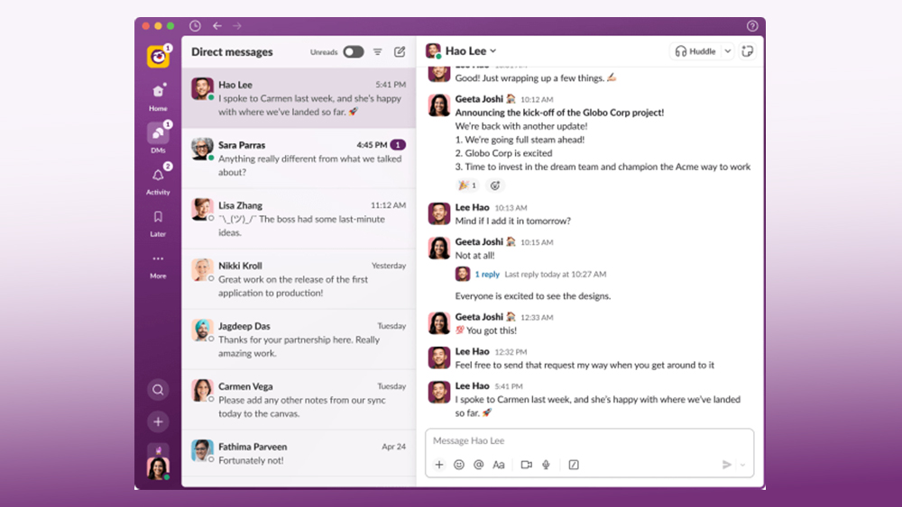
Recognising that things were starting to get a little cluttered, the platform, now owned by Salesforce, has announced a major UI redesign. And strangely, it looks more like email – one of the mediums it was designed to replace (see our pick of the best UI design tools for your own user interface work).

Like many communication apps, Slack has aimed to include more and more functionalities. As well as channels, threads and direct messages for chat, there's file storage, a Google Doc-like feature called Canvases and audio, video and screen sharing in Huddles. That's left the UI starting to feel bloated. So Slack has announced its biggest-ever redesign, introducing a very different look and layout that aims to make it easier to find things.
The Slack resdesign features a new Home section that looks quite like the Slack interface we know, showing channels, DMs and apps. But a key difference is that you'll be able to see channels from multiple workspaces, with no need to toggle between them.

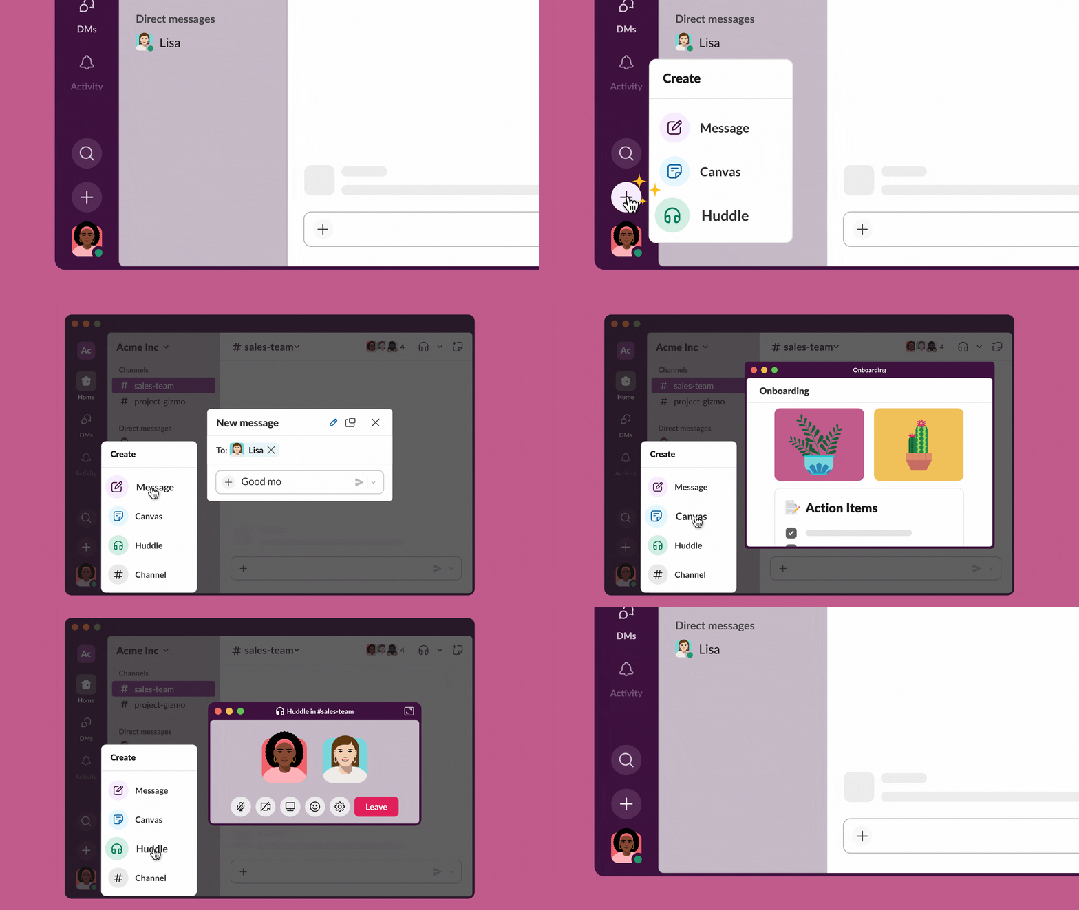
The biggest change is that the new UI adds a sidebar on the left. This includes a DM section that looks much like that of email apps and, dare we say?, even like Slack rival Microsoft Teams. Below that, there's an Activity window that gathers messages, mentions and reactions from all your Slack workspaces. Meanwhile, a single 'Create' button, indicated with a plus sign, provides a quick way to perform a range of tasks: be it to send a new message, launch a new chat channel, start an audio or video Huddle or open a new Canvas
The sidebar gives more visibility to Huddles and Later, two features that many users probably haven't even noticed until now (Later allows users to quickly save things and add a reminder). This makes it feel that the redesign is mainly for those who use all of Slack's features (and perhaps to encourage those that don't to start using them). Those who only use the basic messaging features may feel the change is unnecessary, and indeed the redesign is already provoking debate.
@Viber Desktop circa 2013 pic.twitter.com/Mfg7s5sCJYAugust 9, 2023
The Slack redesign is perfect because what you want in a professional tool is to be able to see half of the information you need and for everything to be three clicks away with enormous amount of white space pic.twitter.com/cWmtVVyZDUAugust 9, 2023
This new Slack redesign is wild pic.twitter.com/FlgNdtMRtcAugust 9, 2023
Over on Twitter, many are noting the similarities to email and other messaging apps. "Basically a Gmail reskin," someone has suggested. "Did they copy and paste the Microsoft Teams UI?!" one person wants to know. "Skype and Microsoft teams had a baby, didn’t you hear?" someone else joked.
As for whether the resemblance is a good or bad thing, there are mixed opinions. Some agree that it seems cleaner, while others think it looks more cluttered and difficult to navigate than before. "Ewww this is what happens when companies are bought and the pristine design team gets replaced with MBA upper management decisions," one person tweeted. "Feels Outlook-ish, but I think I’m gonna like it," someone else contested.
The redesigned Slack UI is rolling out for new accounts. Existing paying customers are expected to receive the update in the coming months. You can find out more at the Slack Help center.
Interested in learning more about UI and UX design? Sign up for our online UX design course.


