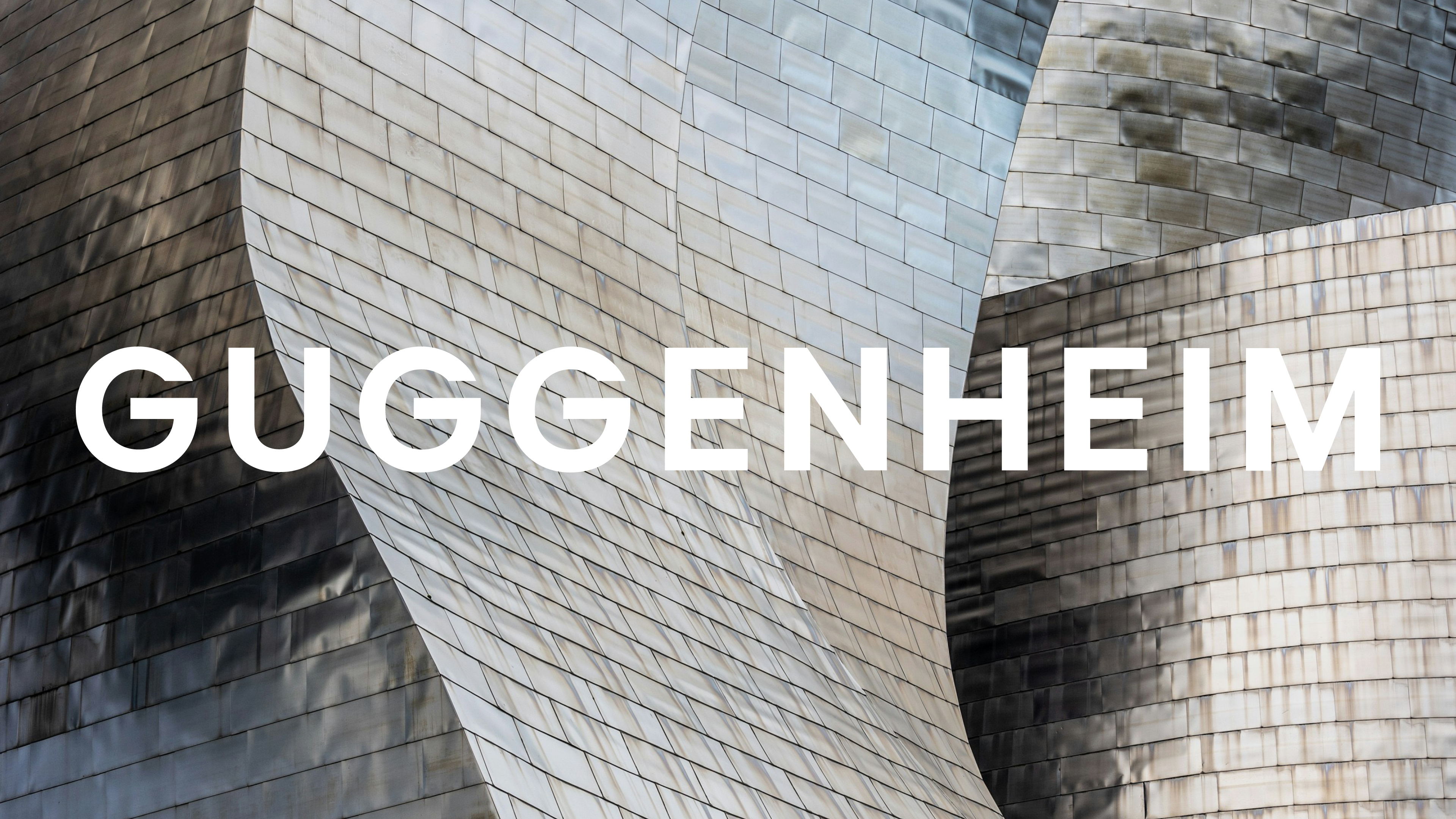
Since its conception in 1939, the Guggenheim Museum has grown to become a global cultural brand, evolving with an increasing need for a strong unified visual identity. Aligning its historic vision and creative values across its four locations, the Guggenheim has unveiled a powerful new brand celebrating its enduring heritage with a refined contemporary flair.
The best rebrands are a celebration of a brand's identity and Guggenheim's new visuals are no different, spotlighting a unique global brand built upon artistic and architectural brilliance. With an authoritative new logo, refined typography and a unified brand voice, the Guggenheim has been re-energised as a creative space for all with contemporary culture at its core.
Created by Pentagram partner Harry Pearce, the new visual identity was shaped around the concept of "one brand, one constellation, one vision and many experiences", developing into a cohesive yet adaptable new global visual identity.
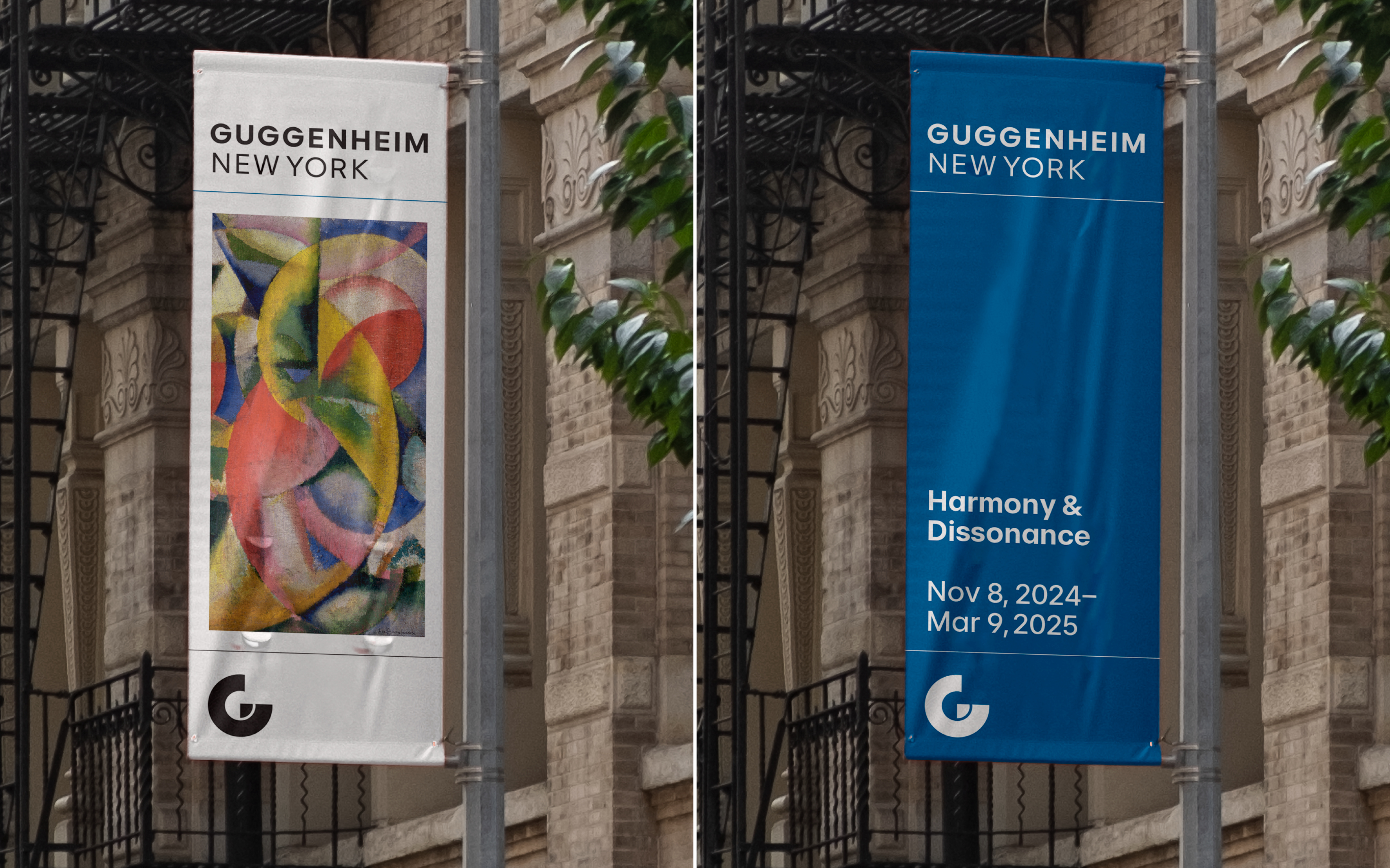
"The design was born of the strategic work by Jane Wentworth and came from the idea of creating a constellation of museums, with one harmonised visual language and identity," Harry tells Creative Bloq. "This developed in a singular mark and new brand architecture where each museum was named by place. The visual approach of each museum could flex to suit its differing audiences, yet use a united design system," he adds.
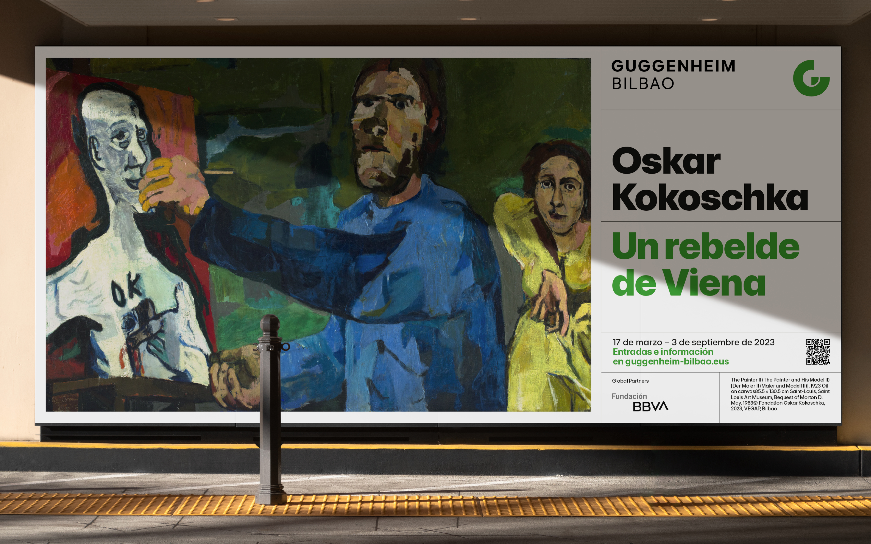
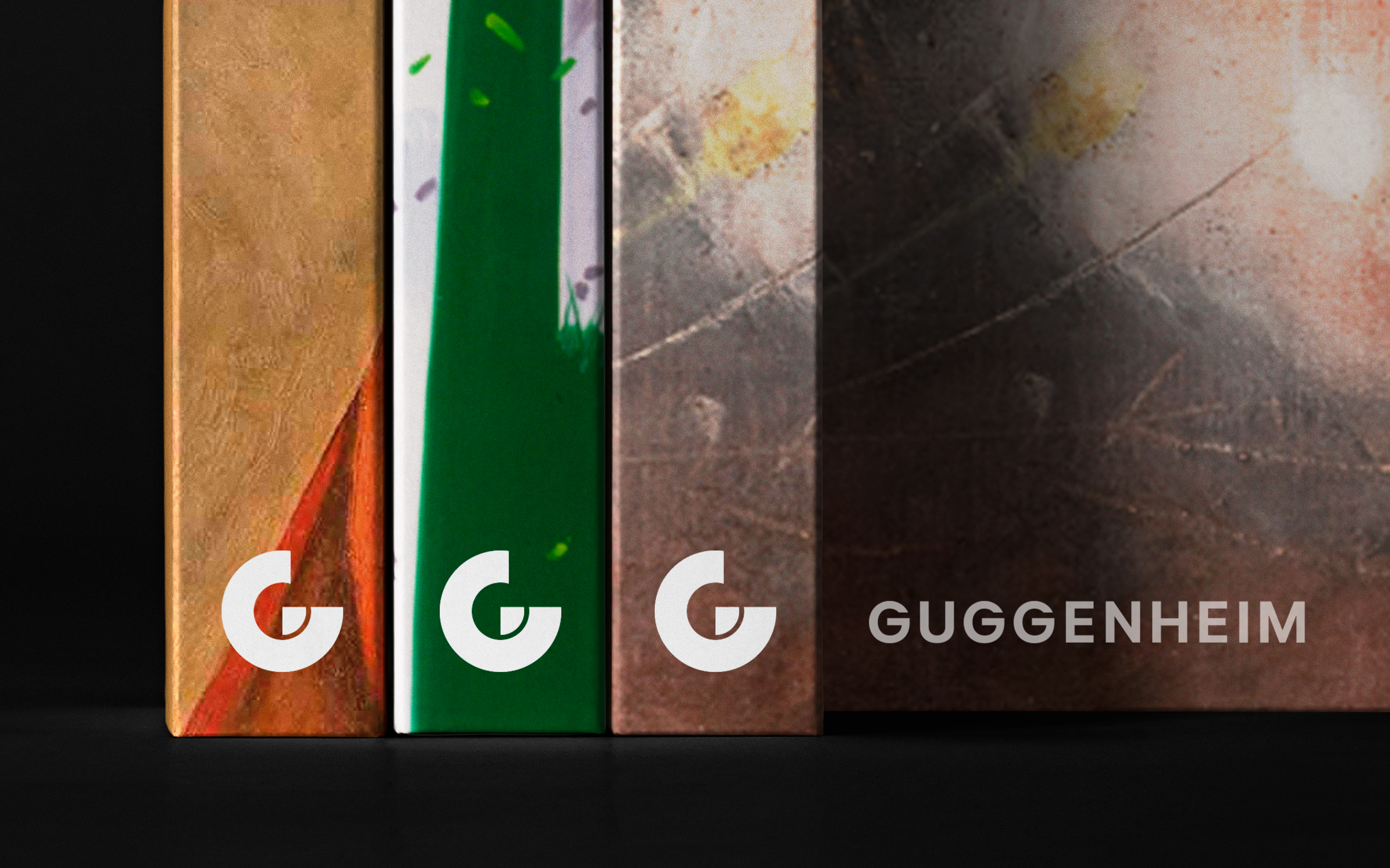
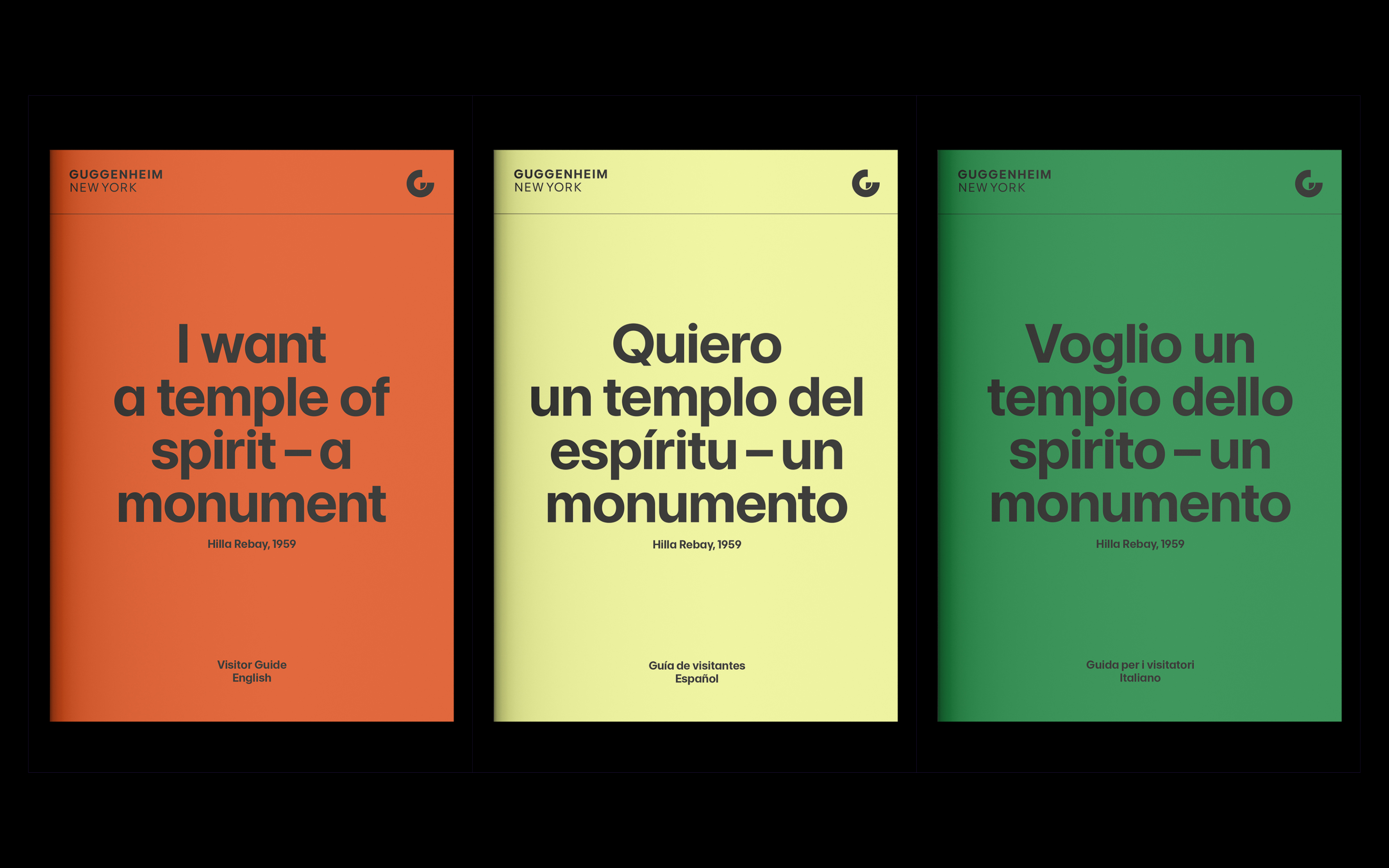
Playing on the brand's iconic geometric typography, the Guggenheim's new logo is a clean and authoritative wordmark that embraces heritage while maintaining a sleek modern appeal. Accompanying the logo is the new 'G' symbol – a figurative emblem that unites the constellation, proving a "simple, iconic sign-off, echoing the architectural form of the museums."
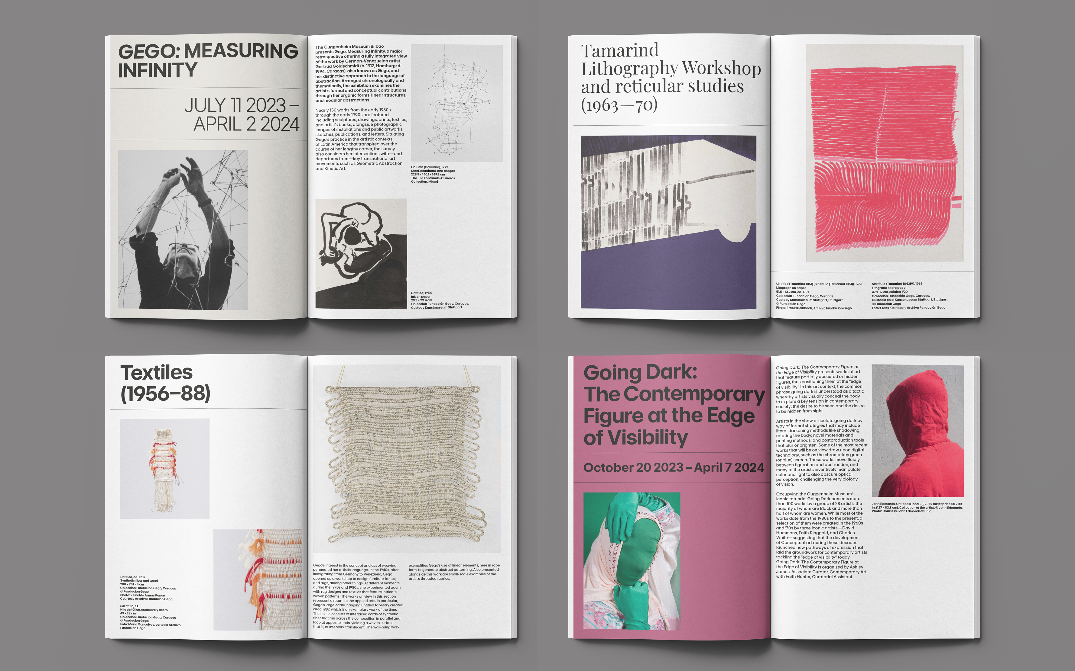
Created in harmony with the logotype, the new primary typeface, Guggenheim Sans creates a modern and accessible appeal across the new brand identity. Paired with immersive motion design, the fresh brand identity is brought to life with the spirit of ‘Amplification,’ playing on the Guggenheim's brand strategy "We amplify the power of many imaginations."
For Harry and the team, navigating the creation of this cohesive brand identity was a highlight of the project. "We were most proud of the fact that it helped these institutions unite, both in spirit as well as in the way they collectively appear," he says. The result is a sleek yet adaptable brand that unites the four locations without stripping them of their unique appeal – a united and flexible global identity that radiates contemporary flair.

For more creative inspiration, check out the playful new London Museum logo that proved unexpectedly controversial. If you're after more design news, take a look at the National Football Museum's new logo that's brilliantly simple.


