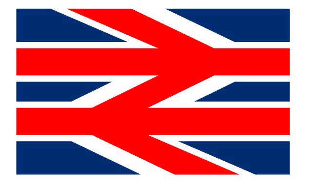
Great British Railways (GBR) is the new train body that the UK government is setting up and naturally, it will need a new logo. The previous government did suggest a logo (above), and registered it with the Intellectual Property Office, but it's been confirmed that the new logo will be different to this design.
So what will this new branding look like? Will it end up as one of the best logos ever made and be a point of pride like the German railway branding? Here's a few routes I think the branding could go down, as well as which directions (pun intended) I prefer.
01. A nod to the Double Arrow
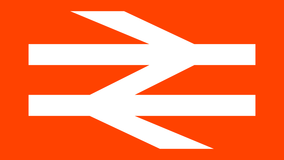
The Double Arrow logo was designed in 1964 by lettering artist Gerry Barney and has been present in British Rail branding since 1965. This logo is for many synonymous with British Rail and is a strong, graphically solid mark that many will recognise. It feels like it'd be a bit of a waste not to at least nod to this logo in the new Great British Railways branding.
02. Inclusion of the Union Jack
GBR could choose to incorporate the Union Jack into its new logo. This could work, as long as it doesn't look too forced or brash, which is quite hard to do with the Union Jack. The logo the Conservatives put forward used both the Double Arrow and the Union Jack together. The result is quite, well... shouty. I think it could be stripped back much more, and might even look chic if done well. To be honest, even just using the colours of the Union Jack might be enough.
03. A simple abbreviation
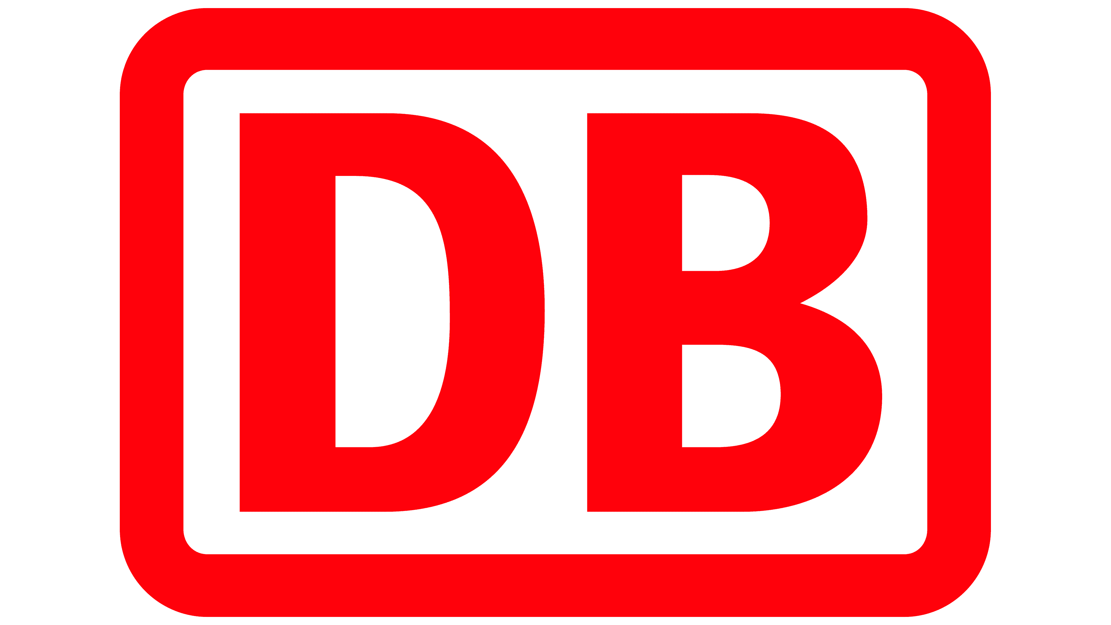
My favourite train logo is the DB (Deutsche Bahn). The simple two letter logo was modernised by 1994 Kurt Weidemann, with typographer Erik Spiekermann designing the font, DB Type. This simple graphic style is (most importantly) legible, recognisable and works across a range of touchpoints. I think GWR in the UK also works really well, and paired with the dark green, it also looks rather chic.
04. A nod to our most-loved characters
The most popular suggestion for an image that would work well on GBR from the Creative Bloq team is Thomas the Tank engine. Just imagine having one of our most-loved characters all over every train in the land.
05. Interesting colourways
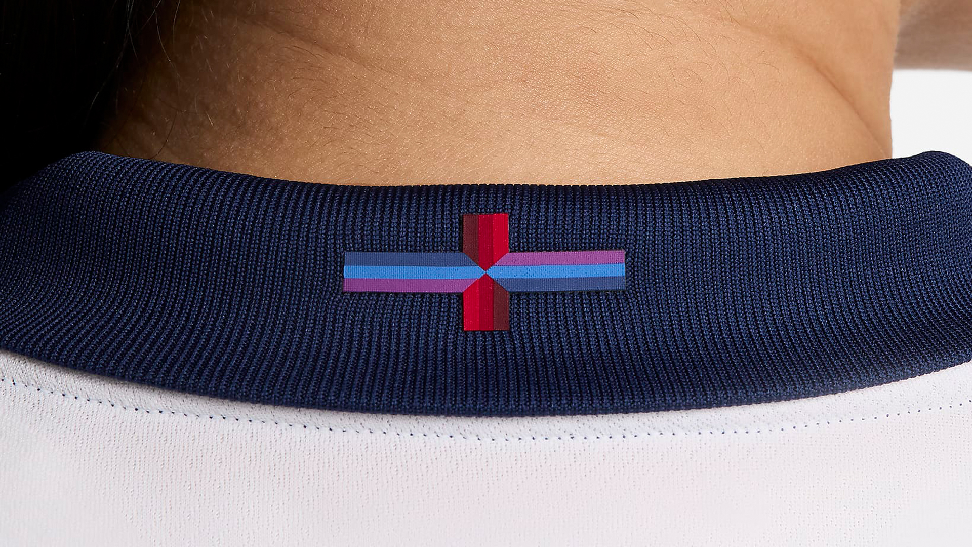
For Great British Railways, the obvious colourway route to go down would be red, white or blue, but perhaps GBR might go down the route of 2024 England football kit and add in purple or another colour. It might be interesting to see a new colour palette that isn't that obvious.
06. Something completely different

Remember when the London 2012 Olympics logo first came out and everyone's jaws dropped to the floor? Great British Railways could also go down this route and mix things up with a totally different approach to its branding. It's worth noting that the London 2012 Olympics logo made it to our list of the best Olympic logos of all time, and the best rebrands of the 2000s, and many think the bravery paid off.
What do you think the Great British Railways branding should look like? Let us know in the comments.