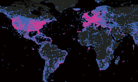
Who shares their images with the world? This map of Flickr activity around the globe starts to give us an answer.
When they're not mapping zombies, Mark Graham and the team at the Oxford Internet Institute, are undertaking even more serious research into the state of the internet - this map is part of that work.
Using Flickr's API, they mapped every geotagged picture on Flickr by downloading the count of photographs in every 0.5 x 0.5 degree latitude-longitude square on the Earth's surface.
As might be expected, the largest concentrations of photographs can be found in some of the world's most populated places.
But, says Graham, who also runs the blogs floatingsheep.org and zerogeography.net:
The density of photographs is not simply a factor of population. Potentials for participation are limited by both censorship of the platform (e.g. in Iran) and the presence of more popular services (e.g. in China). In the rest of the world, the patterns on this map point to images being mostly created by people in the world's wealthiest and most highly connected regions. The stark contrast in the number of photographs covering Mexico and the United States and the lack of dense clusters of images in the most populated parts of Africa (e.g. coastal West Africa) reinforces this point
More open data
Data journalism and data visualisations from the Guardian
World government data
• Search the world's government data with our gateway
Development and aid data
• Search the world's global development data with our gateway
Can you do something with this data?
• Flickr Please post your visualisations and mash-ups on our Flickr group
• Contact us at data@guardian.co.uk
• Get the A-Z of data
• More at the Datastore directory
• Follow us on Twitter
• Like us on Facebook


