The Paris 2024 Olympic Games start on Friday, and the event's unusual logo design is sure to attract as much interest as the sporting action. Much mocked for looking like 'Rachel from Friends', the logo is intended to represent the Olympic touch and Marianne, the personification of the French Republic.
But how does it compare to previous Olympic Games logo designs? Paris can lay claim to having set a landmark in Olympic design history the last time it hosted the Games. A century ago this summer, the Paris 1924 Olympics were the first to have what could be considered a logo. And for anyone not familiar with the French capital, it might look almost as bizarre as this year's effort (also see our pick of the best Olympics logos of all time and our history of the Olympic rings).
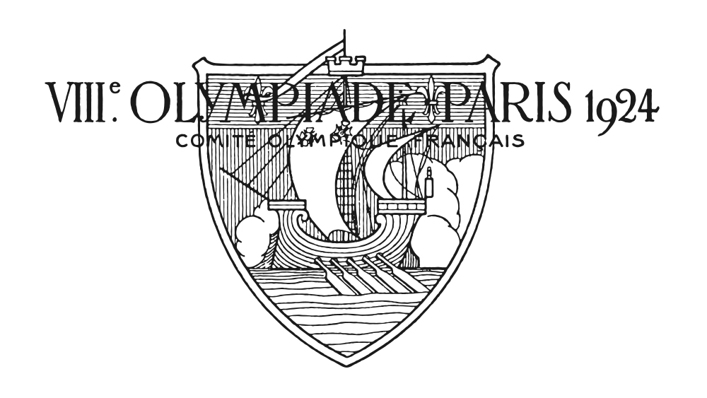
In the 1920s, logo design hadn't developed into the graphic design discipline that it was today. That might offer some justification for why the Paris 1924 Olympics logo was mega busy and fairly illegible. The black-and-white emblem featured a woodcut-style image of a sailing ship overlaid with text reading 'VIIIe olympiade Paris 2024'. If you're wondering what an old sailing ship has to do with the Olympics, the answer is nothing: it was lifted from the Paris coat of arms but made even busier with the addition of oars and clouds.
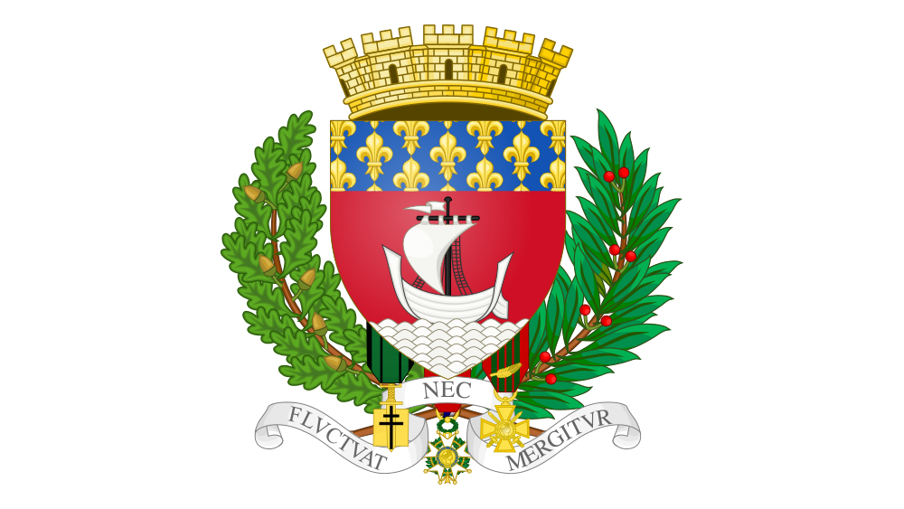
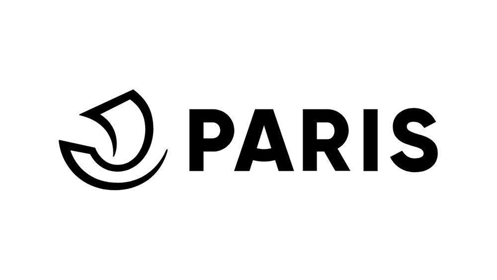
A reference to the founding of Paris on the Ile de la Cité in the Seine, the ship appeared on the first Paris coat of arms in the 14th century and remains in the current version, which dates back to 1853. It also appears in the modern government logo for Ville de Paris, albeit in a much more minimalist form (see the second picture above). It may have been inspired by the emblem of the Marchands de l'eau, a guild that had the right for commercial navigation on the Seine in the 12th century.
And the Paris 2024 logo?
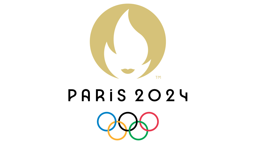
The Paris 2024 Olympic Games logo continues to raise eyebrows due its curious bouffant, It makes use of negative space to depict a representation of the Olympic flame that's intended to double as the visage of Marianne, the personification of the French Republic since the French Revolution. Marianne has long been intended to represent the values of liberty, equality, fraternity and reason, and was inspired by the Goddess of Liberty.
Looking like the face of a woman with a bob, the design has been likened to everyone from Victoria Beckham and Kristen Stewart to Sian Clifford in Fleabag and even Penelope Redd from The Sims. It's also been suggested the design looks like the logo for a hairdresser's or even a dating app thanks to its resemblance to the Tinder logo. But Paris has stuck to its guns, and, perhaps like the London 2012 logo, we will come to love the Marianne.
For more design inspiration, see our picks of the best new logos and the worst logo designs of 2024 so far. For sports logos, check out the new Raiders logo and our pick of the best sports logos of all time.