Mimi and Kristian’s house was up third at The Block auction day and took out third place, selling for $2.93 million. The newlyweds from Adelaide walk away with $1.03 million (the profit from the sale) for three months of hard work. They’ve been strong from the start as The Block 2024 contestants, with a Modern Coastal house style.

As 31-year-old Kristian is an electrician, he’s brought that experience to the build. Meanwhile, Mimi is a 28-year-old restaurant manager at her family’s business, Ba Khang, which has freshly-renovated interiors and a buzzing schedule to keep her on her toes, just like on The Block.
The couple have been frontrunners from week one, winning the main bathroom reveals. They got to meet the 2023 winners Steph and Gian, who shared their tips for winning The Block 2024. It helped them hone a strong style that embraces the natural Phillip Island setting, with oceanic emeralds and sapphire hues, tactile earthy elements and elevated nautical details.
While they floundered slightly at times, these two were still in a good position come auction week. Being the only team with a two-storey house set them apart, and their consistently chic style also had them in good stead. But the real indication they would do well is the fact that Block super-bidders Danny Wallis and Adrian Portelli both voted for House 5 at the Domain Buyers Jury in week eight. It was billionaire entrepreneur Adrian who snapped up their place in the end, along with the rest of The Block holiday houses.
Tour every house on The Block 2024
The Block 2024: Mimi and Kristian’s house
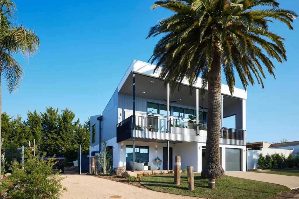
Take a look through House 5, the only double-storey home of the series.
Week 1: Main bathroom
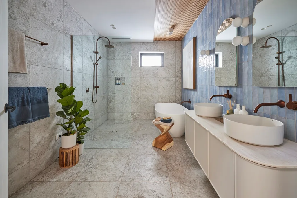
Kristian and Mimi walked away with the win and $140,000 in prizes for their bathroom with a beachy feeling in the first week. “The holiday home we’re trying to create is a contemporary, coastal kinda vibe,” said Mimi. “It’s welcoming and fresh and soothing.” The responses were overwhelmingly positive from the judges. “This room’s a huge success,” said Darren, who loved the blues.
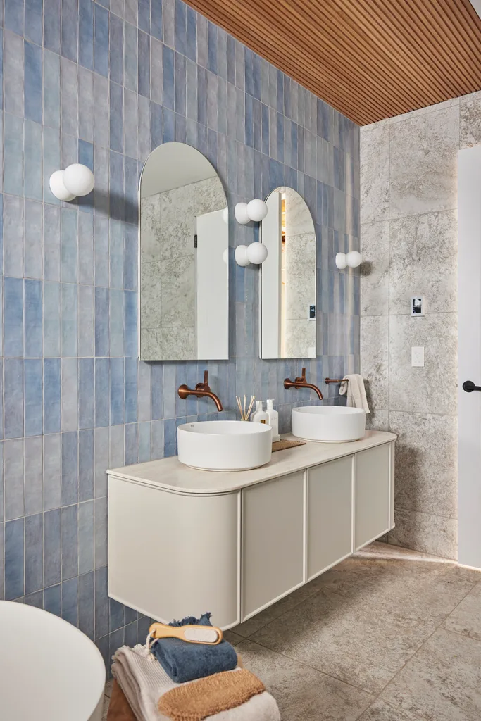
Darren’s only qualm was that there might have been a better layout, “judging by how much open space there is that doesn’t have a purpose”. It impressed from a real-estate perspective, though. “This truly is a proper family bathroom,” said Marty.
Score: 28.5/30
Week 2: Guest bedroom
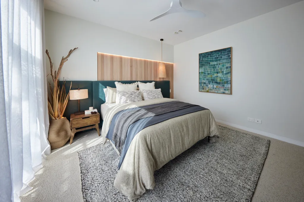
This couple was on a roll, with their modern coastal guest bedroom putting them in the top spot once again. “This is another level,” said Marty, who appreciated the “high end” feel. “This is saying boutique hotel,” agreed Shaynna. The asymmetry of the room wasn’t doing it for Darren, who called it “design for design’s sake”. A power point visible next to the bed was another small detail that could be improved on. Subtle nautical touches such as the rope on the pendant give this room a sophistication the judges approved of.
Score: 28/30
Week 3: Main ensuite
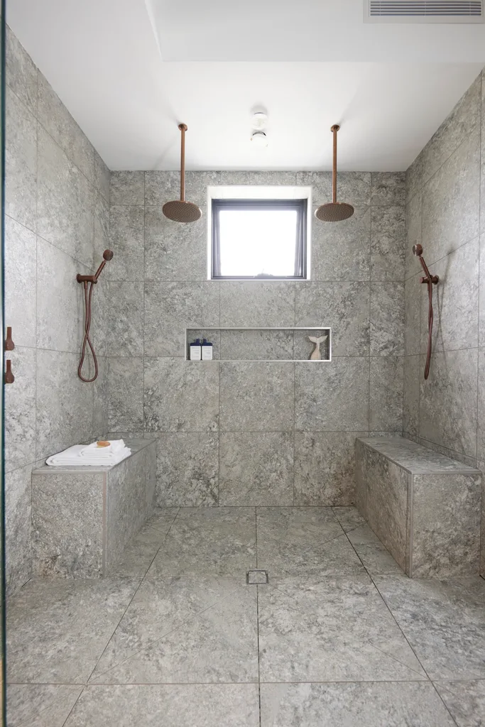
There were some major planning flaws for Kristian and Mimi this week after two wins, with the oversized shower being the biggest problem. “I’ve never seen such a big, useless shower. There’s no bath,” said Marty. “I think they believe [the shower] is the hero of the room and it’s not.”
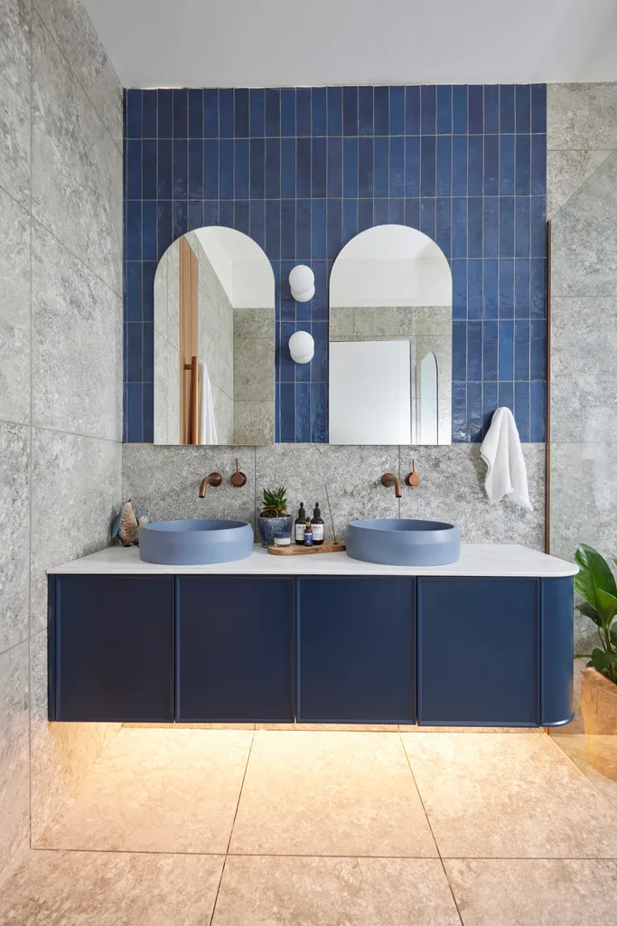
As a palette, it was praised, from the blue tiles to the timber panelling. “I love the materiality, I love the colours,” said Darren. The contemporary arched mirrors were another win, yet the naff styling was a glaring misstep. “They’ve missed the mark. Maybe they got a bit too cocky,” said Marty. “It’s a real let-down for such an important room for the sale of the house.”
Score: 21.5/30
Week 4: Kids’ bedroom
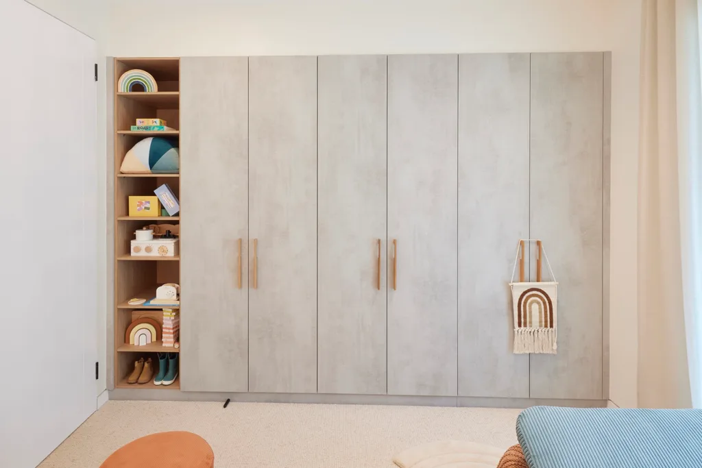
“The colour palette is so sophisticated, I absolutely adore it,” said Shaynna, taking in the whimsical rainbow-themed room. The interior designer was impressed with their ability to reference rainbows, arches and circles throughout the space “without it feeling over the top”.
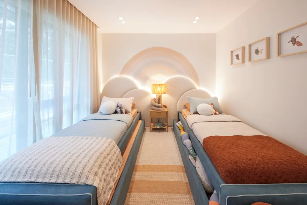
It was a turnaround from the previous reveal, when the newlyweds had failed to impress. “Kristian and Mimi probably got a bit complacent last week,” Darren exclaimed excitedly when he saw it. “You can see what happens when you get a bit complacent. I don’t see complacency here. I just see expertise. I see attention to detail. High levels of finish, a beautiful layout, great decisions in design. They’re back, baby.”
Score: 28/30
Week 5: Main bedroom and walk-in robe
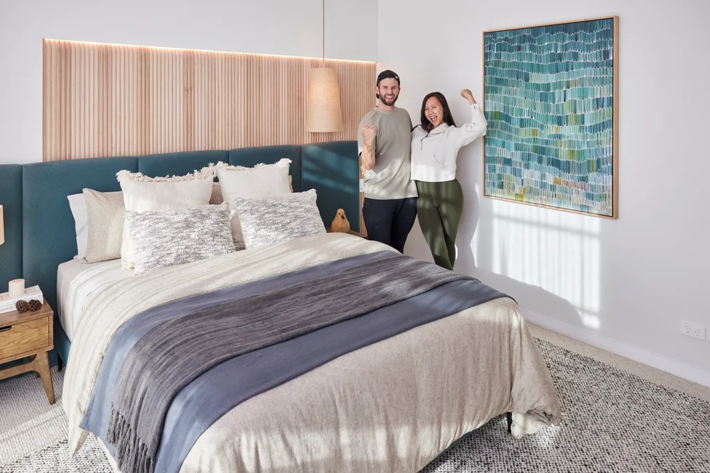
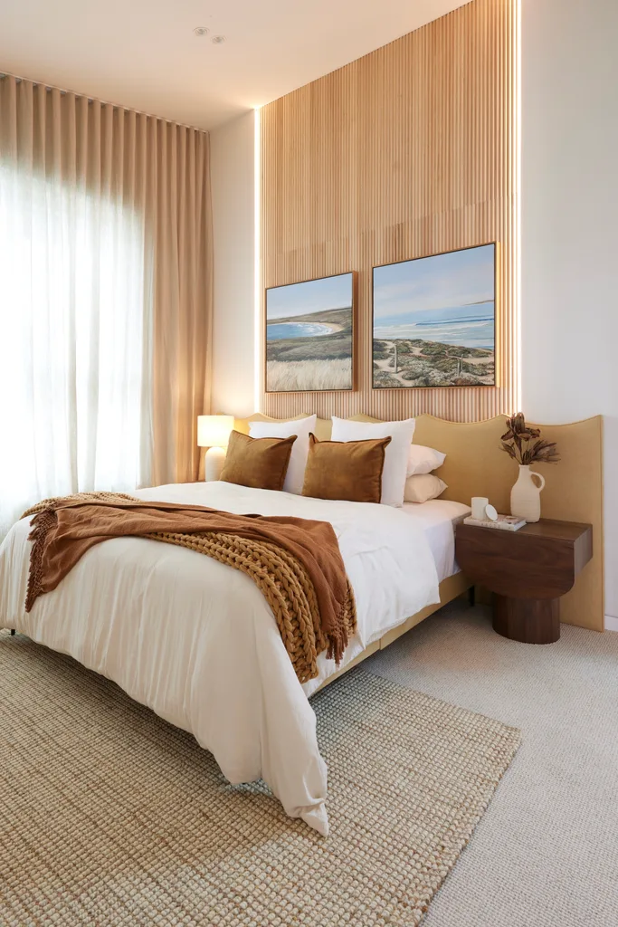
“This is by far the most hotel-like room that we’ve walked into, in terms of finesse, calmness and sophistication,” said Marty, who pointed out the waved bedhead from Steph and Gian’s brand Japandi Estate. As part of the only double-storey house in The Block this year, the raked ceiling made an impressive sight. Even more impressive (in Darren’s opinion) were the sheer curtains designed on a rake in such a short timeframe.
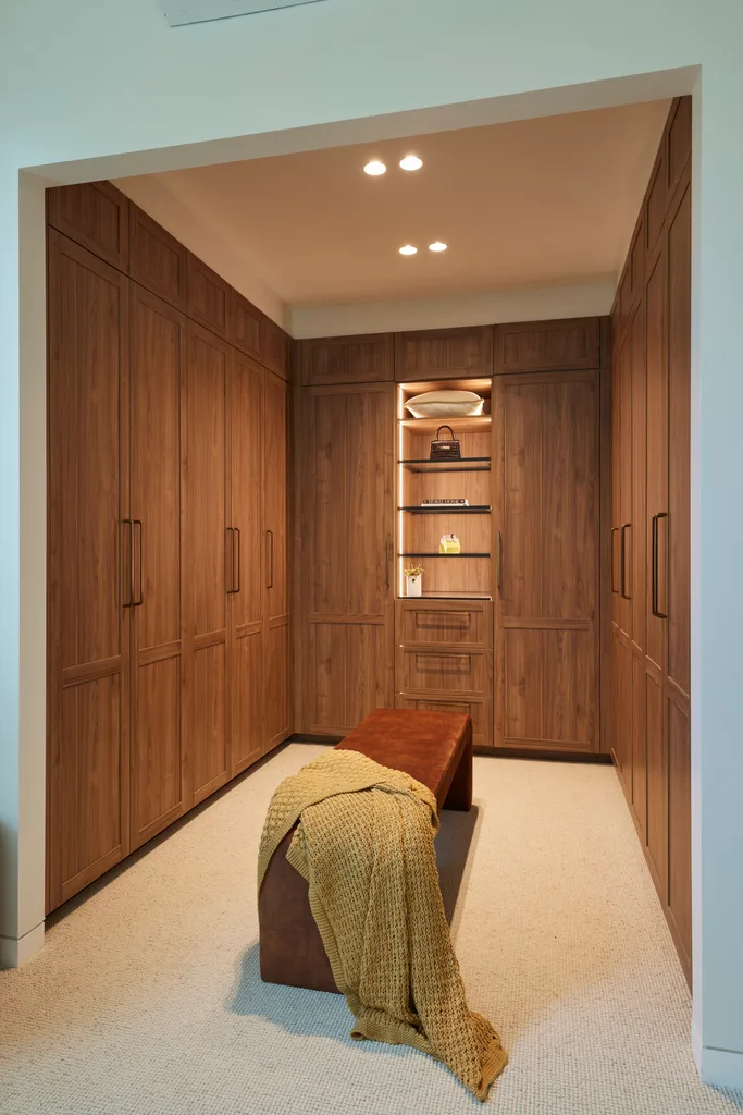
This team won the Hafele wardrobe upgrade, which gave their soothing room an extra touch of opulence. “This is not just a holiday home, this isn’t just a place to retire to,” said Shaynna. “They’ve created a lifestyle in this house. It feels coastal. It feels warm, it feels inviting. It says Phillip Island. I can imagine people wanting to buy this to live in for the rest of their life.”
Score: 28/30
Week 6: Kitchen
- Best feature: Chevron flooring
-
Biggest mistake: Controversial oven colour
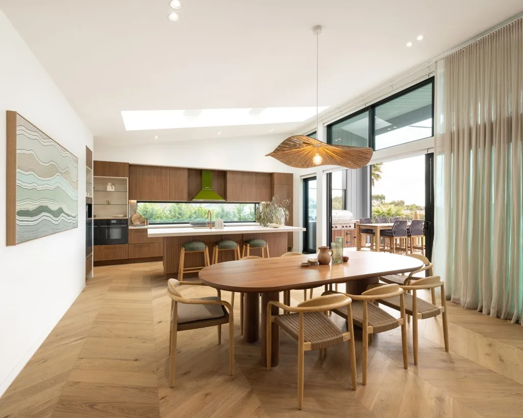
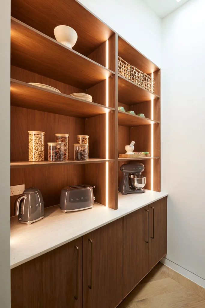
The “Shrek kitchen” may not be very marketable in Marty’s opinion, but it still exudes plenty of style. “I haven’t seen a triple stack before, with two shadow lines,” said Shaynna, referring to the Cosentino Dekton Marmorio benchtop. Yet Marty felt it was gimmicky. “This triple stack for me looks like a mistake,” Marty disagreed. “I would have preferred a thick stone – it’s a nicer, more refined look.”
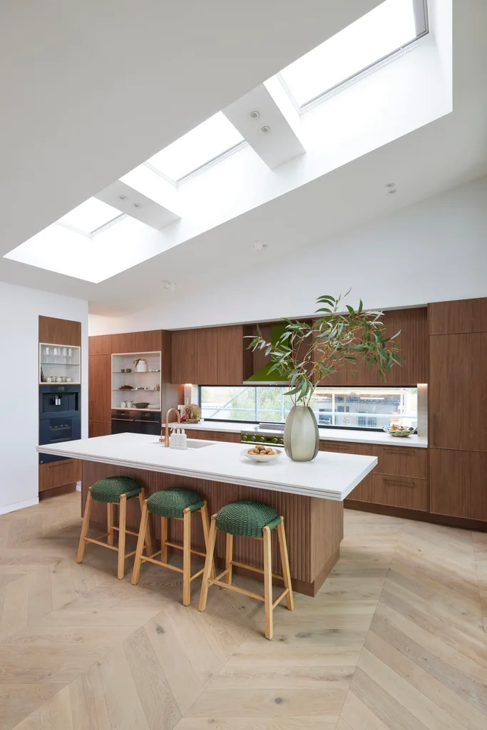
The walnut cabinetry, hardware and glass splashback were hits, creating an outlook over the backyard. “I love the natural light,” said Marty. Yet he pointed out the poor placement of the fridge. “If that’s the fridge down there, five steps away from the central hub of the kitchen, it’s just not right.”
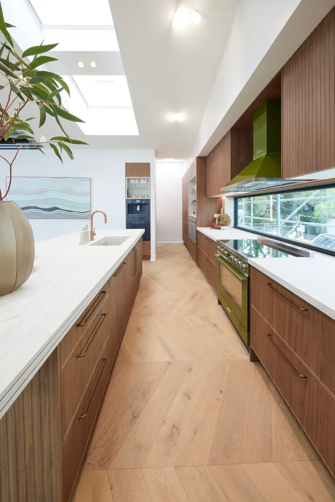
All the judges agreed the chevron flooring was a wonderful choice. “These would be my favourite floors of today,” said Marty. The “Shrek” oven colour was controversial, with Marty adamant that it would turn off buyers. Yet the space was striking from a design perspective, perhaps with a different choice of stools that didn’t clash so much. “It has a lot of drama to it,” said Darren.
Score: 26.5/30
Week 7: Guest ensuite
After their “Shrek” kitchen mishap in the previous week, Mimi and Kristian’s chic ensuite was more up Marty’s alley. “Now this is what I like,” he said. “This is clean, marketable. It’s just so well put together.” He liked how the timber on the ceiling warmed up the room and was a detail used in previous rooms. “It tells a story of the house, because it’s consistent with the other bathrooms, and buyers do like consistency,” he said.
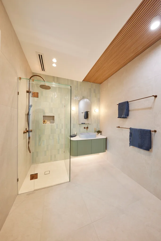
“I really dislike it,” Darren declared about the timber strip. “It’s an inclusion for the sake of an inclusion that doesn’t relate to anything else. I have a problem with it. It makes the room imbalanced.” It was a sentiment shared by Shaynna who felt Mimi and Kristian’s penchant for asymmetry was failing them. “It feels a bit odd because it’s off-centre,” she said.
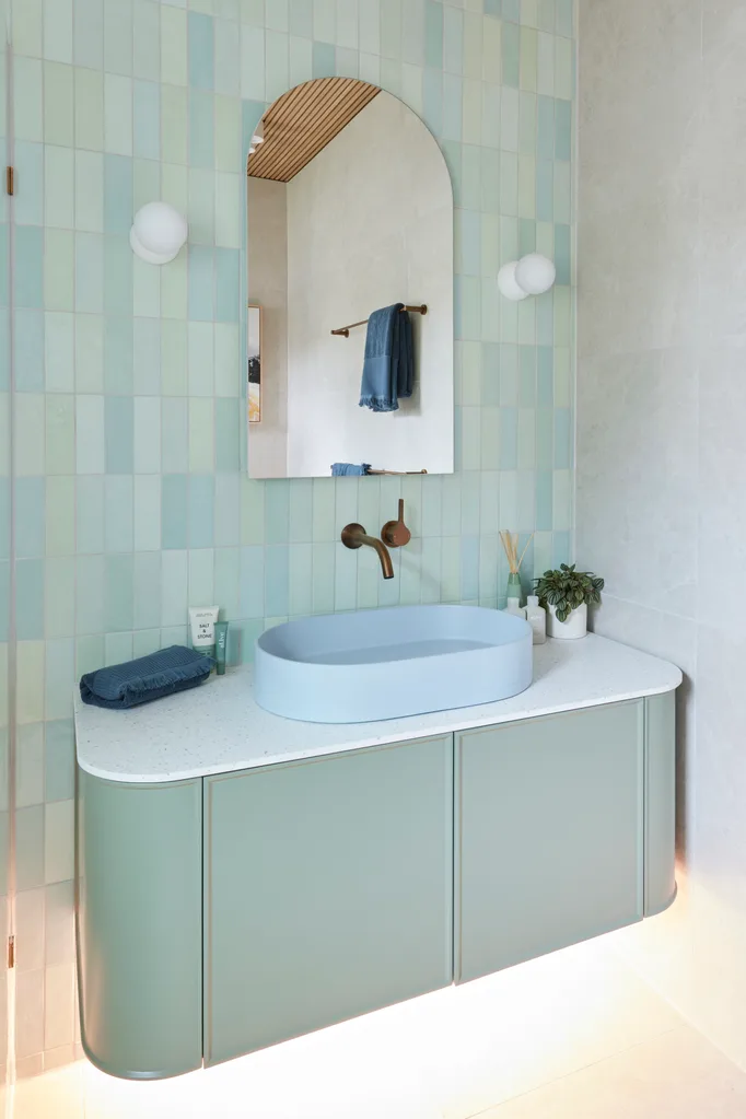
The blue and green tiles were a beautiful combination with the blue basin and green vanity, yet perhaps a tad formulaic in the context of a competition that needs to wow the judges week after week. “It’s not exciting me, because I’ve seen them do it,” said Shaynna. “It’s rinse, lather, repeat.” From a real estate perspective, Mimi and Kristian’s consistency was exactly what excited Marty, as he knew it would bode well for auction.
Score: 24.5/30
Week 8: Living and dining
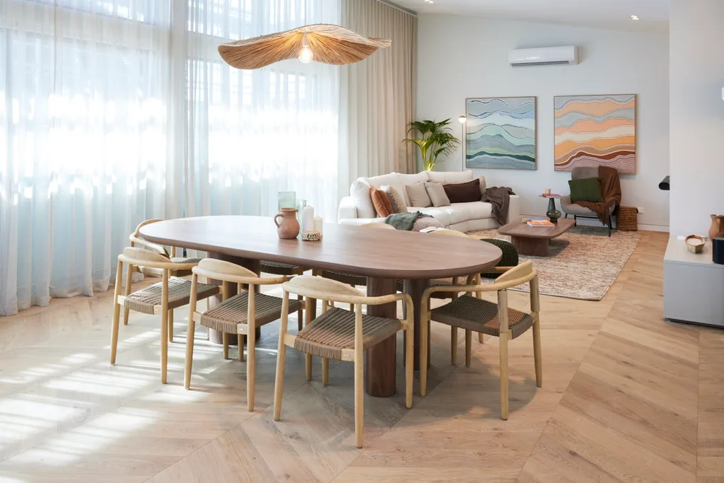
The only team with a two-storey home, their floorplan left them with the smallest living and dining area. What they lacked in space, they didn’t make up for in the design. “When you have a smaller space, you need to balance that by upping the luxury in the materiality,” explained Marty. “There’s no sophistication. For me it’s the biggest let-down of the day.”
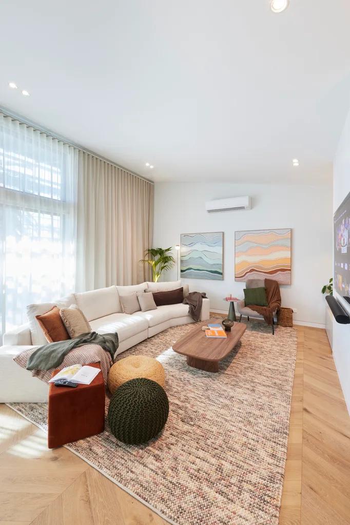
The couple went with a soft green laminate feature wall and walnut table that was in the wrong spot for Shaynna. “I find this table a barrier,” she said. “You’re walking in here and you’re going straight into the dining table. I would have preferred a round table.”
Score: 23.5/30
Week 9: Office and rumpus
A floorplan change saw Mimi and Kristian change a downstairs bedroom into a rumpus with access to the pool and a bathroom beside it. The judges weren’t convinced. “If you’re going to change the floorplan to your advantage, you have to blow us away,” said Shaynna. “This has zero connection to the lifestyle outside.”
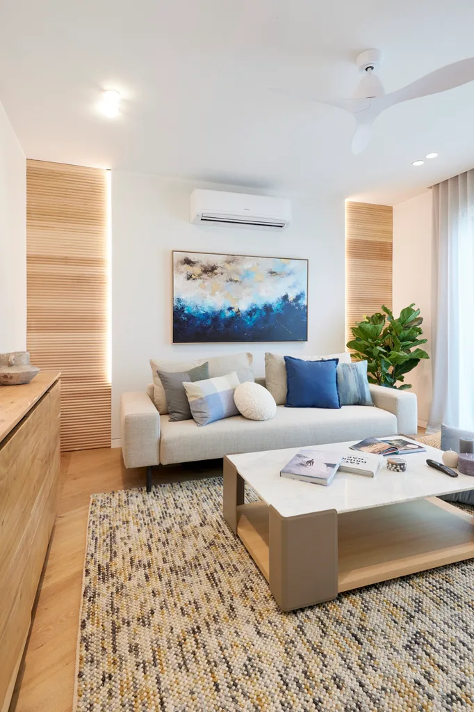
They also thought it should have been more suitable for post-swim hang outs. “Shouldn’t this be a place that’s pool-friendly? If you have a plunge pool there and you want to come in and watch TV and play games, don’t you want surfaces that kids can be in their bathers?” said Shaynna.
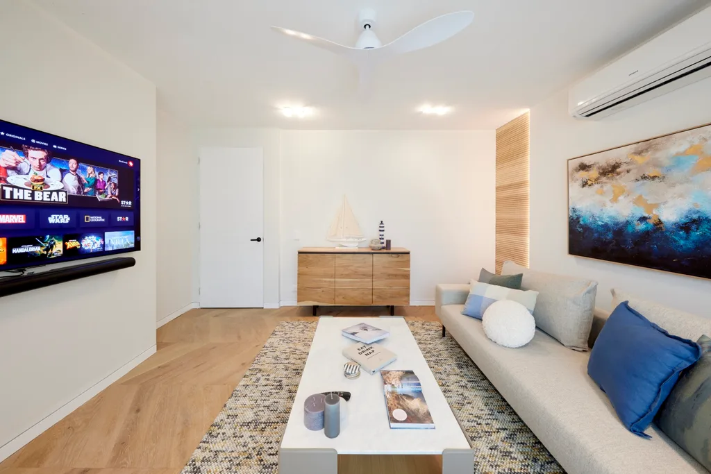
Week 10: Laundry and guest bedroom
Ignoring advice from the judges, Mimi and Kristian stuck with their decision to change the floorplan and make what was supposed to be a rumpus into a guest bedroom. “We’re opposite a communal area and with all that glazing, it should have been a rumpus,” said Marty. “It’s definitely a mistake,” added Darren.
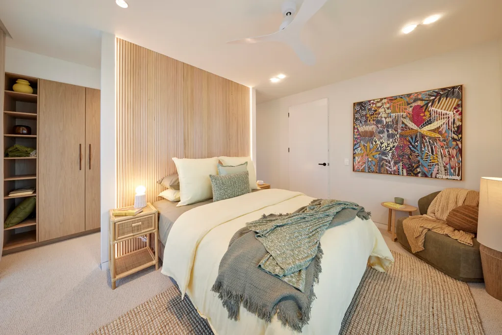
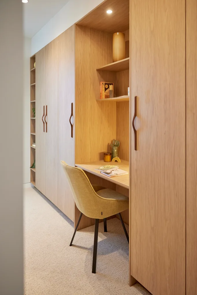
Despite that, the room was beautiful, with soft yellow and sage green. A Porta timber nib wall doubled as a room divider and bedhead. Behind this was built-in cabinetry and a desk nook.
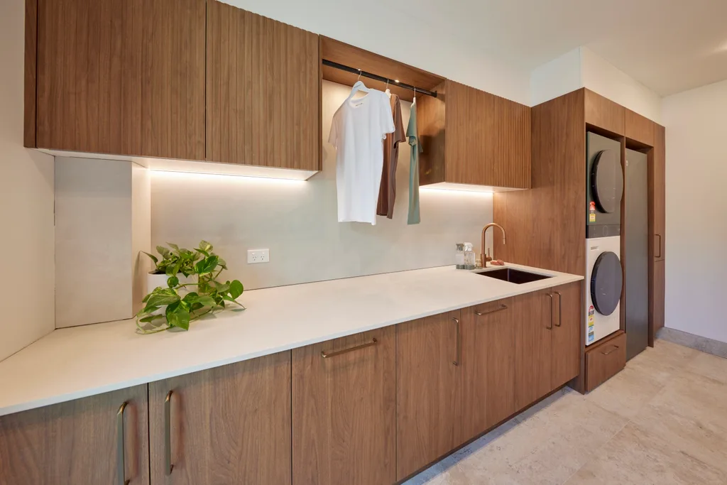
They ended on a high with the laundry, which had plenty of storage and bench space. “This is a laundry,” said Darren. “I didn’t know I wanted green appliances before today, but yes I do.” The direct access from outside was a win and the layout was impeccable. “This is probably the laundry of the day,” said Marty.
Score: 20.5/30
Week 11: Backyard and pool
“I love the mosaic tiling,” said Darren about the finish on the large pool at House 5. “As soon as you walk in, you’re drawn to it. It screams resort,” landscaping expert and guest judge Dave Franklin agreed. Although they only had a small deck with two chairs, there was plenty of grass nearby to sit on and “be part of the pool environment,” as Shaynna put it.
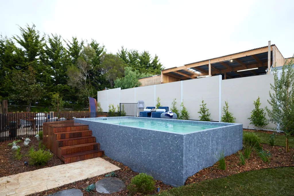
“It makes you feel coastal,” said Marty of the backyard. There were piers wrapped in rope, which were appropriate for Phillip Island, plus a rowing boat that had been repurposed as a drink station by the dining area. While a smoker for cooking was placed here, the barbecue Mimi and Kristian won in a previous week was noticeably missing.
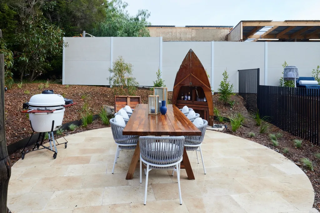
It had been placed on the upstairs balcony, but the judges felt this would be a better spot for it. “When you’re playing in the pool, just to have a sausage on bread is one of the easiest things,” said Shaynna. “You don’t want to go running upstairs.” Next to the basketball court was a fire pit surrounded by a dry stone wall. “It’s a cracker,” said Darren.
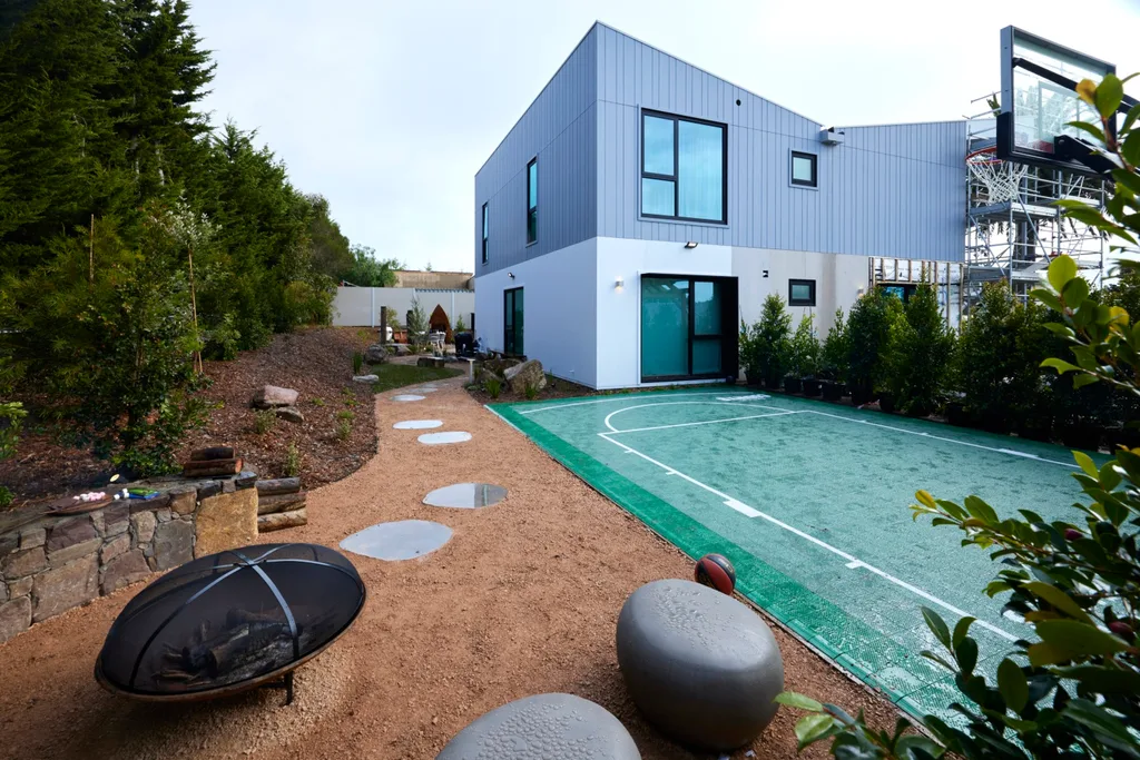
Seasoned The Block landscaper Tom Lovett (who has helped two previous teams win landscaping week) worked on Mimi and Kristian’s property. He guided them towards a basketball court with a three-point line, so they had the largest court on The Block.
Score: 35/40
Week 12: Front yard and facade
Landscaper Tom Lovett leant out his own boat to demonstrate one of House 5’s biggest selling points to the judges. “I brought my boat to show them this is another storage spot to park a boat or a caravan,” Tom explained. The fact Mimi and Kristian already had a large palm tree was also a big win. “We’ve got the second biggest palm tree here which looks fantastic upstairs, looking underneath there. It’s a little bit of privacy,” Dave pointed out.
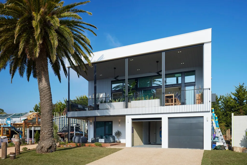
As part of the facade, Mimi and Kristian revealed their completed upstairs balcony. “I love the elevation here and the fact you can be king of the castle and see out over the block,” said Shaynna. “I’m loving the stone here, I love the fact they have these pots here and it gives you privacy, but I have to say they’ve got the layout wrong.”
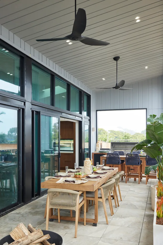
It was noted that the fire pit was an unusual choice for the space and a built-in fireplace would have been better, yet budget constraints didn’t allow for this. Making this the main entertaining area with the $30,000 barbecue they won earlier in the season left little room for youngsters to play. “In every other house, there’s a connection to a space where kids can run around and be outdoors. That’s not it here,” said Darren.

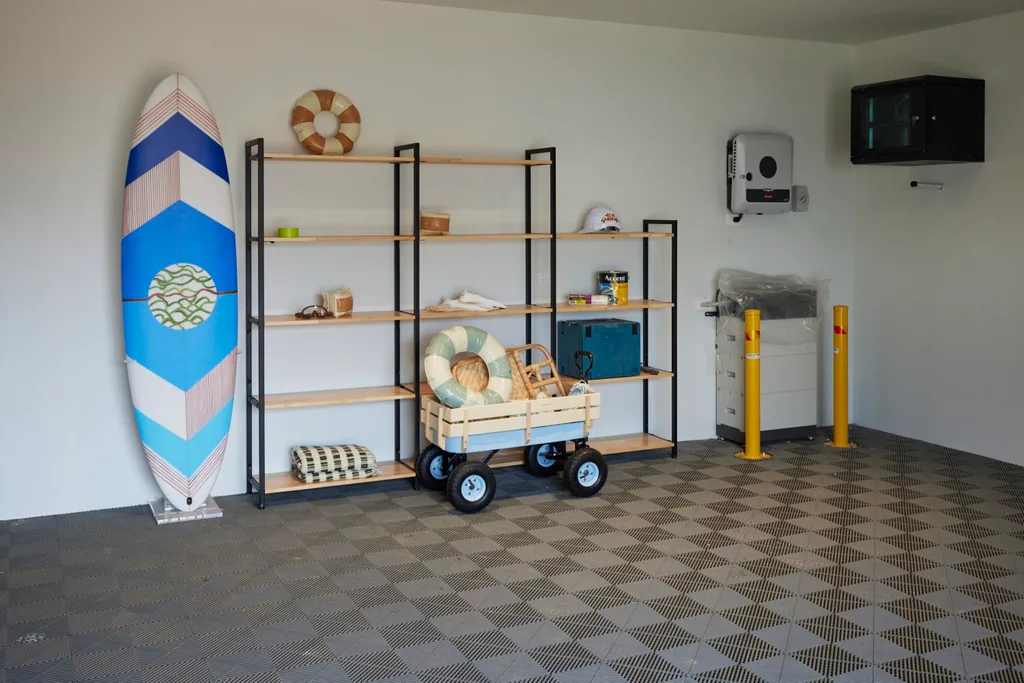
The garage was beautifully styled, but they left one of the walls unpainted with the bricks exposed.
Score: 31.5/40
Head to the real-estate listing for more details on Mimi and Kristian’s The Block house.
Tune into The Block 2024 on Sundays at 7pm and Mondays, Tuesdays and Wednesdays at 7.30pm on Channel 9 and 9Now.
Take a tour of all The Block holiday houses so far
Week 5: Main bedrooms and walk-in robe reveals
Week 8: Living and dining reveals
Week 9: Office and rumpus room reveals
Week 10: Laundry and guest bedroom reveals
In case you missed it:
This article originally appeared on Home Beautiful and is republished here with permission.


