The 1990s ushered in a radical new era for typography, as the rise of desktop publishing democratised font design and unleashed unprecedented creative experimentation. What emerged was a wild mix of styles that reflected the decade's competing impulses – from grunge-inspired deconstruction to sleek fashion-forward elegance.
This was a time when established designers pushed the boundaries of legibility with intentionally distorted fonts, while emerging studios forged new connections between typography and digital culture. Whether appearing in glossy magazines or early video games, the typography of the 1990s embodied both the creative freedom and growing pains of an industry in transformation.
But which of the thousands of typefaces used during the 1990s made the most impact? We asked a selection of design and typography experts to pick their favourites and explain why these fonts made such a splash in the last decade of the 20th century. For the best type of other decades, see our typography of the decade series, and for more font inspiration, see our free fonts post.
01. Comic Sans
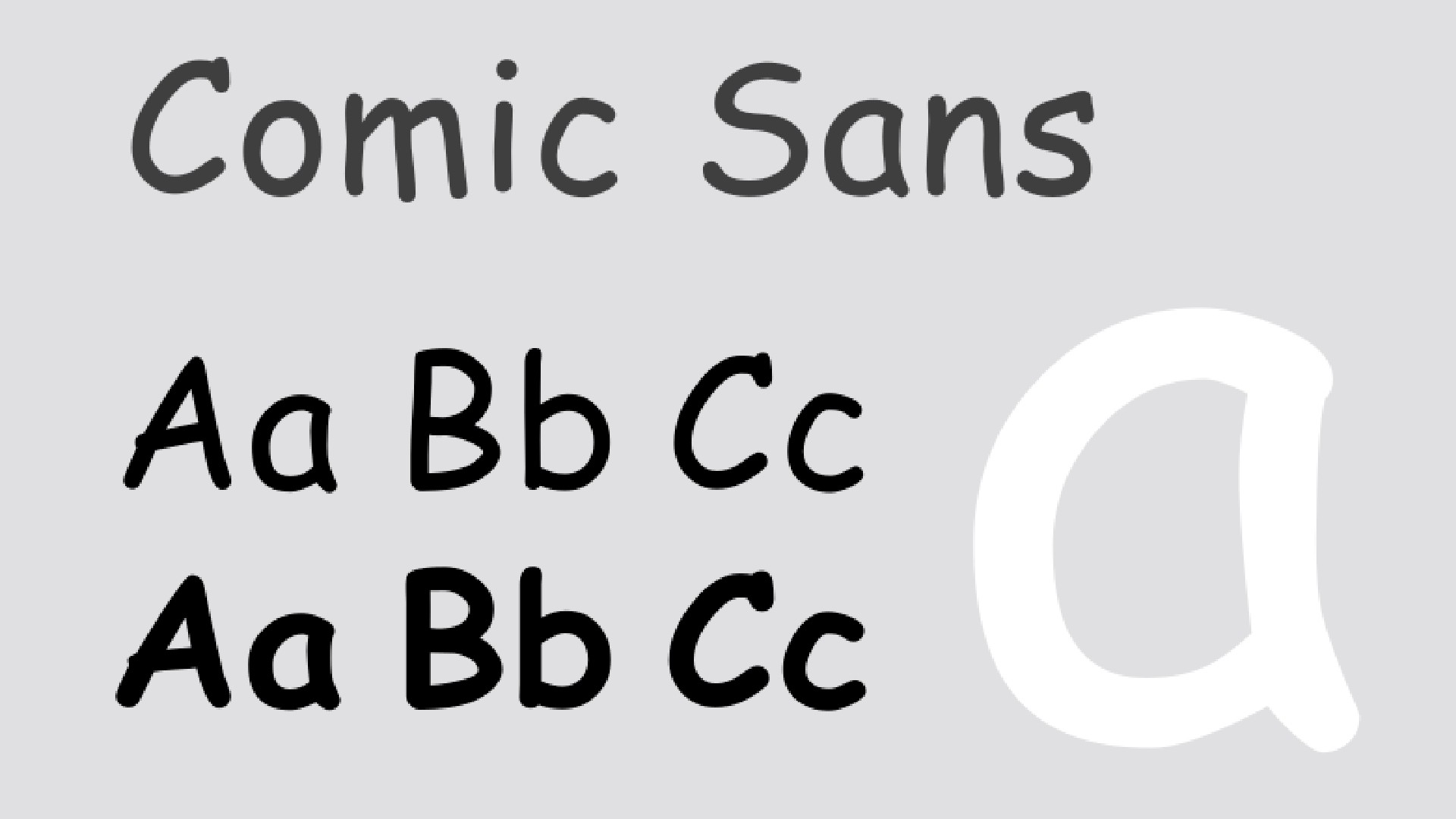
We'll start with the elephant in the room. Designed by Vincent Connare in 1994, it's probably the most controversial font of all time, and has been long been held up as a crime against typography. But our experts beg to differ.
"Comic Sans has a bad reputation, but it’s a font I’ve always loved," counters Jessica Walsh, founder of &Walsh and the type studio Type of Feeling. "Its hand-drawn, friendly appearance was meant to mimic comic book lettering, and despite its polarising reputation, it became an iconic part of '90s design culture.
"Though often criticised, Comic Sans became highly influential as a casual, informal font widely used in digital and everyday communications," she adds. "It was my AIM [AOL Instant Messenger] profile font in the '90s because it was fun, and the other stock computer fonts were boring."
Comic Sans is often linked to poor design, but I would argue that the issue isn’t with the font itself: it’s with how it has been used
Eleni Beveratou
Eleni Beveratou, creative director at Dalton Maag, is also a fan. "Despite its infamy, Comic Sans remains one of the most viral fonts in the world to this day," she believes. "It's often linked to poor design, but I would argue that the issue isn’t with the font itself: it’s with how it has been used. Comic Sans in its own right has nothing wrong."
The font was originally designed to appear in speech bubbles of Rover, a cartoon dog used by Microsoft Bob, a software interface developed by Microsoft. "In that context, Comic Sans fitted its brief quite successfully," she says. "The real problems stem from how it's been applied over the years to convey messages that are at odds with its playful, comic-book style."
For example, as she notes, it famously appeared in a NASA announcement about the discovery of the Higgs Boson, entirely typeset in Comic Sans. "The playful nature of the font clashed with the serious tone of the message, creating a jarring effect."
That said, many of those who use Comic Sans inappropriately aren’t professional designers; they’re everyday people simply trying to communicate in a friendly, approachable way. "For many years, Comic Sans was one of the few readily available fonts with a casual look," Eleni explains. "As a designer, I can't fault people for trying to convey emotion through the limited fonts they had access to. After all, that’s exactly what fonts do: express emotions."
Instead of criticising its misuse, then, she advocates offering users more diverse font options and encouraging designers to research and thoughtfully select fonts that not only fit the brief but also convey the appropriate emotional tone; "not just because they personally like a font from a preselected library".
02. FF Blur by Neville Brody
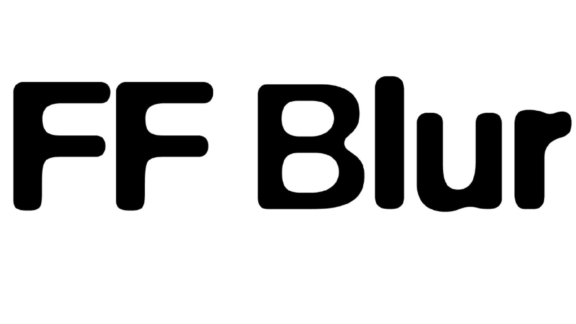
One of those famous graphic designers that every creative should know about, Neville Brody was one of the big names in 1980s and 1990s publishing, most notably from his revolutionary layout designs at the Face and Arena magazines.
FF Blur is a typeface he developed in 1991, by blurring a grayscale image of Akzidenz-Grotesk and then vectorising what remained. A sans-serif font distinguished by its blurred and distorted appearance, it became an essential typeface of the 1990s zeitgeist and remained both popular and celebrated ever since. For example, it was one of 23 digital typefaces included in a section added to the Museum of Modern Art in New York's permanent collection in 2011.
Lucas Luz, art director at Type of Feeling, recalls what an impact it made on its initial release. "FF Blur emerged during a time when experimentation in typography and graphic design was at its peak, with designers pushing boundaries and challenging conventions," he remembers.
"It showed that typography didn’t just have to be a tool for conveying the meaning of words: it could have its own personality and make a statement. That’s exactly how I like to approach typography in my work; almost like an illustration, where letters and words communicate a feeling, a vibe. "
I appreciate FF Blur for its bold non-conventional approach
Gianluca Ciancaglini
Gianluca Ciancaglini, head of type design at Landor, is also a fan. "I appreciate FF Blur for its bold non-conventional approach and its ability to break away from the modernist norms that had dominated typography before the 1990s," he explains. "This typeface represents a rejection of digital perfection in favour of a more expressive and irregular aesthetic, reflecting the growing desire for typographic experimentation during that era.
"Initially conceived as a critique of the precision of digital design, the font became an icon of postmodern aesthetics and alternative graphic trends of the '90s," he adds. "The typeface was widely used in advertising, fashion, and bold branding projects due to its irregular and unique look."
And it's not just a museum piece, but a useful typeface for designers today. "FF Blur is perfect for those seeking typography that conveys creativity and a break from traditional conventions," says Gianluca. "It challenges conventional readability in favour of radical graphic expression, making it an iconic choice for projects requiring a strong and unconventional visual impact."
03. Backspacer
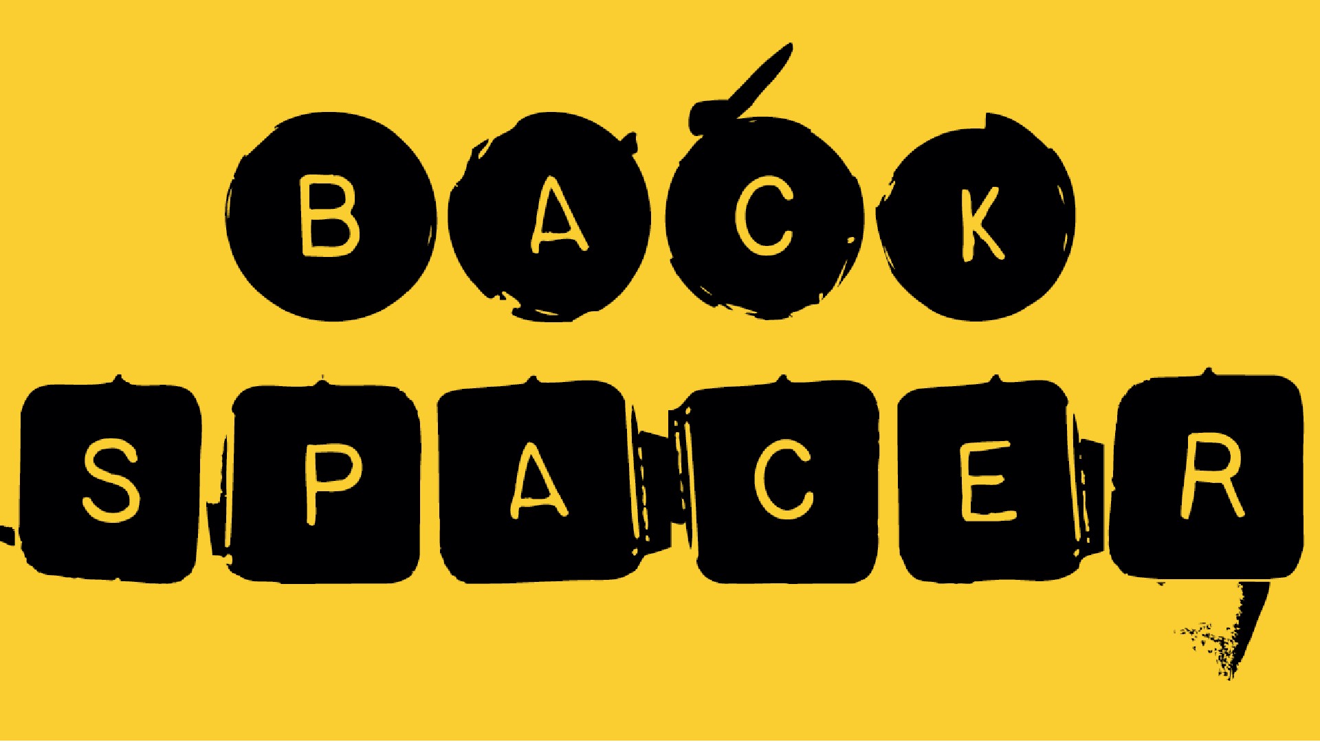
"The growing accessibility of computer hardware and font software during the '80s and '90s gave rise to what I would describe as typography’s punk movement," says graphic designer Martin Baillie. "Looking back through Emigre’s font collection spanning this period, there’s an anarchic feel to a lot of what was being made, with designers welding together serif, sans-serif, rounded, classical, modern and grungy forms."
One example is Backspacer, designed by Nancy Mazzei and Brian Kelly in 1993. Their inspiration came from an old typewriter they found in an abandoned lot in Brooklyn. After keeping the typewriter for two years, they decided to discard it, but kept the keys due to their beauty. The keys were eventually photographed, and these images became the foundation for the typeface.
"Backspacer has its letterforms embedded in blotchy circles and rectangles," says Martin. "For me, looking at this brings back memories of watching Lee and Herring’s Fist of Fun on the BBC, which had a similar type treatment in the opening titles."
04. F500 Ang-ular
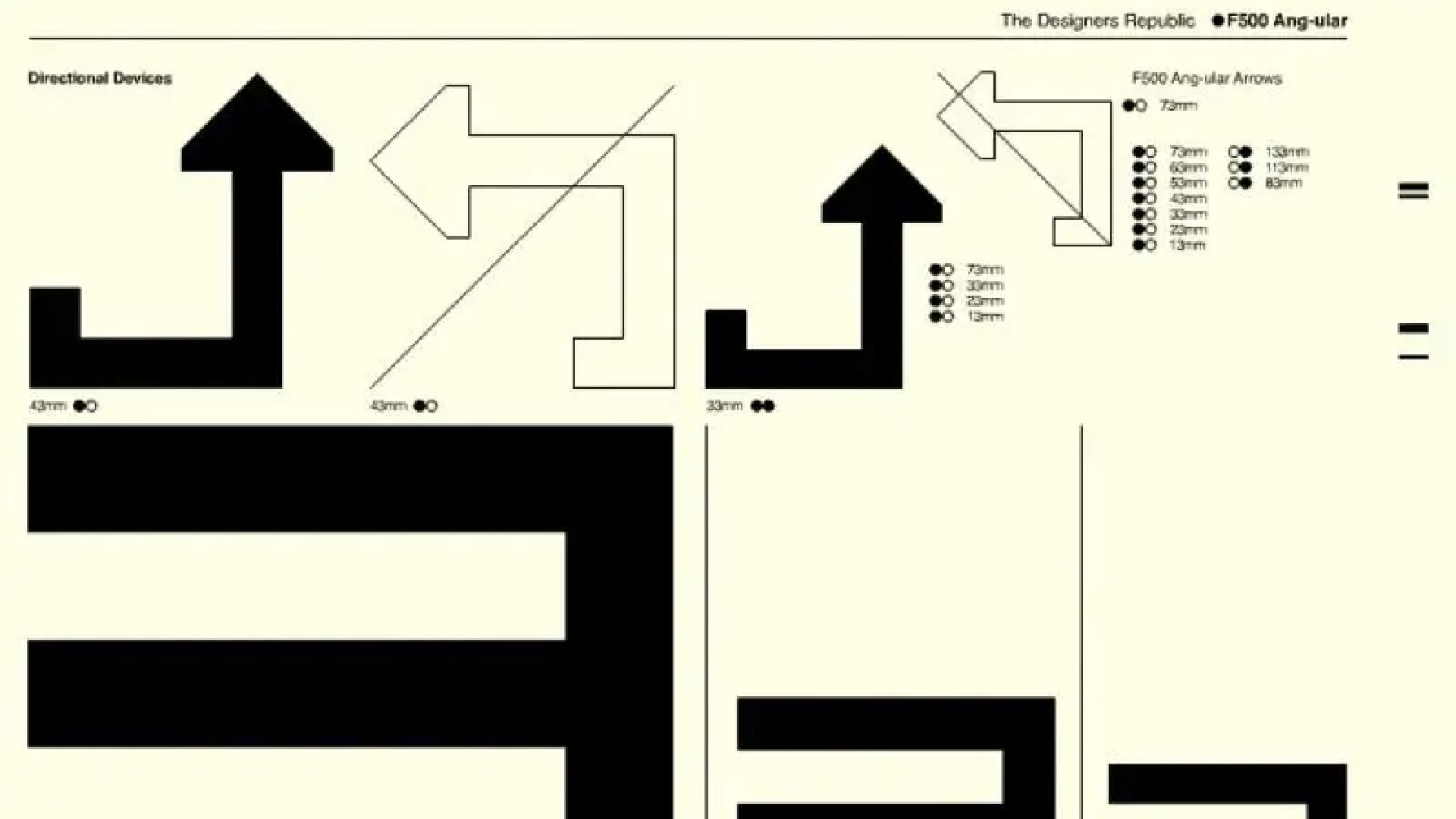
The 1990s were the decade when videogames transitioned from novelty kids' toy to major culture phenomenon, so we absolutely had to include a gaming font on this list. And Gianluca has picked a great one for us: F500 Ang-ular, created by The Designers Republic for the anti-gravity racing series Wipeout.
"The Designers Republic represents one of the most iconic and innovative studios of the 1990s," says Gianluca. "And this collaboration with the videogame publisher Psygnosis – which also included a pioneering visual identity – was a groundbreaking moment in video game design."
The F500 Ang-ular font, with its geometric and angular shapes, perfectly embodied the futuristic spirit of the game, contributing significantly to Wipeout's visual success. "The typography, along with the overall branding, marked a departure from traditional video game design, merging elements of graphic design, rave culture, and gaming into a unique fusion," explains Gianluca. "F500 Ang-ular is one of the fonts that best represents the visual experimentation of the '90s, and the work on Wipeout remains an outstanding example of how design and video games can innovate together."
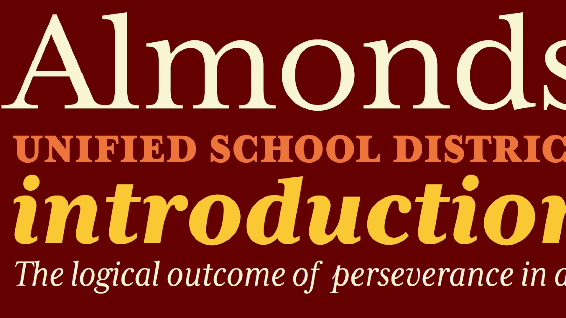
05. Didot
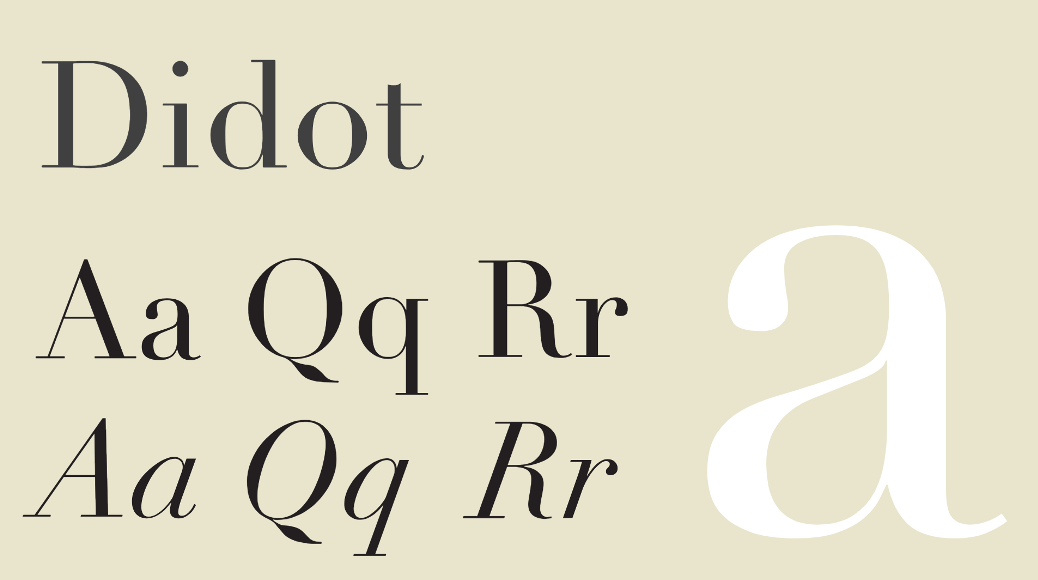
A classic of 19th century French typography, Didot was created between 1784 and 1811 by Firmin Didot of the famous French printing and type-producing Didot family. And it saw a big revival in the 1990s as it dovetailed with a decade in which attention turned away from the colourful gaudiness of the 1980s and back to the aspirational themes of high fashion and style.
"The high-contrast lines of Didot captivated the 90s with its presence in fashion, editorial design and luxury branding," explains Rosie Garschina, executive creative director of Trollbäck+Company. "Adopted by publications such as Vogue, Vanity Fair and Elle Magazine for high-gloss spreads, its long exaggerated hairlines conveyed a feeling of understated elegance. With a recent resurgence of '90s era design, Didot again maintains its relevance in recent brand work for Zara and Calvin Klein."
06. Missionary
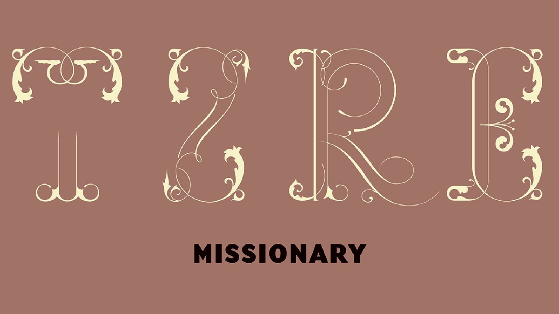
Designed by Miles Newlyn in 1991, Missionary is a novelty font that resembles the vernacular lettering of Celtic manuscripts from the Dark Ages, following the fall of the Roman Empire. It's a particular favourite of Simon Manchipp, founding partner at SomeOne. And he's known about it longer than most of us.
"In the '90s I was lucky enough to meet, work with and make a lifelong friend of Miles Newlyn while at St. Martins School of Art in Covent Garden," he says. "Whispers came through the college of a designer whose skills surpassed the norms and I sought him out at one of the shows put on in the Letheby gallery in Southhampton Row. There on the wall were the mad but beautifully crafted sketches for a typeface that was to become known as Missionary."
To this day, there is nothing like it
Simon Manchipp
This was a time of high typographic experimentation, and it wouldn’t be long until Simon saw the typeface, fully rendered and operational in the pages of Emigre Magazine, shipped over to London from California. "To this day, there is nothing like it," he maintains. "Almost impossible to use, the font takes digital mastery, technical flair and historical knowledge and mixes it all in a fontographer fuelled fountain.
"While Miles is now one of the best typographic designers on the planet, turning his hand to all manner of bluechip brand projects, Missionary remains the ultimate calling card," he adds, although he admits he's only used it once. "As a favour for a friend who wanted a tattoo, I took the capital letter 'O' and twisted it 90 degrees," he recalls. "It was designed to be about 3 inches across and on his arm. He liked it so much he had it enlarged and applied to his entire back."
07. Mrs Eaves
Mrs Eaves was designed by Zuzana Licko in 1996 and is based on the famous transitional serif Baskerville, originally designed in 1757. Named after John Baskerville's live-in housekeeper, Sarah Eaves, it was designed to soften the stark contrast of Baskerville's design. Zuzana Licko studied printed samples rather than the lead type models used in later Baskerville revivals, resulting in a version with heavier, more characterful strokes and reduced contrast.
It's a personal favourite of Steve Campion, creative director at Good Noise. "Mrs Eaves has many design traits that resonate with our studio’s aesthetic of being imperfect, yet pleasing," he explains. "It's elegant, with a feminine touch and full of personality. The overall feel is that it has loose spacing between the characters and, when set in a large body of text, can appear very open and not actually that easy to read. It does, however, have an undeniable charm. Interestingly, its designer never specified how Mrs Eaves should best be used.
"The font is popular on book covers and dust jackets, though we've found it works very well when used in shorter bursts of text," Steve adds. "In our work, we've utilised it a number of times for the body text of menus in high-end restaurants."
08. Aleph
Designed by Philippe Apeloig in 1994, Aleph is drawn on a basic calligraphic system inspired by Roger Excoffon’s 1952 typeface Banco. It has a sharp, modern look, contrasting with the historical approach of calligraphy, and its letters – composed of vertical strokes and slight curves – are never fully closed, as if halted mid-stroke.
"Aleph is a beautiful example of timeless graphic typography, without taking itself too seriously," enthuses designer Natasha Lucas. "Its forms are inspired by the gestures of the human hand, mimicking the calligraphic strokes of a broad nib pen. Despite these classical origins, Aleph is unexpected and striking, brutally constructed with minimal components and playful, rhythmic mark making. This tension between old and new makes Aleph’s origins elusive, feeling incredibly contemporary, even today."
09. Eagle
Font Bureau's Eagle was inspired by Morris Fuller Benton’s famous titling typeface, Eagle Bold: a symbol of American recovery drawn in 1933 for the National Recovery Administration. It design was started in 1989; then David Berlow designed a lowercase, finished the character set, and in 1990, added Eagle Book for setting text. In 1994, Jonathan Corum added Eagle Light and Eagle Black to form a full series.
"Famously used in the Cartoon Network logo, this font brings me a deep sense of nostalgia as a child of the 90s," says Natasha. "It appeared in some of the decade’s most iconic visuals, such as in the TOY of Toy Story’s logo. And while this bold, impactful font carries memories of that era for me – and probably for many others born in the 90s – it also has timeless qualities that would still work well in visual identity projects today."
For more explorations of design throughout the decades, see our logos of the decade and rebrands of the decade series.