The 1970s were a bold, transformative decade for design, and typography was no exception. As phototypesetting matured, designers found themselves freed from the physical constraints of metal type, enabling letters to touch, overlap, and interact in entirely new ways.
More generally, designers embraced the curves, flair, and experimental spirit of the time, giving rise to typography trends such as playful display fonts, chunky serif types, and futuristic styles.
We've spoken to leading typography experts to explore the decade's most influential and innovative typefaces. Read on to discover which one they picked, and why they remain a powerful source of inspiration for creatives today. For further inspiration, don't miss our guide to the best '70s logos or see this year's hottest type trends.
01. Baby Teeth
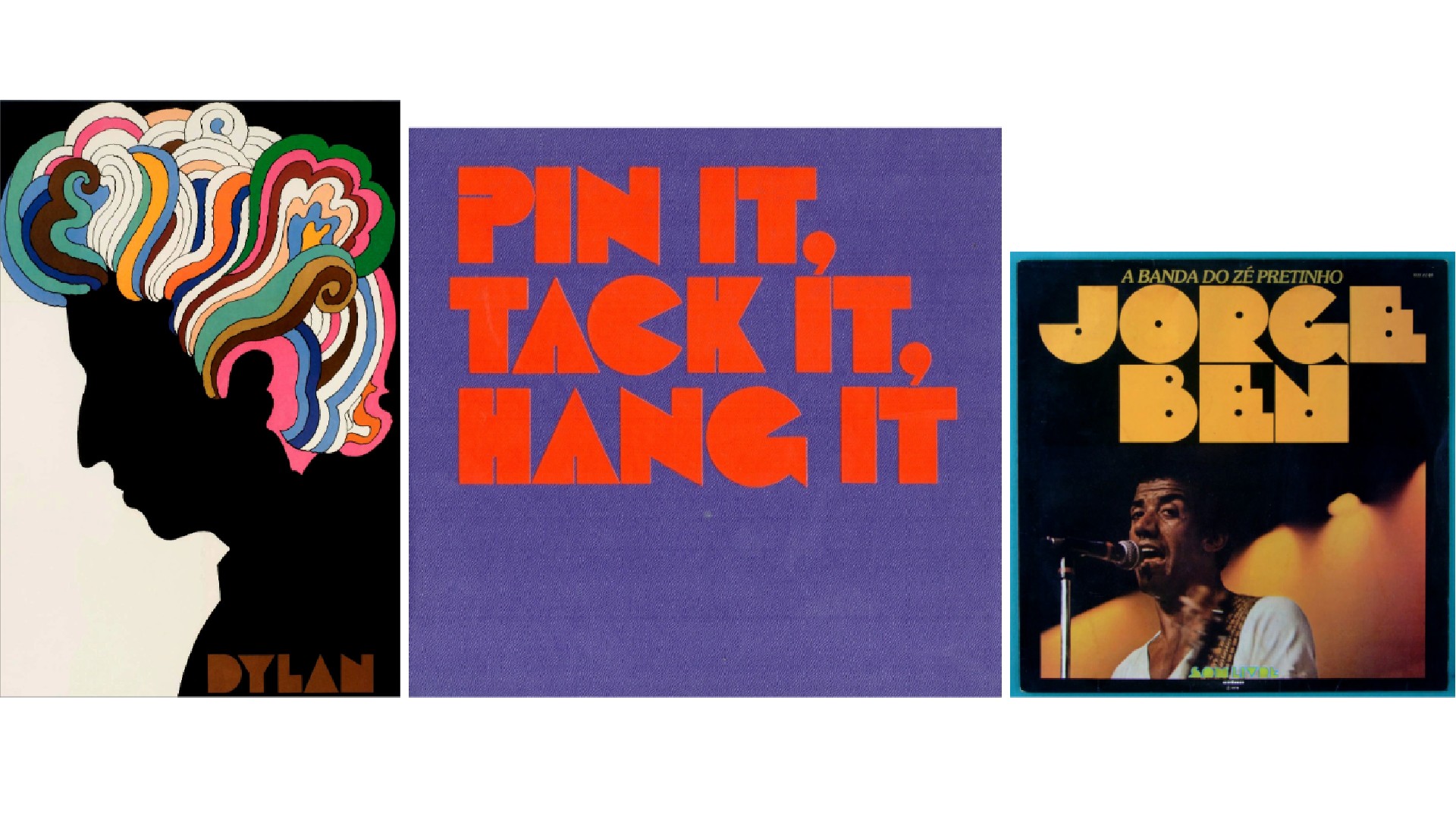
Famed New York creative Milton Glaser is one of those names that every graphic designer should recognise. But while he's best known for his 'I [Heart] New York logo, and work for Bob Dylan and DC Comics, he also crafted a fair few typefaces, and Baby Teeth was one of the most notable. Inspired by a hand-painted Mexican advertisement, it was released in 1968 and went on to become a defining typeface of the following decade's countercultural movements.
Jessica Walsh, creative director at Type of Feeling, is among its fans today. "Baby Teeth is a standout for me," she enthuses. "With its chunky, sans-serif design, which feels both playful and daring, it encapsulates the psychedelic aesthetic of the period. This typeface is a reminder that design can be both serious and fun."
02. Stop
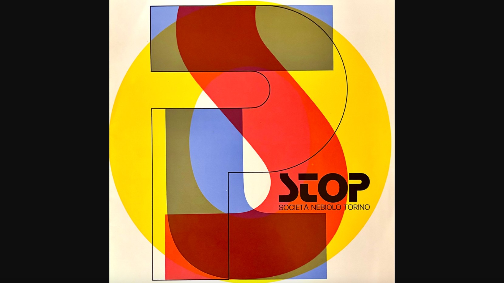
Released by the Nebiolo type foundry in Turin in 1970, Stop was one of the last typefaces produced in metal, yet its impact would be thoroughly modern. Designed by Aldo Novarese, it was launched on the market as a “new alphabetical sign… in the quest for new graphic ideas”. Its extremely stylised shapes letterforms were specifically designed to make attractive logos, initials and monograms.
As Landor's design director Gianluca Ciancaglini observes: "Stop is a prime example of modernist design, with its simple, geometric forms and stark contrasts. Each letter is a study in precision and balance, a testament to creator Novarese's meticulous approach, and radical departure from the ornate scripts of the past."
In short, while drawing inspiration from modernist principles, Stop exhibits a visual complexity that sets it apart. "Novarese, with his masterful hand, has created a balance between essential geometric forms and carefully crafted details that lend the typeface a distinctive personality," notes Gianluca. "It's a perfect example of how typography can be both rigorous and expressive."
03. ITC Avant Garde Gothic
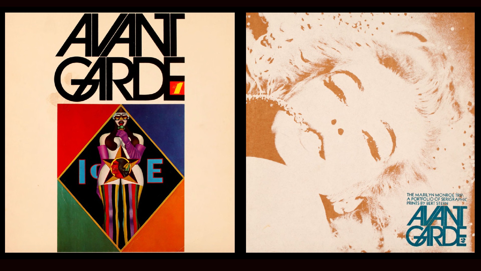
Designed by Herb Lubalin and Tom Carnase in 1970, ITC Avant Garde Gothic is a geometric sans serif font family. "It was based on a logo Lubalin designed for Avante Garde magazine, whose distinctive look came to define a specific era of graphic design in the 70s," explains Rosie Garschina, executive creative director of Trollbäck+Company,. "A suite of alternative ligatures creates several recognisable combinations that felt futuristic and forward-thinking at the time."
Gianluca is also a fan. "This sans-serif font masterfully combines a modern, minimalist aesthetic with a strong personality, profoundly influencing how we perceive typefaces," he enthuses. "It captures a spirit of a generation that was eager to break free from the constraints of the past and embrace the future."
Riccardo De Franceschi, creative director at Dalton Maag, adds that its release came at a pivotal time for type technology. "From the mid-20th century, first photocomposition and then dry transfer lettering freed fonts for the first time in history from their physical constraints," he explains. "Letters could finally touch and overlap, and ITC Avant Garde Gothic was designed to make the most of these technological innovations."
In practice, that meant that: "Round strokes were allowed to touch the next letter. Straight vertical stems were separated by a very fine space, as were the diagonals of the 45-degree slanted alternate shapes for 'A', 'M', 'V', and 'W'. This extremely tight rhythm is punctuated by the large circular counters of letters like 'O' and 'D'. A range of innovative ligatures are at the core of the set, including interlocking and nested uppercases – something that 'nobody had ever fooled around with', as Lubalin himself put it."
04. Trooper Roman
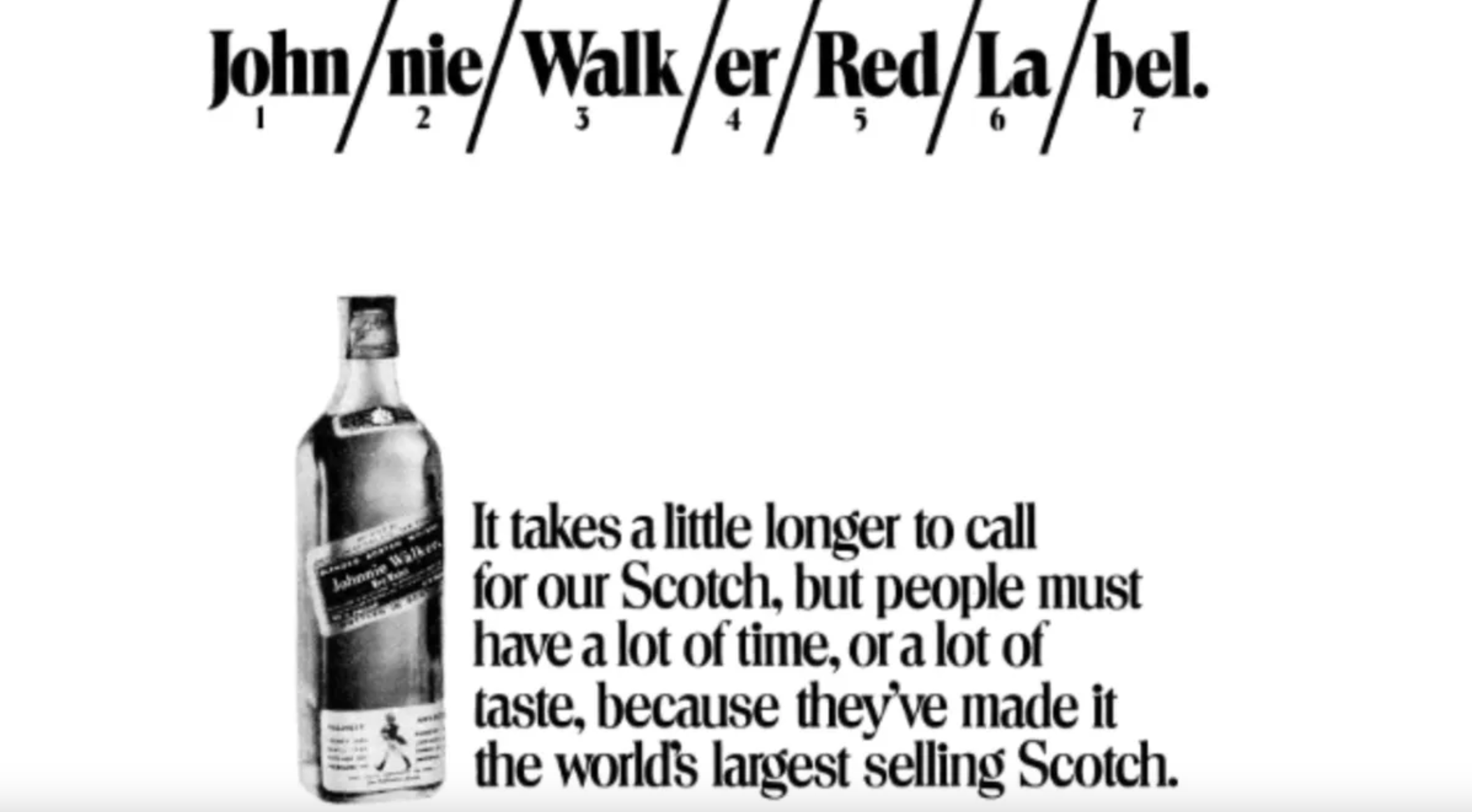
Created by Dave Trooper in 1974, Trooper Roman is a Didone display face that exemplified the new possibilities of phototype technology. Thierry Blancpain, co-founder of Grilli Type, reflects on why it made such an impact.
"Trooper Roman is a classic 70s design that brings so much flavour to the table," he says. "Design elements like the tall x-height and the short, stubby serifs create a high impact and most importantly fun impression.
"It was designed for VGC, creator of a phototype machine that allowed for headline typeface setting," Thierry adds. "These machines allowed for resizing, scaling, squeezing and expanding typefaces on the fly, in a way that was totally new to the design world, coming as it was from metal and wood type."
05. Cooper Black
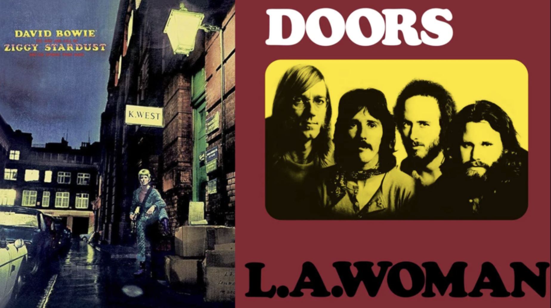
Cooper Black is an ultra-bold serif typeface intended for display use, which was designed by Oswald Bruce Cooper and released by the Barnhart Brothers & Spindler type foundry in 1922. But it really came into its own within the counterculture of the 1960s and 1970s, with its distinctive rounded shapes and thick strokes perfectly captured the era's rebellious spirit.
This typeface wasn't just visually striking; it was versatile, used for everything from ads to album covers, such as The Doors' L.A. Woman and David Bowie's Ziggy Stardust. Towards the end of the decade, it also became popular with the emerging hip-hop movement.
Its popularity has persisted, and in 2017, The Guardian named it as the most fashionable font due to its use by fashion brands such as Topshop and Pull and Bear. Cooper Black's distinctive style continues to be used in various design applications, from posters to branding and packaging, and it's typically used to evoke a sense of nostalgia or to add a playful, eye-catching element to a design.
06. Calypso
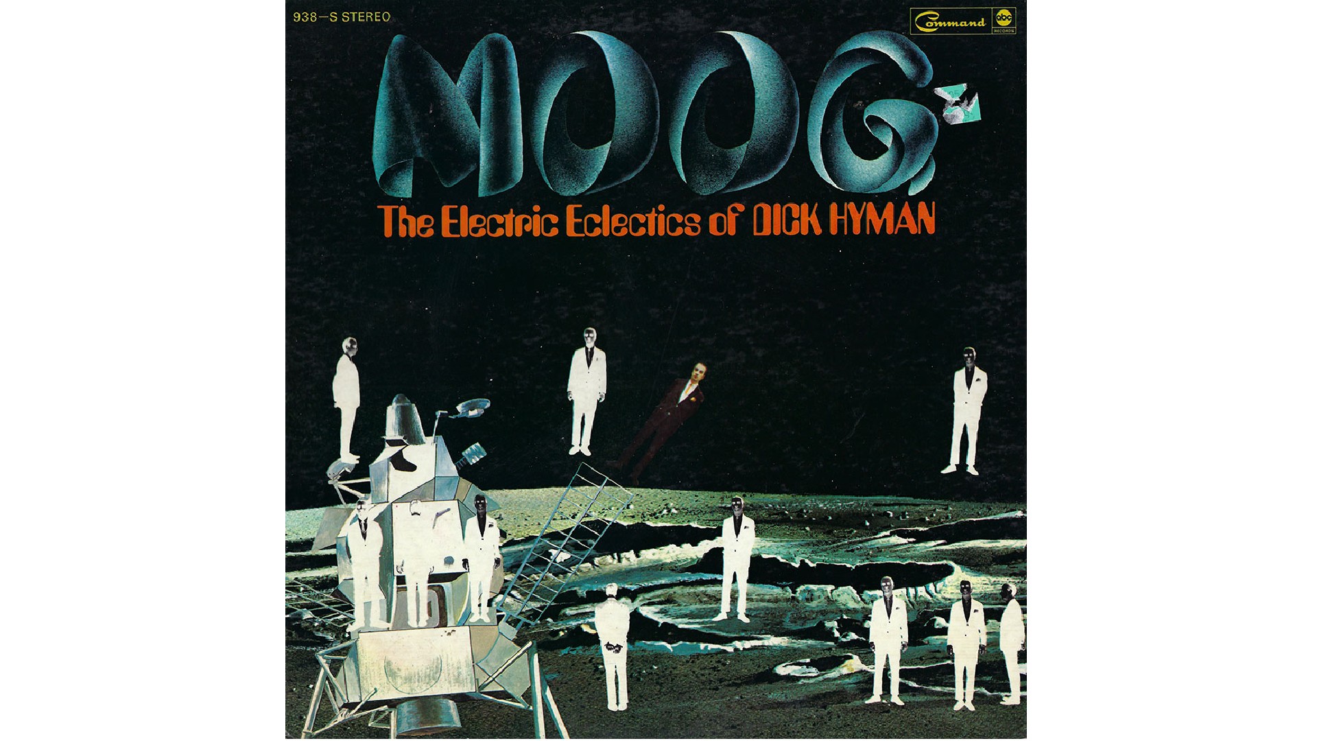
Designed by by Roger Excoffon, produced with the help of José Mendoza y Almeida, and released by Fonderie Olive, Calypso is an experimental display typeface with curvaceous and alluring features that could be likened to pop art. Using a pair of compasses, every character was meticulously hand-drawn dot by dot. Though designed in 1958, it found its true spiritual home in the experimental 1970s.
As Simon Manchipp, founding partner at SomeOne, explains: "The '60s' trippy edge might have been fading, but there were still a few notable moments of typographic radicalism in the '70s. And this three-dimensional, dot screen, halftone stonker is my pick of the bunch. What a wild ride this collections of letterforms gives.
"Much like the BrandWorld thinking we invented at SomeOne, Roger Excoffon created a unique typographic world," he continues. "Not content with providing a set of 3D sculptural forms, there’s also a flat version which is pretty mad, and a line version that’s madder.
"It’s radical design stuff, but when paired with an album titled Moog (1969) from an artist who’s name could well be illegal, with an opening track called ‘Topless dancers of Corfu’, the die had been cast for these bonkers beziers."
07. Frutiger
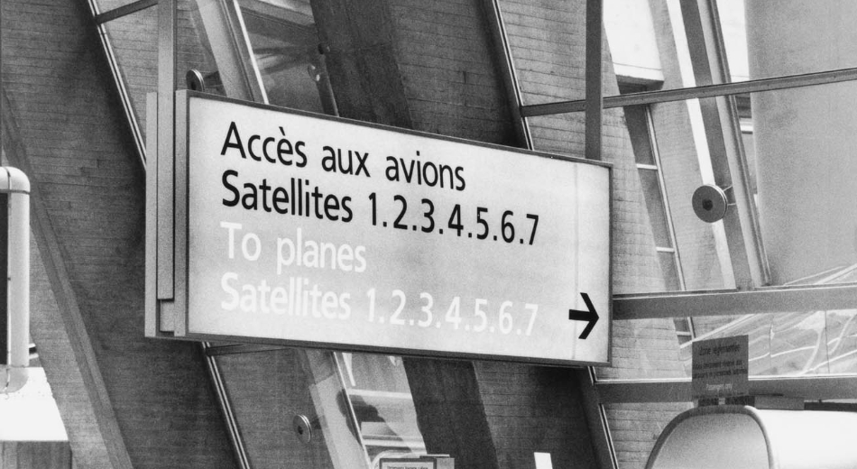
In 1970, renowned Swiss type designer Adrian Frutiger was commissioned to create a signage system for the newly built Charles de Gaulle Airport in Paris. The airport's vast expanse and complex layout demanded a typeface that was both legible and visually appealing, even at a distance.
The result was the sans-serif typeface Frutiger. Its design philosophy is rooted in clarity and functionality. a typeface that can be easily read, even under challenging conditions, while also possessing a distinct aesthetic appeal.
Its success at Charles de Gaulle Airport quickly propelled it to international recognition, and its versatility, clarity and elegance made it a popular choice for a wide range of applications, from print to digital design. Today, its impact can be seen in countless design projects around the world, from corporate branding to wayfinding systems.
08. ITC Serif Gothic
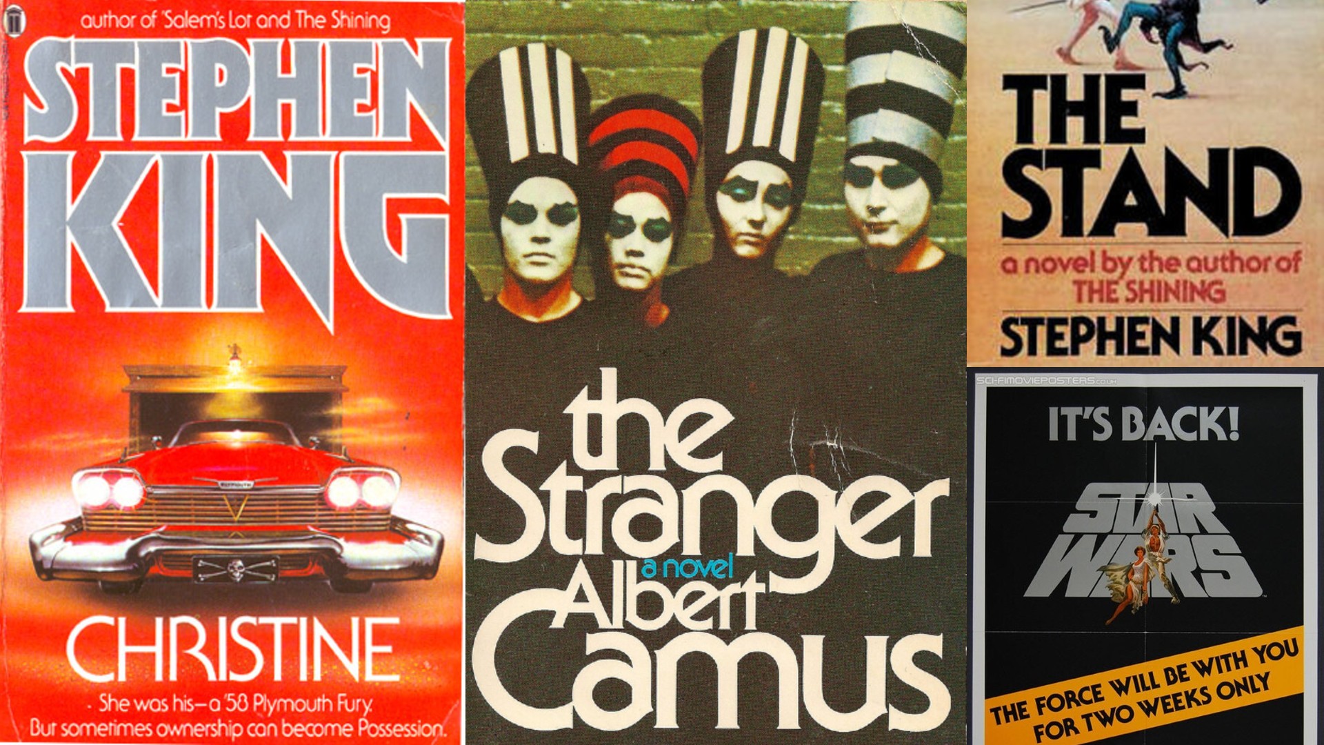
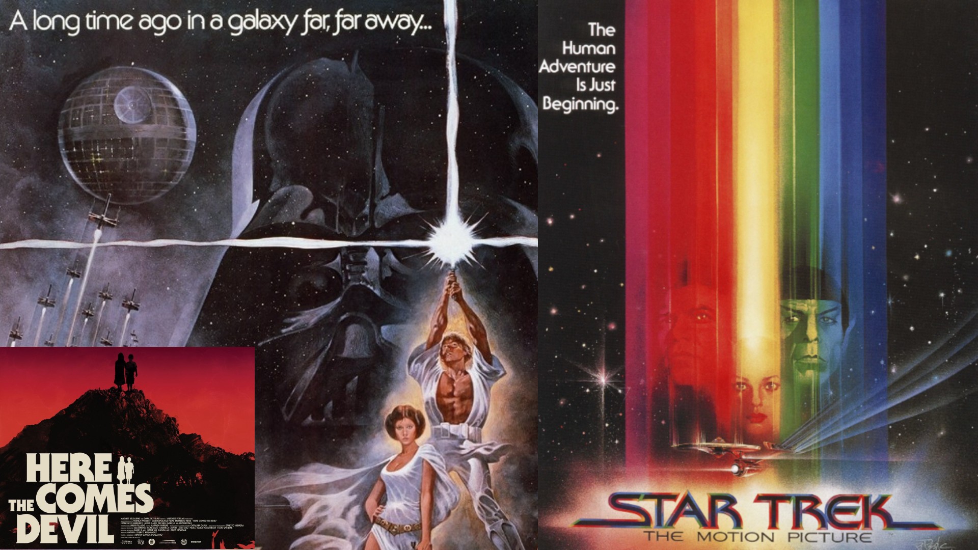
Created by Herb Lubalin and Tony Di Spigna in 1972, ITC Serif Gothic began as a rejected logo sketch before becoming a sci-fi icon, best known for its use on the original Star Wars posters.
For Gary Whitworth, designer at The Chase, it has an immediate emotional impact. "ITC Serif Gothic is the ultimate icon of 70s typography in my eyes," he raves. "The mere sight of it transports me into another world, or should I say universe, of aliens and creatures from beyond.
Popular within the sci-fi world that exploded in the 70s, its chunky features and sharp serifs became a visual shorthand to me, which said much like the typeface itself: you were about to experience something unexpected, but memorable.
"In the end," he adds, "it's become the cornerstone of a 70s aesthetic that still remains hugely popular today. Star Wars, Star Trek, Stephen King, Isaac Asimov, Halloween and numerous other covers and posters were all elevated by its cinematic presence. Not bad for a reject."
For more type nostalgia, see the rest of our typography of the decade series.


