The 1950s were a transformative decade for the Western World. As post-war economies flourished in North America and many European countries, the rise of mass production and advertising led to a booming consumer culture, with new appliances, cars, and other goods becoming increasingly available.
It was also a time that saw type design embrace new technologies and Modernist principles. Most notable of the era's typography trends was the rise of the International Typographic Style, a movement originating in Switzerland that emphasised clarity, objectivity and functionality.
For this article, we've gathered the opinion of the experts to collate the most iconic typefaces of the 1950s, each with its own unique story and influence on the modern day. To learn more, read our full typography of the decade series, or for what's hot in type right now, see our type trends 2025 piece.
01. Courier
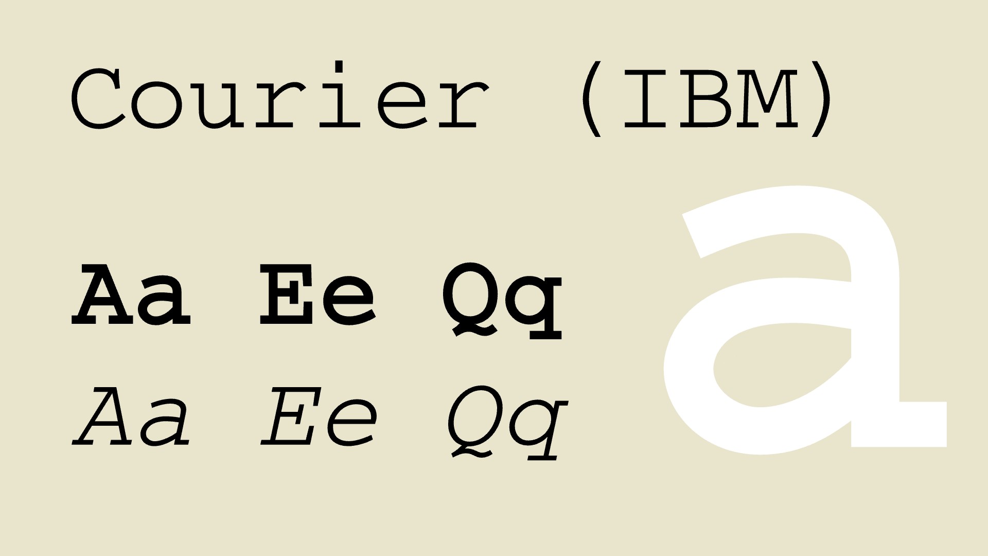
Courier is synonymous with screenwriting and more broadly, the utilitarian aesthetic of mid-century communication. This monospaced slab serif was created to mimic the output of a typewriter, ensuring every character occupied the same horizontal space. This feature made it ideal for aligning columns of text, whether in coding, screenwriting, or tabular data.
"In the late 1950s Courier became the typewriter font," explains Jack Walker, head of art at FCB London. "Monospaced, no frills, and built to get the job done; the standard for everything from office memos to Hollywood scripts. It’s a great example of functional design that's stuck around.
"At a time when script and calligraphic typefaces were overly fussy and clamouring for attention, Courier’s purposeful simplicity made it stand apart," adds Sheetal Schofield, creative director at Brandwidth. "Where other fonts sought to dazzle, Courier exuded a quiet confidence and effortless legibility, inviting you to channel your inner screenwriter, secretary or secret spy.
In today's digital world, she adds, Courier provides a sense of nostalgia, history and craftsmanship. "It allows writers, designers and creators to capture the feeling of typing on a vintage typewriter. It can transport us back to a time when each keystroke carried weight, and the sound of the typewriter meant ideas were coming to life. Courier remains widely used to this day, serving as a reminder that simplicity, when done right, never goes out of style."
02. Transport
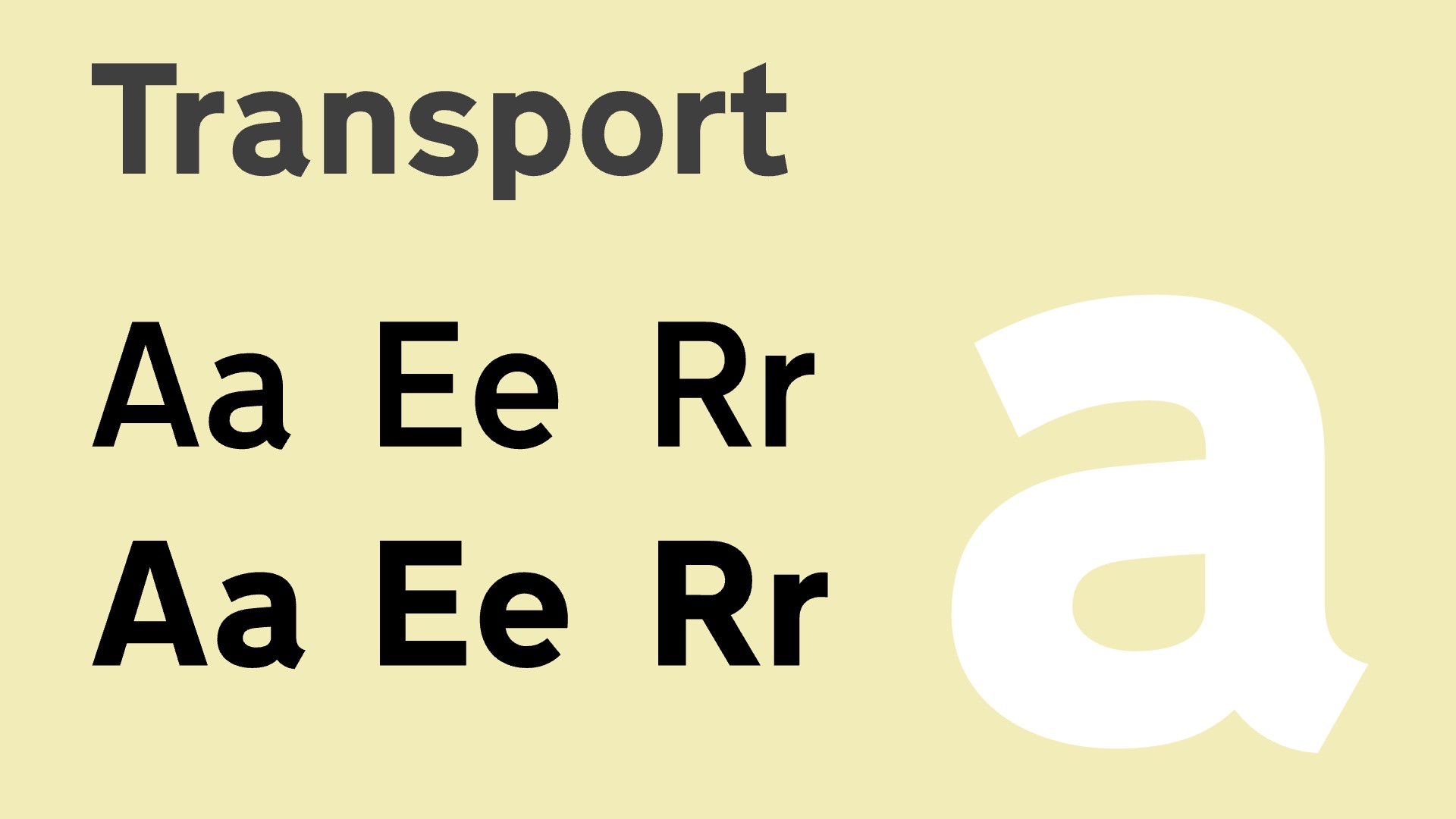
At the start of the 1950s, British road signs featured inconsistent alphabets that were often difficult to read at speed. All that changed, in part thanks to the creation of Transport, a groundbreaking sans-serif typeface.
Transport was commissioned by the Department of Transport as part of the Anderson and Worboys Committees' efforts to modernise and standardise British road signage. It was crafted by between 1957 and 1963 by Jock Kinneir and Margaret Calvert, who also redesigned many of the road signs themselves.
The pair drew inspiration from European signage but aimed for a more legible and user-friendly design. Transport introduced distinctive letterforms, such as a rounded "a" and a unique tail on "t," ensuring clarity even in poor weather or at high speeds. The typeface was released in two weights: Transport Medium, used for white text on dark backgrounds, and Transport Heavy, designed for black text on light backgrounds.
"Transport is one of those fonts you don’t notice, but you’d be lost without," notes Harry Sandhu, senior creative director at Jung von Matt London. "Designed to be easy to read at high speeds, it’s still the face of all UK road signs today. A good reminder that some of the best designs don’t always have to shout to work seamlessly."
03. Vendôme

Designed by François Ganeau in collaboration with Roger Excoffon, Vendôme debuted in 1951 through the French type foundry Fonderie Olive. While officially credited to Ganeau, Excoffon's influence is evident in its dynamic and expressive character, marking it as a quintessential mid-century typeface.
Vendôme combines traditional serif characteristics with a modernist sensibility, featuring sharp, angular serifs and fluid curves. Its elegance and personality made it a favourite for advertising, book covers, and theatrical posters in the 1950s. The typeface was issued in multiple styles, including a condensed version released in 1954, which brought versatility to its use.
"Vendôme took inspiration from old French Renaissance script and created something with a fresher, bolder feel," explains Jack. "Originally for books, it quickly found a home in advertising because it had that rare mix of sophistication and edge. Rooted in tradition but still able to grab attention. It’s one of those typefaces that feels modern, even today."
04. Akzidenz-Grotesk
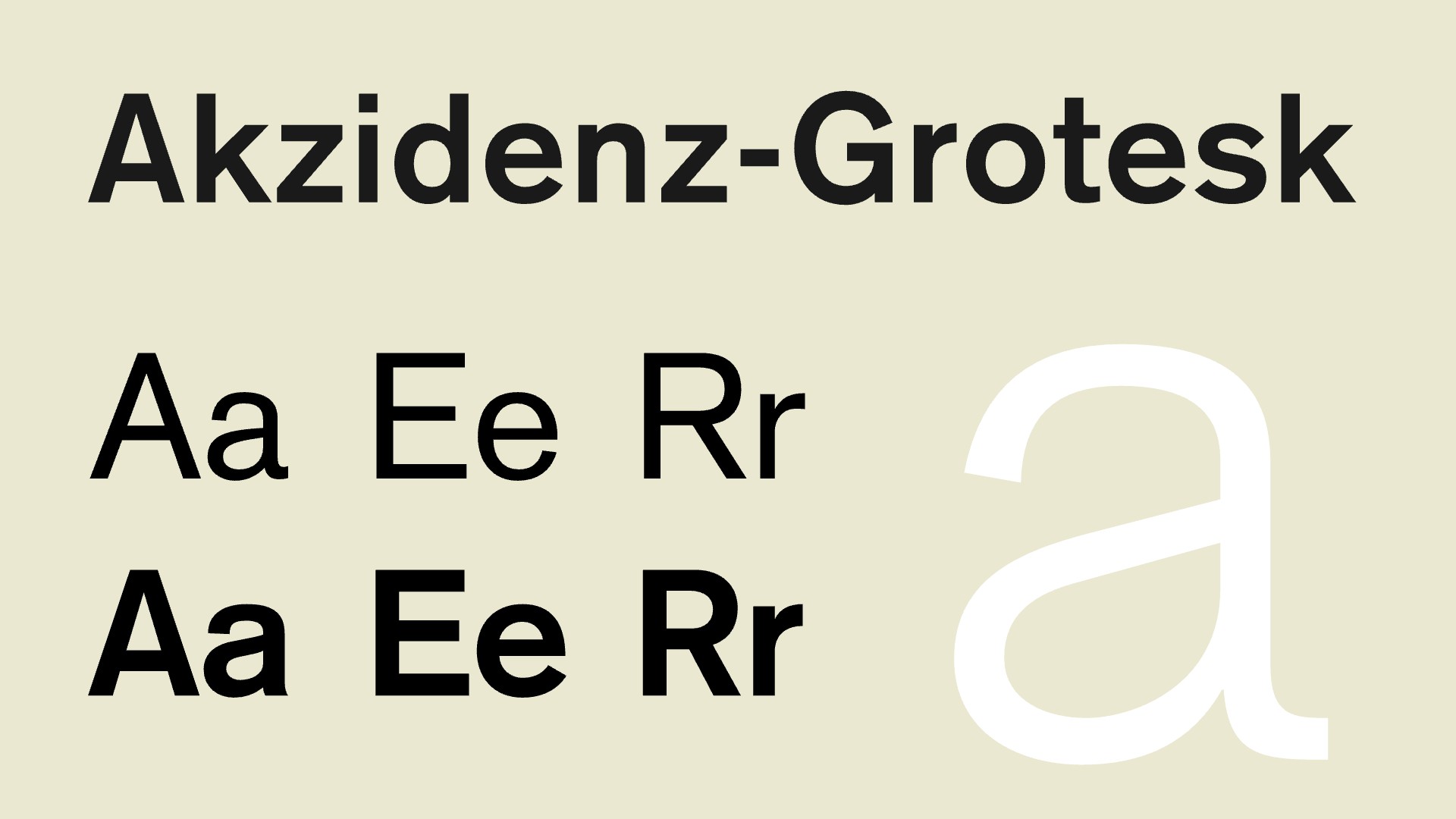
Akzidenz-Grotesk, originally released in 1898 by the Berthold Type Foundry, found renewed prominence in the 1950s. This sans-serif typeface, with its neutral and unadorned design, became a favourite among Swiss graphic designers such as Josef Müller-Brockmann and Armin Hofmann.
The typeface's strength lies in its simplicity and functional clarity. Its even weight distribution, subtle curves, and lack of ornamentation made it a versatile tool for everything from signage to editorial layouts.
By the 1950s, Akzidenz-Grotesk had become the foundation for a new wave of neo-grotesque typefaces. As Harry notes: "Helvetica didn’t appear in a vacuum. Earlier in the decade, Akzidenz-Grotesk laid the groundwork. Functional and groundbreaking, it shaped the International Typographic Style, setting the stage for Helvetica’s dominance."
05. Helvetica
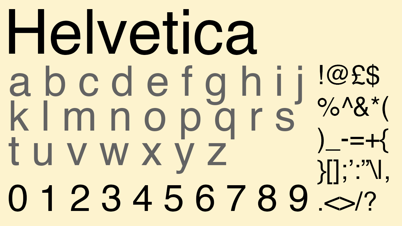
Which leads us on naturally to Helvetica itself. Created by Max Miedinger and Eduard Hoffmann, Helvetica is one of the most influential typefaces in history. Developed at the Haas Type Foundry in Switzerland, this sans-serif font was designed to provide clarity and versatility, with a high x-height, tight spacing, and minimal ornamentation. And the timing couldn't have been better.
"The 1950s were advertising’s golden age," explains Harry. "And Helvetica, born in 1957, changed everything. Its neutrality and precision didn’t shout; it persuaded. Helvetica stripped away the unnecessary, letting brands speak with clarity and confidence. It wasn’t just a typeface, it was modernity, a tool for brands to mean something."
Wayne Deakin, global principal at Wolff Olins, couldn't agree more. "Originally named Neue Haas Grotesk, Helvetica defined modernism with its clean, versatile sans-serif style," he enthuses. "Today, it’s a cornerstone of branding, signage, and design."
06. Cooper Black
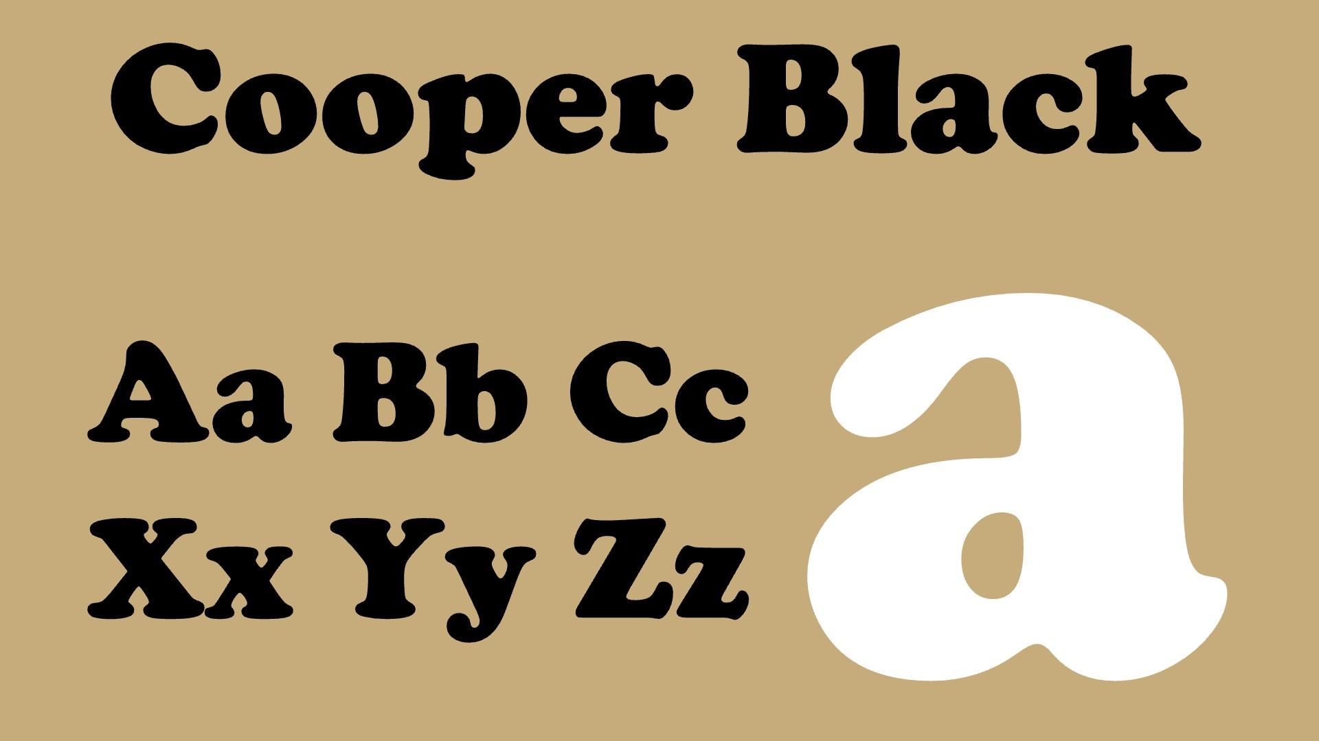
Cooper Black is an ultra-bold typeface intended for display use that was designed by Oswald Bruce Cooper and released by the Barnhart Brothers & Spindler type foundry in 1922. It was revived mid-century and became hugely popular. Its bold weight made it highly legible in advertising and headlines, where it commanded attention, and its strong, confident lines complemented the sleek shapes of automobiles, furniture, and architecture of the era
"A more expressive alternative to Helvetica, this bold, rounded serif exudes charm," says Wayne. "Famously used by brands like EasyJet and Campbell’s Soup in the 1950s, it also graced The Beach Boys' Pet Sounds album cover. Today, its warmth and retro appeal make it perfect for brands seeking a friendly, memorable identity."
07. Microgramma
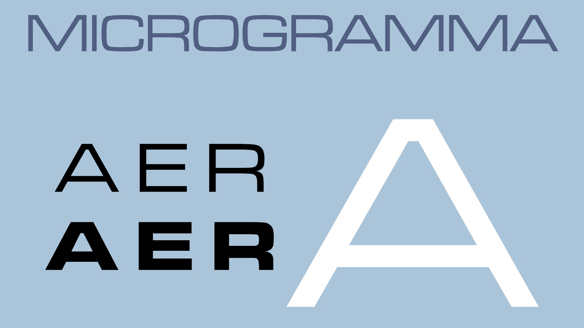
Designed in 1952 by Aldo Novarese and Alessandro Butti, Microgramma is a sans-serif typeface characterized by bold, geometric forms and extended letterforms, giving it a bold and modern appearance. And it's a font that Brendán Murphy, global creative director at Lippincott, feels a strong personal connection to.
"My uncle was a draftsman for Dublin Corporation," he recalls. "As a birthday gift, he gave me a set of Faber-Castell Soft Pastels in an elegant wooden case, and some cast-off Letraset dry-transfer alphabet sheets, one of which was Microgramma. The first thing I did with this brutish font was to hand set my name on the wooden case. It was an ugly and out of character pairing, but an effective hands-off warning to my younger siblings: these are not play crayons!
"More draftsman than artist, Microgramma is more mechanical and technical," he continues. "It has a wide stance like the hollow concrete blocks used to build Irish houses. Later as a junior designer in the 1980s, I used it for its then 'futuristic' voice, heralding the promise of the new digital age signalled by the introduction of Sinclair and Commodore computers."
08. The lettering of Saul Bass
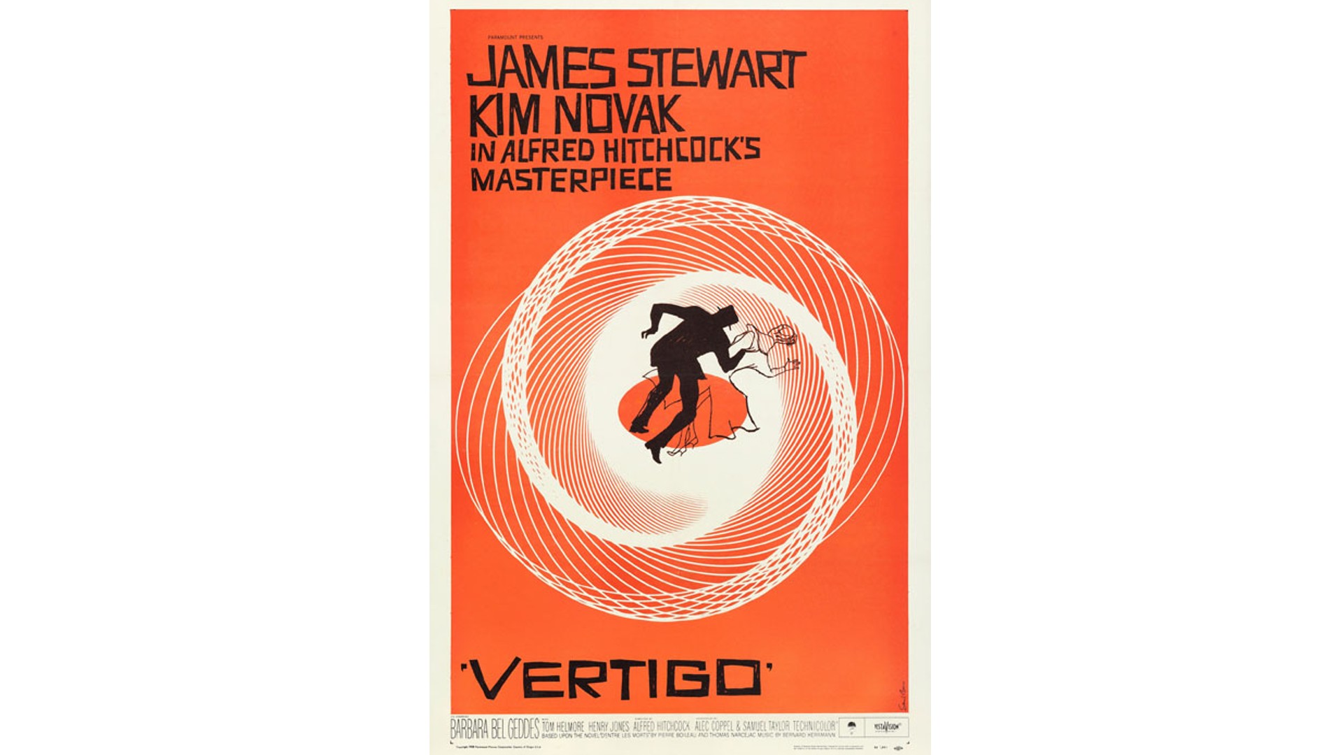
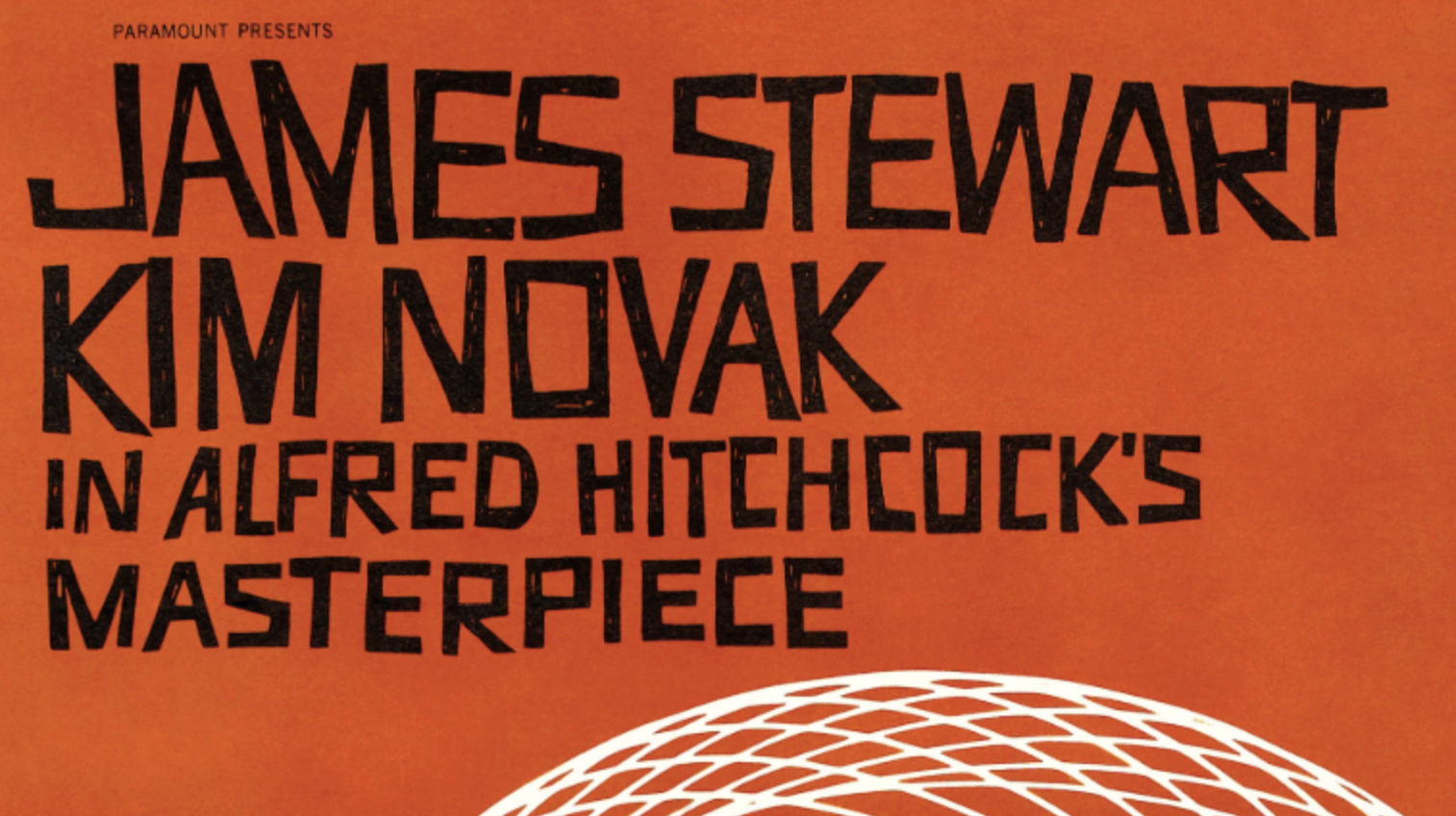
We'll end, not with another font, but something equally important... As SomeOne founder Simon Manchipp points out: "Surely the greatest typography of the 1950s isn’t a typeface at all, but came from the pen of Saul Bass. His style of custom lettering defined an age and pioneered a new approach in visual communication."
A revered name in typography to this day, Saul Bass was an American graphic designer and filmmaker who revolutionised the use of typography in film title sequences during the 1950s. Before he came on the scene, film titles were typically static and uninspired, simply listing the credits on a black screen. Bass, however, saw an opportunity to use typography as a dynamic and expressive element to enhance the cinematic experience.
Along with his iconic posters, he pioneered the use of kinetic typography, where text moved and transformed on screen, often in conjunction with abstract imagery and music, to create visually stunning and emotionally resonant title sequences.
"‘Thinking made visual’ is the quote you’ll hear from him and it’s bang on," enthuses Simon. "I shared a punt with him in Cambridge once and he was a very memorable man. Great moustache too. The way he made typography do all the work is still a great steer for the designers of today. It cut through the visual noise of the 50s and it does the same today. A visionary approach to typography and its application."
If you love delving into history, don't miss our logos of the decade and adverts of the decade series.


