The 1920s saw incredible transformation in typography and graphics more broadly. It was, in fact, the decade when the term ‘graphic design’ was first coined in 1922 by William Addison Dwiggins to describe his book design process, which combined typesetting, illustration and design. With the end of WWI, Bauhaus marked graphic design becoming an academic discipline and profession, and Art Nouveau’s curves evolved into the geometric styles of Art Deco. Towards the end of the decade, the New Typography movement, first outlined by designer Jan Tschichold, brought about a rejection of the classical rules of typographic symmetry.
As these new principles took hold, it opened up limitless possibilities for composition, communication and artistic expression. So, let’s jump in and take a look at some of the most iconic typefaces of the decade, as chosen by typographers, designers and industry experts. For more inspiration for your next type project, check out the best typography of the decade series and the type trends to watch in 2025.
01. Futura
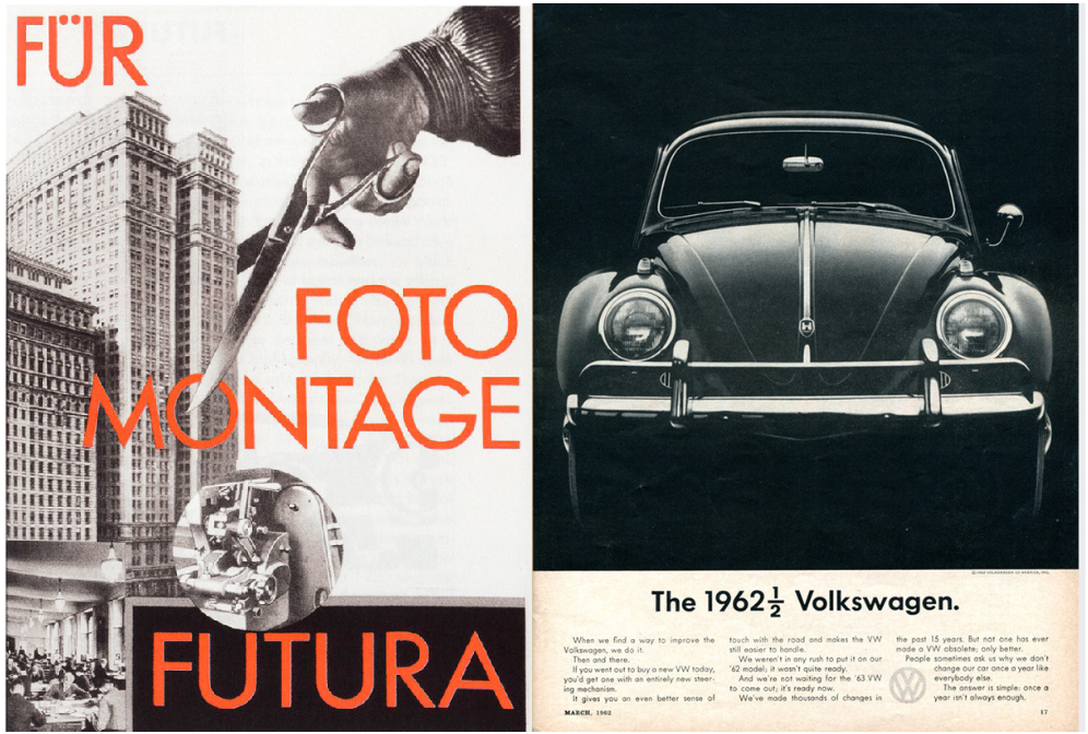
One of the most popular typefaces of the decade, among those we spoke to for this article, was geometric sans-serif Futura, designed by Paul Renner and released commercially in 1927.
“Following the Futurist and Dadaist movements, artistic creations tended towards reconstruction, characterised by both experimentation and rationalisation. Certain movements – such as the development of geometric characters and the New Typography – are at the forefront of this restructuring with a functional aim. Certain countries like Germany played an active role – it was there that the famous Futura was born, and that Tschichold became a driving force of the New Typography,” says Damien Collot, creative type director of Monotype.
“The first research leading to the creation of Futura is a source of inspiration for the diversity it offers and the extreme manipulation of letter forms, which demonstrates the full potential of expression in the Latin script,” Damien continues. “Even though most of these shapes have not stood the test of time, the reasons why Futura was created a century ago are the same reasons why it is chosen today: for its ability to express construction, structure, system, logic, simplification, reinvention and innovation. The proof lies in all the examples of its use that we find throughout history in various applications and fields, across cinema, fashion, automotive and publishing.”
London-based designer Laura Foley agrees that Futura’s strength is demonstrated by its continued popularity and versatility. “I’ve always liked Futura because it’s simple but still has a lot of personality. It’s really clean and easy to read which makes it work in so many different formats,” she says. “It’s been used for some pretty iconic brands too, such as Volkswagen and IKEA. Even though it was designed in the late 1920s, it still feels modern and fresh today.”
It’s the true standout of the decade, according to design director Danielle Tallon. “The Bauhaus movement had a big influence on the art scene in the 1920s. This design style is known for its abstract, angular, and geometric shapes,” she says. “Its use of circles and clean lines evoke a similar aesthetic to the Bauhaus design style. Originally marketed by The Bauer Type Foundry as the ‘font of the future’, Futura’s timeless geometric forms make it a favourite among many brands and designers to this day.”
Abigail Baldwin, director at design agency Buttercrumble, agrees it feels as bold and modern as it would have done when it was first released. “Futura epitomises modernist typography. It was groundbreaking for its time,” says “Its geometric shapes and clean lines reflect the Bauhaus movement's focus on functionality and minimalism. We love using Futura because it still looks fresh and timeless. It’s always effortlessly stylish.”
02. Erbar-Grotesk
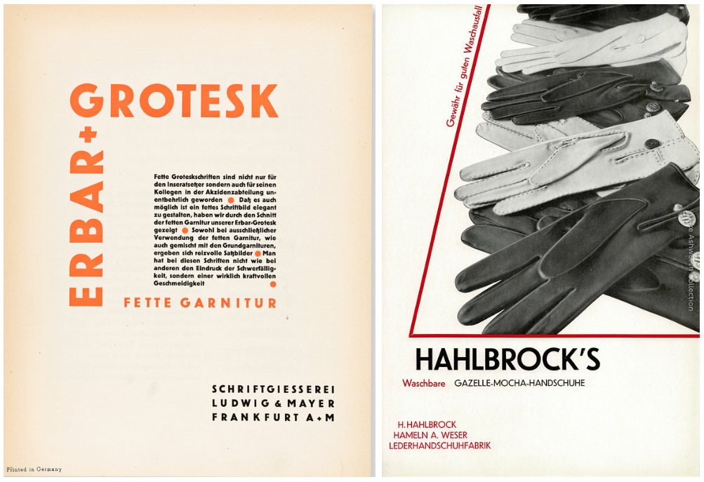
“Erbar-Grotesk holds a significant place in the history of typography as quite possibly the earliest example of a fully realised geometric sans-serif to become commercially available. Created during the interwar period, it reflects the optimistic spirit of modernism and the Bauhaus movement, emphasising simplicity, functionality and clarity,” says Stuart Brown, type designer and typographer. “Its clean, geometric lines and minimalistic design made it a precursor to later iconic typefaces like Futura and Helvetica that came to dominate 20th-century graphic design. Unlike its successors, however, Erbar-Grotesk retains a slightly softer and less rigid aesthetic, lending it a unique warmth and charm.”
Created by Jakob Erbar, a German type designer and teacher, and released in 1926 by the Ludwig & Mayer foundry in Frankfurt, it's a good example of the era's transformation of sans-serif grotesques into more purely geometric typefaces, with circular forms, hard angles, and evenly weighted strokes.
“Erbar aimed to create a typeface that embraced the principles of modernity while remaining highly readable,” Stuart continues. “The classical proportions and uniform stroke weights of Erbar-Grotesk demonstrate a focus on harmony and balance, eschewing decorative flourishes in favour of unembellished functionality. It was well-received at the time and widely used in interwar advertising and editorial design. Though today it may not enjoy the same level of ubiquity as Futura, Erbar-Grotesk's influence is unmistakable, marking a pivotal moment in the evolution of sans-serif typography.”
Josh Berta, associate partner and executive creative director at VSA Partners, agrees that, while not widely known, Erbar is worthy of recognition. “Its principles of neutrality and legibility gave rise to generations of typefaces,” he says. “At the time it was considered very modern and sleek, though using it nowadays – or its contemporary redesign, Dunbar – would feel decidedly retro. Ironically, that retro feeling now positions it as a distinct choice that is no longer neutral but instead has a quirky, hip personality.”
03. Broadway
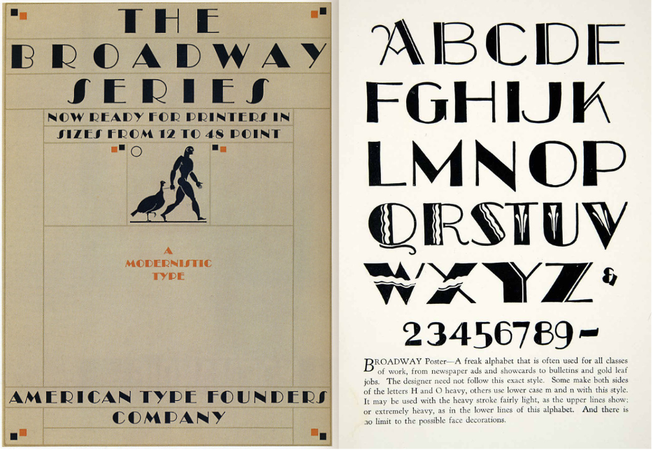
This next Art Deco classic, popular in poster design at the time, is a favourite of the decade for Carol Wahler, executive director of The Type Directors Club, an organisation cataloguing and showcasing typography globally. Decorative and theatrical, it saw several iterations after its first all-caps release,.
“One typeface of the 1920s that stands out is Broadway, designed in 1927-1928 by Morris Fuller Benton for American Type Foundry,” she says. “In 1929, Sol Hess added the lowercase for Monotype. This typeface always stands out as a representative of the Art Deco period. It has been used on many record albums, book covers and, of course, theatre. It is truly iconic.”
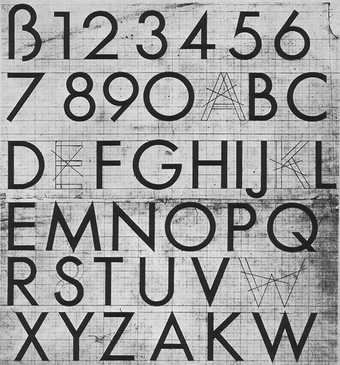
04. Universal
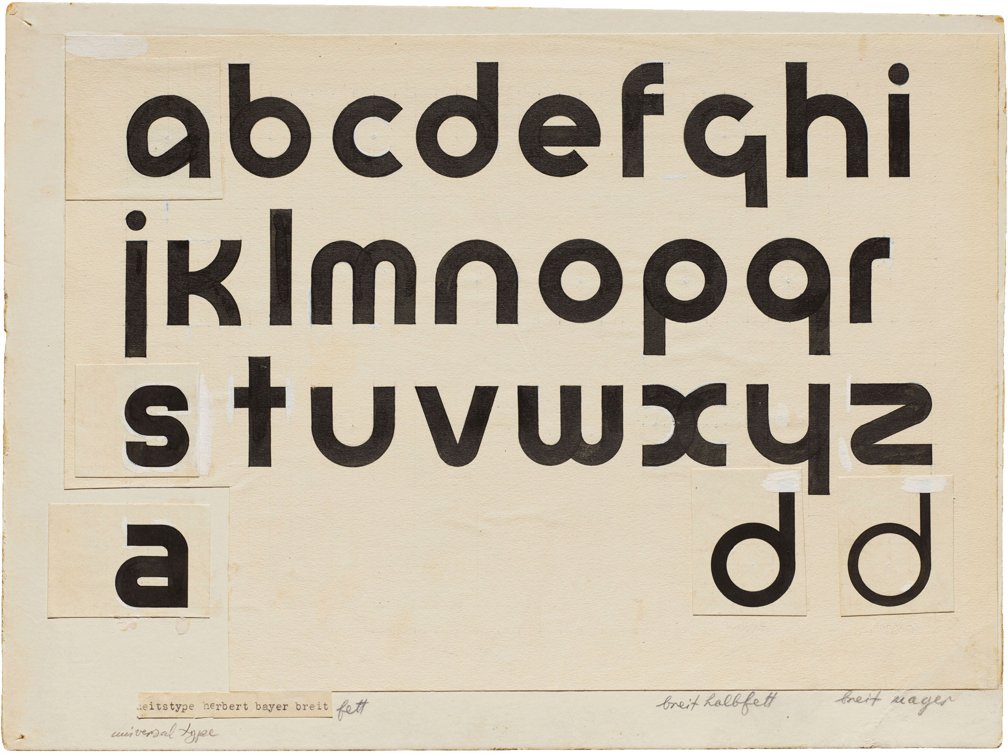
Looking more closely at the dominance of the Bauhaus School design aesthetic, Chris Page, founder of design agency Jelly and its type department head, highlights the movements disregard for the previously rigid rules for type and lettering, which were replaced by a more radical, avant-garde approach. “At the Bauhaus school the study of letterforms and typographic layout was part of the basic curriculum and students were encouraged to take risks with innovative approaches to type. These innovations were things like removing of capital letters, eliminating Gothic type and and encouraging to use strong geometrical shapes and colours to bring type into the new age.”
“The font that sums up this movement was the font commissioned by the Bauhaus director Walter Gropius from the designer Herbert Bayer. It was meant to be an ‘idealist typeface’, resulting in Universal,” says Chris. “With a simple geometric sans-serif font that abandoned all adornment and had no upper and lower case, Bayer's rationale was to simplify typesetting to its basics and to abandon any pretence to calligraphy or sensitivity to previous letterforms.”
05. Cooper Black
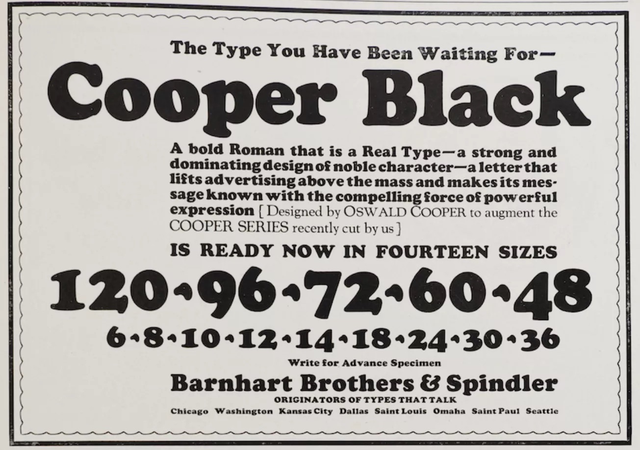
Despite the majority of typefaces at the time exemplifying geometric forms, in contrast, in what Josh calls “perhaps the last gasps of the more organic Art Nouveau movement”, the iconic Cooper Black was created. It was designed by Oswald Bruce Cooper and released by the Barnhart Brothers & Spindler type foundry in 1922.
“Bold and friendly with soft, bubbly forms, it was a widely used and often imitated display face at the time,” Josh says. “Cooper Black is timeless. Contemporarily, it is more closely thought of as part of the psychedelic vernacular of the 1960s and 1970s due to its revived, prevalent use at that time. And undoubtedly, the recent rise of typographic identities and new typefaces that employ similarly soft aesthetics, such as Chobani’s logo, is directly tied to a nostalgia for a more humanistic vibe, in contrast to more engineered styles prevalent in corporate and technology spaces.”
06. Gill Sans
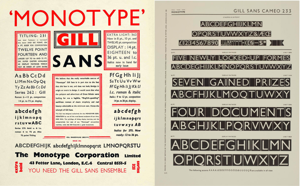
“Gill Sans is one of those typefaces that has it all – elegance, functionality, legibility, personality, and a stunning italic. Its modernist simplicity has just enough distinctiveness and warmth to make it feel like it has a pulse,” says Astrid Stavro, creative director and founder of Astrid Stavro Studio, design consultant and president of the International Society of Typographic Designers (ISTD). “The delightful inconsistencies and surprising contrasts imbue Gill Sans with soul. Take the sweeping tail of the capital ‘R’, the double-storey ‘a’, or the open-looped ‘g’ – each unexpected quirk adds character without sacrificing legibility. Its timeless appeal lies in that unique blend of simplicity and expressive individuality.”
However, the humanist sans serif, designed by Eric Gill in 1926 and released by Monotype in 1928, is perhaps the most controversial of the decade.
“Gill Sans is a great example of the challenges of separating the art from the artist. It’s hard to think of a more iconic British typeface, but its legacy has been tarnished in recent decades,” says Andy Henderson, designer and typographer. “While I won’t be proposing Gill Sans for any projects it’s hard to deny how elegant, functional and influential the typeface is. Its double-storey lowercase letterforms and calligraphic italics take more influence from serifs than other sans-serifs and gave it the unique character that led to its use across Penguin Books, British Railways and the BBC.”
07. Industria Gravur
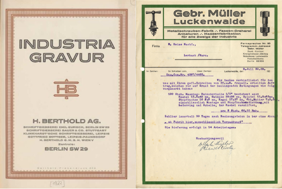
Designed by Hermann Zehnpfundt, Industria Gravur was added to the Industria series as an inline style in 1920. The original series was released in two weights in 1910 at the Emil Gursch type foundry, which was later acquired by Berthold in 1917.
Among its uses are bold poster titles and letterheads (and note, this typeface should not be confused with Neville Brody's 1984 sans-serif font of the same name).
“If you told me Industria Gravur was released in the 2020s I’d believe you,” says Andy. “Its wide, sharp letterform wouldn’t look out of place coming from Pangram Pangram or Grilli Type. Industria was first developed in 1910 before this inline version was added to the family in 1920.”
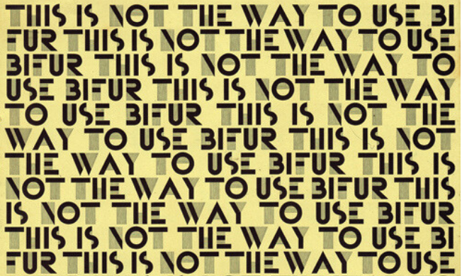
08. Bifur
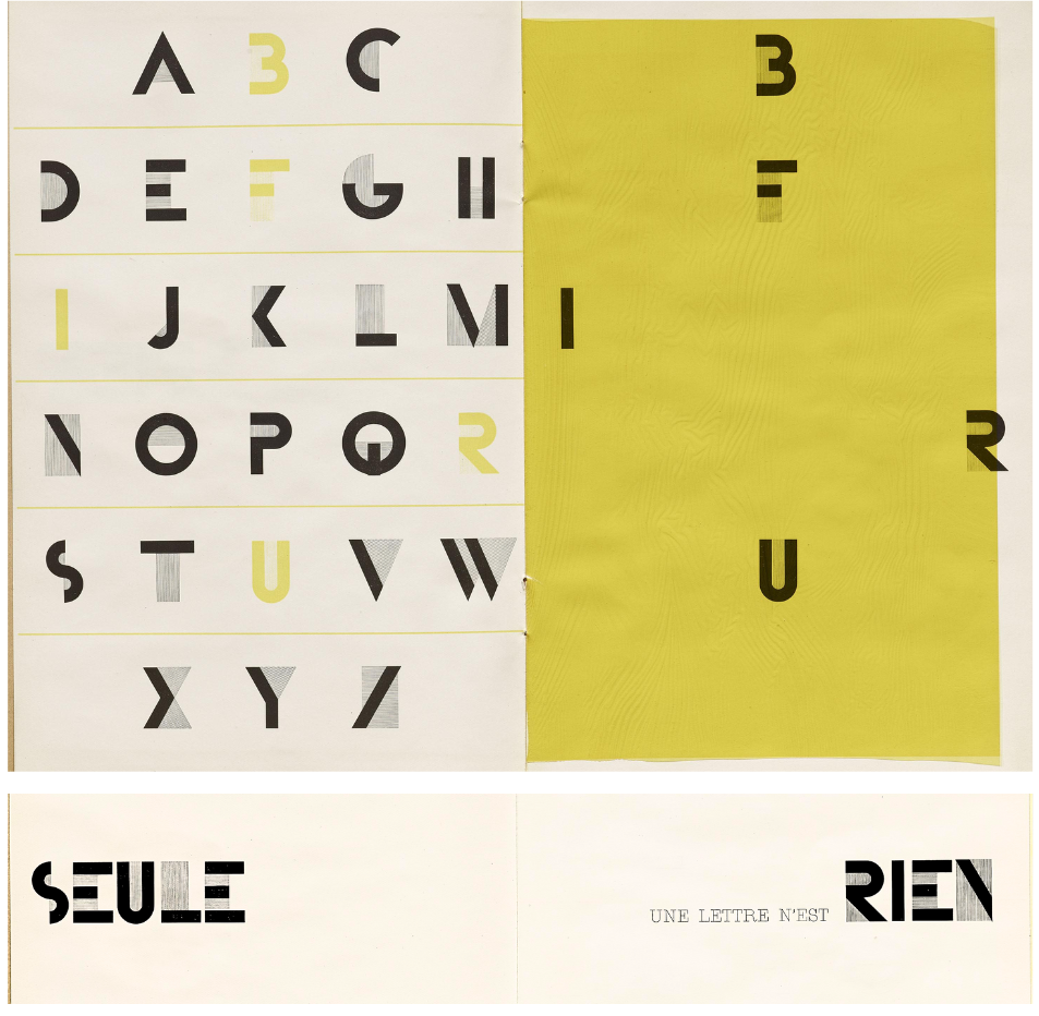
“A typeface that appears naive yet reveals, upon closer inspection, that nothing has been left to chance – this is Bifur,” says Eleni Beveratou, creative director at Dalton Maag. Bifur was designed in 1929 by the French artist and type designer A.M. Cassandre for French foundry Deberny & Peignot. Eleni highlights it as a modern, experimental typeface that challenges the traditional norms and reimagines readability and form.
“Bifur has often been celebrated for its modular structure. Each letter is comprised of two distinct layers: a solid primary structure and an abstract, linear overlay. Separately, these layers deconstruct the letters to the brink of being unrecognisable. However, when combined, they create a striking result,” says Eleni. “Developed as a bold and innovative response to the cultural and artistic movements of its time, particularly Art Deco and Modernism, Bifur exemplifies Cassandre’s avant-garde approach to typography.”
Two elements in particular stand out to Eleni: its name and a memorable quote from its type specimen: “As a typeface designer, I know firsthand that naming a typeface can be one of the most challenging aspects of the process, often stirring debate. In this case, however, the name is spot on. While I don’t know the full story behind its naming, Bifur is derived from the French word bifurquer, meaning ‘to branch off’ or ‘to split into two paths’. This perfectly encapsulates the essence of the typeface’s split-layer design while remaining distinctive and memorable.”
The quote that resonated with Eleni, from the specimen of Bifur: “A letter alone is nothing”, is “a sentiment the typeface demonstrates exceptionally well”, she says. “For me, it holds an even deeper significance beyond what Cassandre may have intended. Typeface design transcends the creation of individual letters. When letters come together to form words, they evoke emotions; when seen collectively as writing systems, they facilitate human connection and communication. I couldn’t agree more: a letter alone is indeed nothing.”
09. The work of Kurt Schwitters
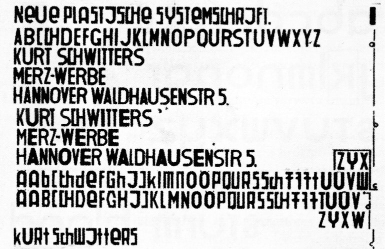
Part of the Dadaism art movement, dedicated to the rejection of traditional aesthetic values, artist Kurt Schwitters is best known for his collages and installations. He also founded Merz, a publication that featured found typographic fragments and his phonetic alphabet experiments known as 'Systemschrift'. Created in 1927, Systemschrift was Schwitters' attempt to link sound and shape, to create a unique visual speech texture.
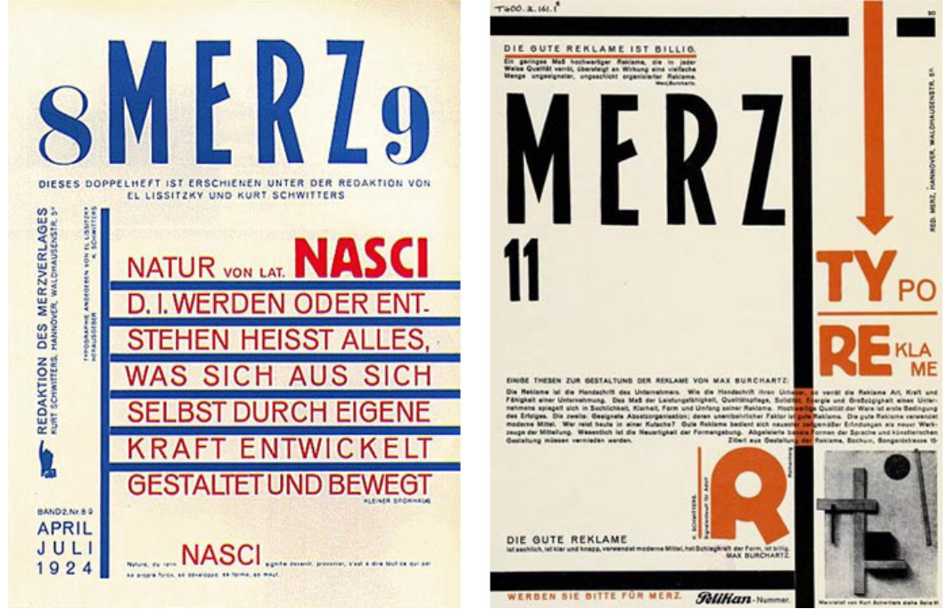
Typographer and educator Mark Millington recounts his first encounter with Schwitters as a young designer. “I walked into art school thinking I’d become a fine artist. But when I stumbled upon the radical art movements of the 1920s and 30s – Dadaism, Constructivism, and the Bauhaus – everything changed. I was captivated by the innovative typography and design that these movements created,” he says.
“It wasn’t just a new style – it was a revolution. As I delved deeper into graphic art, I discovered the incredible magazine Merz, founded by Kurt Schwitters. Merz was a platform for the international avant-garde, featuring contributions from artists like Jean Arp and Theo van Doesburg, and writer Tristan Tzara. The early issues were a perfect blend of Dadaism, showcasing a bold new way of thinking about art. The influence of these pioneers can be seen in every aspect of design, from typography to layout. It’s a legacy that continues to inspire me.”
For more top type, see our best typography of the '30s and best type of the '40s pieces.