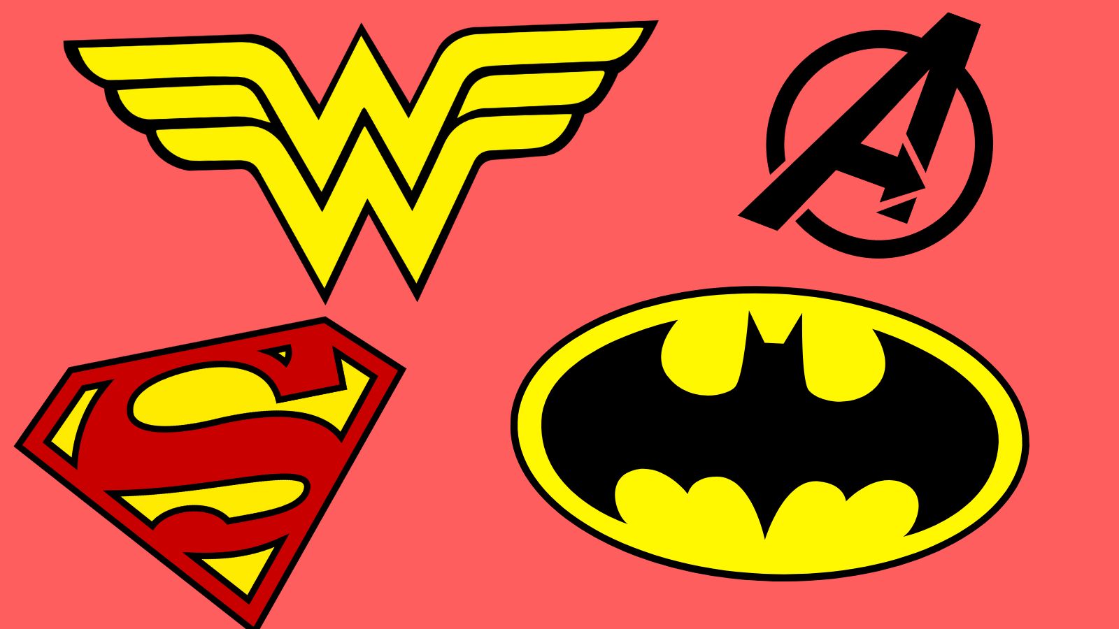
A good superhero needs a great logo. Done right, a superhero logo can become an instant icon and go on to become one of the world’s most recognised symbols, on a par with the best logos like the McDonald’s arches. A good superhero logo should be simple, stylish and convey the essentials of the character, giving a sense of tone as well as any particular pieces of iconography.
I’ve picked the best superhero logos that accomplish all that and more – the ones that have stood the test of time. Many of these are the kinds of logos where, in most cases, even a person who has never picked up a comic book in their life will look at them and know exactly which superhero they’re conveying. Others are less well-known, but exhibit some truly clever design choices that convey what the hero in question is all about.
If all this gets you inspired, check out our guide the best free logo design tools – and if you just want to see more great logos, we’ve got you covered with our rundown of the best logos by decade.
1. Wonder Woman
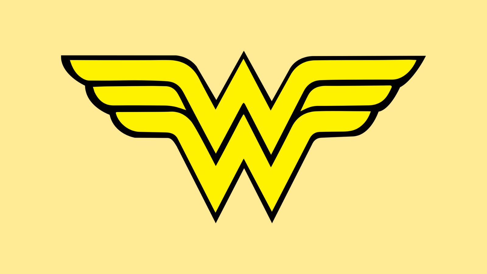
Though Wonder Woman made her debut in 1941, it wasn’t until the early 1980s that legendary graphic designer Milton Glaser (who had also designed the DC comics logo) was tasked with refreshing her identity, and gave her this instantly iconic logo. Previous logos for the character had all used the golden eagle that Wonder Woman wore as an emblem – while there was nothing especially wrong with the designs, no-one would associate them with Wonder Woman if they didn’t already know that she wore an eagle. Glaser’s genius was to deftly take the eagle motif and combine it with the character’s initials, creating an instantly iconic double-W.
When rendered in gold as it often is, this logo also takes on the appearance of a golden crown – a nod to Wonder Woman’s noble origins as Amazonian royalty. Combining so many meanings into a single, instantly identifiable emblem is a spectacular feat of design, and it’s not surprising that this logo has remained so strongly associated with the character for more than forty years. When Gal Gadot’s version of the character was introduced into the DC Cinematic Universe, it was with this logo. You don’t mess with perfection.
2. Spider-man
There have been many, many iterations of your friendly neighbourhood webslinger’s logo over his many decades of existence. Unsurprisingly, the central motif has always been a spider, but as you can see in this useful infographic by designer Ricky Franklin , there’s been a huge amount of variance in the shape, style and body of the spider itself.
For my money, the best versions of the logo are the ones from the Sam Raimi films starring Tobey Maguire, first for Spider-Man (2002) and then the slight rejig for Spider-Man 2 (2004), featured above. The design is elegant and unfussy, with the distinctive body shape of the spider rendered using simple shapes. The length of the legs implies agility, while the sharp points, pincers and subtle stings in the tail convey a sense of danger.
Also, I’m sorry, but I think the redesign for Tom Holland’s version of the character in the Marvel Cinematic Universe is dreadful.
What is that. It looks like a large man standing in a hallway. It looks like a health-and-safety sign warning people about excessive construction noise. Horrid. Somebody roll up a newspaper and kill it.
3. Batman
We all knew this was coming. Like Spidey’s, Batman’s logo has been through many variations while remaining fairly constant in its basics – it has pretty much always been the icon of the bat with its wings spread. However, this version designed by artist Neal Adams in 1969 is probably the most iconic, and has almost certainly appeared on the most merchandise over the years.
Adams is one of the most important and celebrated artists in the Batman canon – together with writer Dennis O'Neil he was responsible for moving the character away from the campy trappings of the 1960s Silver Age, giving rise to the darker, broodier version of Bats that modern readers and filmgoers are more familiar with.
Part of that transition came with this logo – while the striking yellow-on-black colour scheme had already been established in a previous iteration, by extending the wings right out to the edges of the oval, Adams creates a sense of imminence, as though we’re seeing the bat in the last seconds of extending its wings before enveloping its prey (yes, I know that’s not how bats hunt, but it’s how Batman hunts, okay?).
4. Superman
Since we’re dealing with the classics, we might as well move onto what is almost certainly the most recognisable superhero logo of all time. That glorious, sunny, red-on-yellow ‘S’ for Superman is one of the most immediately recognisable symbols on the planet. It’s encased in a shield that symbolises Supes’ role as humanity’s protector, while the balloon-style lettering hearkens back to the Golden Age of superheroes.
There have been many, many iterations of the iconic ‘S’ emblem over the decades. This enormous chart from the good people at Superman Homepage shows you exactly how the emblem has evolved. While the original 1938 version established by co-creators Jerry Siegel and Joe Shuster may not look much like the version we all know, it is still a letter ‘S’ encased in a shield in a red-on-yellow colour scheme, and those attributes have remained relatively consistent.
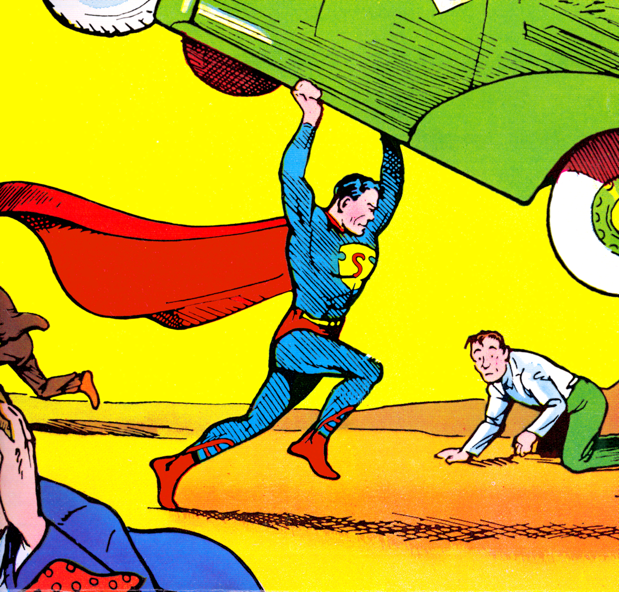
As such, it is difficult to credit who exactly is responsible for the version that everybody knows – online you’ll find it variously attributed to many different luminary comics letterers and illustrators of the 29th Century, including Fred Ray, Gaspar Saladino, Todd Klein, Wayne Boring. As is often the case with a continuously evolving medium like comics, there isn’t really one single person you can credit for the design.
5. Deadpool
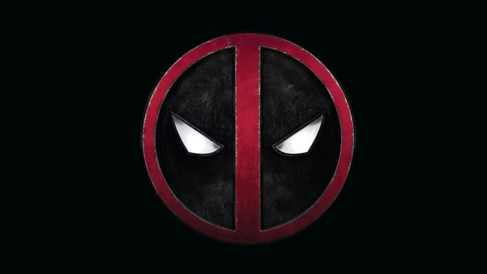
Once something of a niche superhero that nobody outside the comic-book world was familiar with, Deadpool has exploded in popularity in recent years thanks to the success of the Ryan Reynolds movies beginning in 2016. As such, this clever little logo has become a globally recognised icon.
It’s effective thanks to its simplicity, with the red-and-black colour scheme mirroring the colours of Deadpool’s costume, and the white eyes staring straight at the viewer, evoking Deadpool’s well-known habit of breaking the fourth wall. In a similarly meta touch that the merc with the mouth would appreciate, this icon actually originated as part of Deadpool’s costume – it was originally on his belt buckle.
It was artist Mark Brooks who introduced the famous ‘evil-eye’ look to the buckle when he took over pencilling duties for the comic series ‘Cable/Deadpool’ – previously, the buckle had had a more neutral, round-eyed look. In an interview with CBR, Brooks revealed that this was actually a mistake that came about when he redrew the buckle from memory, rather than checking a reference image.
6. Captain America
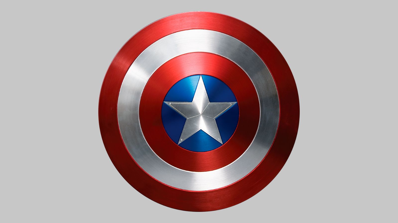
You don’t name your character ‘Captain America’ because you’re terribly worried about subtlety or nuance. The circular stars ‘n’ stripes shield, which also doubles up as the character’s immediately identifiable logo, isn’t one of those ones where there are all these tiny hidden details and easily missable clever touches. It’s red, white and blue, it’s stars and stripes, and if you’re a bad guy, it’s flying directly towards your face and hitting you with sounds like WHAP and PANG and WANK.
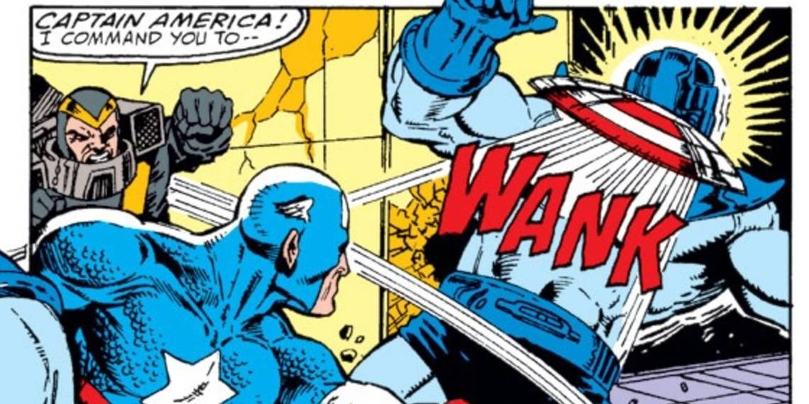
In his first outing in 1941, Cap originally sported a triangular-style shield, though complaints from the people at Archie Comics regarding its similarity to their similarly patriotic ‘Shield’ character (look, there was a war on) led to a hasty rejig. From issue #2 onwards, Captain America wielded the disc-shaped shield that would become the character’s most distinctive piece of iconography.
7. Green Lantern
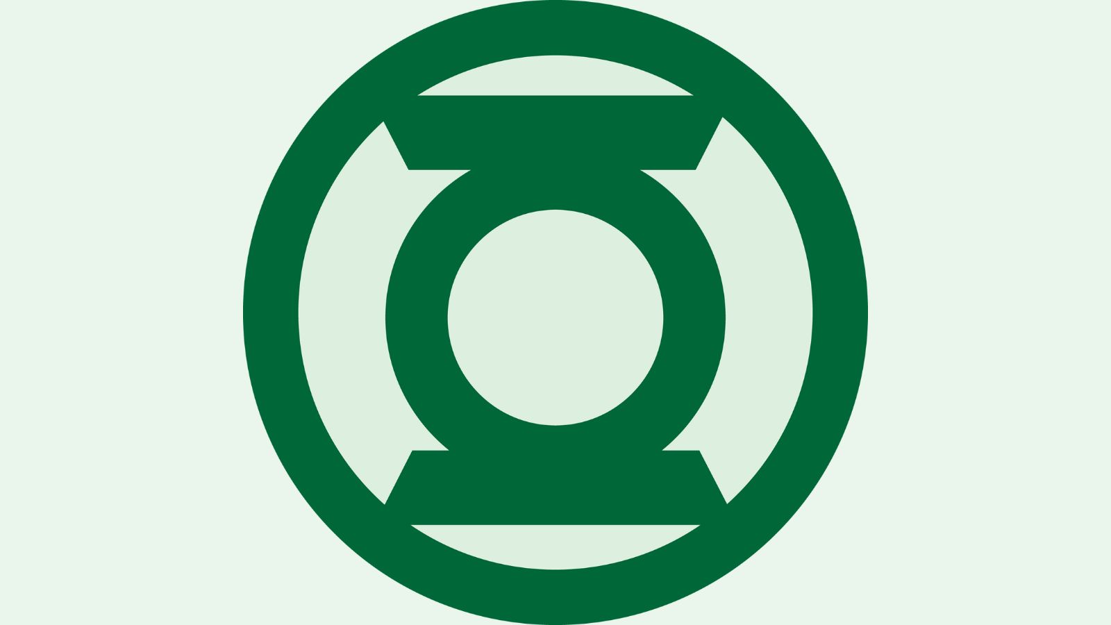
As we’ve seen, superhero logos tend to trade in similar colour schemes – reds, blacks, yellows, the odd bit of blue. Green Lantern’s logo immediately sticks out by being, well, green, but also by being somewhat more abstract than some of the others – it doesn’t immediately clue you in the way a big picture of a bat does.
This symbol carries multiple meanings that are important to the character, simultaneously representing both the eponymous lantern that is the symbol of the Lantern Corps, and the ring that Hal Jordan and his contemporaries use to exert their powers.
8. The Avengers
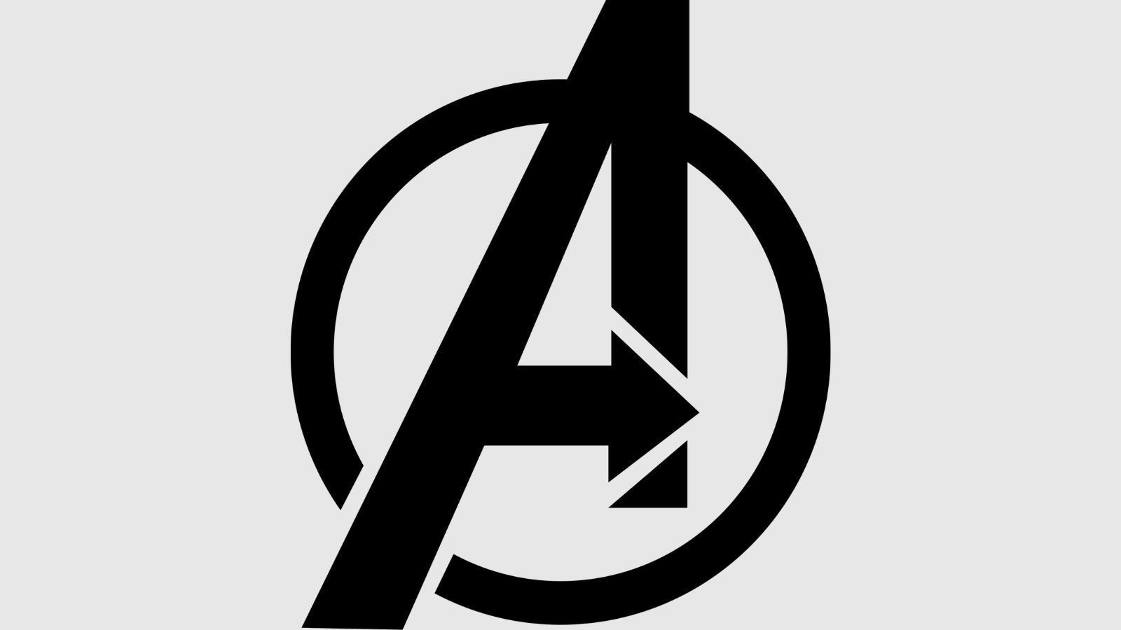
Finally we have the iconic ‘A’ from the most famous superhero team-up of modern times, the Avengers. The circle that encases the letter suggests themes of unity, while the thick, blocky lines project strength.
There’s also a right-pointing arrow contained within the A, suggesting forward momentum and a call to action. You might have assumed that this was a bit of a rip-off of the famous Fedex logo with its concealed right-pointing arrow, but remarkably it appears that the Avengers got there first, with their arrow appearing on comic-book covers as early as 1971, more than two decades before Fedex.

