We’re only four years into the 2020s and it’s already turning out to be an eventful decade for the film industry. The Covid pandemic has changed the way we watch movies and with increasing amounts of money being poured into high-end television programmes, and TV actors making quicker jumps to Hollywood than ever before, the line between film and television is wavering. Not to mention the advancements of AI that have lead to more CGI and artificial technology being used in film production.
It’s a contentious time for artists, so where has all this left set design? We’ve talked to the experts and curated this list of the films and high-end TV programmes that have come to define what 2020s set design is all about. Elsewhere in the world of design, you can also explore our best logos of the decade series, or see the best logos of the 2010s.
01. Dune: Part 2 (2024)
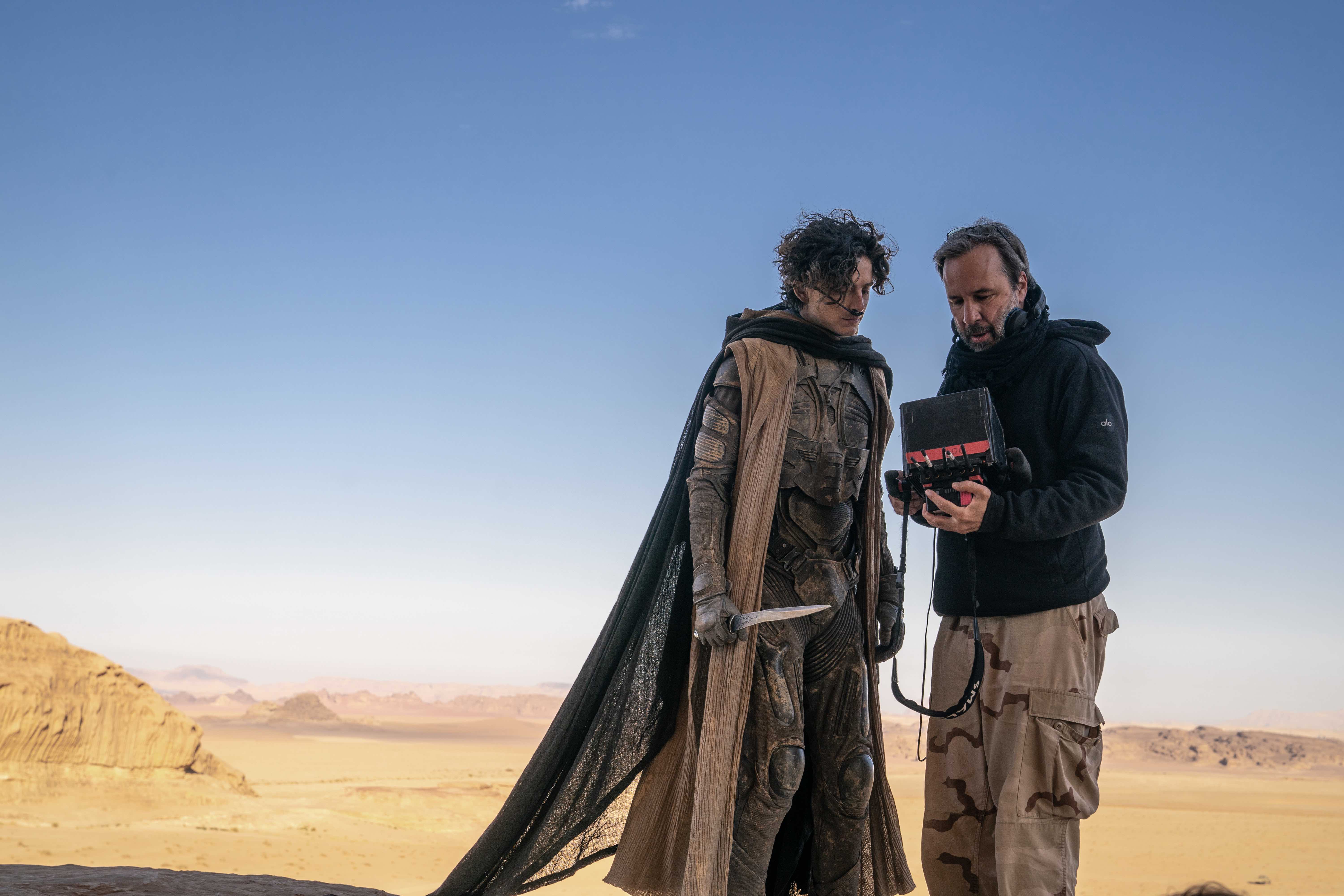
Dune 2 is the much-anticipated sequel to the original film in 2021, and has stunned audiences with Nolan-esque production values, wide landscapes and highly advanced CGI. Simone Lezzi, founder of leading London video and photography studio The Heath, mentions Dune: Part 2’s unusual methods in creating its CGI and AI set backgrounds by rejecting green screens. Instead, "they used different coloured screens so that the colour cast goes onto the actors".
"At The Heath, we've been using reflective materials a lot for our projects," explains Simone. "It's something that's being used a lot in the industry at the moment, I'm noticing, especially after Covid." He adds that "at the moment, backdrops are being used a lot". He is finding in his shoots for videos, photography and all types of media, that on-location shoots are becoming a rarity and green-screened backdrops are becoming the norm, even on higher budget productions. Dune: Part 2 certainly could have afforded to film in the desert but the team still chose to use colour screens and create the settings virtually themselves. Possibly this is due to the increased flexibility in adjusting the landscape that comes when digitally creating a setting, such as the colour cast reflections being deliberately used in Dune: Part 2.
"The set design in Dune is stunning," says Manoel Akure, a creative agency owner and filmmaker. "Not least because it relies heavily on nature, and borrowed from the natural settings that some of these planets are shot on, but they really push it in a way that it blends in. It becomes so subtle and believable that you don’t think about it much and I think that’s what some of the best set design is."
Alex Duce, a film buff and former art editor of Home Cinema Choice, compares Dune: Part 2 to a "cross between Lawrence of Arabia and Lord of the Rings". He appreciates the advancements it has made in CGI and how the crew incorporated this so effortlessly into the narrative. With Dune: Part 2, "you’re not thinking it’s computer generated – it just feels like part of the film", he says. "It's a stunning large film," he says, but adds that the set design of the 1980s version of Dune is better, especially as in this version real candles were used live on set. Aspects such as this can add a more authentic quality, even if they are not as sweepingly impressive as Dune: Part 2.
02. Poor Things (2023)
Another standout in this area is Poor Things, which won the Oscar for best set design earlier this year. The film’s production process is another example of the decreasing popularity of location-shooting, with all of its scenes filmed on a specially-built set, and even its exterior scenes entirely studio-based. "When you watch Poor Things obviously it’s CGI as well, but it’s so stylishly done," says Alex. "You’re not looking at it thinking it’s CGI. It’s just part of the film."
It also incorporates cultural references into its set design. "It rips off things like Metropolis," says Alex. This is a favourite technique of his, "I like the things that films rip off," he says, and likens this technique to its use in Tarantino films and "old cowboy films", as well as The Empire Strikes Back.
03. Tenet (2020)
Christopher Nolan has released two major films in the 2020s; and both Tenet and Oppenheimer have been a marvel to look at. Simone highlights Nolan’s preference of real life sets over digital options, and that his sets use "creativity and technology". Tenet especially was revered for its creativity, with much of it filmed in reverse. "In Nolan films the sets use both creativity and technology. Nolan is a fan of using the real thing and not too much digital," he says.
04. The Mandalorian (2020)
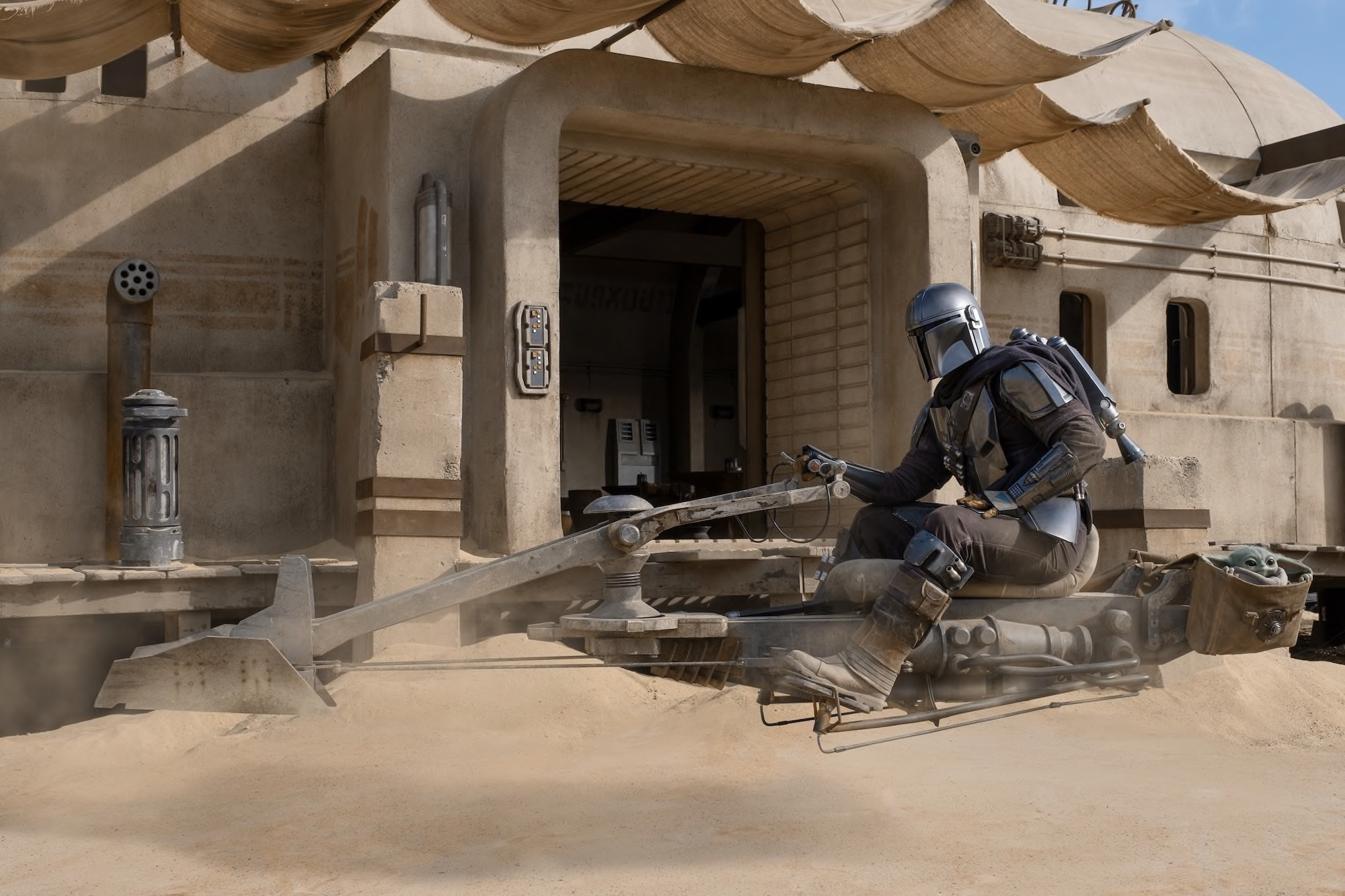
Simone compliments The Mandalorian’s use of green screens. "The Mandalorian used lots of green screens. But it worked really well that they did this because it meant that the set design changed in real time to show the changing of time." He believes that this is technology that will be used more often in years to come, and that gradually there will be less and less tangible set design.
05. Road House (2024)
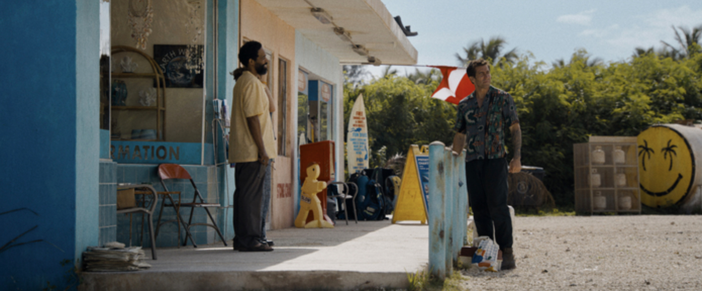
Road House is a "stunning, good-looking film", according to Alex (though he still prefers the original). "The original is from the '80s and it's a cult classic. They've tried to remake it and drag it into the 21st Century."
He especially praises the design of the bar on the beach, which was built entirely on-set. "The beach is the most impressive and lovely looking set of the whole film," he says, but the remake is very far removed from the original. "If you hadn’t called it Road House, it still would have worked and people just would have gone, 'oh, it’s a bit like Road House'."
06. No Time To Die (2021)
The James Bond franchise has always thrived on its classic over-dramatic stylised look throughout all its eras, including the most recent finale starring Daniel Craig, No Time to Die. "I like fancy graphics or things that are super cheesy like Bond films with super stylised opening credits – they're fun to watch," says Alex. He talked of how "it’s been the same since the ‘60s" and when executed well, it’s a style that never gets old.
"The Good the Bad The Ugly and Westerns, with this style you know what you’re going to get," he says. "With things like Tarantino, John Carpenter, they're instantly recognisable – again, you always know what you’re getting." There is something to be said for a story that has amassed this level of definitive set design distinction over the years.
For more on films, see the best movie posters of all time.
