Although we’re only half way through the decade, the 2020s has already given rise to some highly memorable – dare I say potentially classic – print ads. Minimal branding, bold photography and playful use of form are the order of the day for these print ads, standing boldly apart from the moving images of the screens that surround us in everyday life. Some of these are arguably contenders for our best print ads roundup.
Print is certainly not dead. It’s evolving. It’s emotive and it seeks an authentic connection. It quietly demands attention and it holds value beyond a fleeting impression.
So, let's dive in. Here (in no particular order, as usual) are 12 of the best ads of the decade so far, as selected by ad industry folk, designers and educators.
Keep an eye out for more print ads by decade to come. In the meantime, get inspired by taking a look at the best billboard ads of all time.
01. International Women’s Day – ‘Imagine a world’
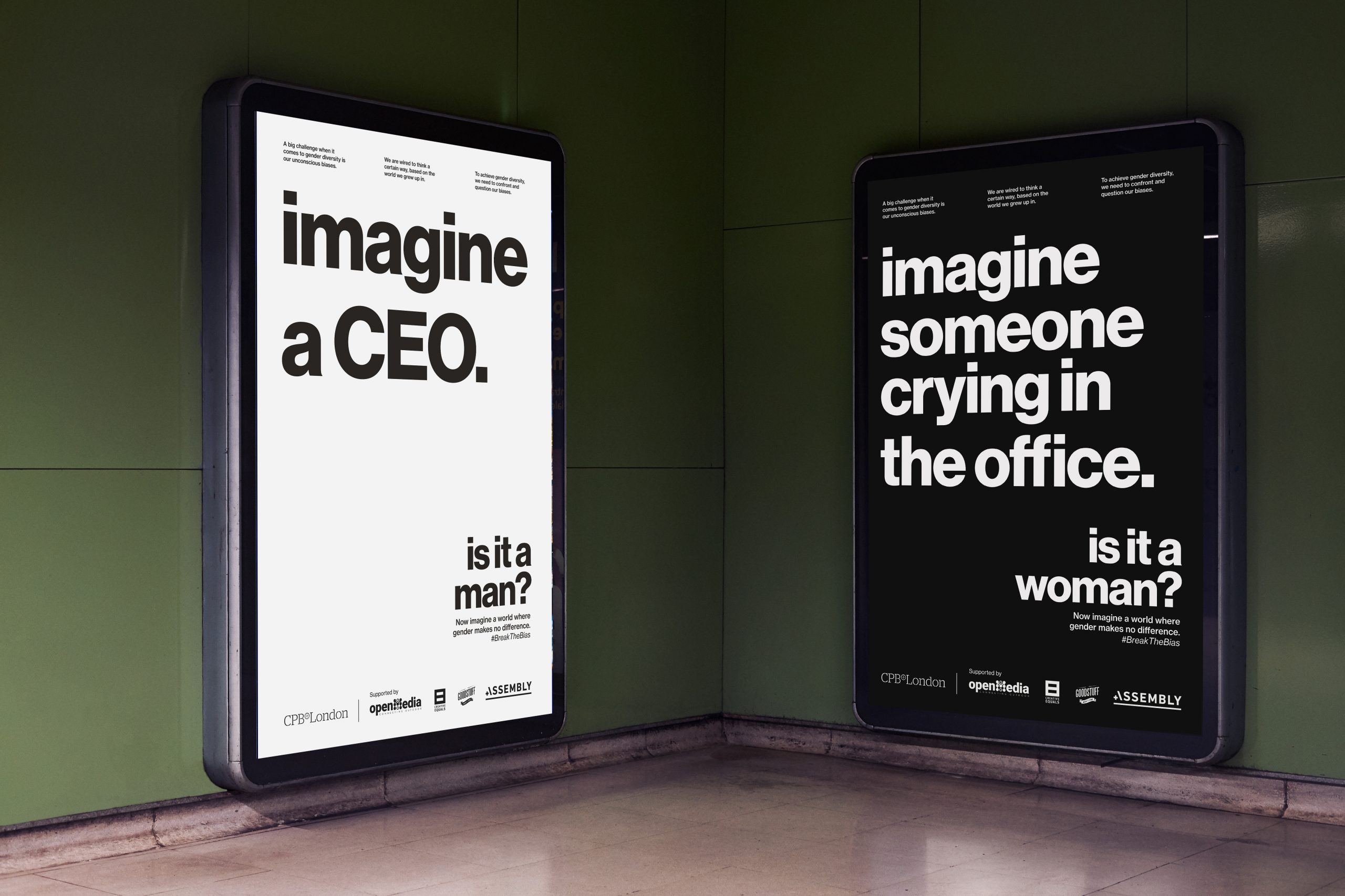
“This public service campaign by CPB London was launched on International Women’s Day’s (IWD) in 2022 to celebrate its theme #BreakTheBias. The campaign’s power comes from its stark layouts with purposely vague commands that require you to rely on memory and personal biases to fill in the details,” says Professor Nancy R Tag, former ad agency creative director and founding director of City College of New York’s master's in branding and integrated communications. “Almost simultaneously, the subhead asks you to identify the protagonist of your memory. The media placements and prompts strongly suggest that you had imagined a stereotype, revealing your gender bias… to yourself. And, even if you hadn’t, the ads nonetheless deliver the provocative point that gender stereotypes are still pervasive.”
“One of my graduate students, Amina Hassan, praised these as revealing ‘how deeply ingrained our gender biases remain in our collective thinking… it’s exactly this kind of creative, thought-provoking content that starts necessary conversations about gender roles and expectations.’ These ads are especially effective because viewers must first reckon with their own preconceived notions in the privacy of their heads, triggering true introspection before conversation.”
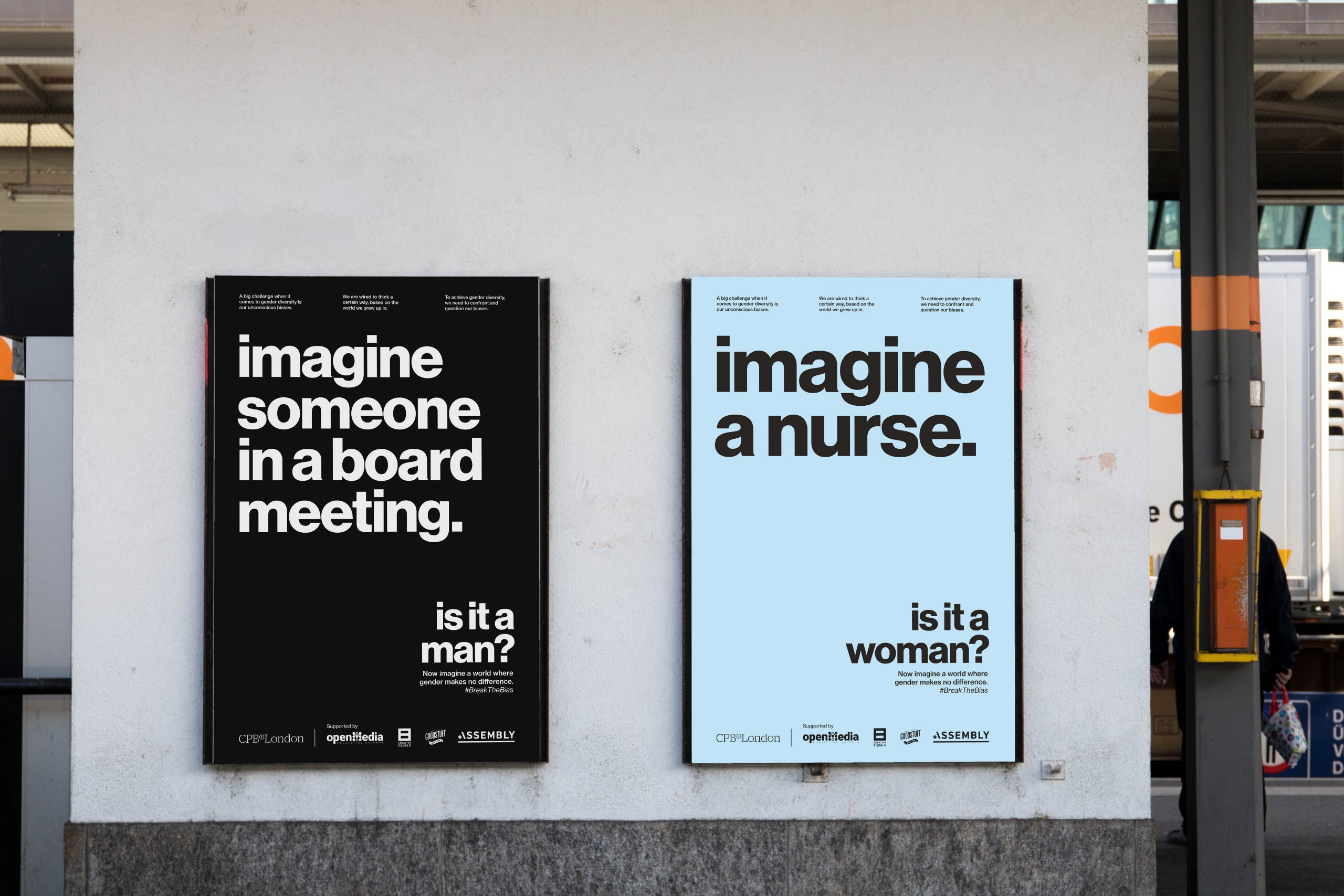
It’s also a top choice for YanYan Zhang, partner of brand design at VSA Partners, who says the power is in the type-led design. “This campaign has always resonated with me,” “It’s purely typography based, but that lets the message be the hero – in turn creating a direct conversational interaction with the viewer.”
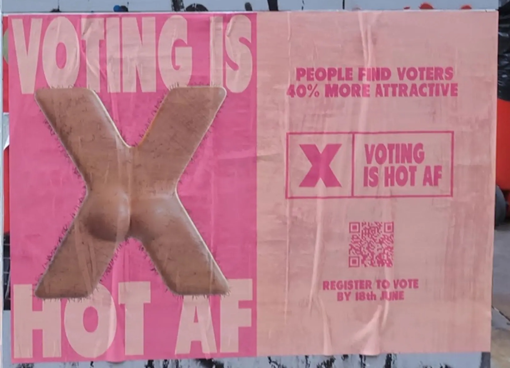
02. UK Election 2024 – ‘Just vote’
This next one first grabbed my attention when I saw it on the back of a long-drop loo door at Glastonbury Festival last year. The naughty series of posters aimed to encourage young people to register and vote in the general election last year. It’s based on research commissioned for the campaign, which found that 40% of 18-24 year-olds think people who vote regularly are more attractive. Over half of the respondents also said voting makes people look more intelligent and a third said more trustworthy.
“Saatchi and Saatchi’s 2024 campaign to reach the younger generation to encourage them to vote uses heavily graphic layouts, a high contrasting colour palette, and playful imagery to stand out to its target audience,” Ciara says. “The headline is prominently and unapologetically used across the top and bottom of each poster, and uses a series of differently executed Xs across the campaign to reflect an X in a voting form. It is provocative and bold, resulting in a confident and effective campaign capturing the attention of young voters.”
03. Specsavers – ‘Should have gone to Specsavers’ 20th anniversary
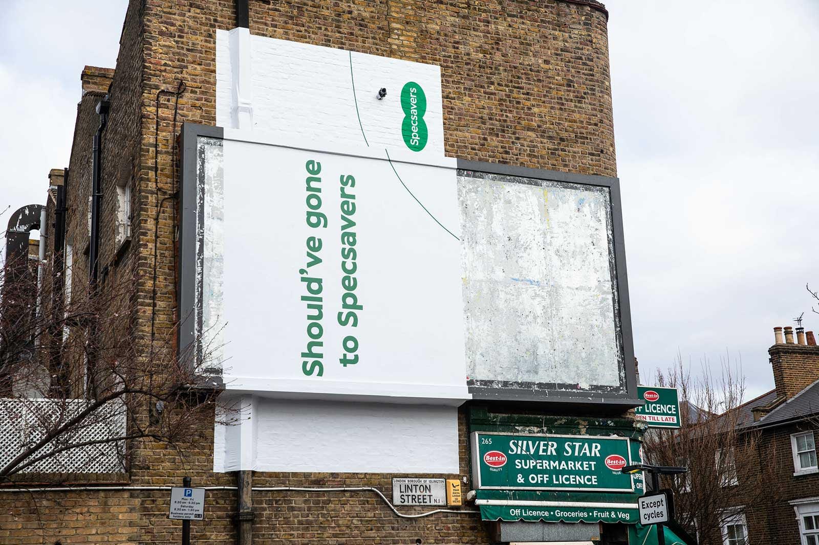
“To celebrate 20 years of ‘Should’ve gone to Specsavers’, in 2022 Specsavers launched a guerrilla-style marketing campaign that cleverly conveys their instantly recognisable slogan in an understated way,” says Ciara Stonley, a creative at agency syn.
Since the inception of the optician store’s slogan in 2002, it has transcended the ad world and remains ingrained in people’s minds, and yet with multiple formats and incarnations, for many people it remains as humorous and silly as ever.
“They have been effective in using humour to continue the running gag to display a paired back and distinctive billboard poster plastered incorrectly over frames on the sides of buildings, over pipes, ladders etc,” Ciara says. “The posters feature an incredibly minimal design, using only one colour other than white, the logo, and one line of text to capture the viewer’s attention”
04. Apple – ‘Shot on iPhone’
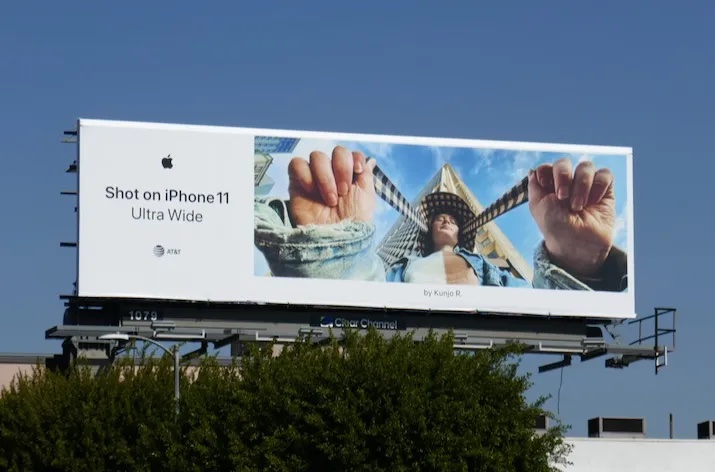
“The shot on iPhone campaign really caught my attention, especially with its billboards in tube stations. I remember being drawn to the 2020 photo competition Apple hosted, where they invited photographers to submit their best images taken with the iPhone 11 and 12,” says Laura. The wider campaign, which ran throughout the 2010s and 2020s is often credited as the campaign that changed smartphone marketing. Not only did it invite iPhone users to submit their images, but also resonated with a broader smartphone audience, breaking down barriers to creativity – no other kit or extravagant lighting needed here for great photography.
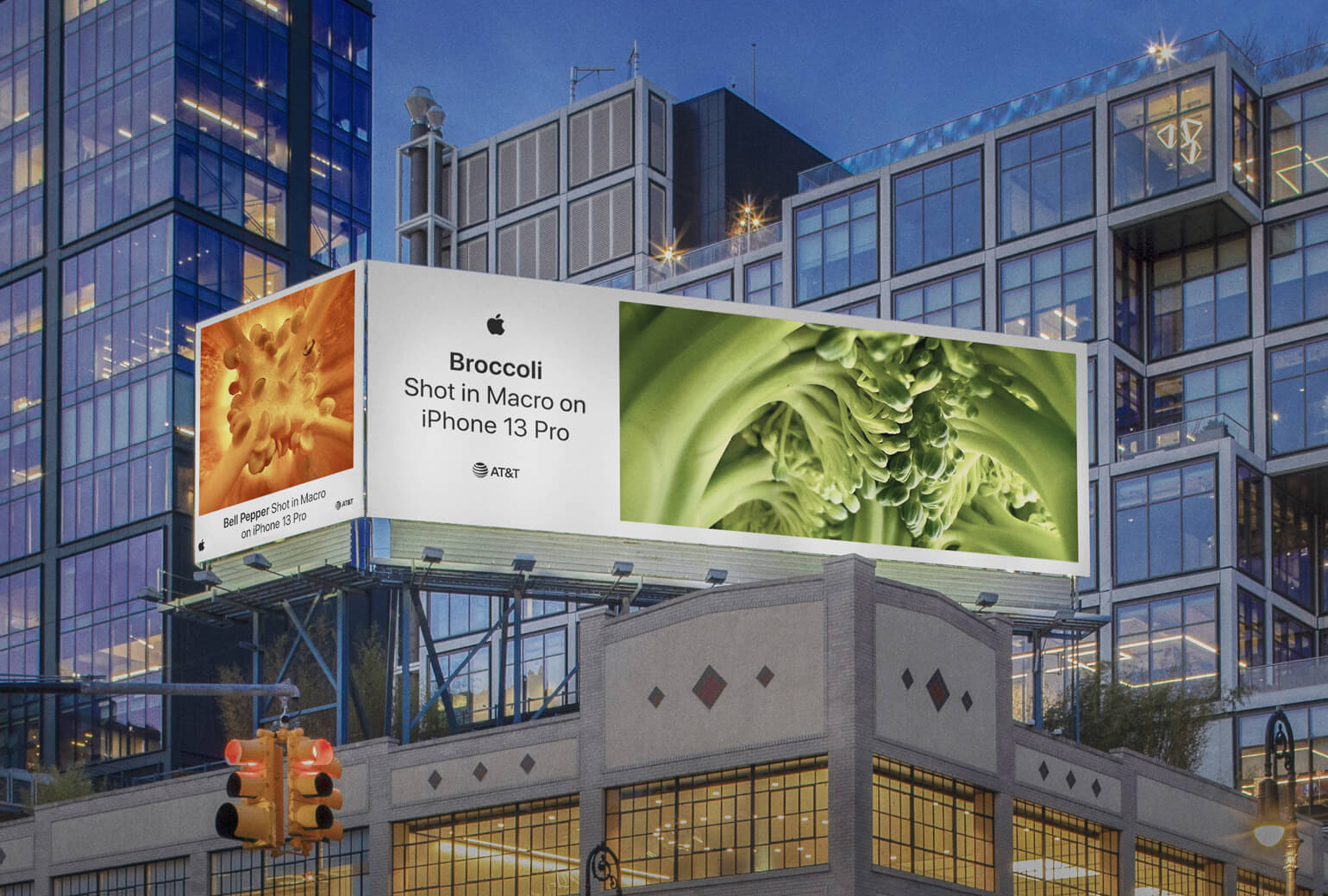
“I liked how the campaign highlights user creativity and promotes the idea of anyone being able to capture incredible photos with an iPhone. What stood out to me was how it showcases photos and videos taken by everyday iPhone users, making the campaign feel authentic, accessible and relatable. The minimal branding and lack of heavy text keeps the design clean, letting the content speak for itself. Apple allowed the images and videos to work without distracting overlays or filters, just raw beautiful visuals that highlight the devices’ capabilities. The typography is simple and modern, using a clean, sans-serif font that aligns with the brand.”
05. British Airways – ‘Windows’
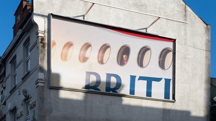
This series of 11 billboard posters, each showing a passenger looking out of a window on a BA flight not only plays on the idea of people taking images from inside a cabin, out of the window, but also acknowledges that great ads often mean saying less – or almost nothing at all. It was produced by creative studio Uncommon, with photography from Pulitzer Prize nominee Christopher Anderson.
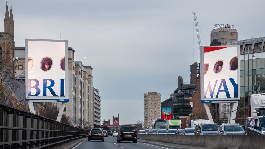
"This campaign is paving the way for a new direction in recognition branding,” says designer Mike Roberts. “No logo, no strapline, just a slight visual clue of the brand and a window into the travel experience.”
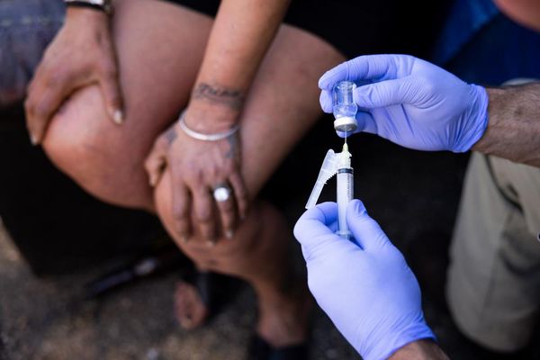
07. Brook – ‘Stop cyber flashing’
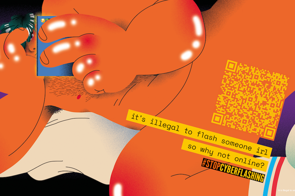
“This is an awful topic with a need to drive conversation around the subject as loudly as possible. Flashing is illegal in real life so why not online?” says Laura Jordan Bambach, founder and chief creative officer at agency Uncharted, former president of D&AD, author, lecturer and multi-titled creative. Laura also previously worked at Grey London, which worked with sexual health and wellbeing charity Brook on the campaign. “Working with Brook gave us an opportunity to educate and garner support to help get cyber-flashing added to the online harms bill.”
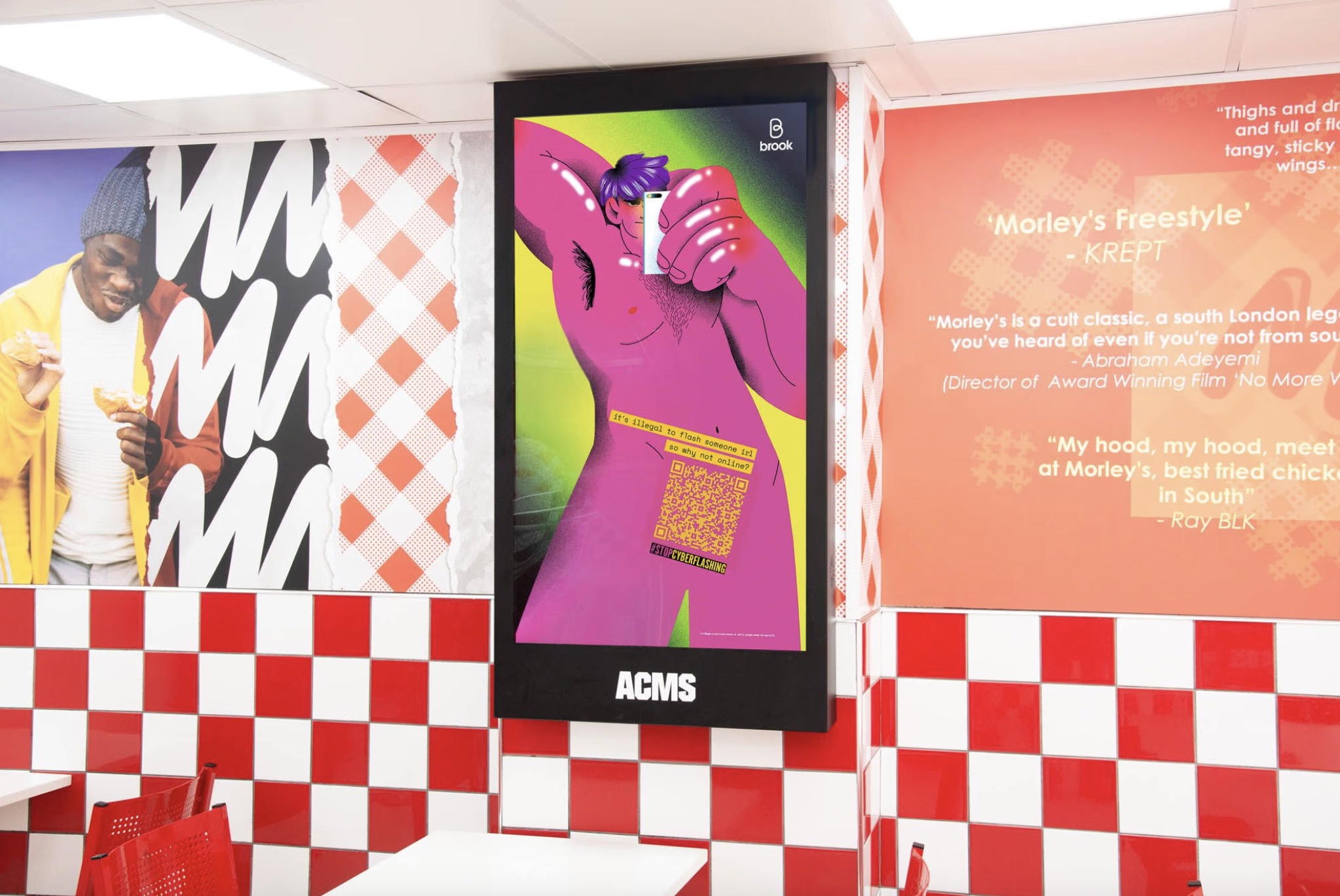
“QR codes became more common throughout Covid-19, so drawing people in with an amazing illustration and then spitting them out with our cock QR MP-messaging codes (that google Safe Search still filters out) was one of my proudest moments. An example of how you can do a lot with a little, alongside a huge amount of passion and perseverance. Oh, and we got the law changed and got mentioned in parliament.”
07. Pepsi – ‘Better with Pepsi’
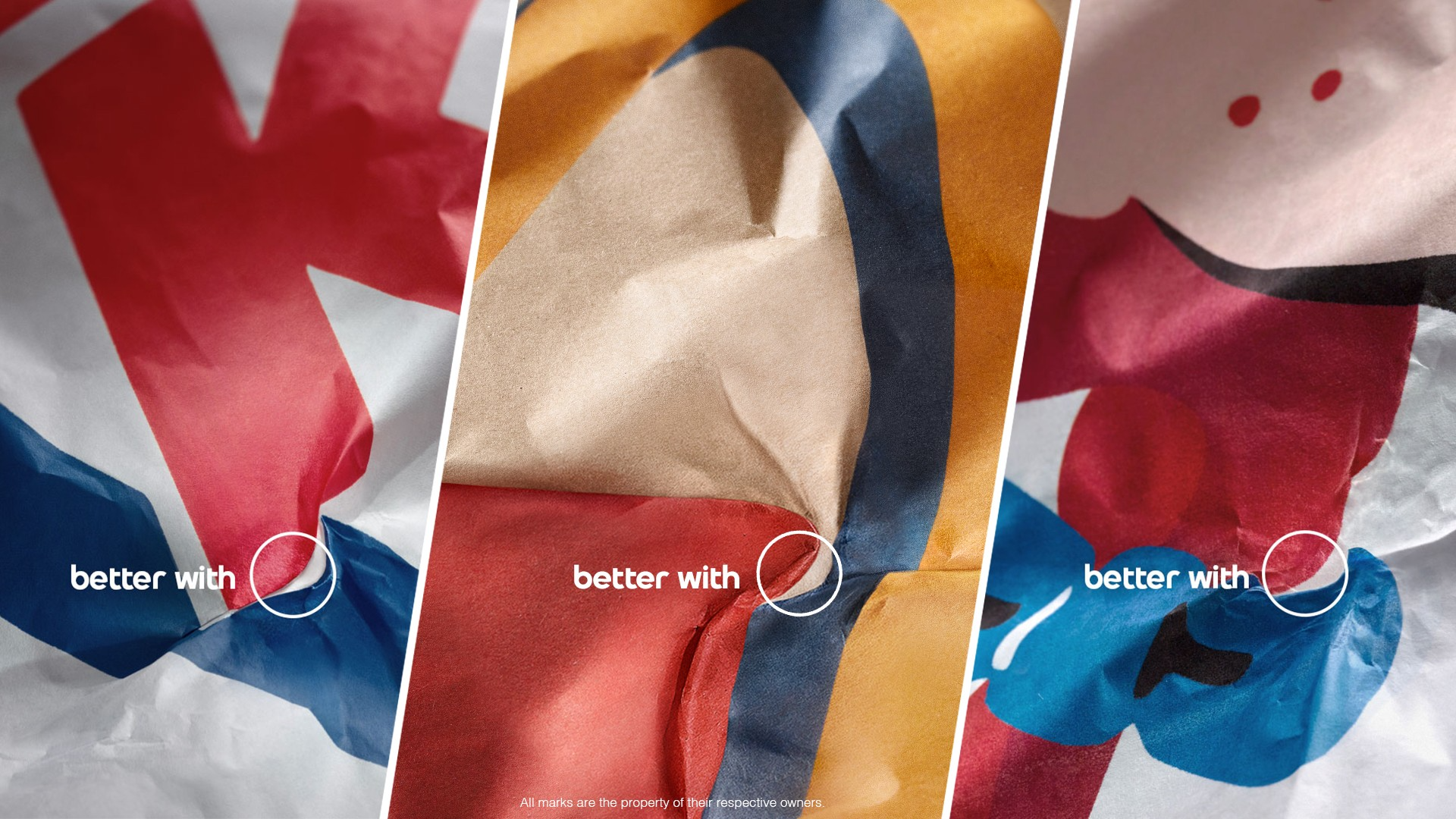
“The best ads are so simple, you can’t believe someone hadn’t thought of them sooner,” says Mike Perry, founder and creative director of New York-based creative agency Tavern. This ad, from 2021, was the result of Pepsi aiming to better understand consumer preferences, by commissioning third-party blind taste tests and a consumer survey to discover how burgers from Burger King, McDonald’s and Wendy’s paired with different beverages. The results showed that participants preferred Pepsi over Coke.
“The ‘Better with Pepsi’ ads, featuring packaging from prominent fast food brands crumpled just so as to reveal a hidden Pepsi logo, are brilliant,” Mike says. “The clever creative idea, paired with the straightforward headline feels effortless, obvious – a delightful Easter egg you can’t believe nobody noticed before.
08. Prada
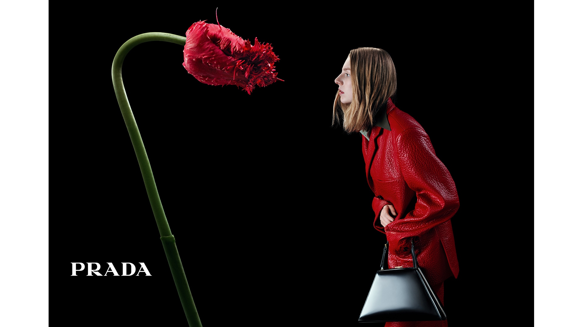
“Prada’s A/W 2023 campaign is a print ad that really stands out to me. I first spotted it in Vogue and it immediately caught my attention in a way that other print ads didn’t. There’s something about the contrast between the clothes and the way Willy Vanderperre captured the imagery that really speaks to me. It’s one of those ads that makes you stop and really appreciate the details,” says London-based designer Laura Foley.
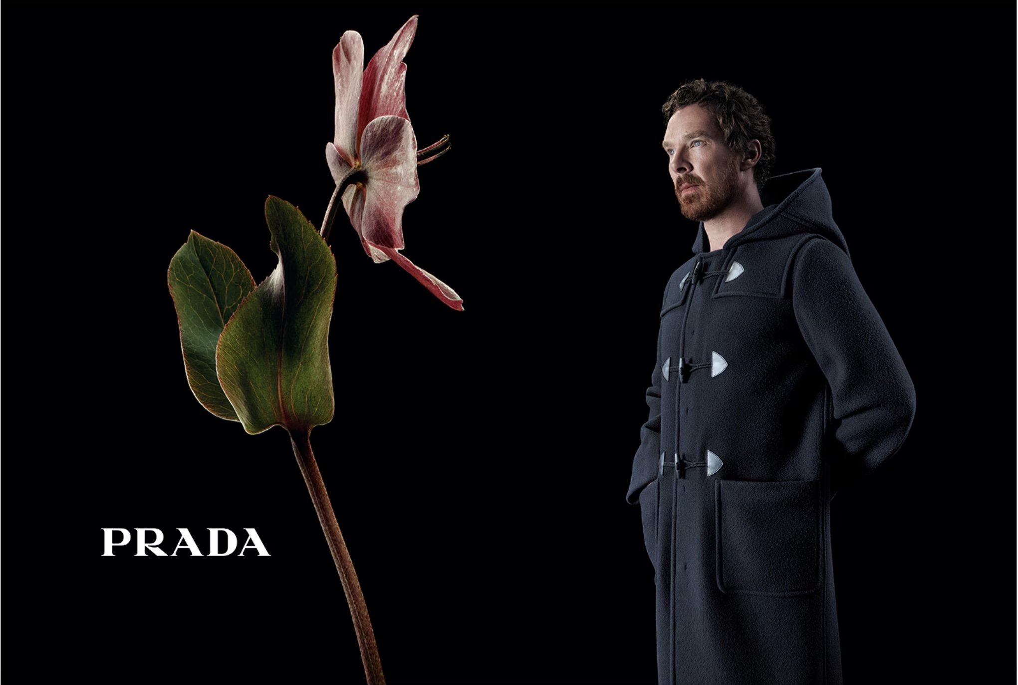
“I love how it blends nature with high fashion so effortlessly. When I opened the double page spread and saw the flowers popping against the black background, it instantly grabbed my eye. The flowers complement the collection so well," Laura says. "The layout is super clean, with a lot of negative space that lets the imagery breathe. The Prada logo is present but placed so subtly that it doesn’t take away from the visuals. The whole ad feels almost like a piece of art – very visual, abstract and conceptual. It’s not just about showcasing clothes, but about creating a whole visual experience.”
09. Telstra – ‘Wherever we go’
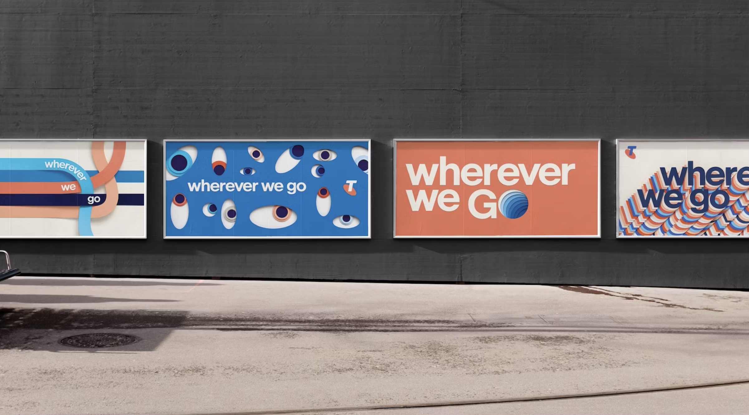
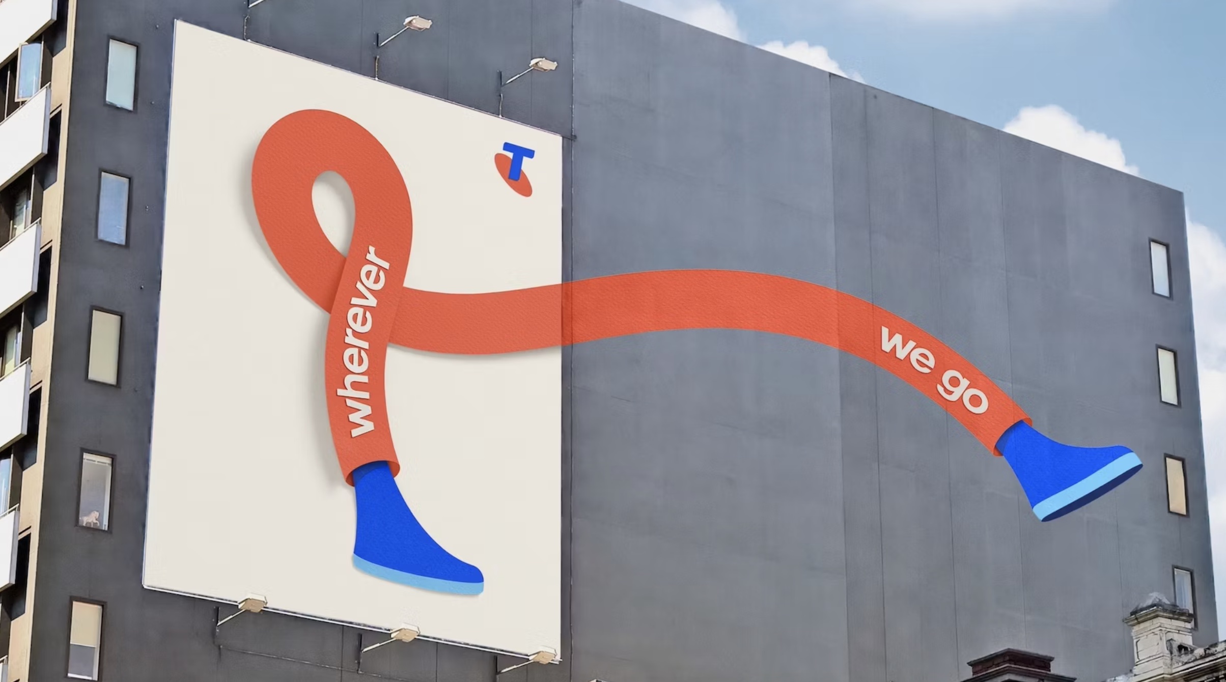
“Micah Walker at ad agency BMEOF is a very passionate and focused dude who just wants to make great work. He loves what he does and it shows with everything that comes from his agency. When they won Telstra (the Australian equivalent of BT) the brand hadn’t done anything really exciting for some time. They were the safe, slightly dull, choice,” Laura Jordan Bambach says. “In every piece of work that BMEOF have done for the brand they have shone. None more than the brand print work that takes the best from classic art direction and turns it into something modern and fun and wonderful.”
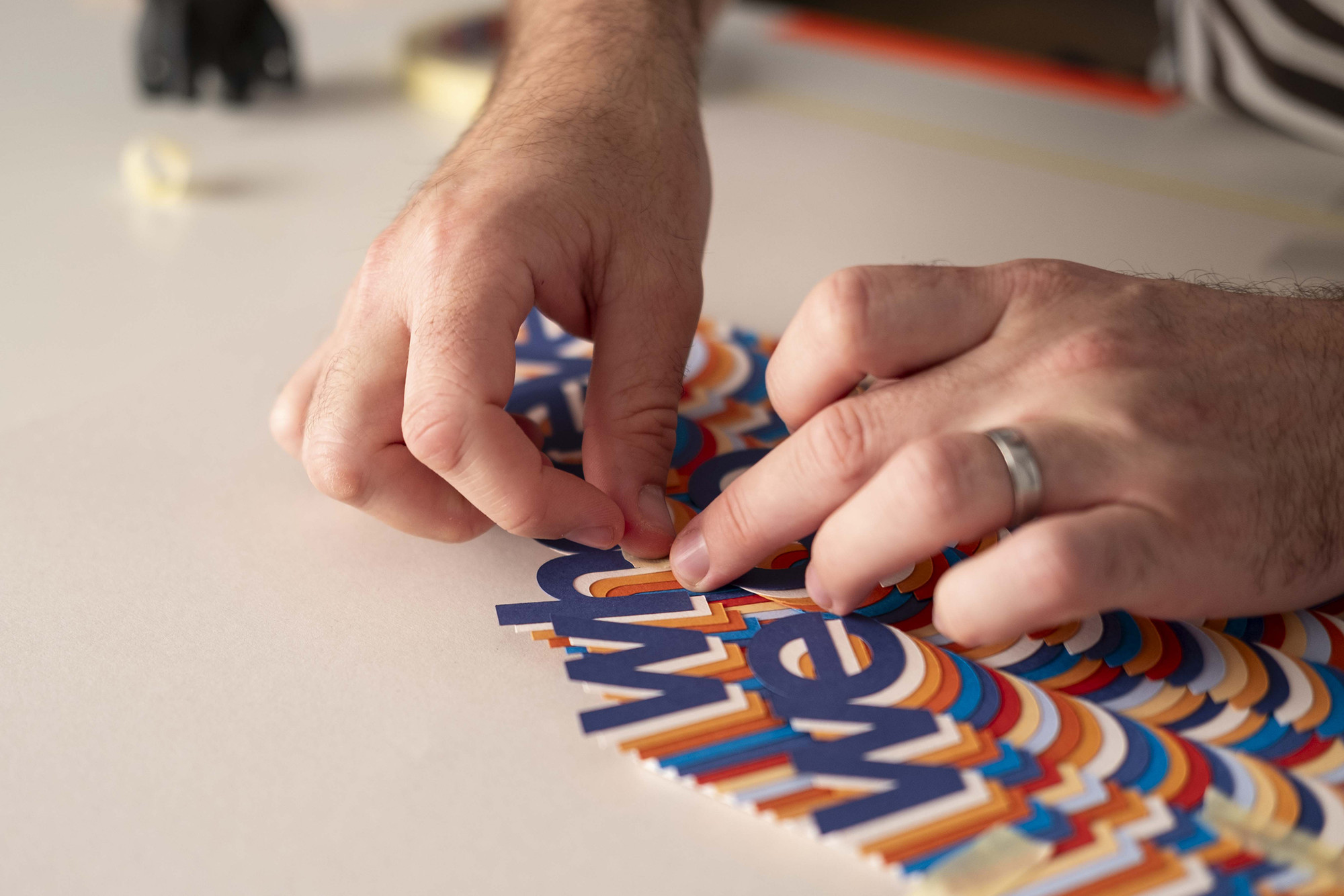
Paper artist Kyle Bean, iIllustrator Ben Hasler and photographer Carl Kleiner worked together to create the graphics for these layered papercraft images. The out-of-home ads were created for a range of sizes and locations at almost 3000 sites in Australia, including special builds and painted wall murals.
10. Heinz – ‘Draw ketchup’
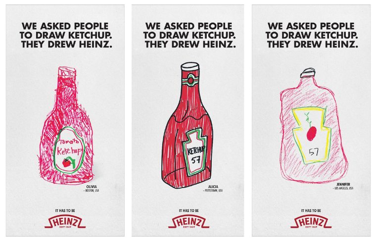
“Heinz is an iconic name that has created several memorable print ads throughout the years,” says YanYan. “This campaign from 2023 showcases the iconic nature of their brand – namely, how it’s synonymous with ketchup. It’s a really simple concept, and the user-generated hand drawings tap into a surprising, nostalgic sentimentality.”
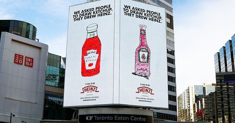
Participants from 18 countries were asked (anonymously) to draw a simple sketch of ketchup simply. The quality of the drawings ranged, but there was a clear common theme among most, with 97% drawing Heinz.
11. River Action – ‘Pooster’
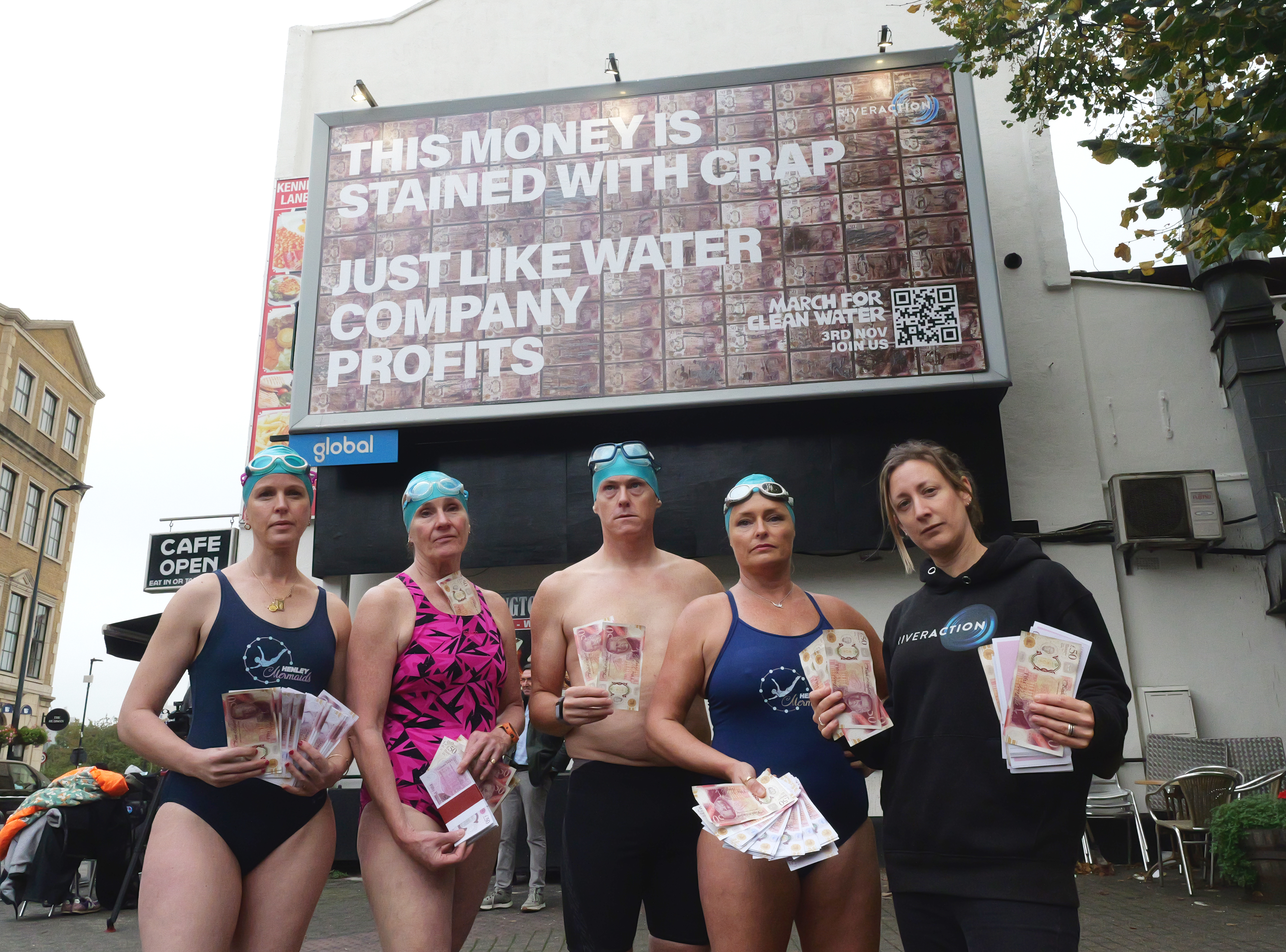
This next print ad from 2024 aimed to highlight the gross reality of water companies making billions while polluting the UK's rivers, created by agency Uncharted for charity River Action.
“Volunteers collected polluted water from every major river and sea around the UK, which was mixed into a poo-sodden paint that we used to soak £50 notes as the ‘paper’ on which to overlay the message,” says Laura Jordan Bambach . “The biggest challenge here was to make the water and pollutants safe to handle for the team as it was being manufactured. After working with UK experts we were able to sterilize the effluent and the result drove a large protest in London the week after.”
12. And a bonus final thought on Banksy
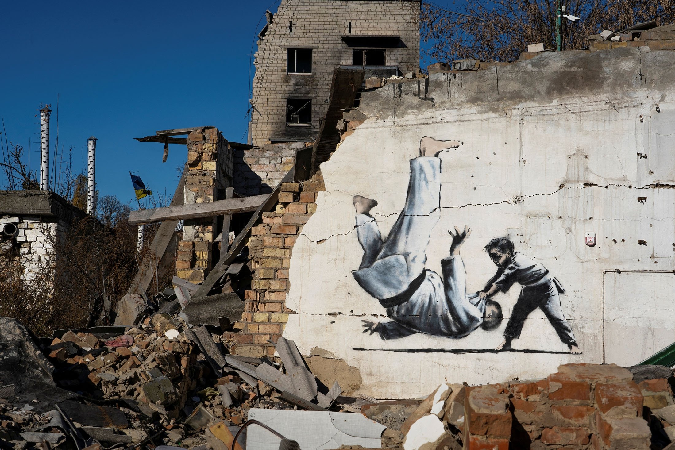
“Ad agencies can't do good ads anymore, because the people who work in ad agencies are all scared to and the primary agenda is to keep the client rather than do bold work,” says Dave Buonaguidi, ad expert, author of Blah! Blah! Blah!: Memories and advice from one of British advertising's mavericks, and printmaker known as Real Hackney Dave. “But we have artists, who have powerful brands, they are their own clients, their own production companies and they are bold and move at speed. No rules, no marketing department full of blockers, no fearful employees with Moleskine pads and lists of reasons not to do things. This is very powerful work. No logo needed, we all know who did it. Very small budget. Big idea.”