Olympics logos are often one of the things we most remember about the world's biggest sporting spectacle: sometimes even more than the sporting action itself. Over the years, we've seen vastly different approaches, from iconic minimalism to vibrant gestural designs and a curious bouffant for Paris 2024, but they've all found a way to capture the world's imagination.
Designing a logo for the Olympic Games must be one of the toughest branding challenges going. The design needs to capture the spirit of a sporting event, and ideally the Olympic ideals. But an Olympic logo isn't just an identity for the Games. It's also a presentation of the host city, which often means trying to balance elements of national heritage while showcasing a country's modernity.
On top of all that, the logo design has to be simple enough to work in lots of environments, from wayfinding signage to printed material and from giant billboards to tiny mobile screens. And that’s not to mention the competing tangle of cross-border committees to navigate and stakeholders to please. Considering those demands, it's surprising just how creative some of the best Olympic Games logos have been. Below we round up our favourites. For more inspiration, don't miss our guide to the best sports logos in general – and of course the overall best logos ever.
The best Olympics logos
01. Tokyo 1964
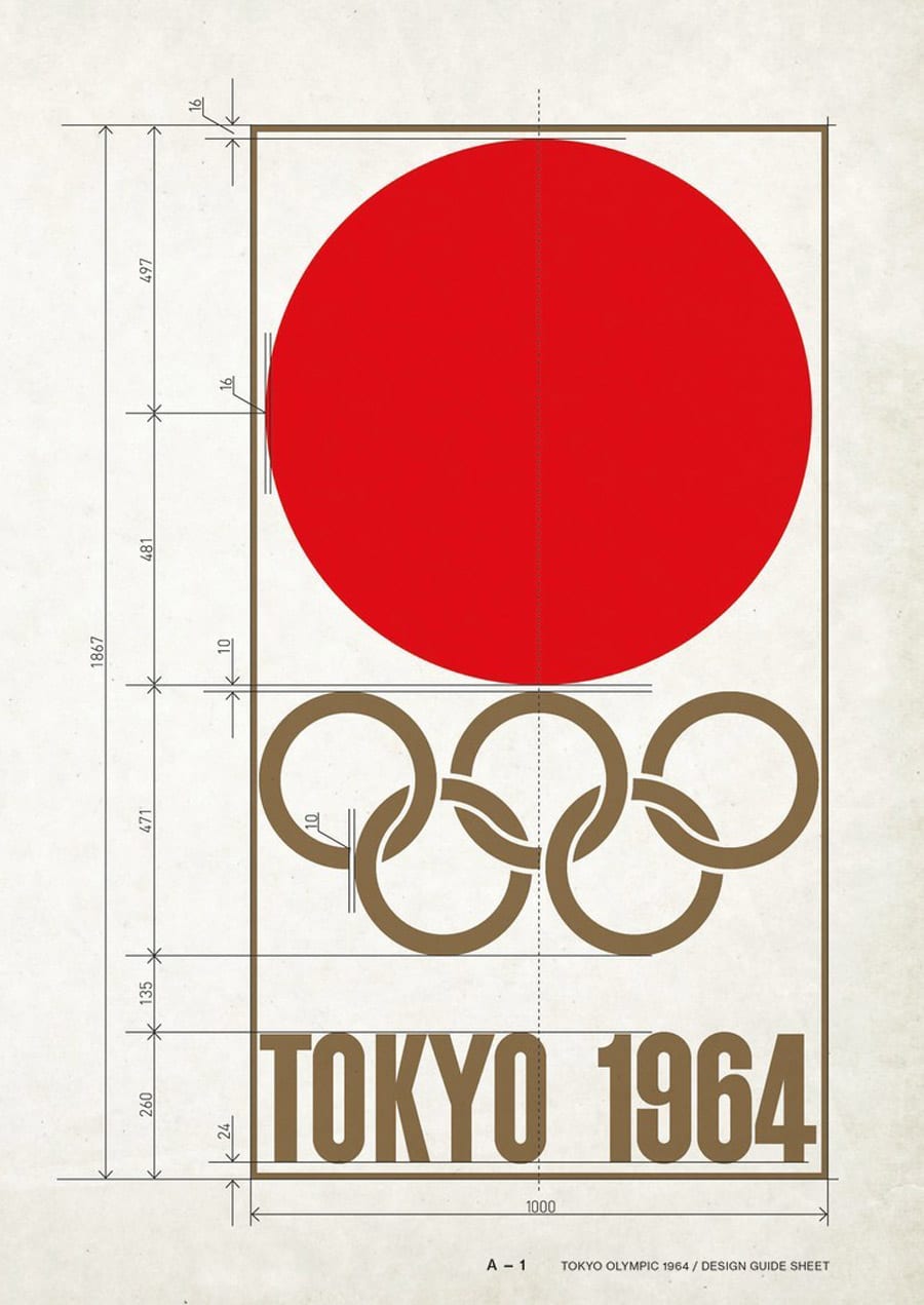
The late American graphic designer Milton Glaser rated this as the best Olympics logo of all time, and we have to agree with him. Elegant, iconic and harmonious, it combines the red sun symbol of Japan with the Olympic rings in a winning gold colour and the words Tokyo 1964 in bold block letters. Designed by the Japanese designers Masaru Katsumi and Yusaku Kamekura, it looks simple, but the way the rings fit together uses quite complex interleaving, removing the usual spaces where they overlap for a more compact and balanced linked icon.
07. Athens 2004
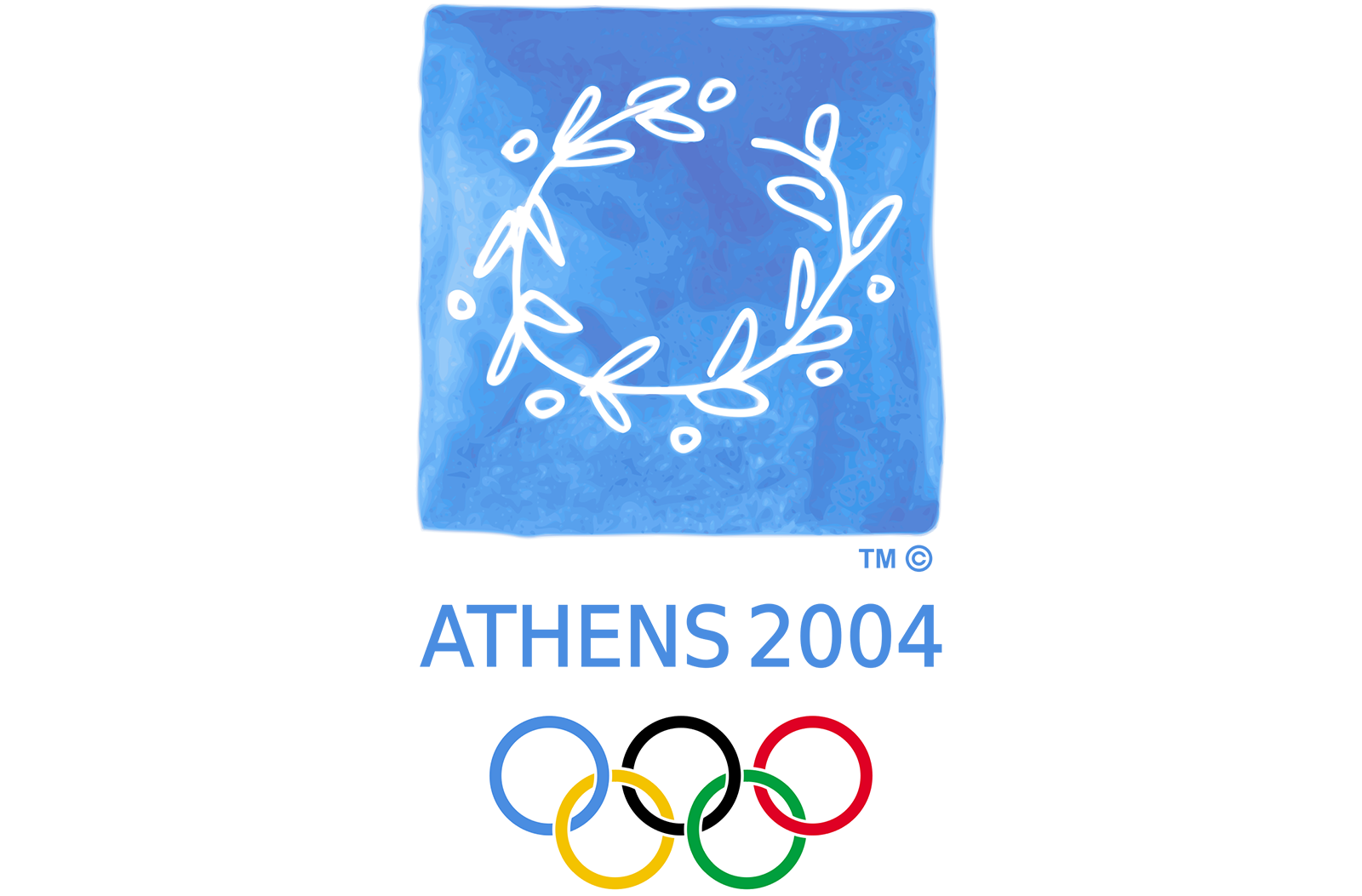
2004 was a landmark year for the Olympics as it was the first time the modern Games returned to the land of their birth. And the logo design chosen to represent the event encapsulated that perfectly. It's very Greek, but rather than going for an obvious national symbol or landmark, the central motif of an olive wreath, the traditional prize given to Olympics winners, also celebrated the Olympic ideals of peace and sporting endeavour.
Created by Wolff Olins and Greek partners Red Design, the distinctive design is fairly unusual for its hand-painted look. It uses Greece's national colours, while the watercolour background was chosen to symbolise the seas surrounding the country.
03. Helsinki 1952
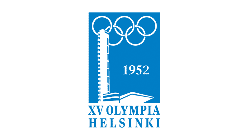
Depicting the tower from the Olympic Stadium might feel a bit cold and detached for an Olympics Games logo today, but this design was a milestone at the time. Many of the earliest Olympic Games logos were either solely typographic or designed to resemble a heraldic element. The 1952 Helsinki Games logo marked a big departure from that. It combined minimal type and flat images in a single-colour design that still looks strikingly modern today.
03. Sydney 2000
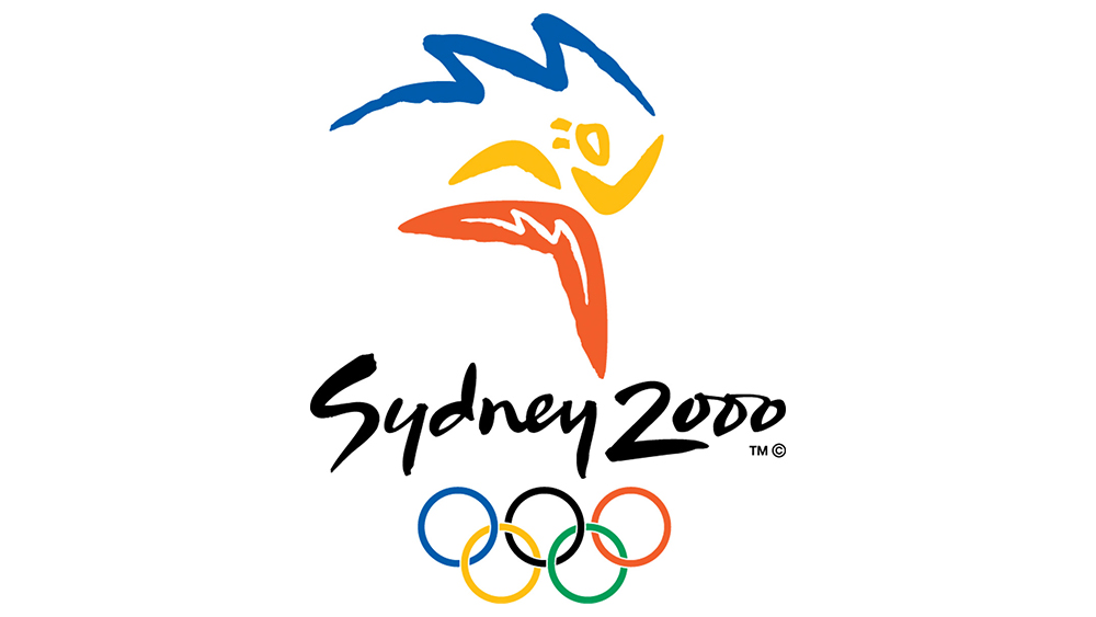
This logo design was very much of its time. We saw lots of logos with a script text style in the early 2000s, but the approach worked very well for the Sydney Olympics complementing the gestural quality of the illustration.
Over the years, several Olympics logos have incorporated stylised illustrations of athletes, but they have tended to be a little messy and difficult to interpret. In this case, there's no doubt as to what Australian architect and designer Michael Bryce's logo shows. The shapes of Australian aborigine boomerang and the sun form a figure in motion, while the blue line at the top also hints at the shape of the iconic Sydney Opera House.
04. Mexico City 1968
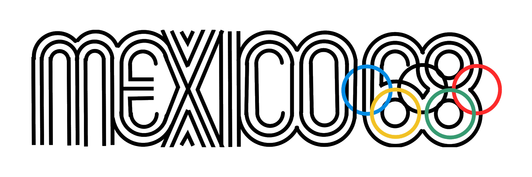
In 1968 a team led by Lance Wyman was asked by Olympic Commitee chairman Pedro Ramírez Vázquez to: “Create an image showing that the games are in Mexico, that isn’t an image of a Mexican wearing a sombrero sleeping under a cactus.” They achieved that and more, creating a stunning logotype that to this day is still regarded as a design classic.
Expanding the geometry of the five Olympic rings to generate the number ’68’, this deceptively simple design takes in influences of both Mexican folk art and 1960s pop art, brilliantly combining both the heritage and the modernity of Mexico, with not a stereotype in sight.
05. Munich 1972
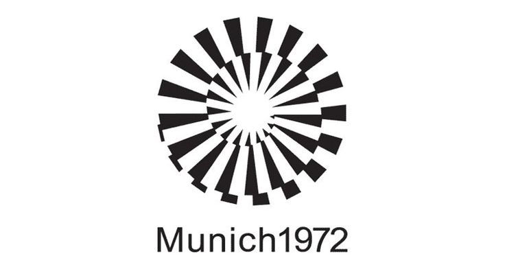
While most Olympic logos seek to incorporate elements of patriotic pride, by 1972 the economic giant of West Germany was confident enough to take a different tack. This modernist geometric logo was designed specifically to avoid reference to any particular country, highlighting a theme of global unity that became all the more poignant after the terrorist murder of 11 Israeli Olympians.
Strongly inspired by the Modernist tradition, it featured a stylised sun and made clever use of a spiral effect to show rays of hope and optimism bursting out of the emblem. It's a sleek piece of design. That said, with no rings or hint of the Olympic colours, the design could be for any event.
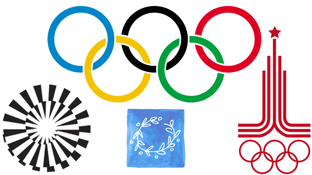
06. Moscow 1980
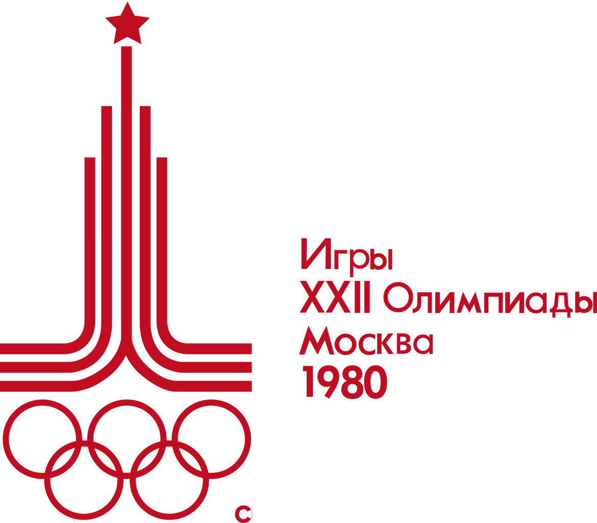
The 1980s saw the use of Olympics logos as assets of national branding reach its peak as the the USSR and then the USA hosted the summer games of 1980 and 1984 respectively, right at the height of the Cold War. The corresponding logo designs didn't exactly suggest that the Olympic ideals would triumph over national self-interest, but they were great pieces of design.
The USSR used the Moscow Olympic Games to project itself as a strong modern nation in the face of a US boycott, and its stunningly uncompromising logo design blends Soviet and Olympic symbolism into one powerful icon, with the red star atop lines representing the Kremlin.
07. Los Angeles 1984
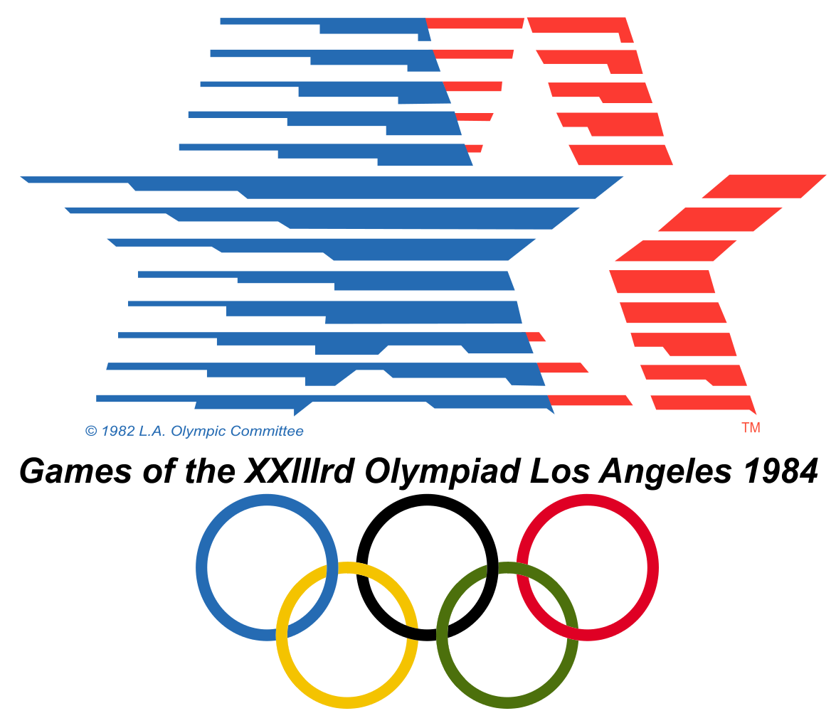
Four years after the USSR, the Games returned to the USA, and this logo design by Robert Miles Runyan & Associates was just as unashamedly patriotic as its Soviet predecessor. With speeding stars in the national colours of red, white and blue, there was no doubt where this Olympics was being held. The go-faster stripes were intended to reflect both national and athletic dynamism while interlocking in a way that echoes the rings below them, subtly tying 'US values' to those of the Olympic movement.
08. Beijing 2008
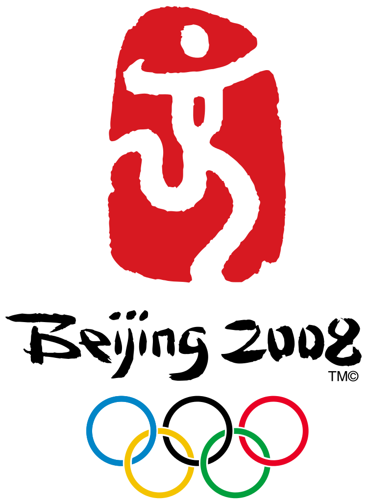
With China emerging as a major economic power in the 21st century, this logo for the 2008 Games packed just as much national pride as those classic designs from the 1980s. Created by Guo Chunning, it depicts a traditional red Chinese seal (the colour of luck in China and the same shade as the country’s flag), the emblem features a dynamic figure which is also a stylised version of the word ‘jing’ (which means ‘capital’ and is the second part of the city’s name). Reminiscent of a runner crossing the finishing line, the figure’s curves are suggestive of a traditional Chinese dragon, while its open arms symbolise an invitation by China to the world to share in its culture.
09. Rio 2016
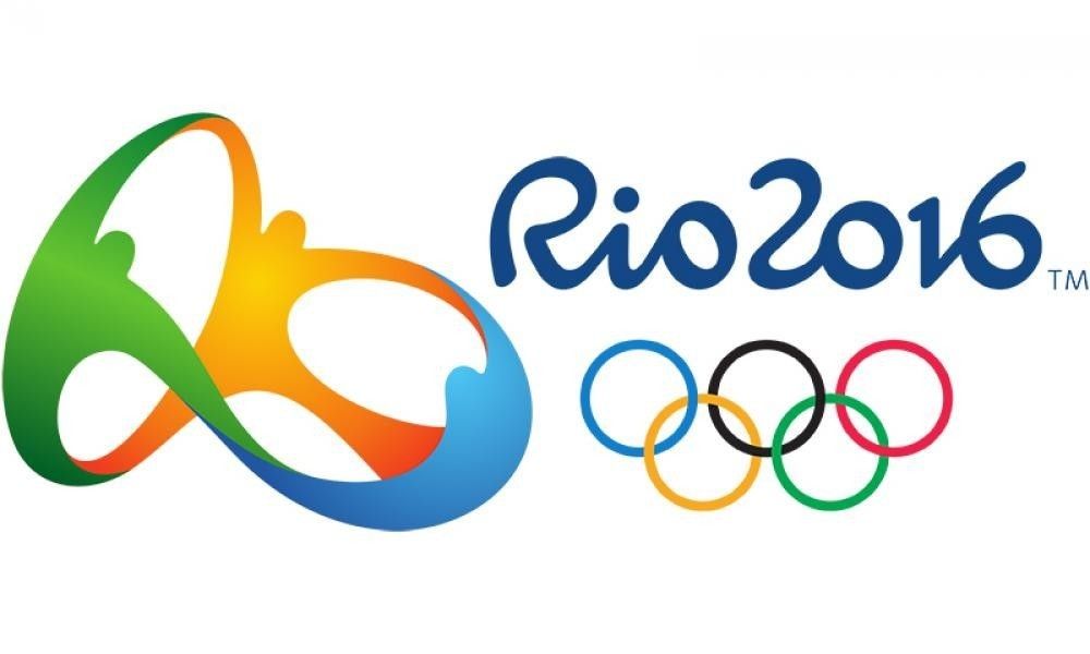
The stretchy-looking 3D logo for the Rio 2016 Olympics felt like something new and different for the Games. With elegant simplicity, it conveys a multitude of themes, and it feels Brazilian without using any overly obvious national reference. The shape was inspired by Rio's famous Sugarloaf mountain, and the colours of sun, sea and forest represent Rio’s environment, but these references aren't layered on heavily, rather they back up a stronger emphasis on the true Olympic message of global unity, represented by people holding hands. You can learn about how the Brazilian agency Tatil developed the design in our article on how the Rio 2016 logo was created.
See here 10 logos that make clever use of negative space.
10. Tokyo 2020
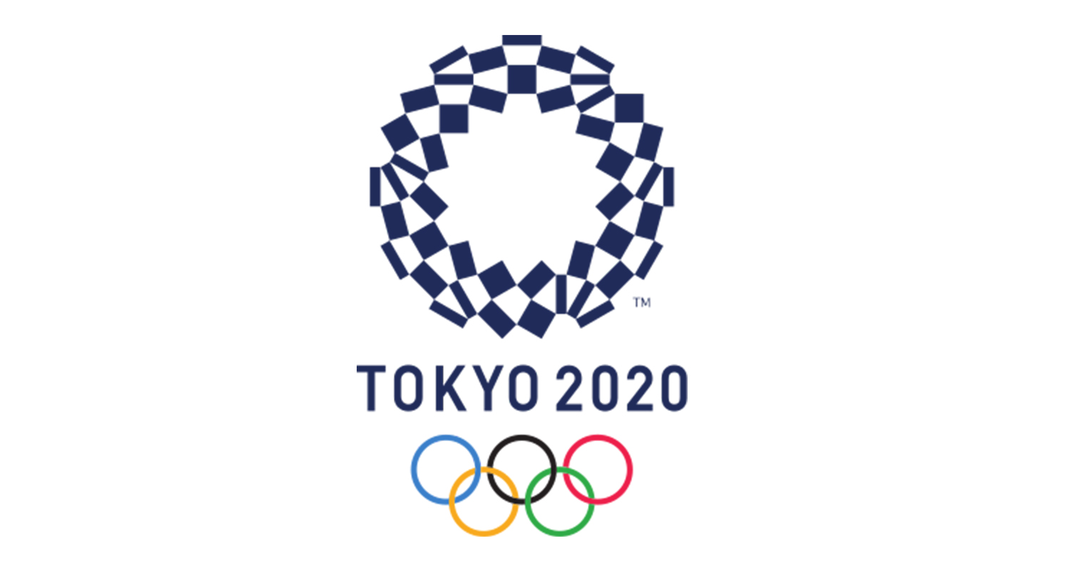
Tokyo did it again in 2020, even if it took two tries. The first logo for the Tokyo 2020 Games (eventually held in 2021 due to the Covid-19 pandemic) was dropped due to claims of plagiarism. Its replacement was the work of Asao Tokolo, an artist known for his intricate, mathematical motifs.
Entitled the Harmonized chequered emblem, the indigo-blue design features a traditional Japanese pattern known as ichimatsu moyo, which first became popular in the edo period (1603–1867) and is associated with traditional 'Kabuki' theatre. Composed of three varieties of rectangular shapes, the design "represents different countries, cultures and ways of thinking" – according to an official statement. It's weird, and hard to reproduce, but it's unique and memorable.
11. Paris 2024
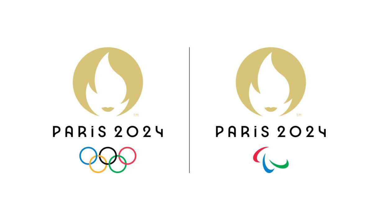
Including this is a list of the best Olympics logos is a controversial decision, I know. The Paris 2024 Olympic Games logo is still being mocked for looking like 'Rachel from Friends' (or 'Gail Platt from Corrie' for those in the UK), and, but when was the last time an Olympic Games logo made you chuckle? Probably never. And that physical reaction makes this a design we'll never forget.
The clever optical illusion logo gives the Paris Games a feminine face, merging the Olympic torch with the visage of woman, who's intended to represent Marianne, the personification of French Republic. It might not say much about sport, but using an immaculately coiffured symbol of the French Revolution is a delightfully leftfield way to include a national reference without recourse to tired symbols or obvious colours. And France has stopped with the logo alone. The Paris Olympics mascots are also inspired by a revolutionary symbol, but everyone thinks they look like something else. Together, they make the Paris 2024 Olympics the wildest event yet for design.
12. London 2012
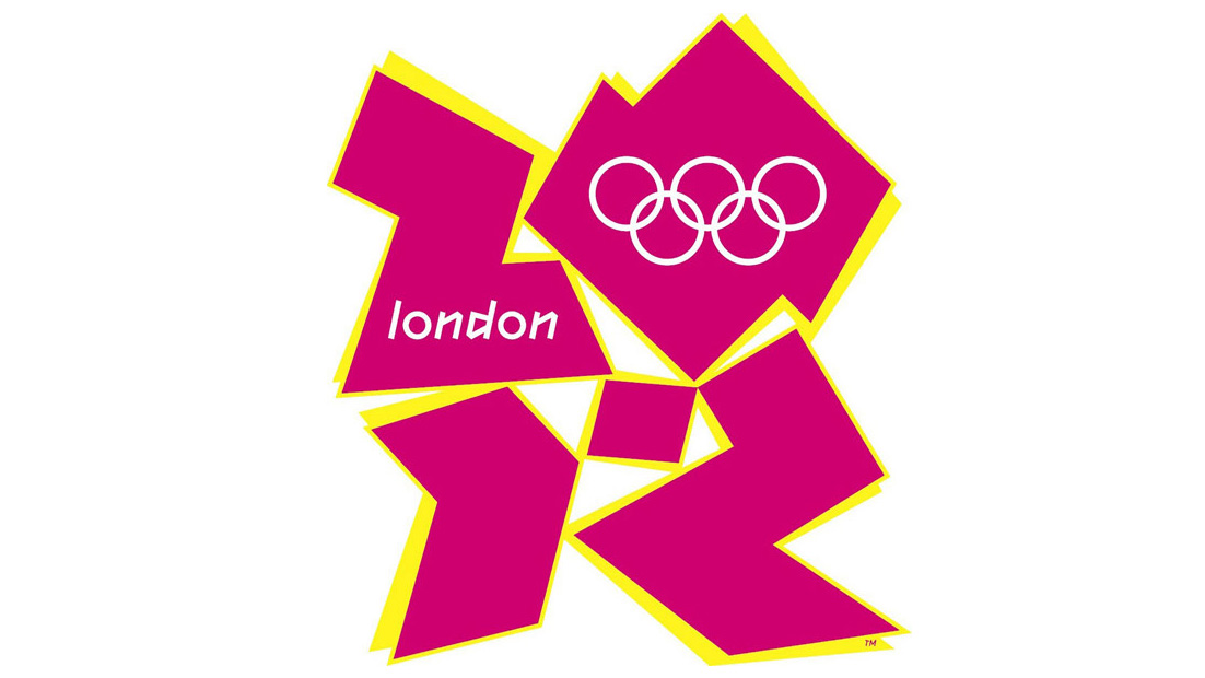
This was another Olympics logo that was heavily mocked and satirised, but when we look back today, we can see that it was an excellent piece of branding. Wolff Olins took a bold direction, and the result stands out from all other Olympics logos, representing London not as a city of history but a city of the now: frenetic, exciting, edgy and forward thinking.
13. Nagano 1998
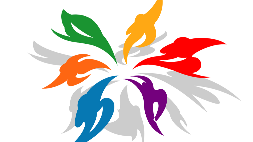
For Winter Games in 1988, the Japanese city of Nagano went with a design that became known as the ‘Snowflower’. With an abstracted athlete making up each ‘petal’ of the structure, along with its grey shadow, there’s a real sense of verve and energy to this design. Some of the figures are a bit hard to make out, and I'm not sure it benefits from the shadows. However, it was a striking attempt to balance the literal and the abstract, and the Japanese with the universal.
14. Sochi 2014
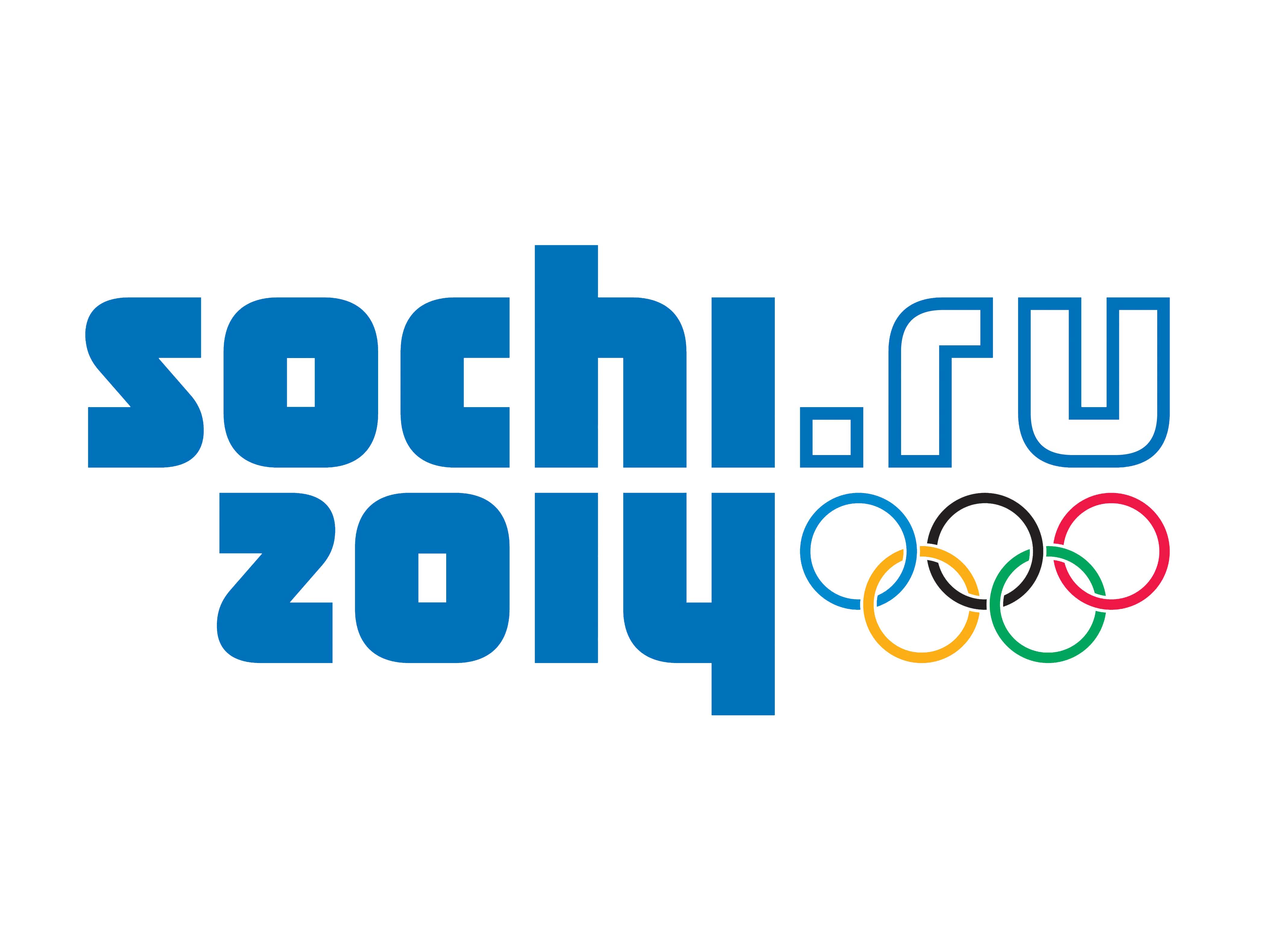
After some debate I decided the Sochi Winter Olympics 2014 logo deserved including as the final entry in our pick of the best Olympics logos if only for doing things differently. Unlike almost all modern Olympics logos, it's a logotype only, with no pictorial element other than the Olympic rings. As such, the text has to work hard.
The lettering is all lowercase, and it doesn’t even feature the official name for the event. Instead, it's presented as a URL: sochi.ru, perhaps in recognition of the fact that Sochi isn't the best known city in world and many people probably didn't know where it was. I think that radical simplicity worked. It's easy to apply, and the mirrored reflection of the 'hi' and the '14' creates a nice balance in the design.
For more sports logo news, see the new Las Vegas Raiders logo and the controversy over the Red Bull logo on Leeds United's kit.