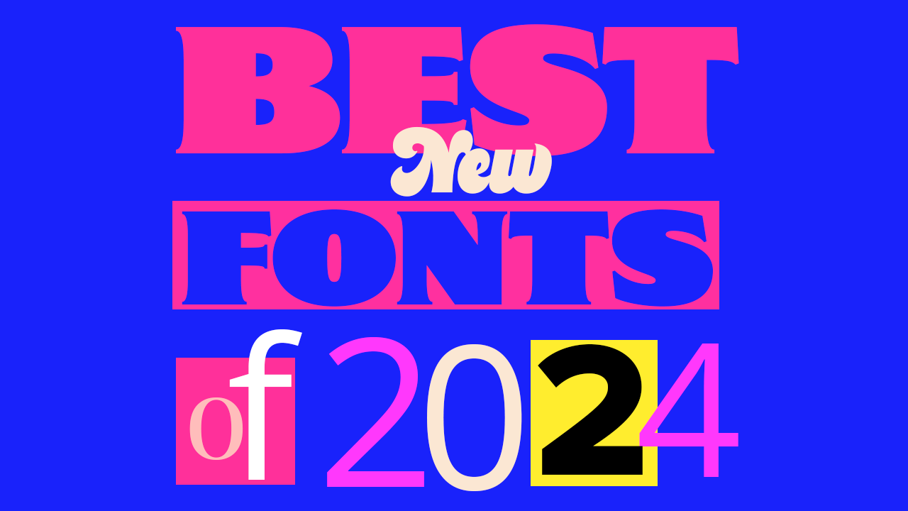
Typography trends of 2024 have been all about shifting away from Swiss-inspired, minimalist designs and introducing more colourful, eccentric typefaces. We’ve seen typefaces inspired by illustration, and have even started to see an increasing amount of conceptual typography more concerned with its shape than legibility.
It looks like we’re ending 2024 with exciting type concepts on the horizon of the design industry, with designers daring to go out of their comfort zones more and edge away from the basics. Individuality is becoming more celebrated, and contentious, ‘anti-design’ concepts appear to be inspiring a great deal of work.
To put together the best fonts of 2024, we’ve interviewed five designers and got their take on the best fonts that have emerged in 2024. Our font professionals are leaders in the industry, from working with brands like Monotype, Adobe and Mustang, to even having had a hand in creating the fonts we use everyday.
For a deeper dive into design trends, take a look at our guide to must-have free fonts or the design trends for 2024 that we predicted earlier in the year.
01. Proxima Nova
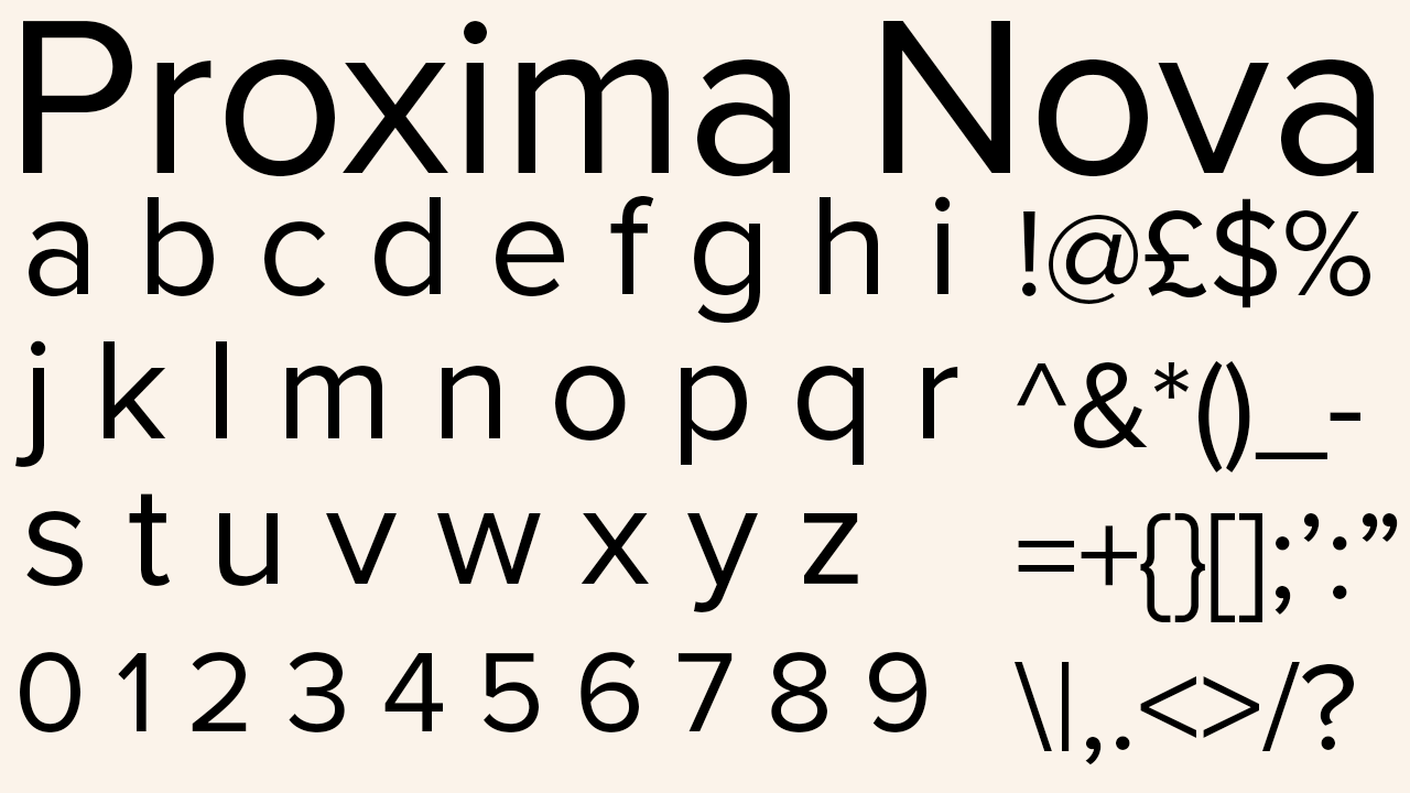
Proxima Nova was first choice for Steve Matteson, former creative type director of Monotype and founder of Matteson Typographics. With the addition of Arabic and Hebrew scripts, “this hugely popular design now has a global reach, which I think is really wonderful,” says Steve.
Steve also points out the divide in typefaces available in Latin fonts in contrast to non-Latin fonts – and that when using Latin and non-Latin language together, “such as on medical records or packaging,” different fonts have to be used for each language. Proxima Nova fills this void. Steve appreciates the comfort "to know that if you’re a creative working for a global brand you have the opportunity to work with all these other languages”.
02. GT Flaire
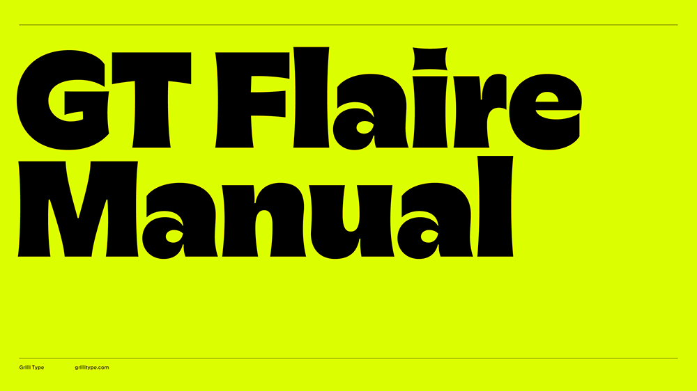
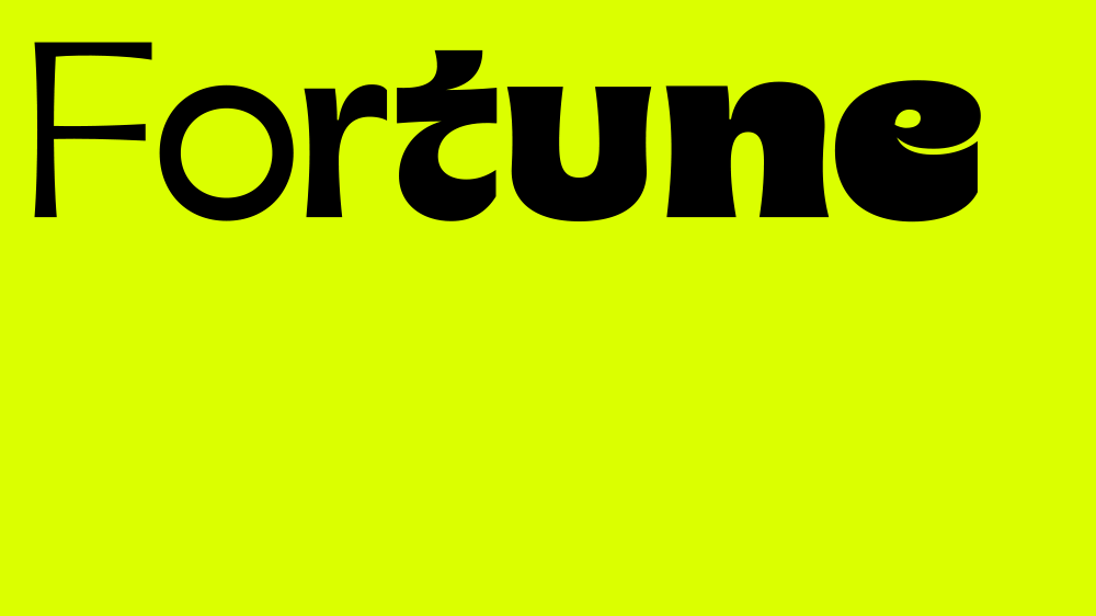
“Grilli Type is always smashing it out of the park,” and has done with GT Flaire, designed by Reto Moser, says Kyle Wilkinson, director of Haus of Thrills. GT Flaire is a large family available in both serif and sans serif, an unusual choice for a font foundry and one that signifies a shift in graphic design beginning to move towards high-contrast designs. The fonts put out by Grilli Type always “stand out the most,” says Kyle. “They’re more useable and can be used in more projects, rather than only being a very specific look that is only right for one very niche project.” This ethos is evident in GT Flaire’s wide and varied display family.
03. Madcap
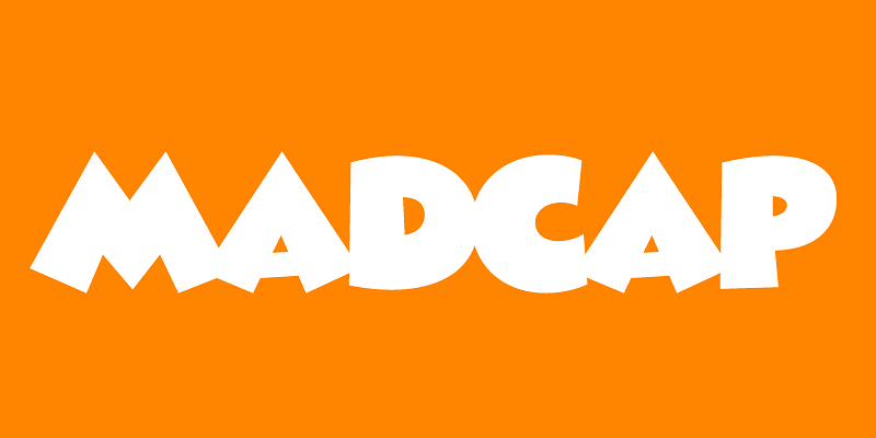
Madcap is a playful font that fills a gap in the market needed for professionally made fonts designed for less serious projects. Steve told us that both him and Mark Simonson usually work with global brands such as Microsoft and Google, meaning that a chance to create something fun like Madcap is always a relief. “When we’re not working on really serious designs we like to work on lettering we started when we were kids,” says Steve. Madcap has been in the works for years.
04. Nebulica
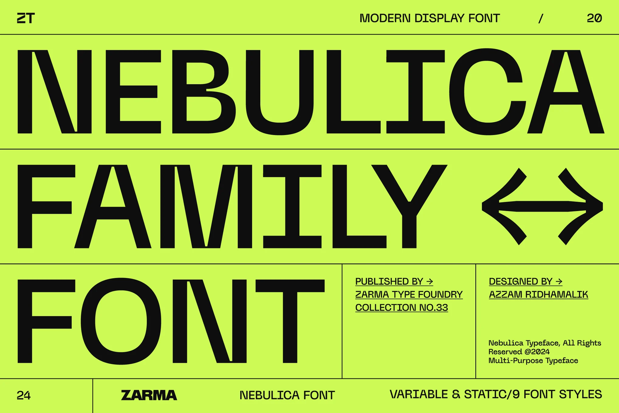
Display font Nebulica, is “super futuristic,” says Izzy Poirer, an established brand designer who runs the Ottawa Design Club and hosts livestreams for Adobe. She believes that the increase of AI is causing “a lot of congregation of worlds”, in design. “I’ve been seeing the same with fonts,” she says. “It’s either super vintage or super futuristic.” Nebulica echoes this trend with its grotesque strokes combined with occasional curves and serifs, and then contrasted once more with harsh lines cutting some of the curves off the top of the letters.
05. Gertie
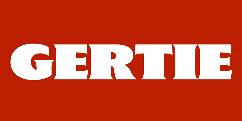
Gertie is reminiscent of early letterpress type styles used on posters and in magazines. In line with Mark Simonson’s current style of retro fonts, it was another one of those unfinished childhood projects, evident from the energy in the serifs. Steve praised Gertie as a successful font of this year, and following a chat he had with Mark in the summer, Steve says he gets "the sense that these [fonts] are reaching back to his days in the ‘70s and early ‘80s."
06. Highmore
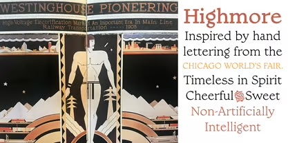
Highmore is Steve’s invention and was inspired by painted sign lettering that was created in 1933 for the Chicago World Premiere. “I love looking at those early inspirational letterforms and making a typeface out of it,” says Steve. In this way, Highmore is almost a nod of respect and acknowledgement to those designers who once created everything by hand. Steve himself follows this example by always using pencil in his font creation, so for those who love old-fashioned fonts that represent the very beginning of typography, Highmore is the perfect choice.
07. Polymath
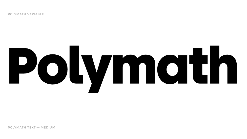
Polymath brings a little more personality to your run-of-the-mill grotesque typeface, which makes it especially ideal for branding. Kyle loves it “because of its versatility,” adding to its potential wide utility in professional projects, where instead of choosing one display and one body font, you can just choose Polymath to cover all bases. “It can be used in professional projects, but it can also be used in something that requires a little more character as well,” says Kyle.
08. Cheesecake
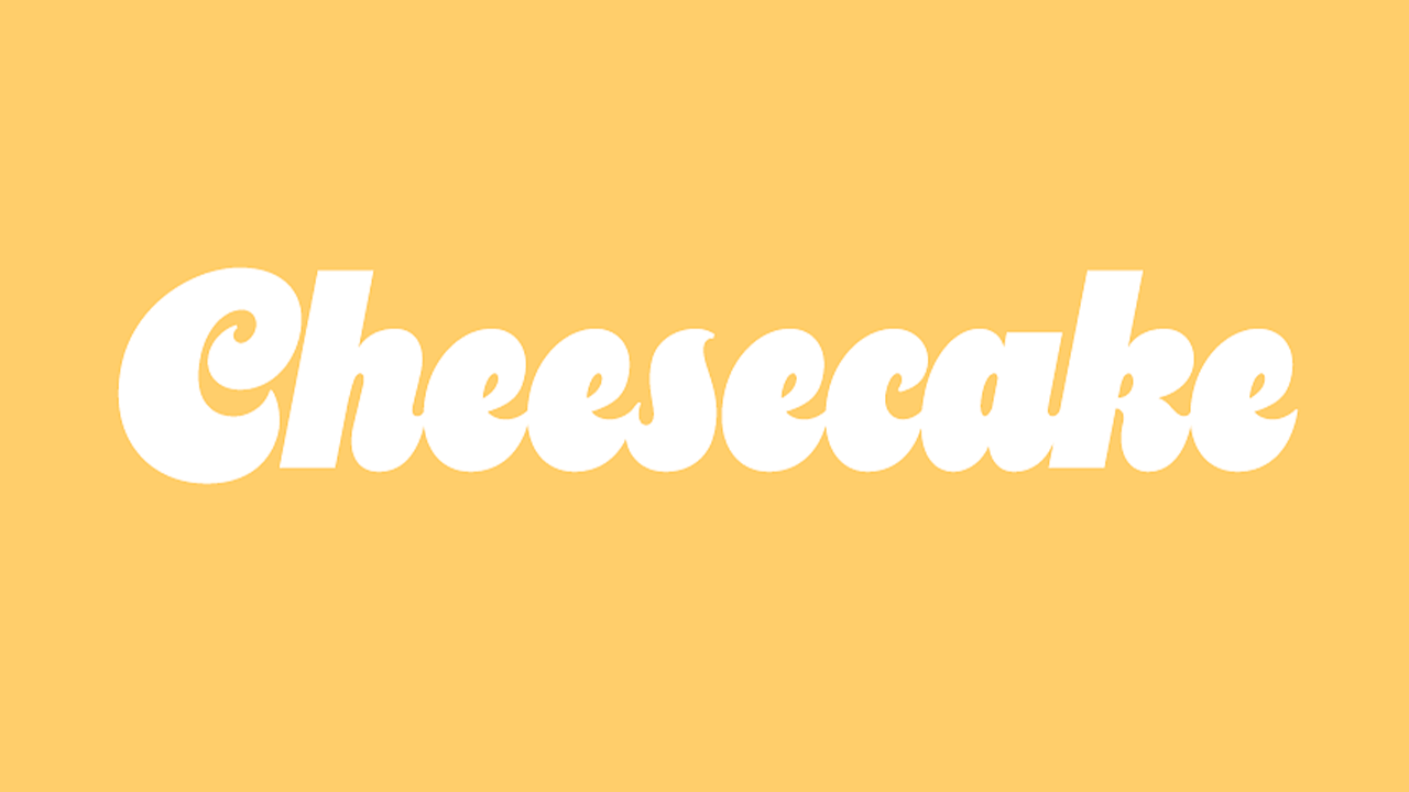
Also designed by Mark Simonson, Cheesecake is a retro typeface that injects a touch of fun into a project. Recommended by Steve, it has notably equal x-heights and large curves, making it an ideal typeface for large-scale designs. Cheesecake would be an ideal fit for designs inspired by nostalgia.
09. Waffle Cone
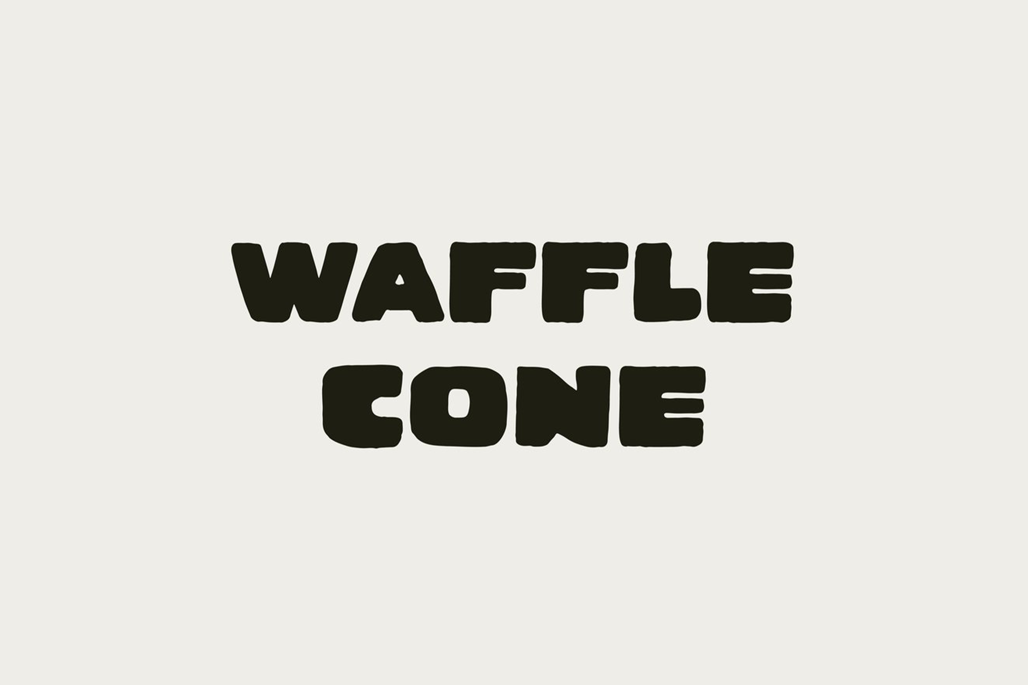
Liz Mosley puts a spotlight on the strength of Taylor Penton’s fonts in 2024. As a previous designer for London School of Economics, a current brand designer and host for Adobe Live, Liz endorses Waffle Cone for its hand-drawn look. “The things I’m really drawn to are hand-drawn looking fonts, and Taylor does quite retro ones, so there’s a lot of texture in them,” says Liz. The wobbly lines of Waffle Cone create texture while allowing you to maintain consistency and professionalism in your design.
10. Wingman
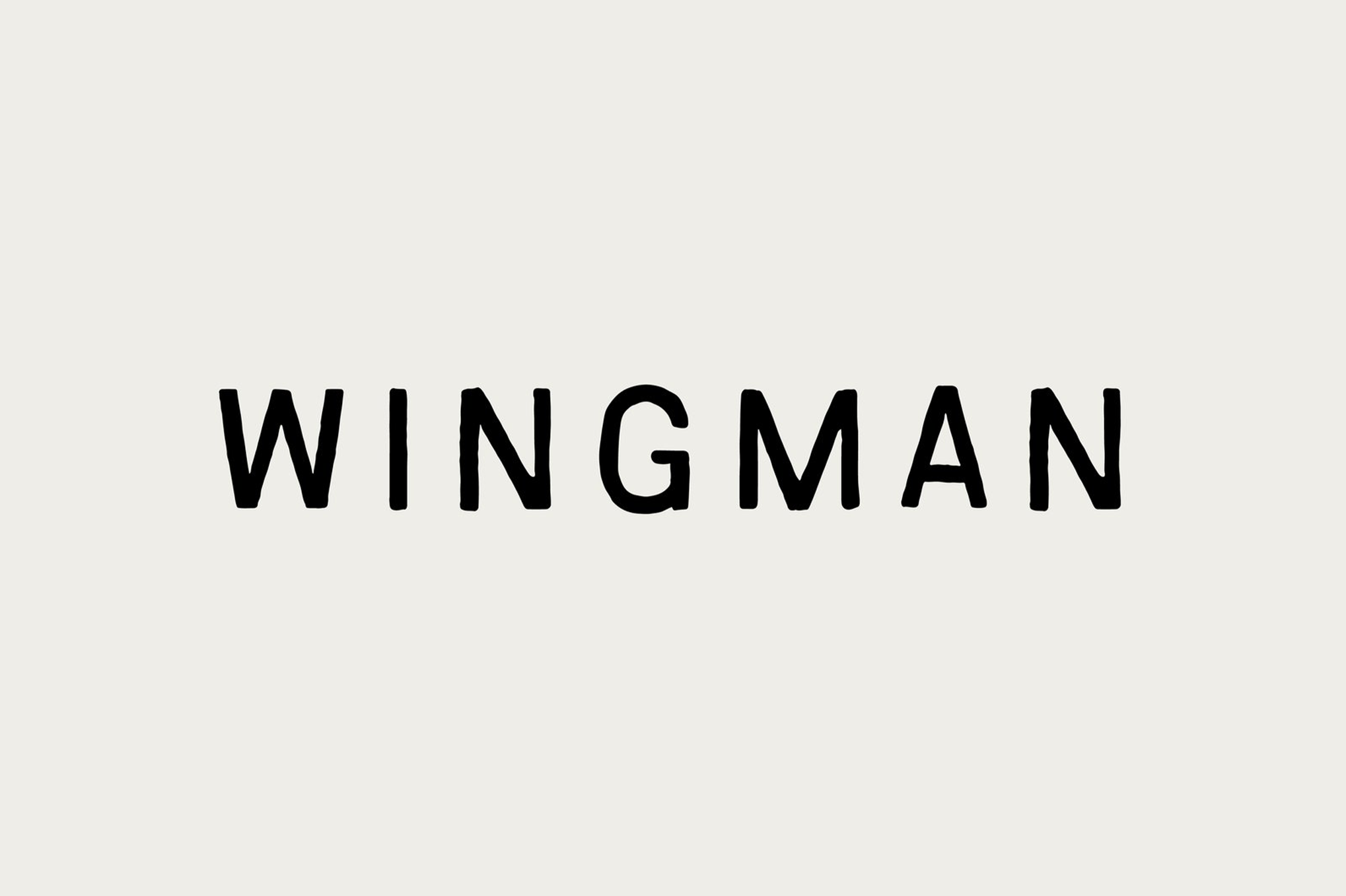
Wingman also stands out with its textured lines that celebrate its hand-drawn element. Liz also loves the texture of Wingman, and noted how valuable it is to find a playful font that’s also well-made and professional in the current marketplace; where selling fonts is becoming increasingly more accessible. Within this culture though, is the opportunity to find unusual fonts made by professionals like Taylor Penton. “Taylor just creates his own fonts and uploads them to his website,” says Liz. “And I think that’s really cool.”
11. Bebas Neue Pro
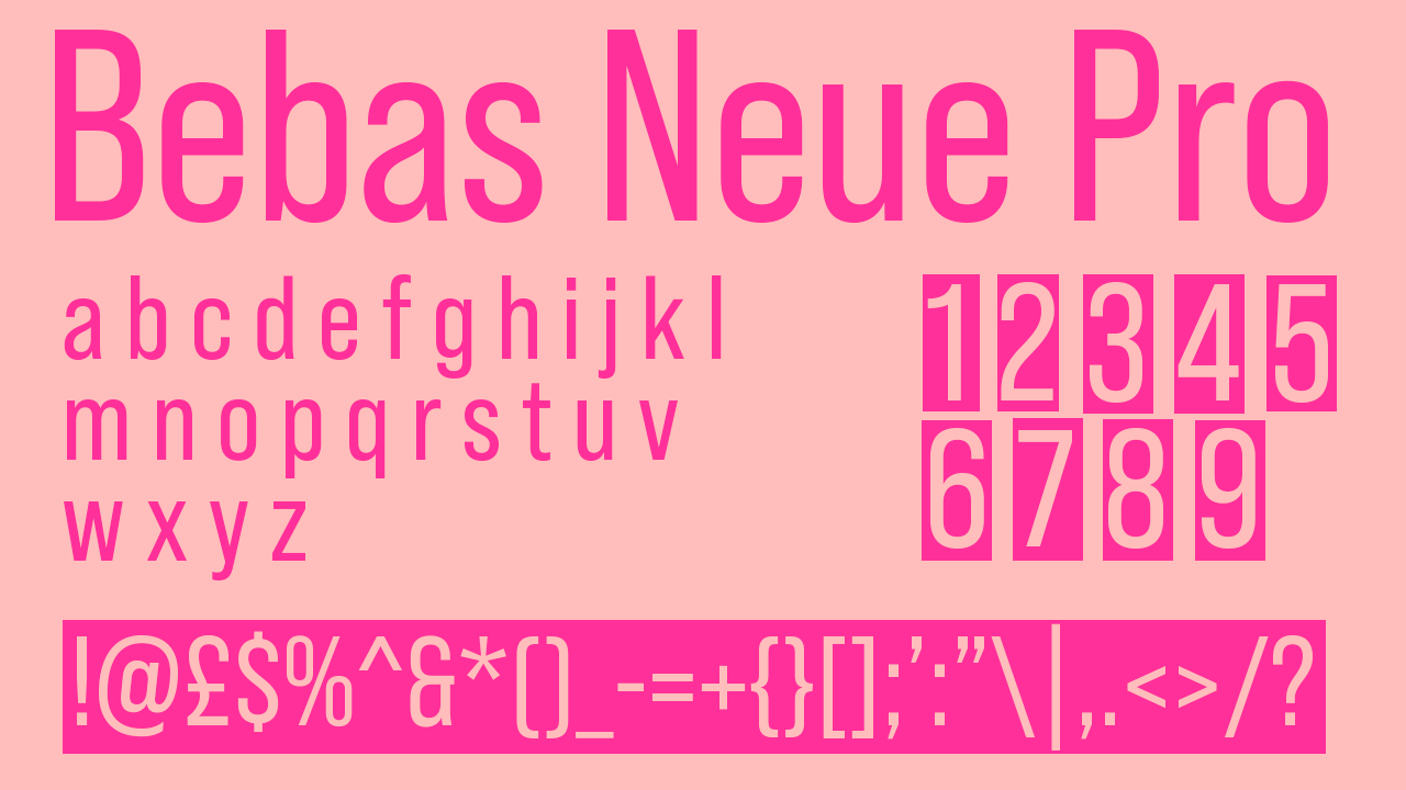
Danielle Clark, brand designer, brand strategist, previous co-host of the Birmingham Design Festival and previous visiting lecturer at Birmingham City University, loved the update Bebas had this year. The typeface has had years of professional popularity, with its first publication in 2005 and Bebas Neue being released five year later. Now, in 2024, Bebas Neue Pro is the latest update, and it finally includes a lowercase script. Danielle, like many of us, has been waiting for this update, and considers it a highlight of the 2024 font scene. “I used it on the ‘Girl vs Cancer Feeling Myself’ campaign,” she says. “It’s a gorgeous font. It’s stunning.” We couldn't agree more.
12. Comic Sands
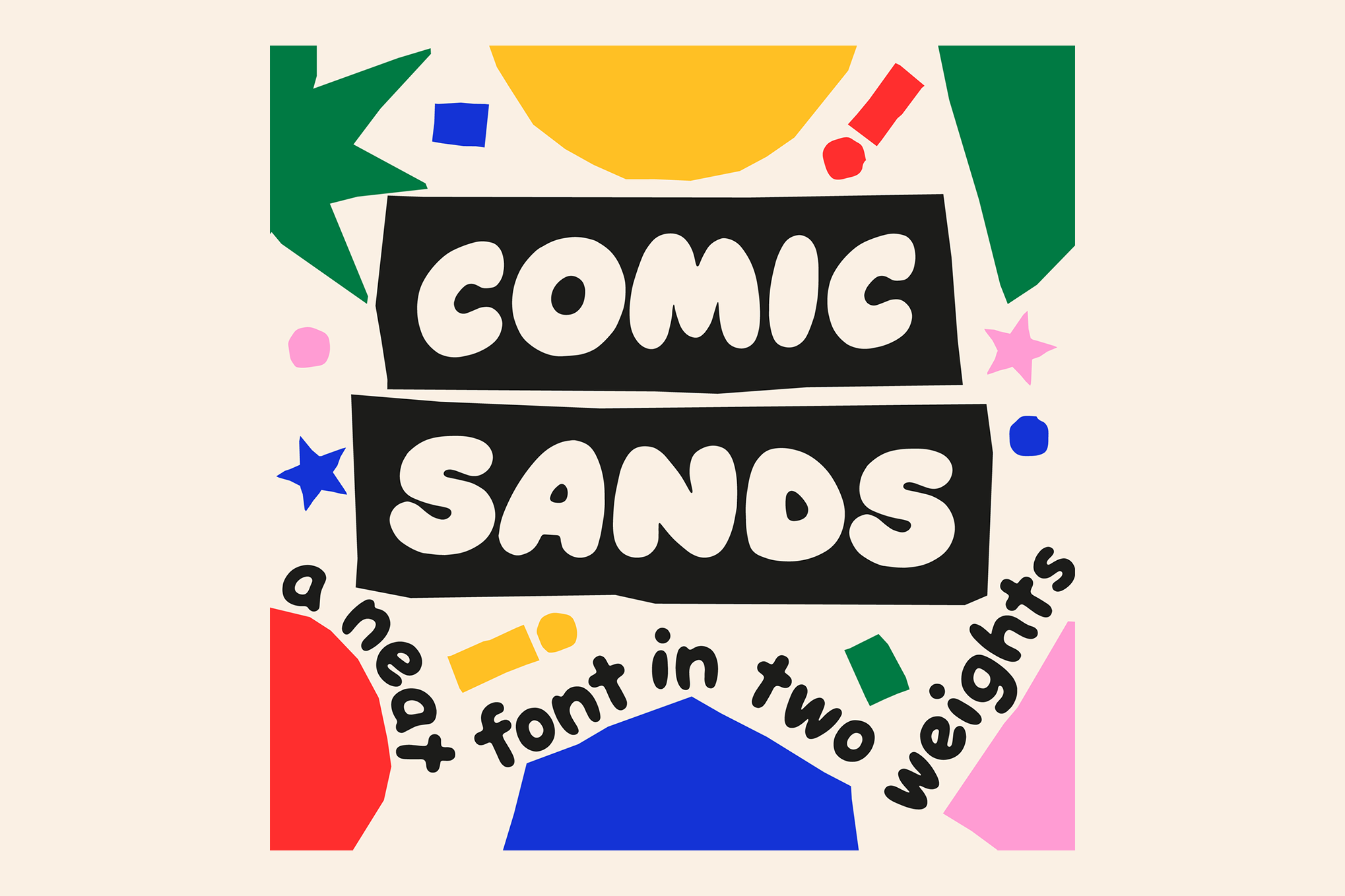
This "parody version of Comic Sans" is one of Liz's favourites. Comic Sands’ strength is its variation in x and y-heights that help to make your work appear hand-drawn while keeping the typeface clear and professional. “It’s a bubble font,” Liz notes, "so it’s really cool and playful.” Suitable for colourful projects, Comic Sands is designed to help individuality shine.
13. Open Sans
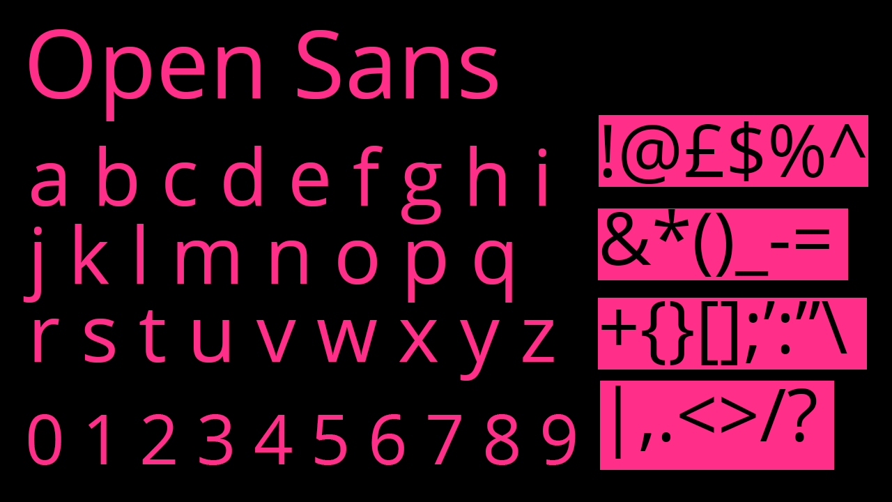
Open Sans is another favourite of Danielle’s. Originally designed by Steve Matteson in 2011, it has long been a staple, and its update this year proves its timeless place on the font scene. “What I love about it is how accessible it is,” says Danielle, noting its ability to operate both as a stunning display font and as addictively readable body text. “It’s a really beautiful font, it’s so versatile,” she says, also adding its impressive ability to work across different platforms as well. “You can use it online, for website publishing, video.” Open Sans is clearly an all-rounder. With 13 different variations, Opens Sans is a designer’s must-have.
For more about fonts, see our typography of the decade series.
