We're halfway through the year, and that means one thing (other than that the days have started getting longer or shorter depending on where you are). Yes, It's time to review the best logos of the year so far.
Many of the designs that most got our attention were rebrands. Some of those were subtle, and some were radical. But we've also seen some entirely new logos that we thought merited an inclusion in the roundup (see our full roundup of the best and worst logos of 2023 for last year's hits and misses).
The best logo designs of 2024 so far
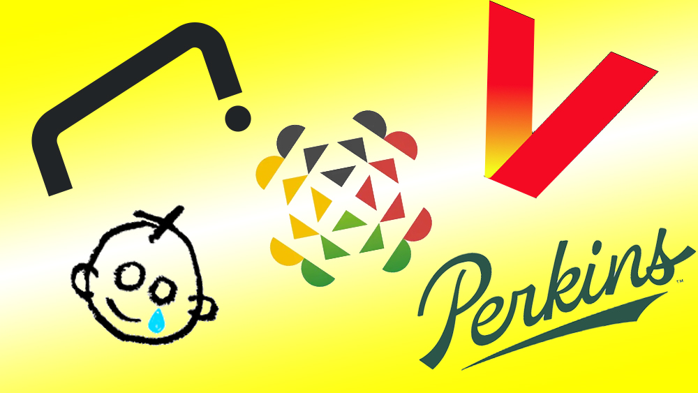
01. The new Perkins logo
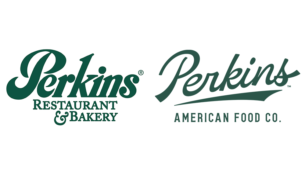
We'll start with rebrands. The new Perkins logo might not stand out if it were a new brand, but we think it achieved what it set out to in this rebranding of a US restaurant chain. It's one of those designs that sounds like a contradiction but totally works: it looks both more modern and more retro than the previous design.
02. The new Verizon logo
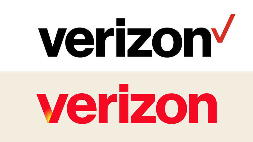
Sure, it looks a bit like Netflix when the V is used alone, but the new Verizon logo is a big improvement. The wireless provider has stuck with Neue Haas Grotesk, but by adopting red as the main colour and a gradient glow on the V, it's warmer, more vibrant, less corporate, and it's putting the focus on its broader streaming and gaming offerings.
03. The new GOSH Charity logo
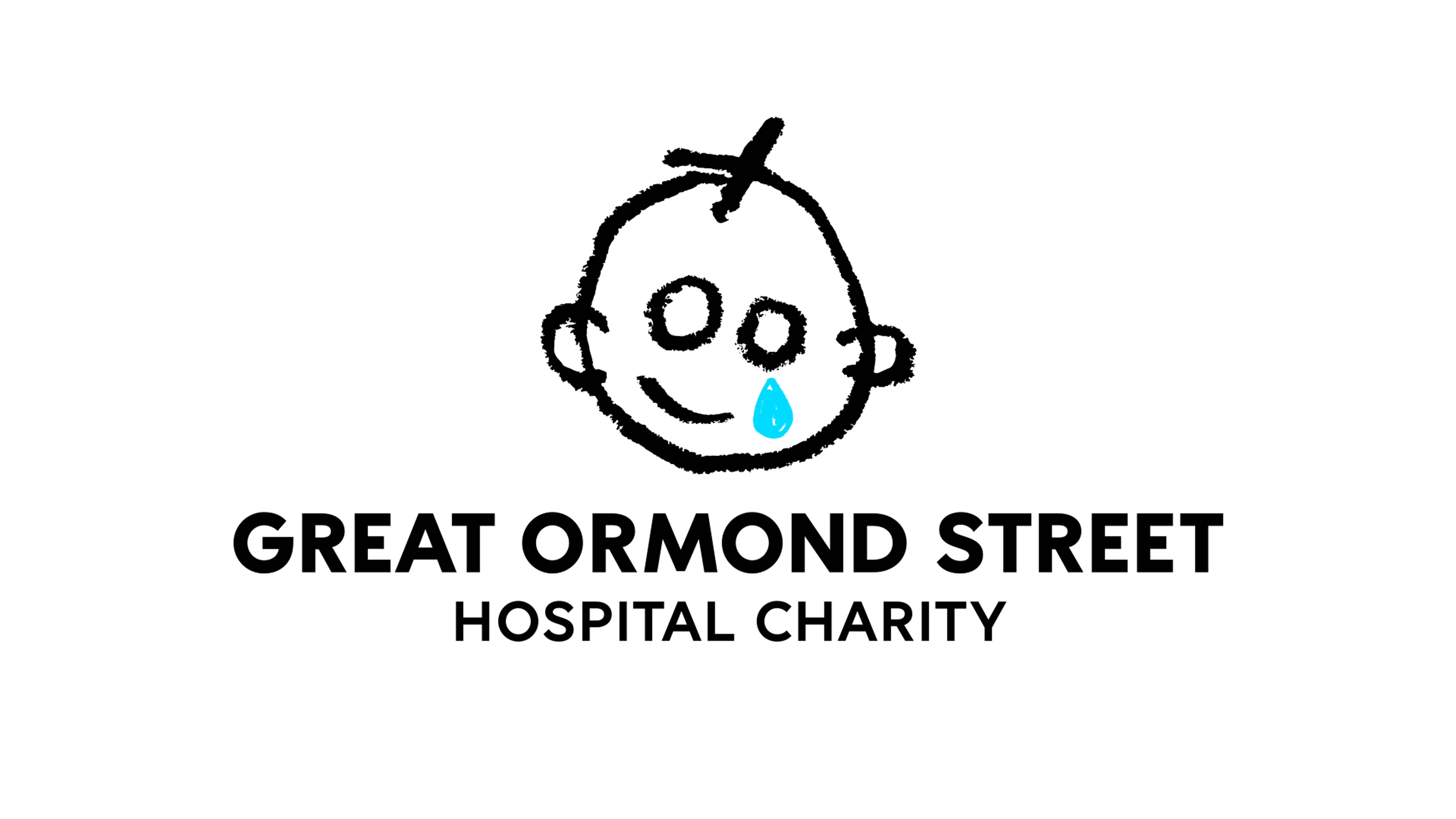
This was a relatively subtle logo change (although the GOSH Charity rebrand involved much more than just the logo), but we think Pentagram and Stuart Gough got it just right, with the rougher, crayon-like line making the logo feel even more authentically childlike.
04. The National Football Museum logo
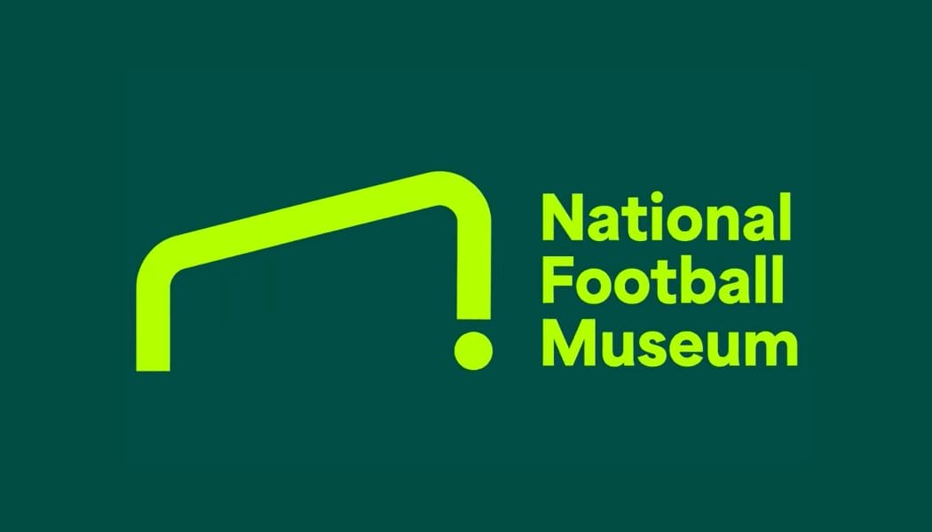
The National Football Museum logo is a goal. Literally. Proof that simplicity is often the way to go with logo design, the icon is inspired by a goal and a ball. But designing such a minimalist logo in a way that allows easy interpretation is a huge challenge. Poke Marketing achieved this by using the shape of a goal viewed at an angle rather than face on.
05. The Nike A'ja Wilson logo
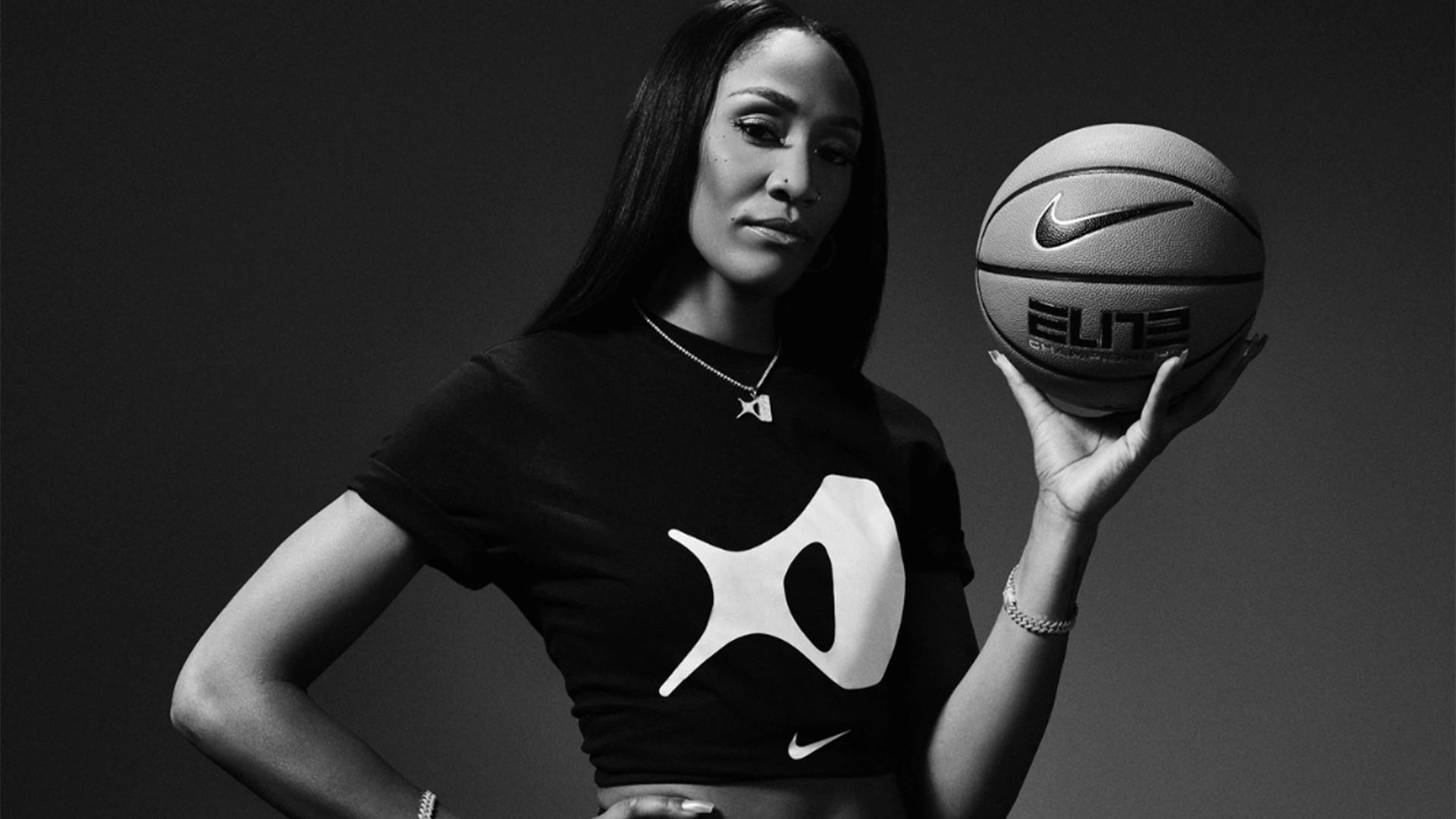
Turning to entirely new designs, A'ja Wilson's logo (referred to as the 'A') has provoked mixed opinions online, but we think it works. It was inspired by the star shape that A'ja draws in her signature, also referencing her self-proclaimed "diamond in the rough" identity.
06. The 2025 World Games logo
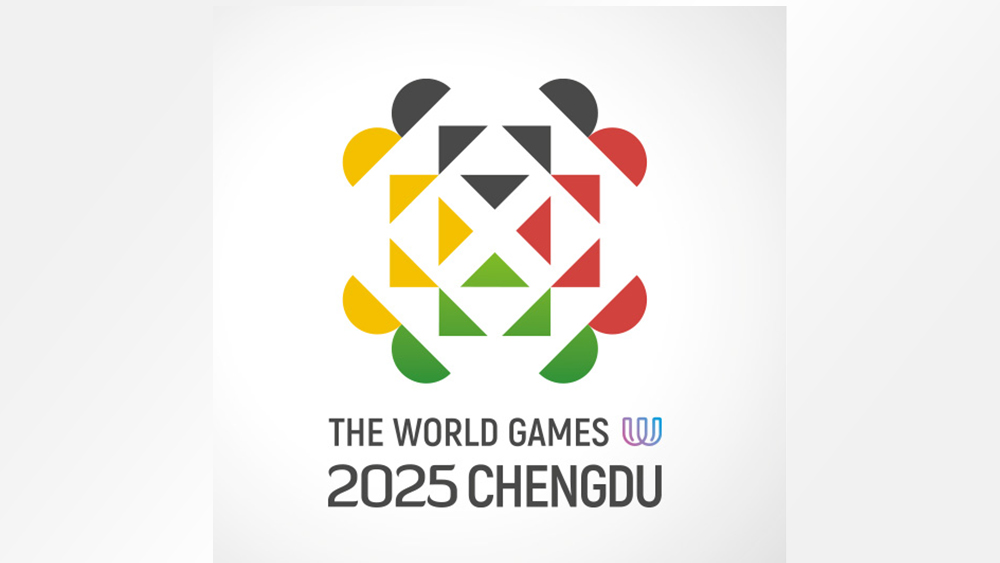
A new logo with an optical illusion? Yes, please. And it's adorable one. Created by British designer John Fairley, the Chengdu 2025 World Games logo features geometric shapes symbolising the interconnected fate of humanity and respect for cultural diversity, but it also has a little Easter egg. The top section (coloured black) looks like the face of a panda, which Chengdu is famous for.
For more inspiration, see our pick of the best logos of all time. And for new designs, see the new Switzerland Tourism logo.