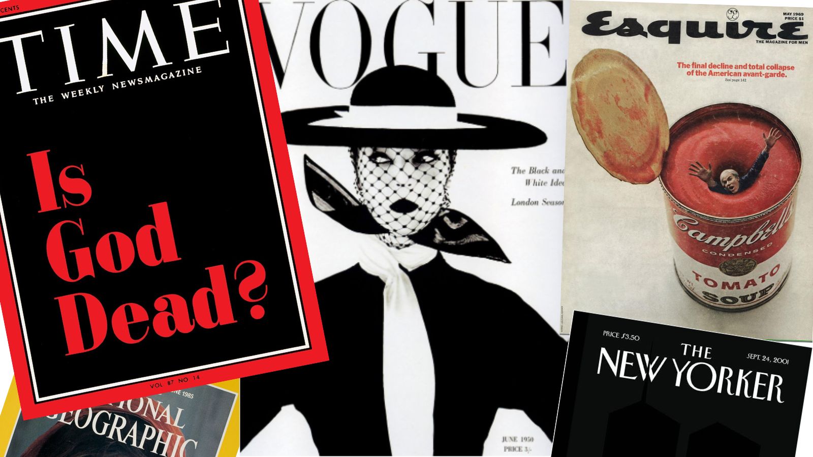
Some of the best magazine covers have gone on to become defining images of the 20th and 21st centuries. Whether they’re depicting the aftermath of war, the transfer of political power or just a famous face in a new context, great magazine covers need to catch the eye, while also communicating the tone and content of the publication within.
It’s a tricky line to walk — and a lot of ink has been spilled regarding how to get it right. Magazine covers will often need to tackle heavier or more complex subjects than the best print ads or billboard ads, and generally have a rather more nuanced concept to communicate.
We’ve enlisted a few magazine experts to help us in assembling this list. It includes, in no particular order, what are for our money the greatest magazine covers ever published. Expect to see some of the most iconic covers, and a few more niche choices that you might not be familiar with — but are no less brilliant. For more design inspiration, check out our rundown of the greatest film posters of all time.
01. Vogue, June 1950: Jean Patchett by Irving Penn
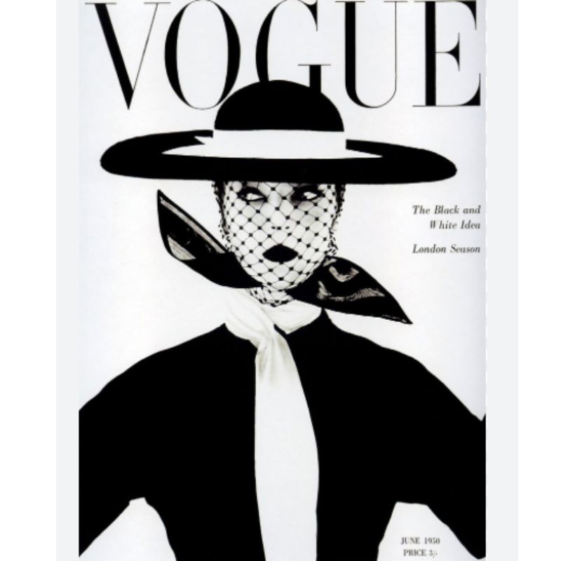
Irving Penn was a virtuoso with a camera, an instrument he himself described as “part Stradivarius, part scalpel.” He was a master in particular of monochrome, combining tones of black and white to create striking images with a strong graphic sensibility. This image from Vogue’s June 1950 issue, appropriately titled “The Black and White Idea”, is perhaps his finest hour.
“Irving Penn’s picture shows a master at work,” says Mark Bentley, editor of Black + White Photography magazine. “Beautifully orchestrated shapes around an oval face. Inspired arrangement of blacks and whites. Oozing style. And it breaks the rule that the model should look into the camera. Fabulous.”
02. TIME, April 8, 1966: ‘Is God Dead?’
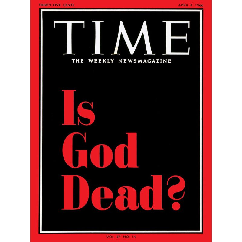
With simple, classic typography, TIME magazine created an iconic cover — its first featuring only text — to ask a question that had been growing among the United States’ leading theologians in response to the increasing secularisation of society.
The full story by the magazine’s religion editor John Elson was quite even-handed in its conclusions, though as you might expect, its Nietzschean title prompted a raft of backlash, with one reader writing in to denounce the cover as a “blasphemous outrage”. However, its impact was massive and its place in history assured. When Newsweek ran a story on the “decline and fall of Christian America” in 2009, its cover for the relevant issue was a clear hat-tip to the legendary TIME cover.
03. The New Yorker, September 24, 2001 by Art Spiegelman and Franoise Mouly
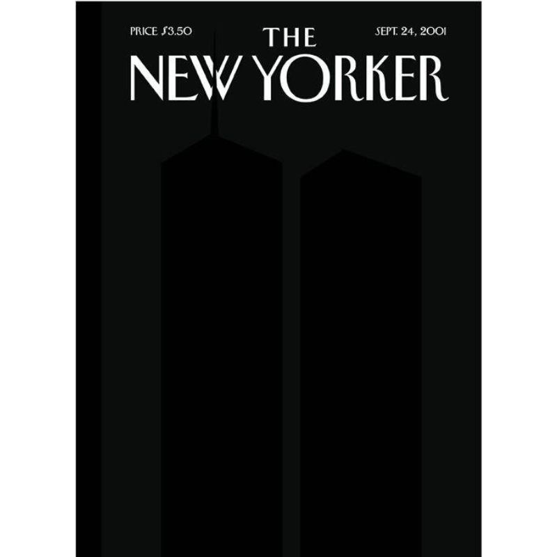
“For this memorable issue, New Yorker Covers Editor Franoise Mouly and artist Art Spiegelman created a subtle, haunting tribute to the events of 9/11,” says Julia Kahl, founder and online editor-in-chief of Slanted magazine.
“Inspired by Ad Reinhardt's black-on-black paintings, the silhouetted Twin Towers were printed in a special black ink over a dark background. The ghostly figures of the towers linger in the darkness, with the north tower’s antenna breaking through the magazine’s logo—a powerful reminder of what was lost that day.”
“I find it remarkable that a commercial magazine like The New Yorker dared to feature such a minimal, almost ‘empty’ cover, reflecting the profound emptiness everyone felt on that day.”
04. National Geographic, June 1985: ‘Afghan Girl’ by Steve McCurry
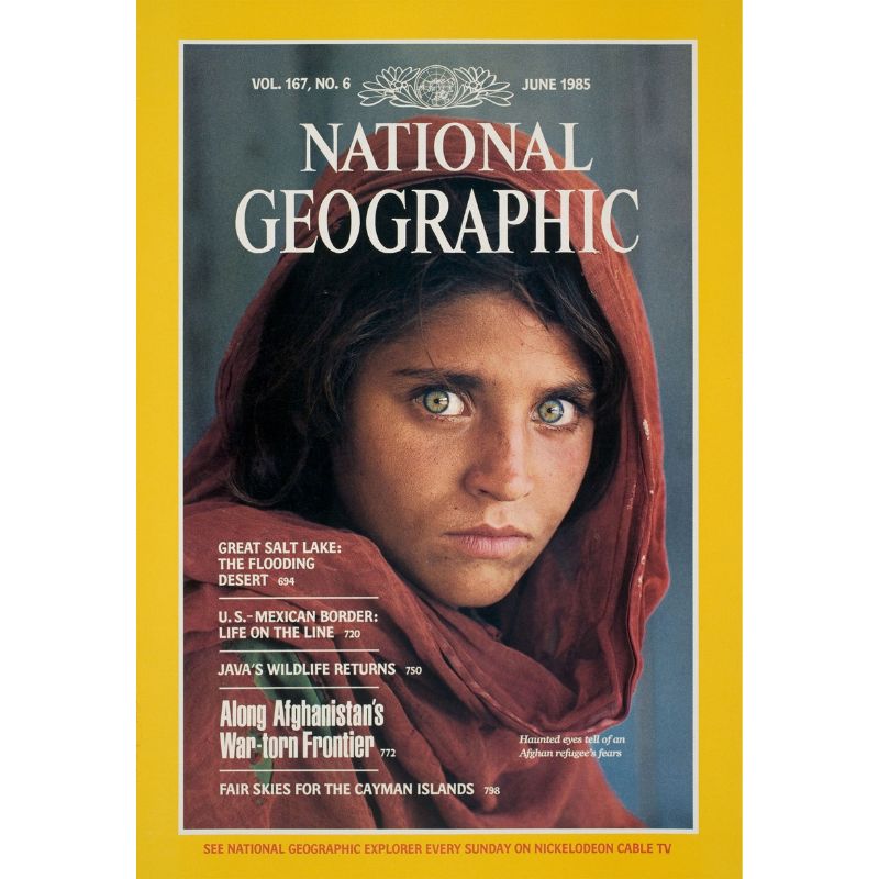
At Nasir Bagh refugee camp, during the Soviet-Afghan war, photojournalist Steve McCurry captured an image of a young girl named Sharbat Gula. The following year, it would feature on the cover of National Geographic, and in doing so become one of the most instantly recognisable photographs ever taken.
“Steve McCurry's ‘Afghan Girl’ which graced the cover of National Geographic in 1985 has to be one of the most iconic covers of all time,” says Nigel Atherton, editor of Amateur Photographer. “The photo itself is striking thanks to the mesmerising eyes of the 12-year-old refugee girl, Sharbat Gula. And the story behind McCurry and National Geographic's decade-long attempts to find her, which they ultimately did in 2002, was also the subject of a TV documentary.”
05. Esquire, May 1969: Collapse of the Avant-Garde
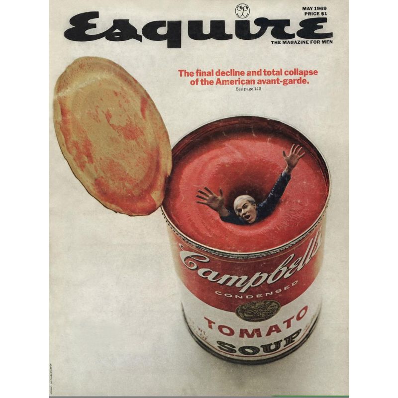
Affectionately satirising Andy Warhol’s famous Campbell Soup artwork by drowning the artist himself in a can of the stuff, Esquire art director George Lois created an instant icon for this 1969 issue.
According to an interview with The Atlantic, Lois knew what he wanted to do the moment he heard the title of Elenore Lester’s cover story — “The Final Decline and Total Collapse of the American Avant-Garde”. When he called Warhol to pitch the idea, the artist was hugely enthusiastic — especially once Lois explained that they’d be using some new-fangled techniques called photo compositing, rather than actually building a huge can of soup.
06. Guitarist, issue 460: The Beatles, Guitar by Guitar

A slightly more niche pick from Black + White Photography’s Mark Bentley, this clever cover for Guitarist magazine features a few subtle design touches that you may have missed at first glance.
“The cover of Guitarist 460 cleverly merges the faces of three of the Beatles with the guitars they played,” Bentley says. “The colours are limited to black and gold, with a white background to give a timeless look. But the reason I love this cover is the barcode. Look carefully and you can see four silhouetted figures walking along the top of the barcode, echoing the Beatles’ Abbey Road album cover. Makes me smile every time I think of it.”
07. TIME, February 8, 2021: ‘Day One’ by Tim O’Brien
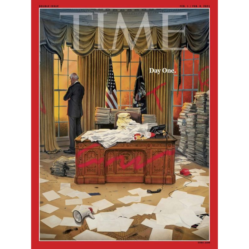
The second TIME cover to grace our list, this cover from February 2021 was illustrated by Tim O’Brien. Depicting the newly sworn-in President Biden standing amid the wreckage of his office’s previous occupant, the cover takes stock of not only the aftermath of the Capitol Riots of January 6, when supporters of former President Donald Trump attempted to violently overturn the results of the 2020 election, but also of a nation having spent four chaotic years under a shambolic executive.
08. COLORS, issue 1: ‘It’s a Baby’ by Oliviero Toscani and Tibor Kalman
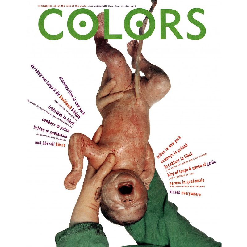
“Oliviero Toscani is known for his ability to shock and provoke, capturing reality in ways that few others have achieved,” says Slanted’s Julia Kahl. “One of his most iconic works is the 1991 Benetton campaign including the COLORS magazine cover, featuring a newborn baby covered in blood and vernix—a completely normal sight for midwives, yet it sparked international outrage.”
“Together with art director Tibor Kalman, Toscani aimed to ‘show the world to the world,’ using the campaign to promote diversity and unity.”
We especially enjoyed this Kamala Harris Time magazine cover, and were less keen on this Donald Trump and Joe Biden design (open with caution). Be sure to check them out.


