The best Google Fonts can elevate your design, making it more readable, visually appealing and memorable. But with over 1,700 free font families in the Google Fonts library, where do you begin?
It would certainly take a long time to sift through them all. But we, and the designers that contribute to the site, have done just that. And we've picked out a selection to help you get started.
Below we've gathered together best Google Fonts available today, including both serifs and sans-serifs. To use them, you don't have to provide any details or sign up for anything, and there's not need to provide attribution if you use them in your designs. Better still, you can customise them as much as you like!
The best Google Fonts
Sans Serif Google Fonts
01. Montserrat
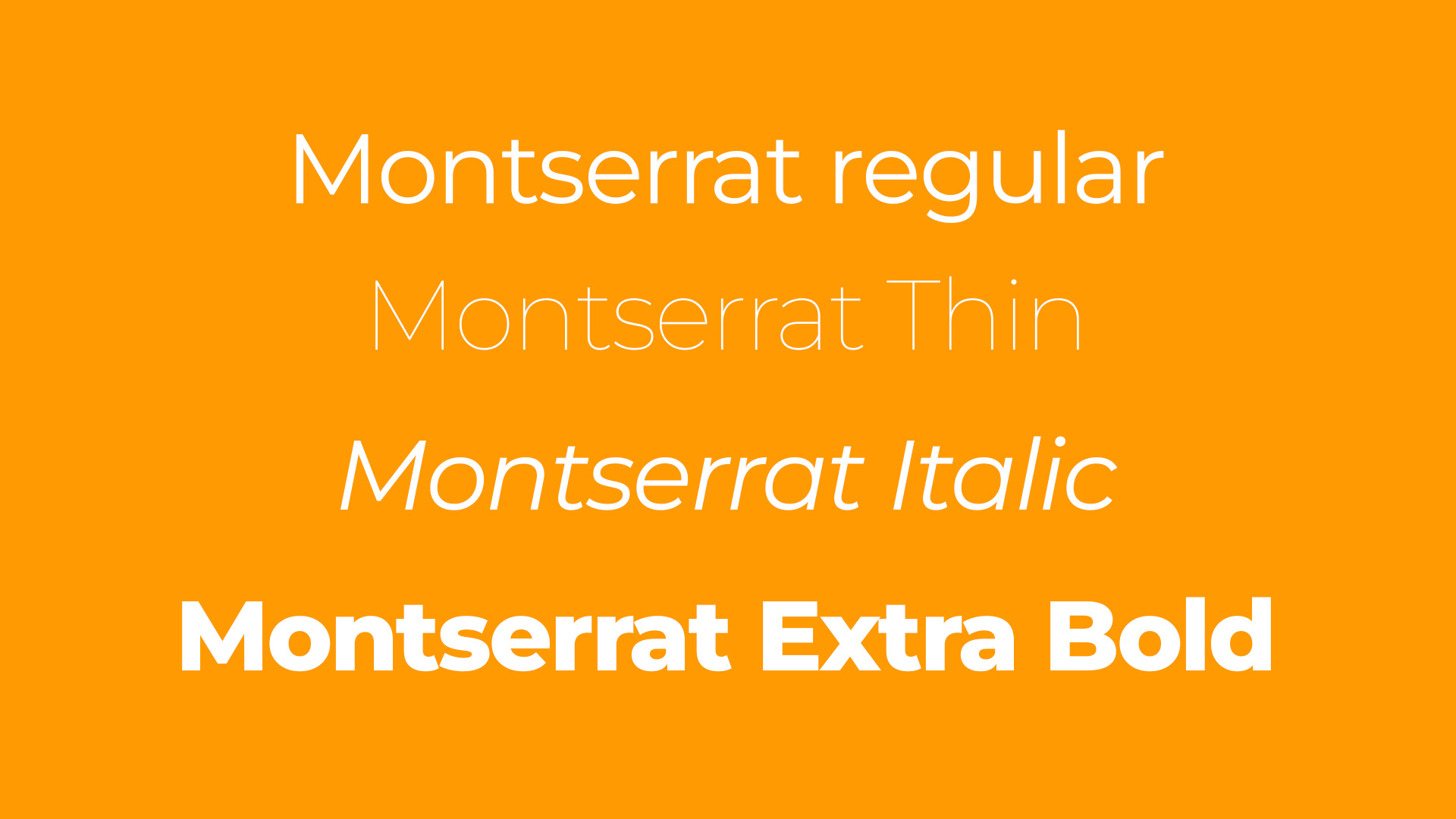
Designed by the Argentine designer Julieta Ulanovsky, Montserrat is named after an old neighbourhood in downtown Buenos Aires and it was inspired by posters, signs and painted windows in the area in the half of the twentieth century. It comprises 18 styles from light to heavy, offering a huge range of choice.
02. Work Sans
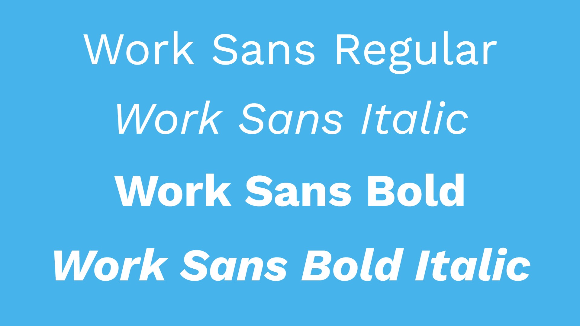
The result of a project led by Australian type designer Wei Huang, Work Sans is a typeface family based loosely on early Grotesques. While it can be used in both print and web design, features have been simplified and optimised for screen resolutions; for example, diacritic marks are larger than how they would be in print. The fonts closer to the extreme weights, meanwhile, are designed more for display use. Since 2020, it's been upgraded to a variable font family.
03. Inter
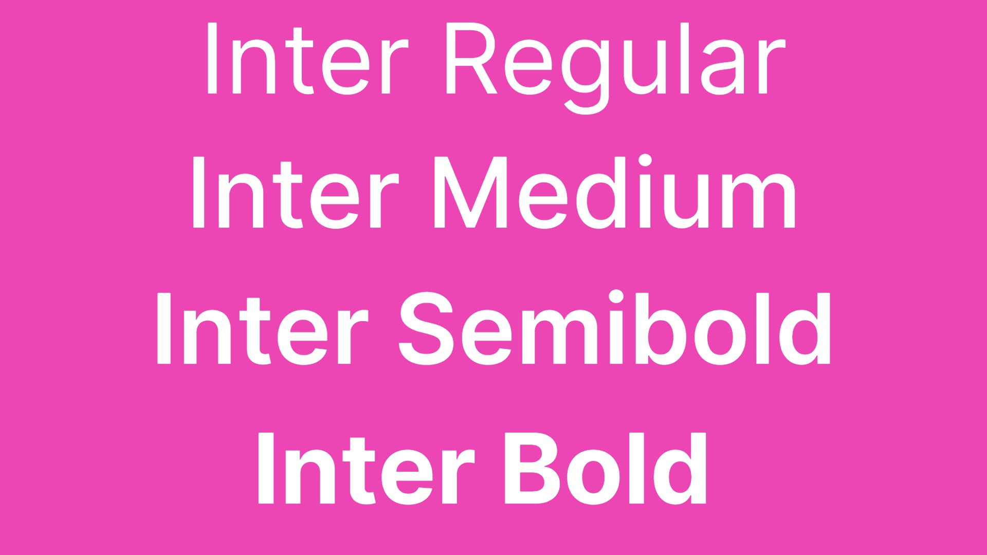
Inter is a variable font family featuring a tall x-height, in order to improve readability in passages of mixed-case and lower-case text. The provision of contextual alternates allows you to adjust punctuation depending on the shape of surrounding glyphs, plus there’s a slashed zero, for when you need to disambiguate "0" from "o". The Inter project is led by Rasmus Andersson, a Swedish software designer living in San Francisco.
04. Rubik
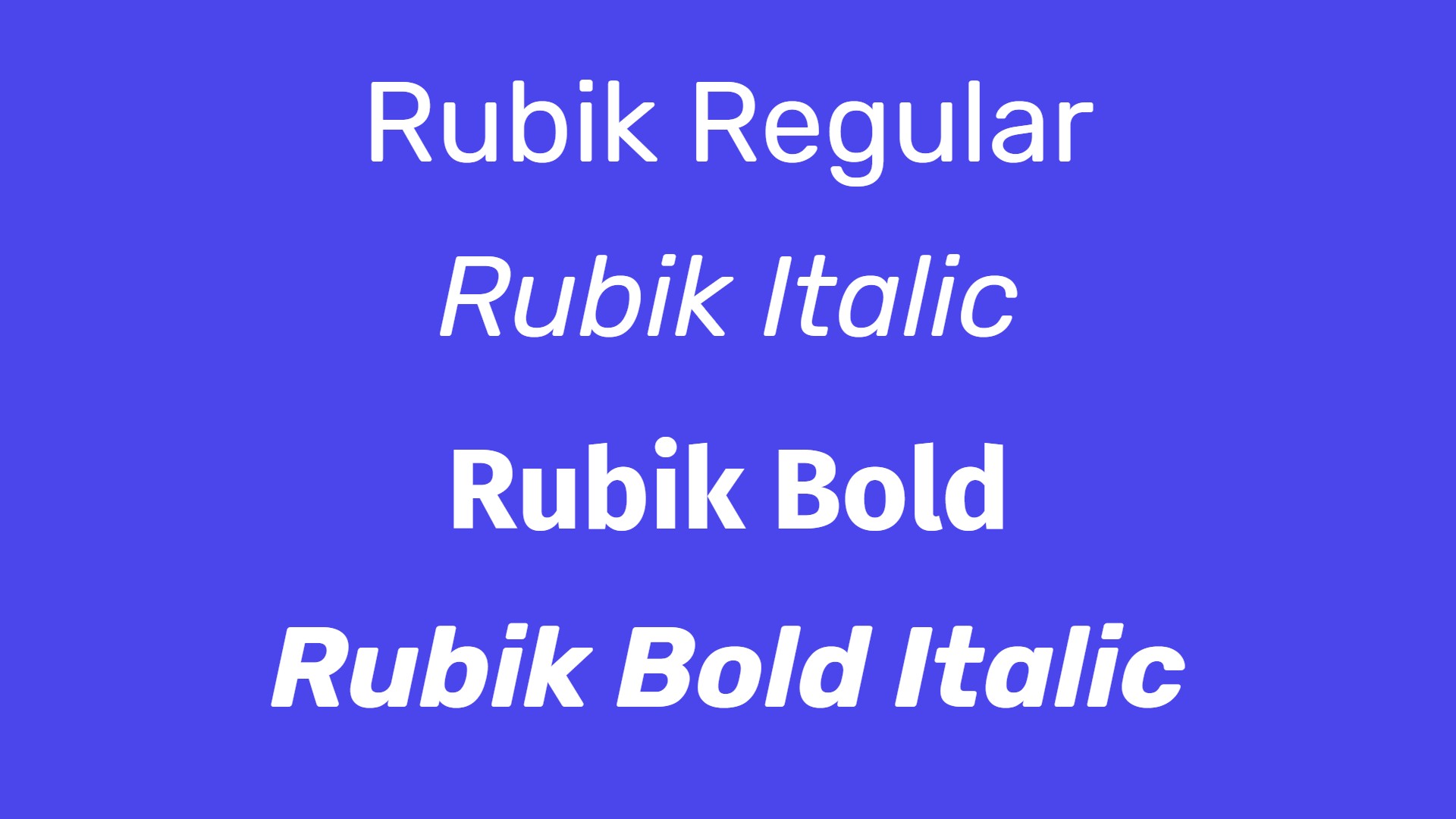
With its rounded corners and low stroke contrast, Rubik is one of the friendliest and most welcoming sans-serifs around. Designed by Philipp Hubert and Sebastian Fischer of Hubert & Fischer, the typeface was originally commissioned by Google for use in a Rubik’s Cube exhibition. A five-weight family with Roman and Italic styles, it also has a monospaced sister typeface, Rubik Mono One.
05. Space Mono
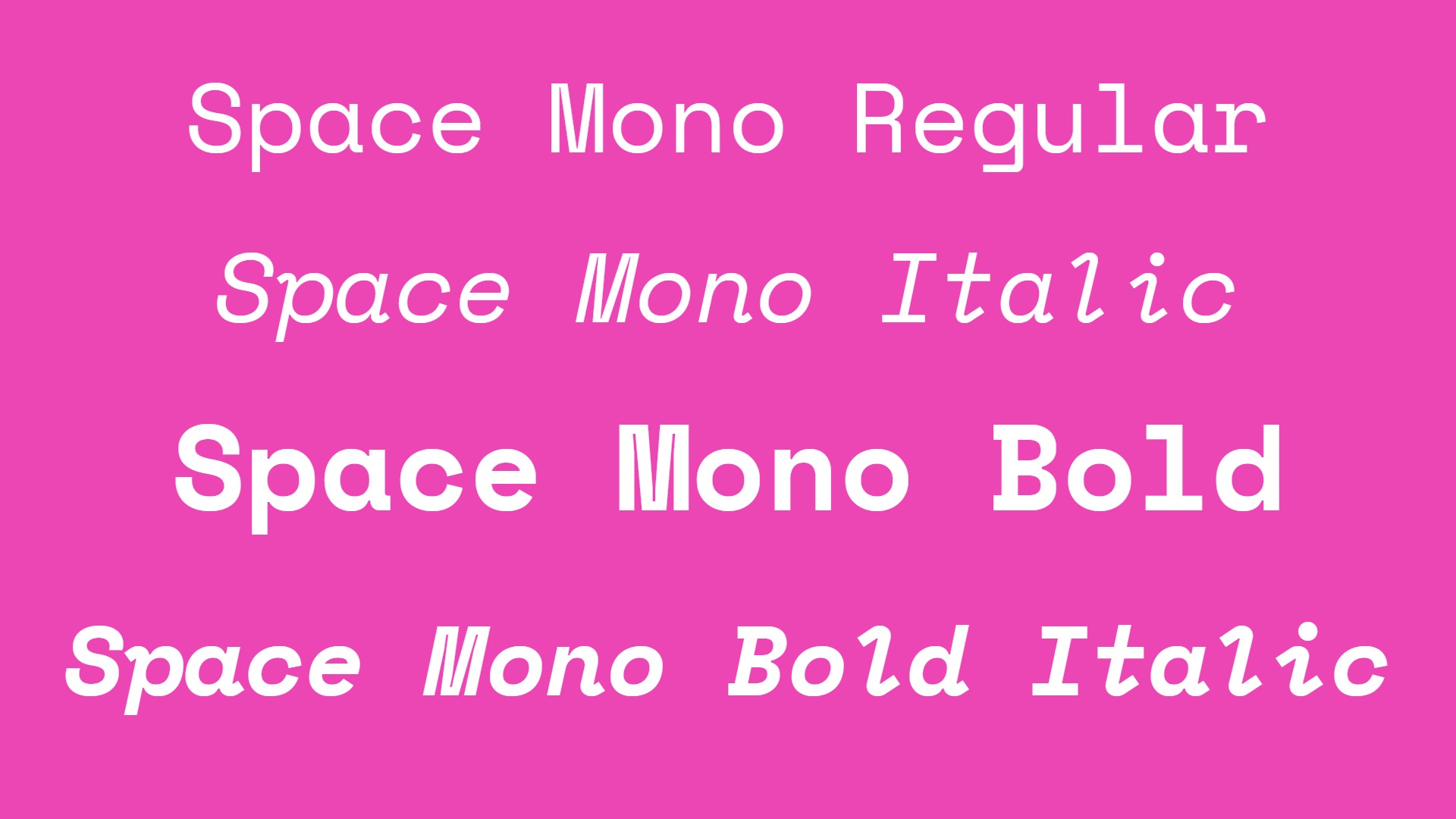
Space Mono is an original fixed-width type family, developed for editorial use in headline and display typography by Colophon Foundry. Its letterforms combine a geometric foundation with grotesque details to evoke the spirit of 1960s newspaper headlines. Its features include old-style figures, superscript and subscript numerals, fractions, centre-height and cap-height currency symbols, directional arrows, and multiple stylistic alternates.
Serif Google Fonts
06. Old Standard TT
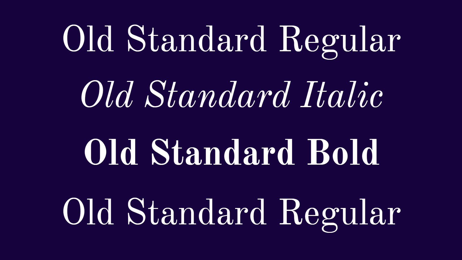
Old Standard was designed by Alexey Kryukov, and reproduces a specific type of modern style of serif typefaces. It can be considered a good choice for typesetting body copy, as its specific features are closely associated in people's eyes with old books they learned on.
07. Cormorant
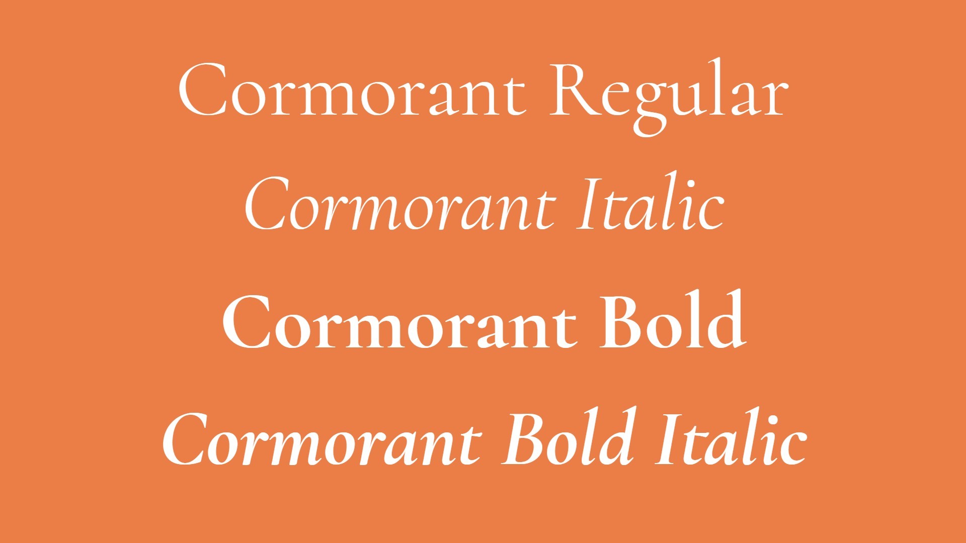
Cormorant is a display type family developed by Christian Thalmann. While it’s inspired by famed type designer Claude Garamont's legacy, no specific font was used as reference, and most glyphs were drawn from scratch. Cormorant currently features 45 font files spanning 9 different visual styles and five weights.
08. Alegreya
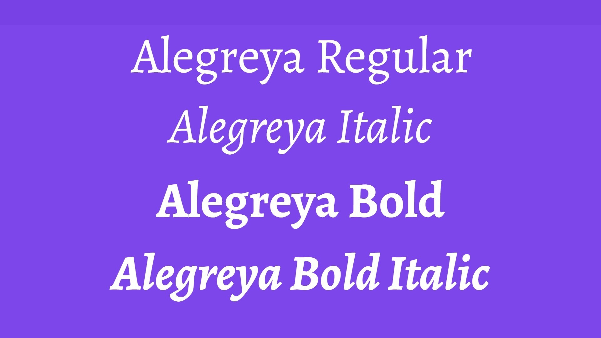
Alegreya is a multi-award-winning typeface originally designed for literature. Designed by Juan Pablo del Peral for Huerta Tipográfica, it boasts a dynamic and varied rhythm which makes the reading of long passages a visual pleasure. Making subtle references to calligraphy, this typeface superfamily (which includes both serif and sans-serif families) offers a great combination of style, authority and diversity.
09. Anonymous Pro

Created by Mark Simonson, Anonymous Pro is a fixed-width typeface family designed with coding in mind. It gives characters that could be mistaken for one another (O, 0, I, l, 1, etc.) distinct shapes, to make them easier to tell apart in the context of source code. Also, the regular and bold styles have embedded bitmaps for the smallest sizes (10-13 ppem.) It was inspired by Anonymous 9, a freeware Macintosh bitmap font developed in the mid-'90s by Susan Lesch and David Lamkins as a more legible alternative to Monaco, the fixed-width Macintosh system font.
10. Vollkorn
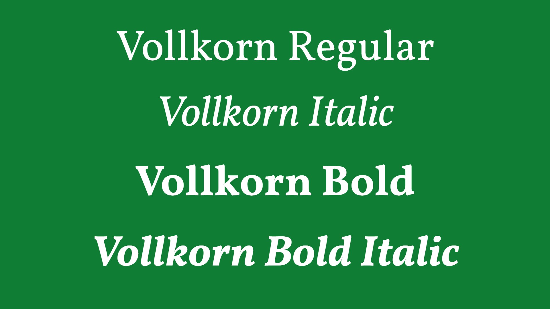
Vollkorn is designed to be a quiet and modest text face for bread and butter use. Unlike its examples in the book faces from the renaissance until today, it has dark and meaty serifs and a bouncing and healthy look. It might be used as body type as well as for headlines or titles.
FAQs
Why use Google Fonts?
There are several reasons to use Google Fonts. Firstly, they're free. Secondly, they're curated and delivered by Google, which offers some quality assurance, as well as knowing you're not downloading anything dangerous. Google Fonts are also very easy to use, whether you download them to your computer or embed them in your site. And there are no complicated licensing restrictions: Google Fonts are open source and most use the SIL Open Font License, so you can use them freely for any kind of work.
How do I choose the best Google font?
When choosing the best Google Font for any project, you need to consider the same things as whenever you choose what typeface to use. That means choosing a font that fits the identity of your brand if the type is for branding, or the topic or tone of the piece that you're going to use it for.
Sans serif fonts often look cleaner and more modern, while serif fonts can feel more classic and traditional, but that's a simplification. It's common to combine fonts in font pairings that complement each other, and often a serif is combined with a sans serif. See our complete brand typography guide and our piece on how to choose the right typeface for some pointers.
You'll want to consider readability, which may vary depending on the size at which you'll be using the font. Display fonts used at large sizes for headers can sometimes sacrifice some legibility for attention, while a body font's main purpose is usually to be readable. You'll want to choose the right weight (for example, bold, light or regular) for each case.
Are Google fonts free to use?
Yes, all the fonts in the catalogue are open source, which means they're available for anyone to use freely for any kind of project. You can use them for both personal and commercial work, you can share them and you can even modify the fonts. Google Fonts takes care of the licensing and hosting.
How do I download and install Google fonts?
Navigate to the Google Fonts website and Select a font you want to download. Select 'download family' or select only one style. To install Google Fonts in Windows, unzip the downloaded folder and select install. On a Mac, you'll need to unzip the font file somewhere, double click on the .ttf or .otf file to open Font Book and preview the font to make sure it appears how you want, and then select Install in Font Book.
On Windows, your Google Fonts will normally be stored at C::\Windows\Fonts\. You can delete the download file once you've installed the font.
How do I use Google fonts in a website?
Simply open Google Fonts, find the font and click it and then, click "+ Select this style". On the right side, click "Selected family", click "Embed" and choose or @import depending on where you need to add the font (HTML or CSS).
Can I use Google Fonts with Adobe?
Yes, it's very easy to use Google Fonts in Adobe Creative Cloud software such as Photoshop and Illustrator. Just download the font onto your computer, unzip the folder, install the TTF file or files and then restart Photoshop or whatever Adobe program you want to use it in. The font should then appear in the list of options when you use the type tool.
We also have a guide to understanding font vs typeface and a pick of the best free handwriting fonts to download.