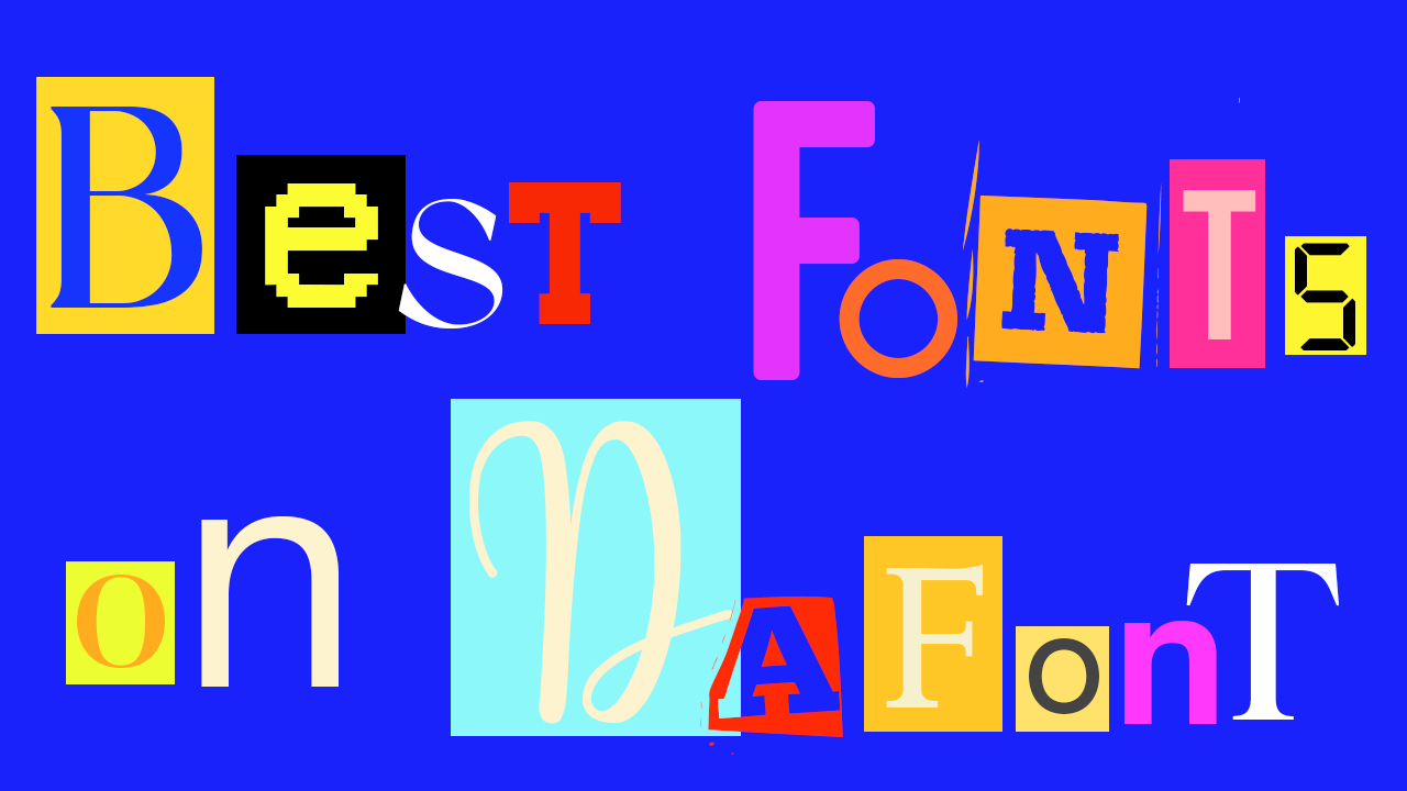
Any designer will know that choosing the right font in a platform like DaFont is one of the most crucial decisions to be made in a project. The right font has an ambitious task on its hands; it must be distinctive and recognisable initially, but also must create familiarity.
Typography also plays a big part in setting the tone for a project and the right font can offer a base to create a piece of distinctive typography of your own. A good font is not too definitive or restrictive; it suggests the groundworks for something that is yet to be created.
DaFont is just one of the many providers of free fonts, but it is possibly the most widely used alternative to Adobe Fonts, and for good reason. Its archive consists of 40,000 different styles. This might sound overwhelming, but no need to panic! We’ve done the sifting for you and created a roundup of all the best fonts on DaFont, for all your designing and typography needs. Just make sure you check the font licensing terms.
01. VCR OSD Mono
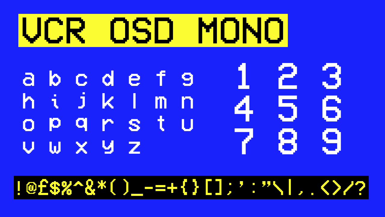
VCR OSD Mono is a personal favourite of mine, and with its frequent use in my own video and graphic design work, I can vouch for its versatility. For a digital look that can be made to appear either glitchy or glowing in all sorts of different colours, VCR OSD Mono provides an old-school version of this, reminiscent of the beginning of the digital era, when super 8mm camcorders were a revelation to the art world. This font gives you the perfect base to inject some glitchy and retro pizazz into your project.
02. Bebas
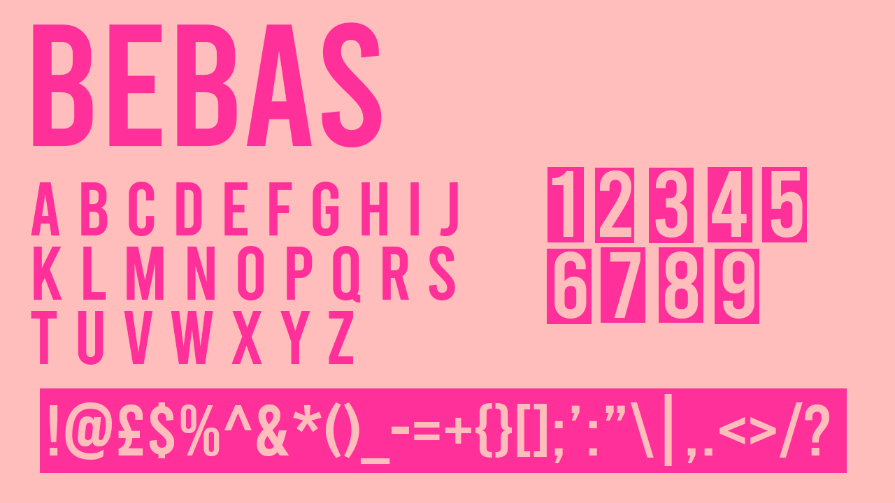
Bebas is a favourite with many designers, myself included. You’ll be pleased to know that it can be used commercially – and often is – so you can feel free to unleash it on all your branding projects. Bebas Neu is another division of Bebas, and also enjoys immense popularity. Bebas Neu is, however, only a slightly more condensed version of the same font, meaning that the use of Bebas covers all bases. Bebas is more flexible as the same condensed effect that Bebas Neu achieves could essentially be created in Photoshop with only a few letter spacing adjustments anyway.
03. University
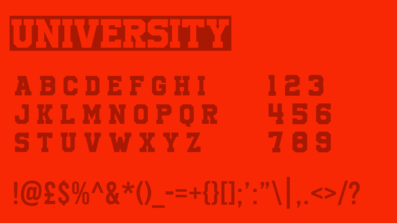
If you need to find a font that looks like the lettering on the back of the varsity jacket, DaFont provides a surprising number of options. University is by far the best of the pick; there are many snazzier versions with more flourishes, but University is our favourite.
04. Drunken Hour
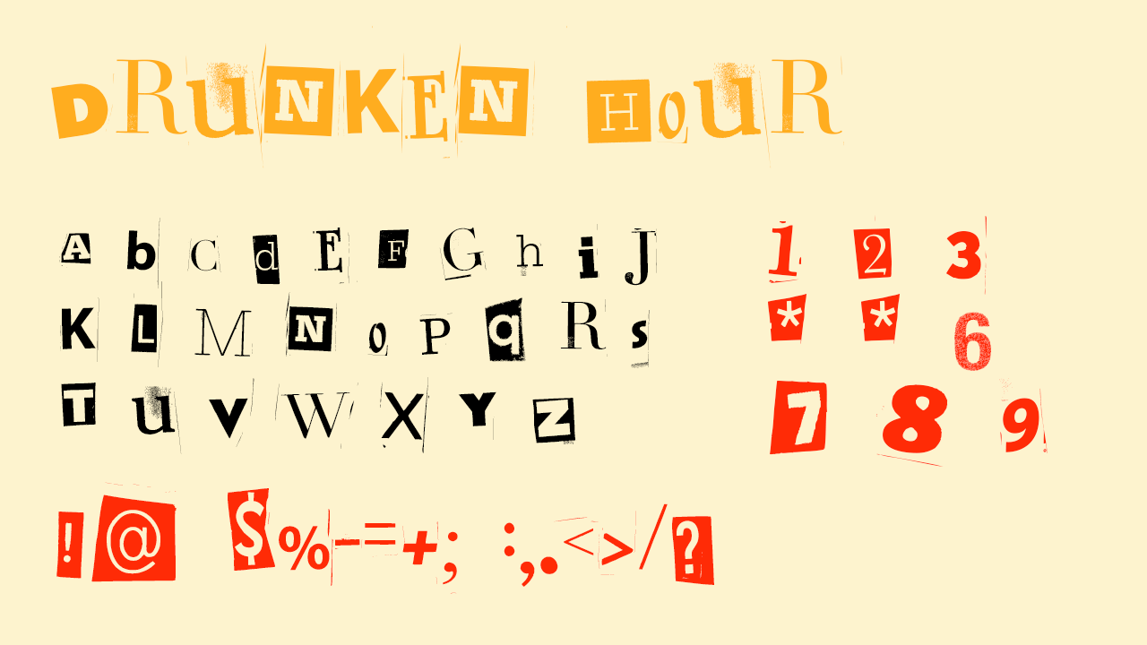
Drunken Hour is slightly more ‘out there’ in the world of typography, but is of a style currently gaining a lot of traction on social media. A template for this font continues to gain viral circulation on both Reels and TikTok, so it’s perfect if you want to make something of your own within this trend. For the Mean Girls Burn Book meets an old-school scrapbook meets a magazine-cut-out-anonymous-message look – Drunken Hour covers all bases.
05. Butler
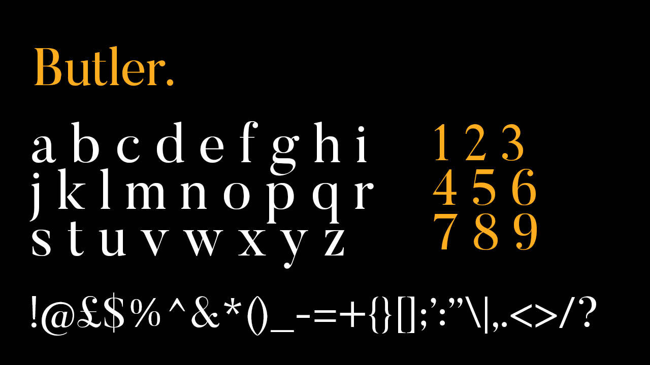
What would a more feminine Times New Roman look like? Butler shows us with its traditional lettering with an extra dose of elegance. Butler is distinctive enough to be used in large typography, and stripped back and classy enough to work well as standard body text with its own stylised touch.
06. Open 24 Display
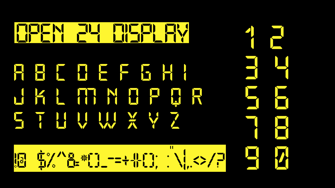
Another digitally inspired font, Open 24 Display echoes the devices created near the tail end of the technological revolution in the early 2000s, when digital devices were becoming the norm and text such as this was widely seen. While VCR OSD Mono (above) gives us a font reminiscent of a ‘90s camcorder, Open 24 Display is perfect for achieving something similar to the design of an early 2000s pocket digital camera.
07. Coolvetica
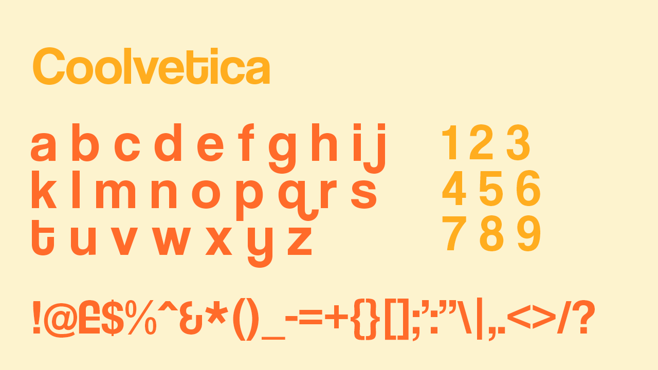
Coolvetica is a popular choice for the loyal Helvetica enthusiasts out there who want to stay true to their sans serif ways while spicing it up with an extra roundedness. The essentials of Helvetica remain intact, but a distinctive extra roundedness to the letters stands out and a more compressed and bolder lettering shines through.
08. Garet
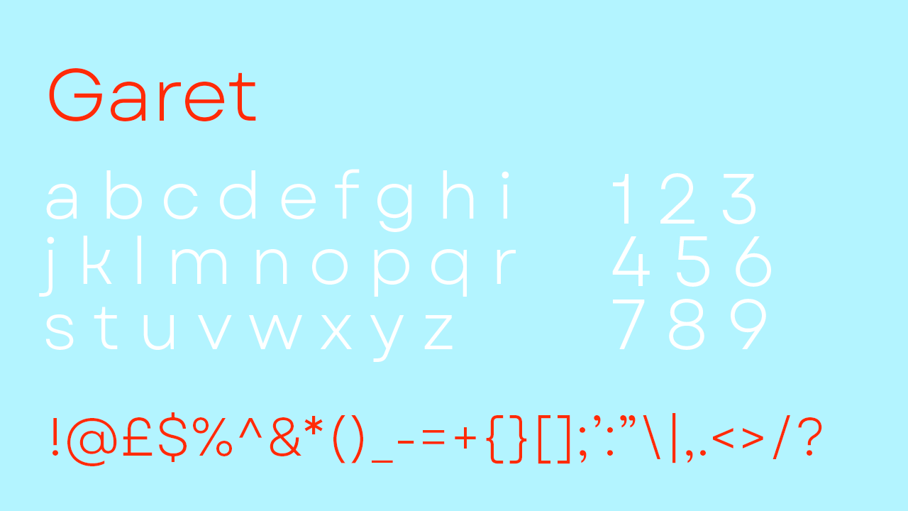
Garet offers a light typeface. It's not as flexible as some of the others on this list, and you’ll either love it or hate it. Perfect for website copy or stripped back body text, Garet offers something beautiful with enough individuality to finish off the right project.
09. Agency
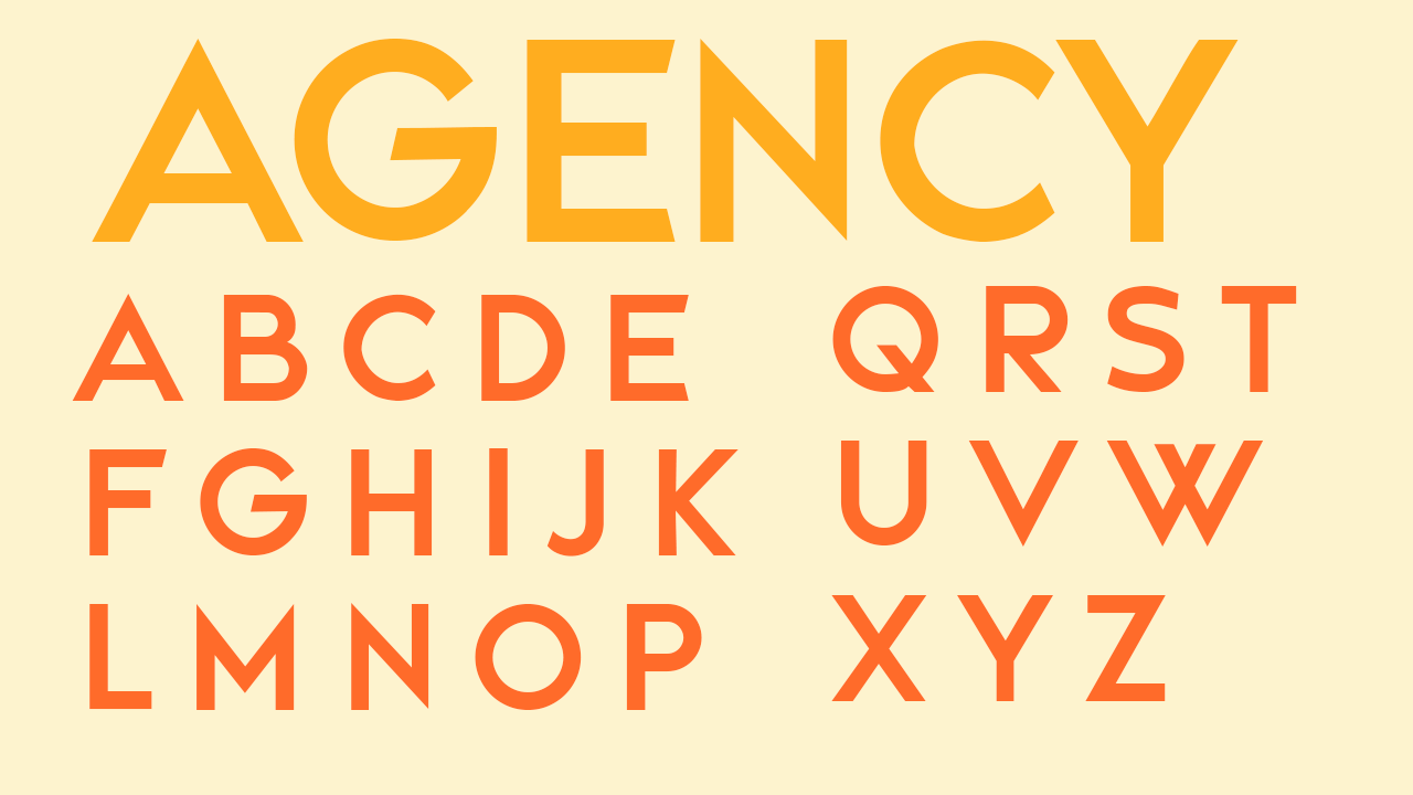
Agency has a hint of retro branding, and looks as though it may have been the favourite font used for the basework design of ‘80s posters and packaging. It’s important to note that punctuation and numbers are not included in this font pack, so it is best suited for creating impact with punchy titles and headings.
10. Apollo
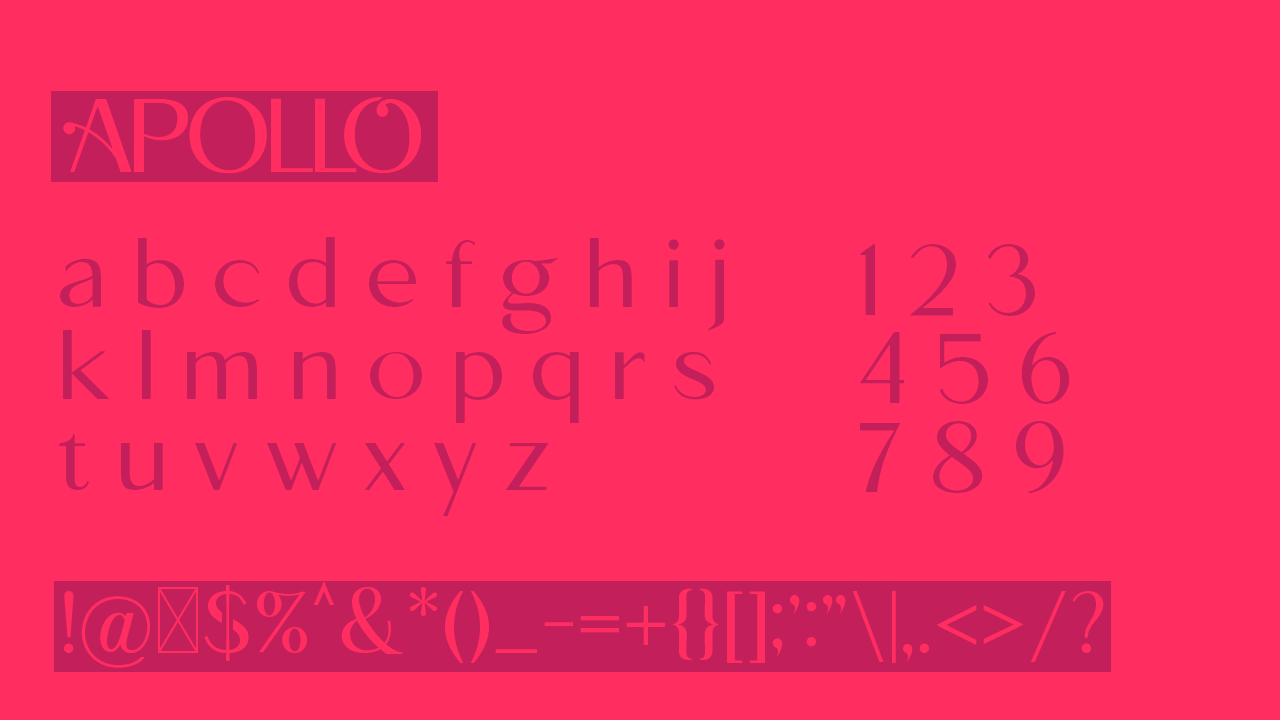
Apollo offers a fully stocked 1930s-themed typeface. Completely equipped with its own flourishes that define its post-art-deco style, its creation is still not so finite that its impossible to add your own touch. It comes with both uppercase and lowercase lettering as well as a full set of matching numbers and punctuation; to completely equip you to create 1930s-inspired typography.
11. Just Sans
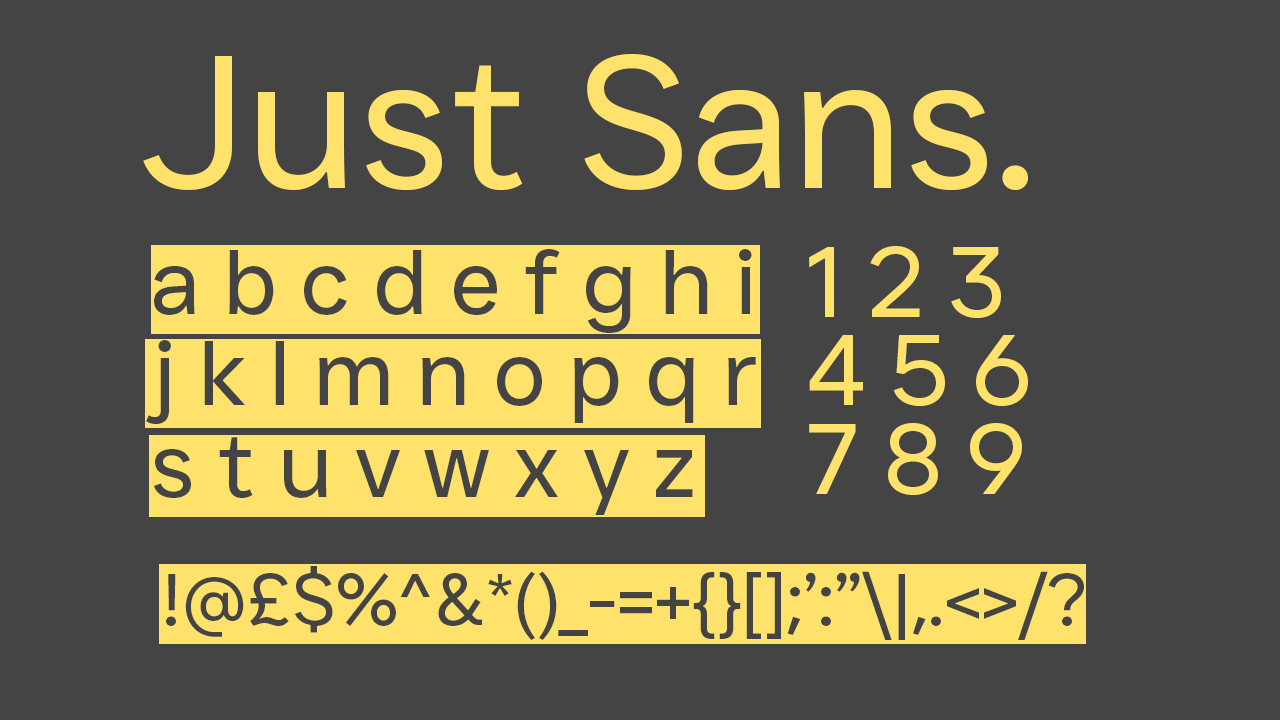
Possibly one of the best sans serif fonts out there, Just Sans does what it says on the tin. It fully sets you up for clear and professional writing, but its beautiful simplicity makes it perfect for striking headings as well.
12. Paparazzi
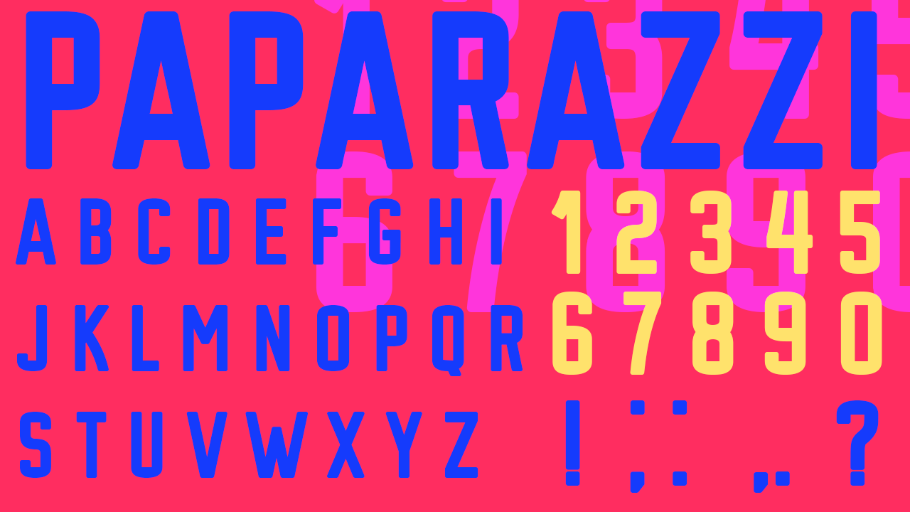
Paparazzi can deliver an eye-catching result, especially when used with strategically placed bold colours. Paparazzi comes with a full set of everything other than some punctuation, accentuating its intended use for just the fundamentals. Best for headers and large typography, Paparazzi stays punchy from a distance and offers endless opportunities to make it into your own striking piece of work.
13. Vogue
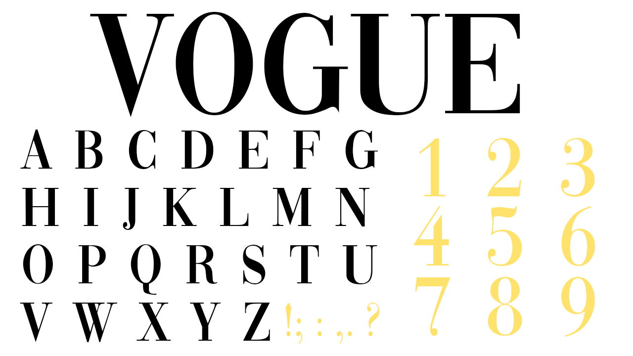
The Vogue font enables you to customise however you’d like, meaning you can add yourself or your pets onto Vogue covers without needing the viral Vogue cover filter. This one is only available for personal use.
14. New York
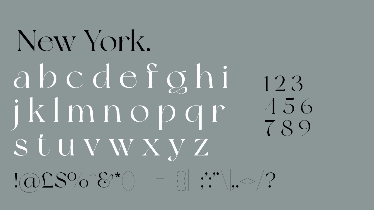
The name of the font is fitting; it feels awfully similar to the classic old-fashioned look of The New Yorker’s branding. New York may look like a header font at first glances, but this pack comes with a full set of upper case and lower case lettering as well as numbers and punctuation.
15. Constantine
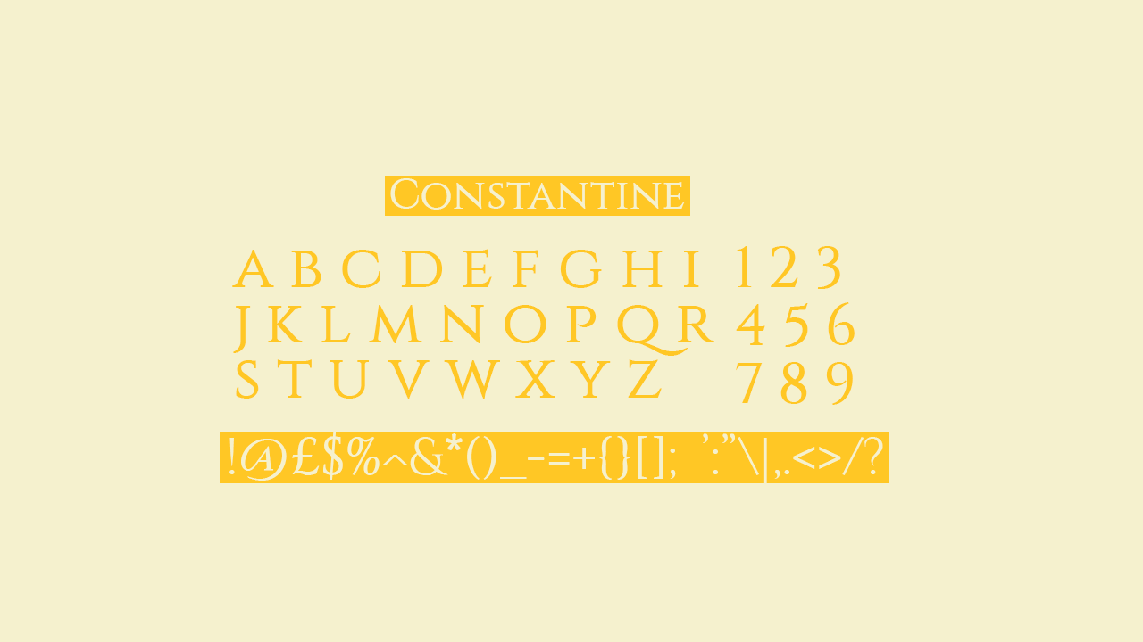
Constantine offers a full keyboard set, and as a light, upper case only font it’s perfect for headings and title graphics when you need to make a stylised impact.
16. Serfiyan
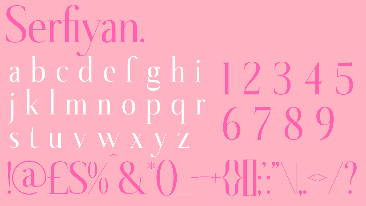
A dignified font presents itself in Serfiyan; perfect for both casual writing and more complex design pieces. It presents a timeless and endlessly classy style, but is a more unusual serif font, so is ideal for a more stylised look. The typeface offers the full keyboard – giving you the space to use it for any project.
17. Wensley
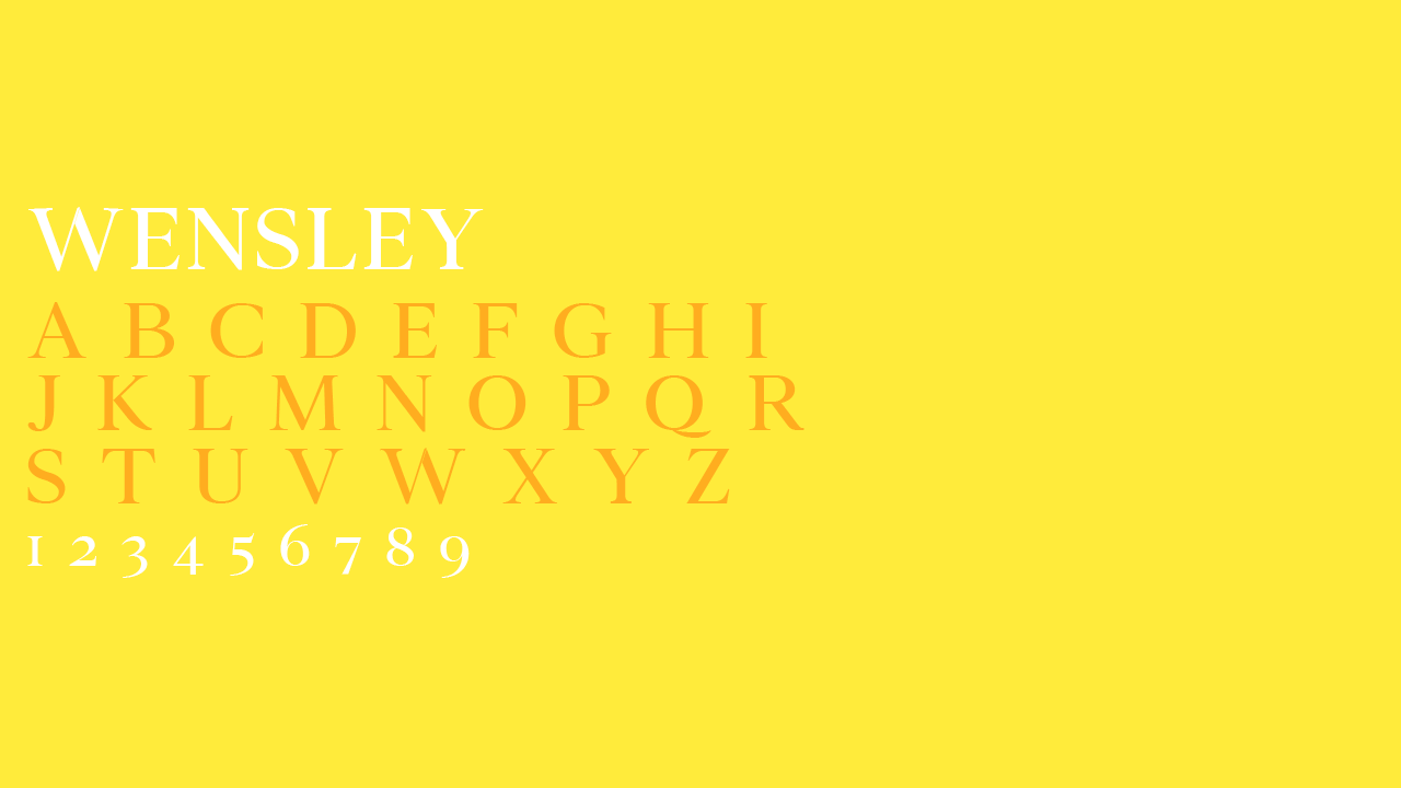
Wensley would be the perfect tool for a branding project, but bear in mind that there is no punctuation included and it only comes up in upper case, meaning it's not as versatile as some of the others on this list. It is, however, timeless, and beautiful enough to deserve a place as the title font for a large number of branding projects.
18. Hello
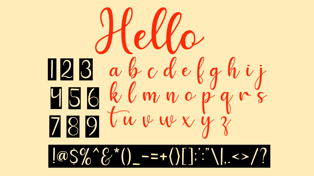
We love a good script font and Hello covers all bases. This full keyboard has a sophisticated and friendly flourish that isn't always present in a calligraphy font. It's available for personal use only.
19. Blacksword
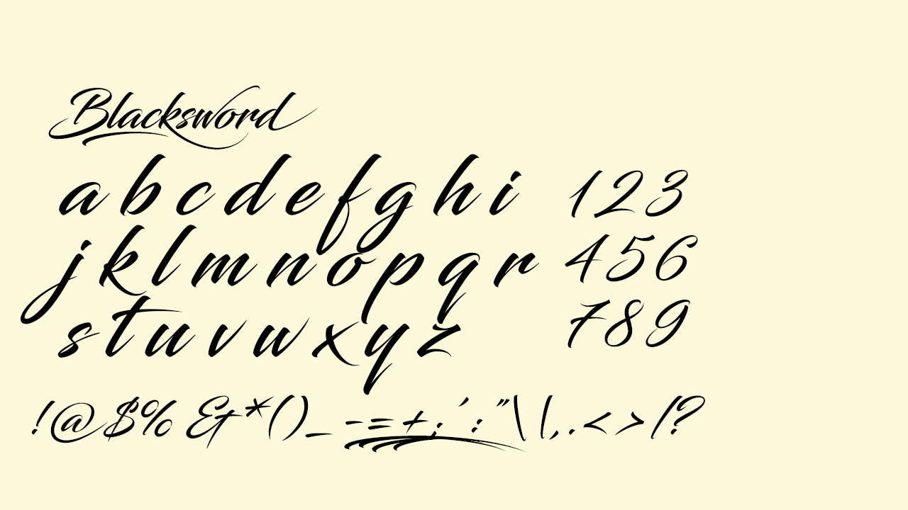
Blacksword is a lettering with a larger flourish and a heavier slant than Hello, making it an ideal alternative for those who need a font with more of a dramatic slant, while staying sophisticated.
20. Creato Display
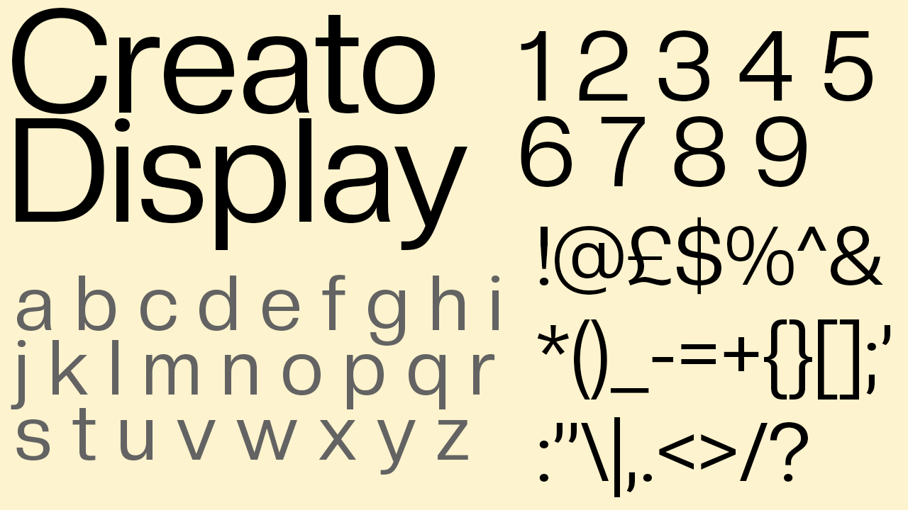
For a stripped back sans serif font, Creato Display is a classic display typeface – designed for headings and title graphics. However its simplicity and the modern touch of its rounded letters make it perfect for anything from title graphics to professional documents. With its breathtaking design and versatility, Creato Display could well end up as the new Helvetica.
21. Belgiano Serif
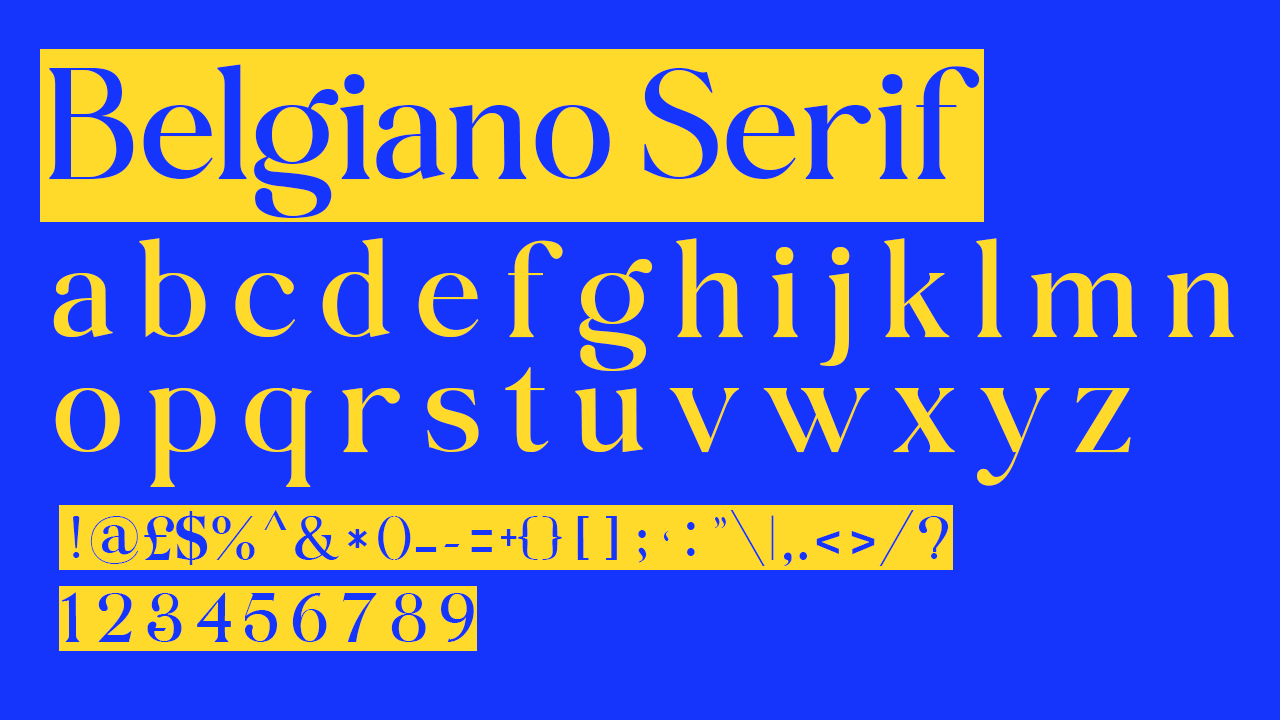
Belgiano Serif is, in my opinion, one of the best serif fonts out there, and I'm wondering why it’s not a standard Adobe font to begin with. Belgiano Serif’s beauty has the ability to create outstanding graphics both at large headline scale as well as at a small body text scale. Download it and make the most of it, because Belgiano Serif should have overtaken Times New Roman as the standard serif font a long time ago.


