Decorating with dark neutral paints is a wonderful way to add sophistication and a moody feel to your home – as well as a depth that light neutrals can't always achieve.
But what are the very best dark neutral paints to try out? We turned to interior designers who share their top suggestions below from leading paint brands. From charcoal grays that provide more softness than black, to dark brown paints that align with the latest color trends, these neutral paints are both stylish and liveable.
Whether you're considering going bold with dark paints in a small room such as a pantry, or are feeling inspired to take them to the kitchen cabinets, the right dark neutral paint can add so much design appeal to your home.
1. Beverly, Farrow & Ball
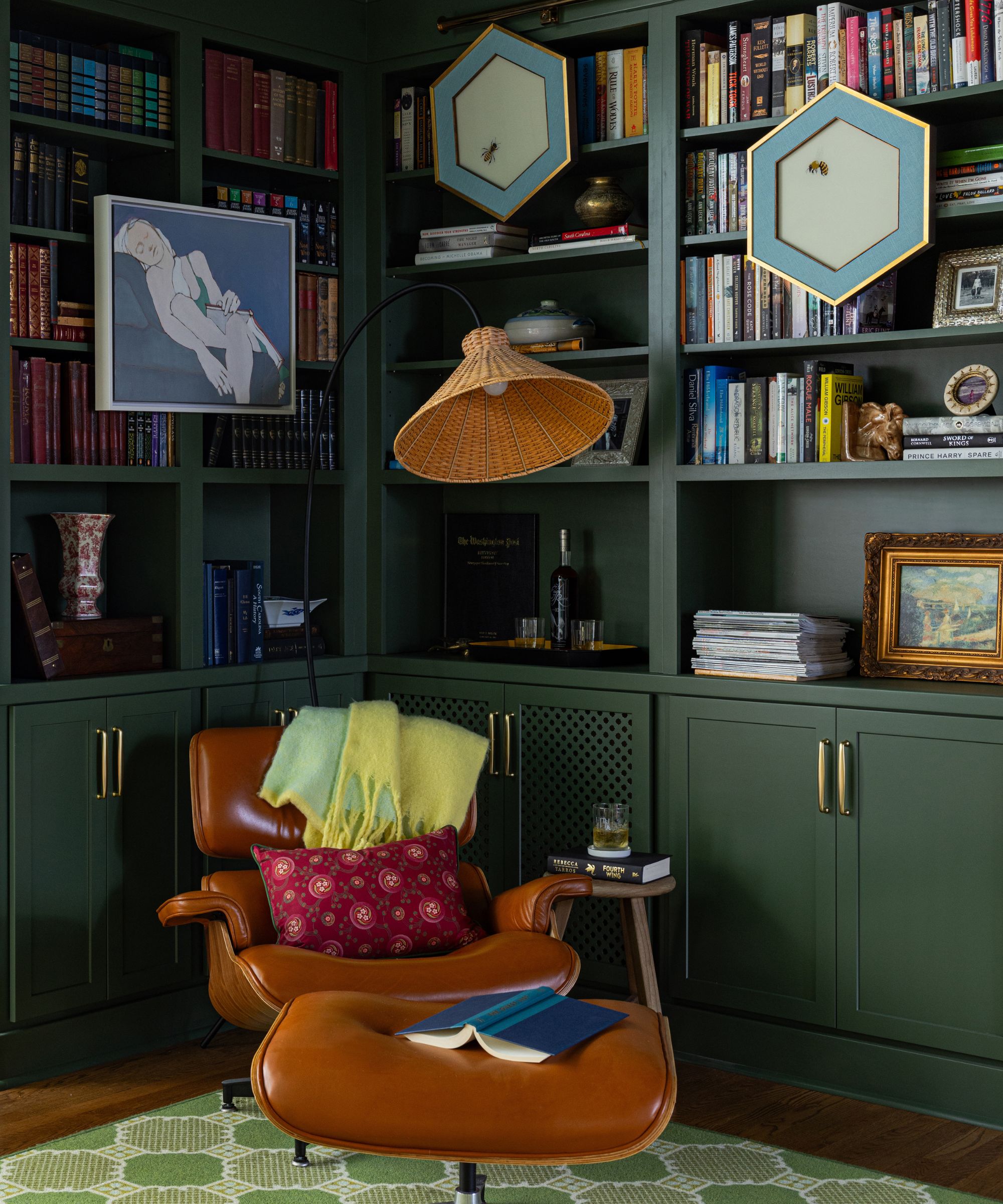
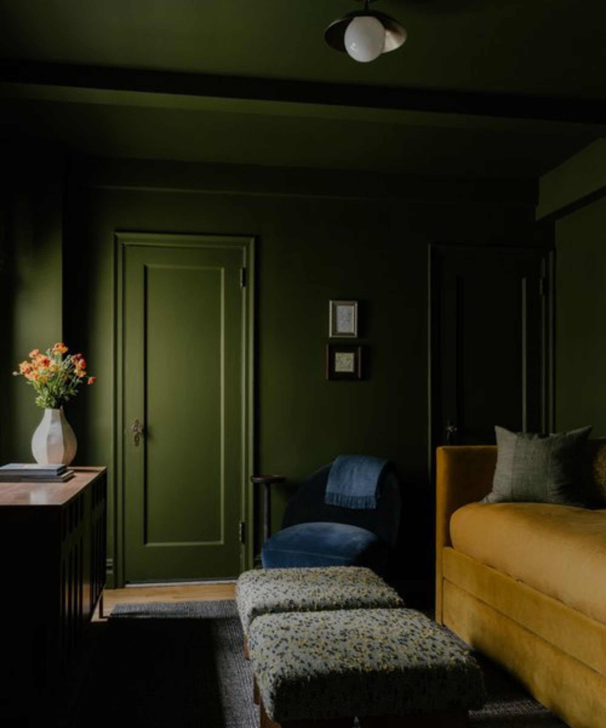
While green paints don't typically fall into the category of neutrals, designers often use them in place of neutrals due to their versatility and timeless appeal.
'I love Farrow & Ball's Beverly – it is the perfect neutral green and adapts to any space that it is used in,' explains Charlotte-based interior designer Alexis Warren. 'I love that this green is bright enough to bring light to the room, yet dark enough for a moody feel. I used it in a library to create a moody feel and it is so great. It provides the perfect backdrop for this and any other space.'
If you don't want to commit to painting the walls, add smaller decor items in dark green like this textured pillow cover.
Or, refresh your bedding with this deep green set for a sophisticated look.
Perfect for the spring and summer months, this pitcher adds timeless green to your al fresco tablescapes.
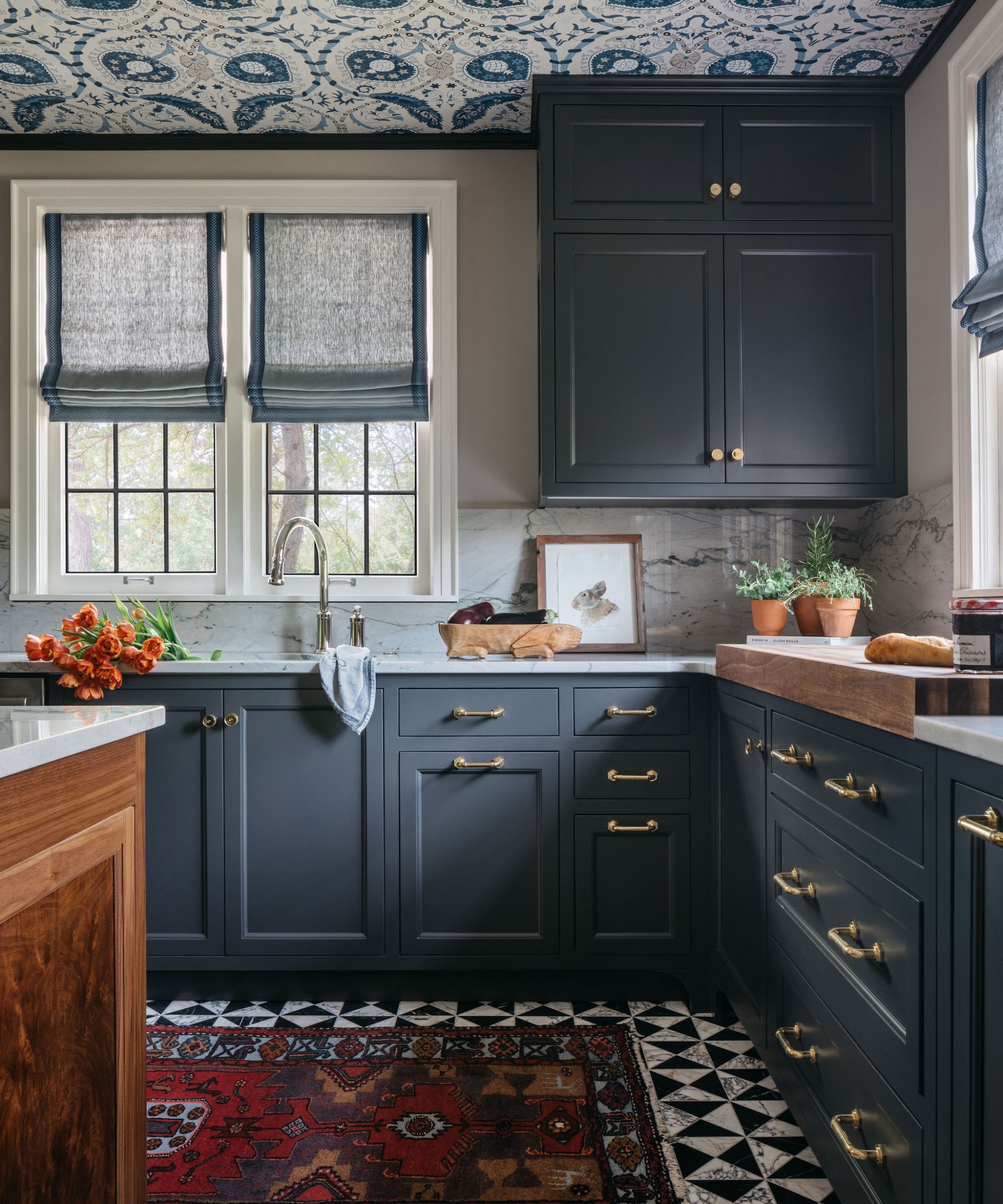
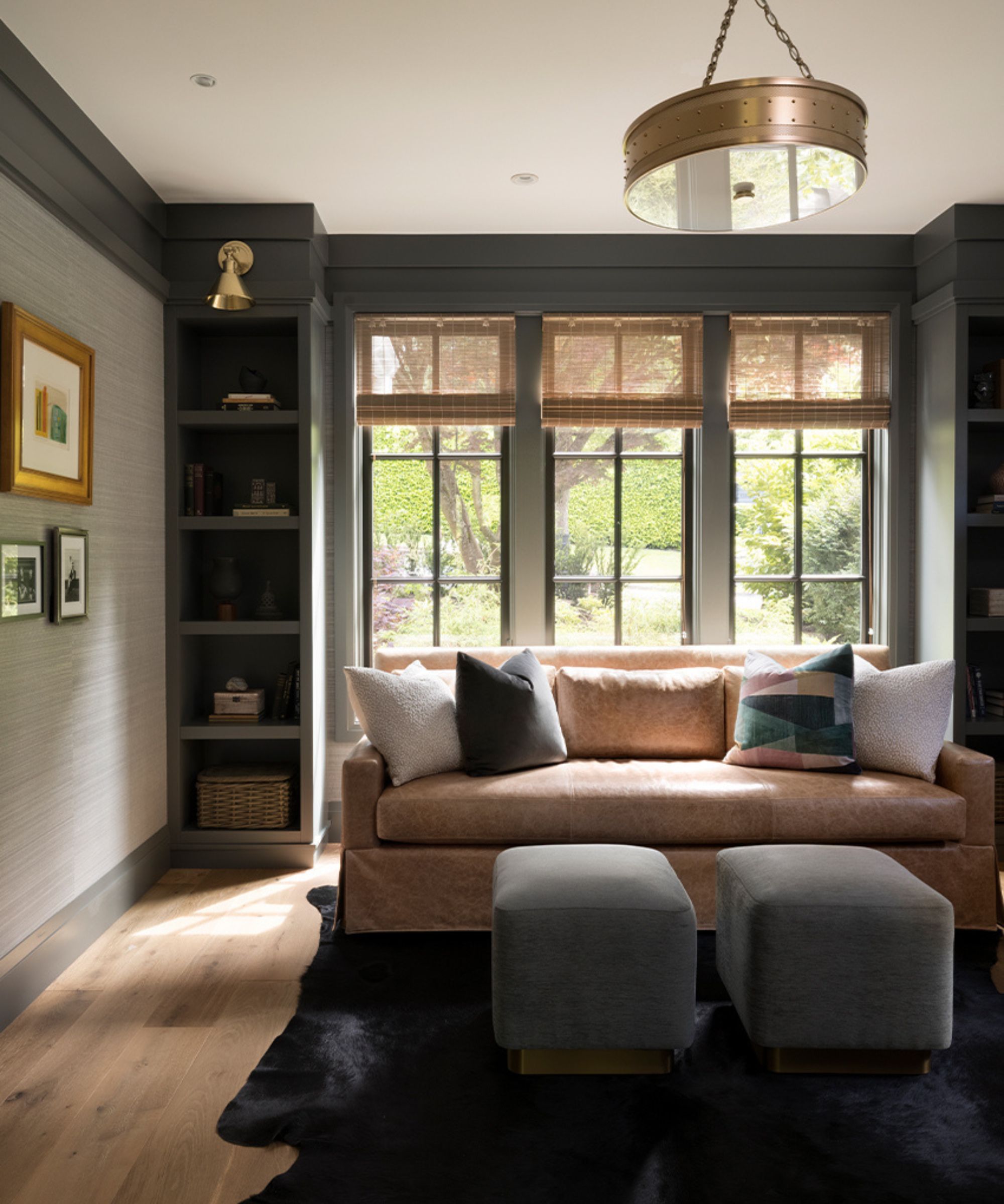
2. Porpoise, Sherwin-Williams
'My go-to dark neutrals are Sherwin-Williams' Porpoise and Iron Ore,' shares Wisconsin-based designer for Peabody's Interiors Emily Winters Posselt. 'I love these colors because they are warm neutrals that are impactful but not harsh or cool in their undertones. Both create a very cozy feeling in a room but in a sophisticated way.'
In this kitchen, Porpoise was used on the kitchen cabinets – creating a rich yet soft aesthetic that pairs wonderfully with the lighter neutral tones.
3. Dragon's Breath, Benjamin Moore
'We love using Benjamin Moore's Dragon's Breath,' says interior designer David Frazier. 'It’s a complex and richly hued neutral that blends deep gray-brown with a subtle hint of green. It pairs beautifully with warm colors, creating a soft atmosphere that’s never harsh.'
If you're looking for a brown paint that doesn't lean too warm, Dragon's Breath is a good one to try thanks to its balancing gray tones.
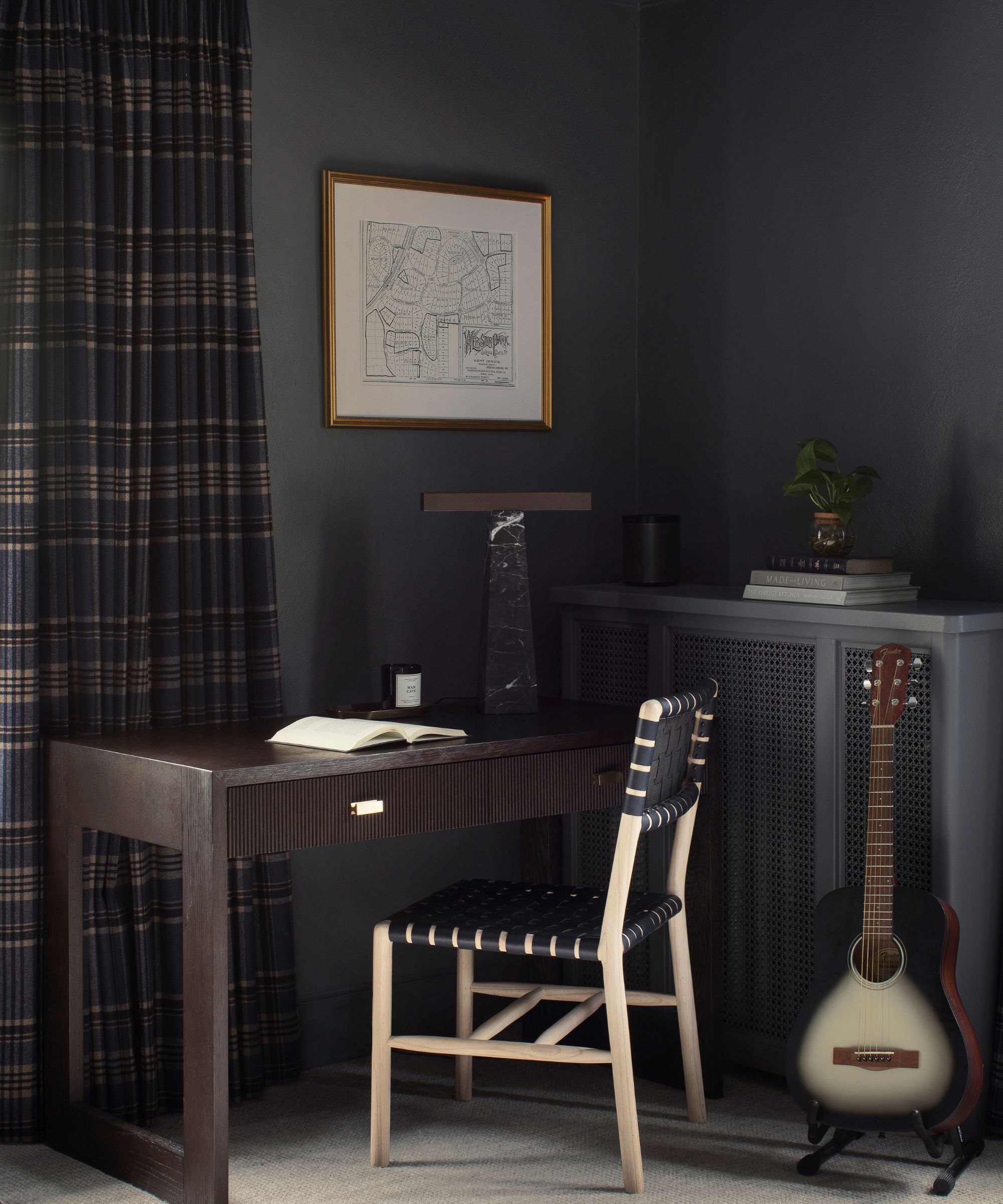
4. Iron Ore, Sherwin-Williams
Sherwin-Williams' Iron Ore is a popular dark paint that's often used by designers, including Vyanca Soto, owner and principal designer at California-based Market Studio Interiors, who says:
'My go-to dark neutral I love is Iron Ore by Sherwin-Williams – a deep, velvety charcoal with just the right balance of warmth and depth. It’s bold without feeling harsh, making it perfect for exterior paint, accent walls, or even exterior trim.'
'We love using it in spaces where the goal is to create an intimate, moody atmosphere without committing to pure black. It pairs effortlessly with warm woods, aged brass, and creamy whites, allowing for a layered, sophisticated palette that feels timeless rather than trendy.'
5. Whitall Brown, Benjamin Moore
'Whitall Brown by Benjamin Moore is one of our go-to dark neutral paint colors, and we used it beautifully in this project on the doors, select cabinetry, and even on the ceiling of the entryway,' shares designer Kristen Thomas of Studio Thomas.
'We paired Whitall Brown with rich wood floors and beams, creating a seamless flow between architectural elements. This shade serves as the perfect bridge between the hardwood flooring and the baseboards, offering depth without harsh contrast,' explains Kristen.
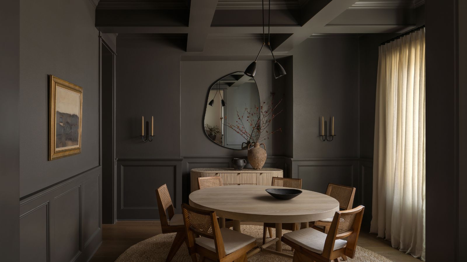
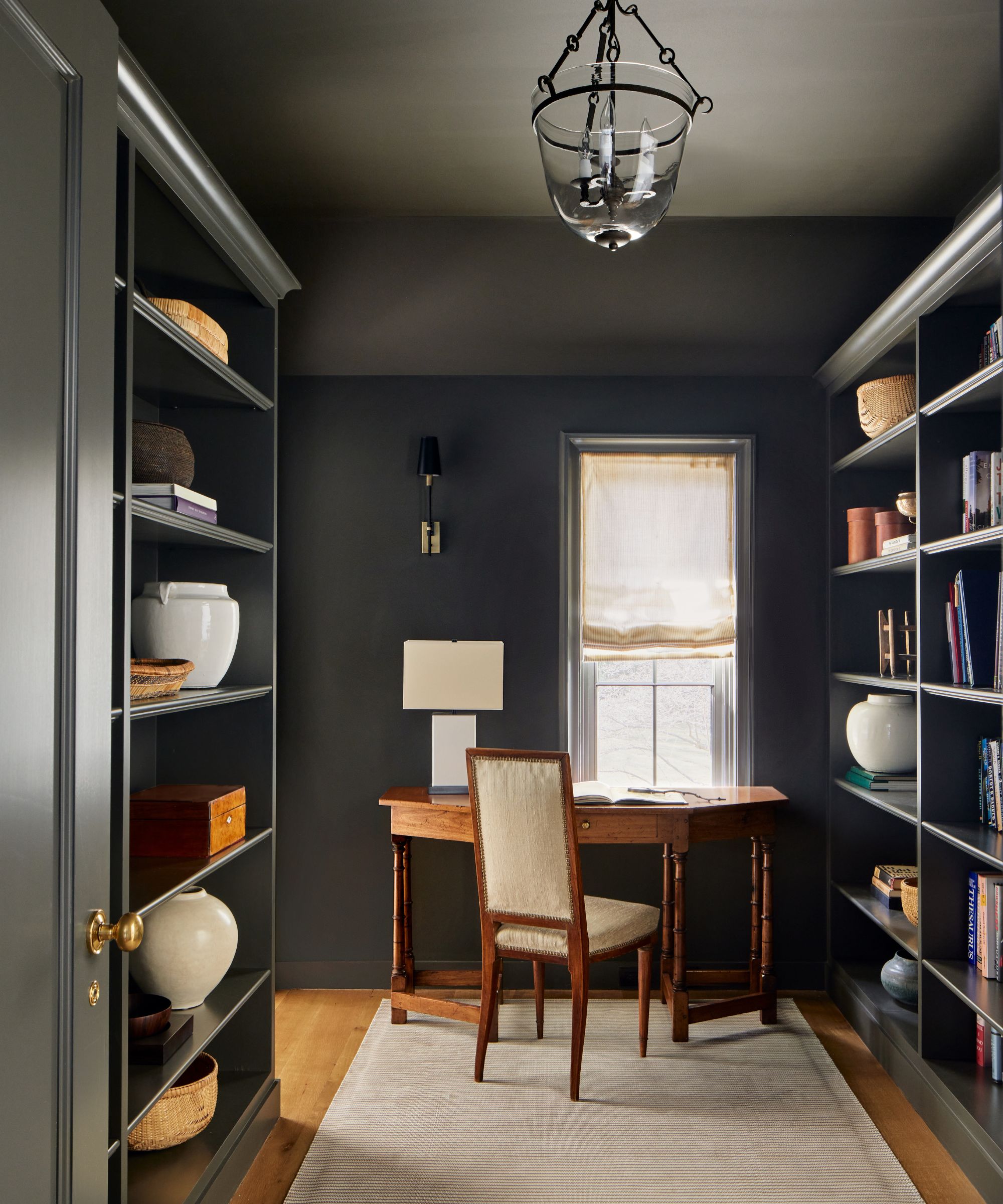
6. Kendall Charcoal, Benjamin Moore
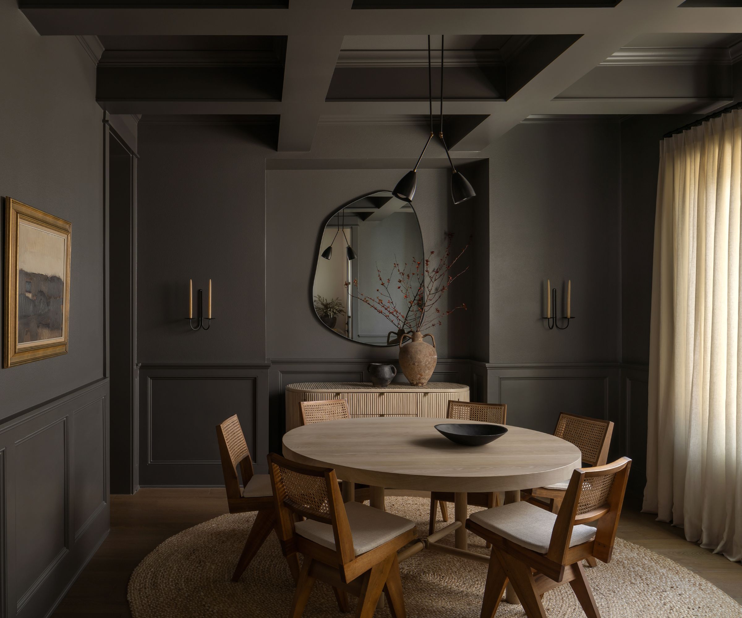
'One of our tried and true dark neutral shades is Kendall Charcoal by Benjamin Moore,' says interior designer Jenna Barton of Jenna Barton Interiors. 'We've used this rich, earthy, dark gray in bedrooms (including my own!) for a soothing and calming effect; and here in this dining room, as a dramatic, moody statement.'
While some gray paints can lean too cool, which can make a room feel drab, Kendall Charcoal has a warmth to it thanks to its rich undertones.
7. Night Out, Sherwin-Williams
'As designers, we all have our go-to whites, grays, and blacks, but when I am looking for something more I find that I am drawn to paint colors that aren’t easy to describe in simple terms,' explains interior designer Amy McCoy of McCoy Design Studio.
'Colors that have complexity and don't fit neatly into the aforementioned categories. One of my favorites among dark neutrals is Night Out by Sherwin-Williams. I would describe it as a refined charcoal hue. It’s dark but not overly so and depending on the light can lean cooler or warmer with hints of blue in it,' adds Amy.
8. Bancha, Farrow & Ball
'Green is a surprisingly versatile neutral, such as Farrow & Ball’s Bancha, and still works to create a cozy atmosphere without relying on traditional dark neutrals. It's enveloping and cozy but also chic and stylish,' explains interior designer Emma Beryl Kemper.
9. Grizzle Gray, Sherwin-Williams
'When looking for a dark and neutral gray paint color, we love Sherwin-Williams' Grizzle Gray,' says designer Stephanie Brown of Stephanie Brown Inc. 'It’s the ideal shade of gray which doesn’t pull green, or blue… it feels perfectly balanced and offers a great backdrop for a dramatic room, or used on cabinetry.'
Style small accents of gray if you don't want to paint the walls, such as this pillow cover.
Go darker with this gray linen duvet cover – perfect for the warm summer months.
Which of these dark neutral paints is your favorite? Before committing to any of them, make sure to sample shades in your space – as colors can vary greatly depending on the lighting of a room, especially with these darker neutral paints as they are real chameleon shades.