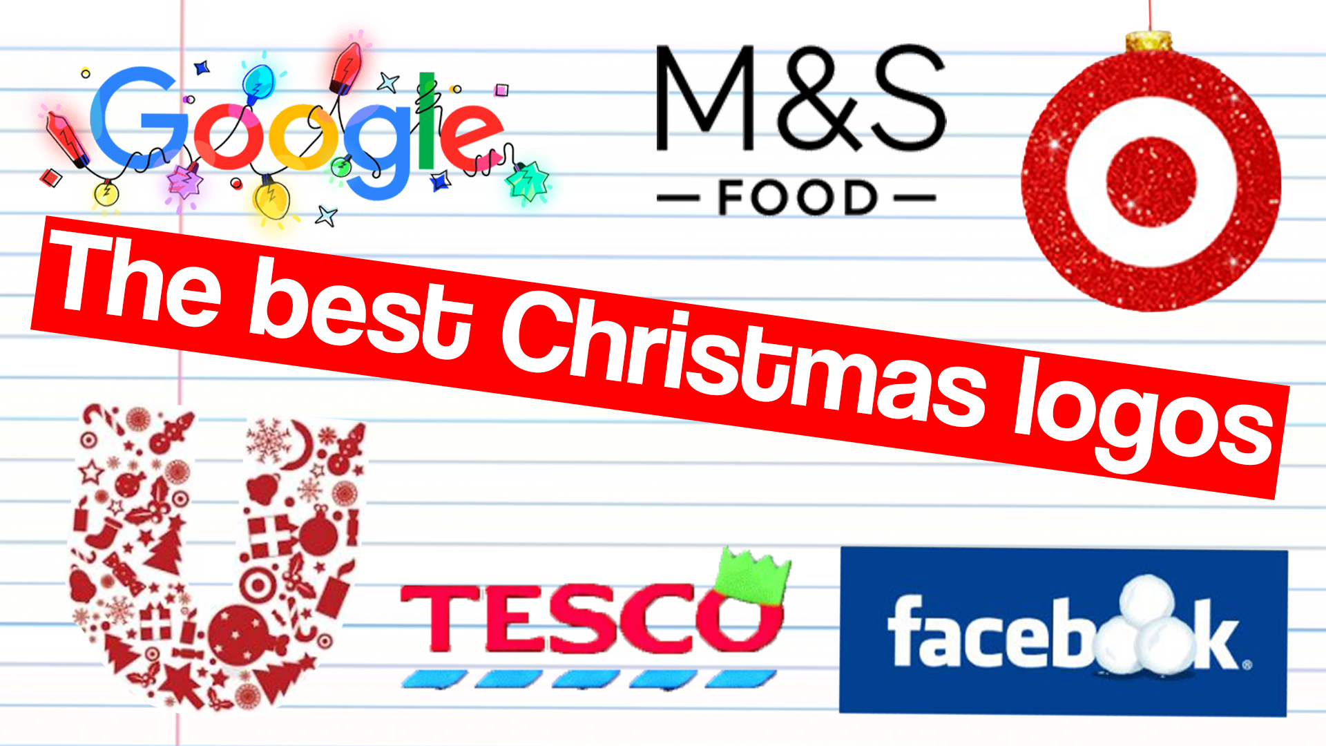
A logo seems like the perfect vessel to show off key moments in a brand's yearly calendar with a clever addition or temporary iteration, but you’ll be surprised to find out that some of the most famous moments of Christmas marketing don’t always come with revamped logos.
The yearly John Lewis Christmas advert and the Coca-Cola Christmas branding are some of the most famous pieces of Christmas marketing, but neither change their logos for the season. This shows us that a revamped logo is not always needed. But there are many household brands that still make an impact with a Christmas addition to their logos.
These brands are often renowned for Christmas in some way, for example M&S' focus on Christmas food (or pyjamas) put it at the centre of the season for consumers wanting some extra sparkle or luxury. Adding a Christmas touch to its logo reinforces the messaging that it is an essential holiday brand, pulling customers through the door. Sometimes though, like in the case of Google, Christmas is used as a chance to connect with their user base in a different way.
We've put together a list of brands that go big for Christmas with their visual design. If you want to do the same see our list of the best Christmas fonts (and catch up with some of these brands on the best logos of all time list).
01. Google
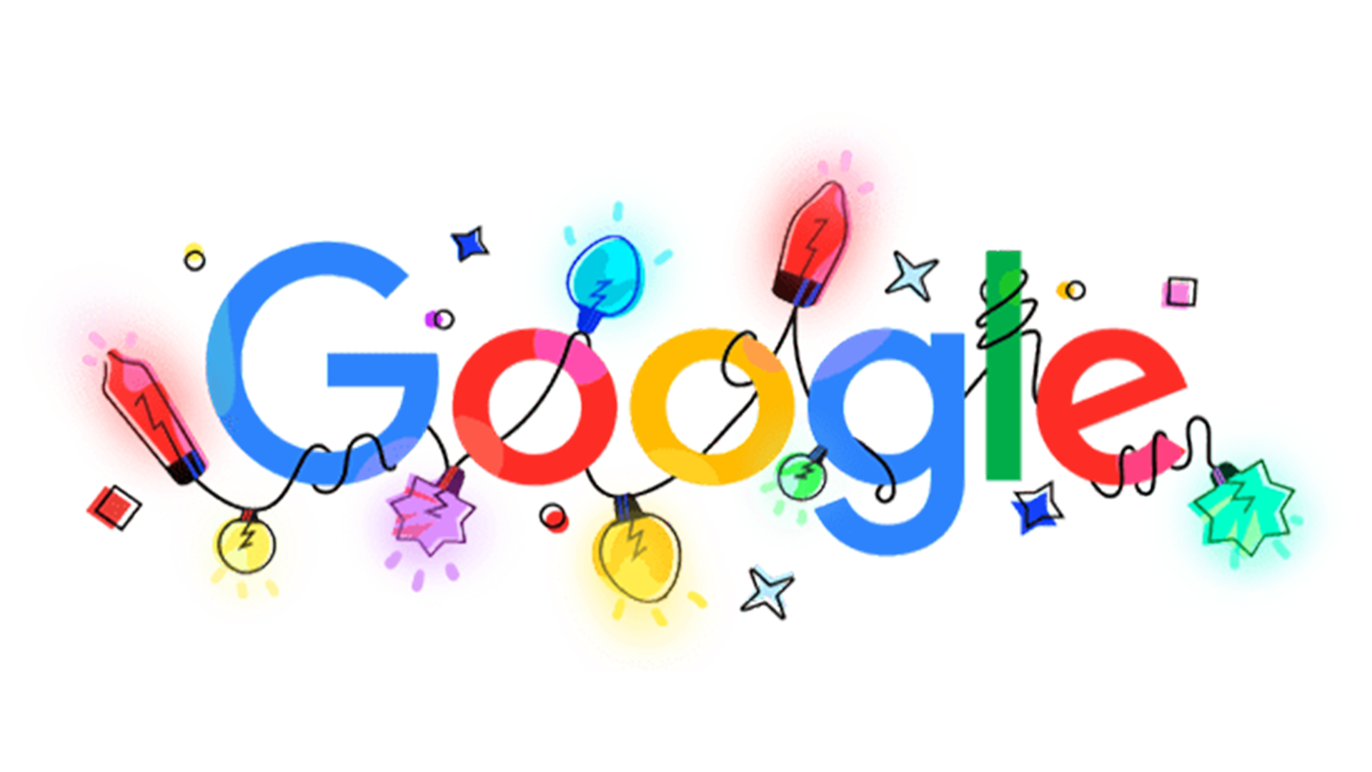
I don’t need to tell you about the fame and design relevance of Google’s ‘doodles’, meaning it places itself instantly on this list without effort. Created by designer and illustrator Maisie Derlega, this year’s Christmas doodle of the Google logo features the standard design adorned with beautifully illustrated fairylights wrapped all around the letters. And a seasonal hot tip to add: if you click on the ‘share’ icon next to Google’s logo on the homepage, a link will appear for you to copy. If you paste this into your browser you get to see a darkened version of the Google homepage featuring the lights lit up and glowing in a live animation. Small touches like this are what makes this season feel just that touch more exciting.
02. Tesco
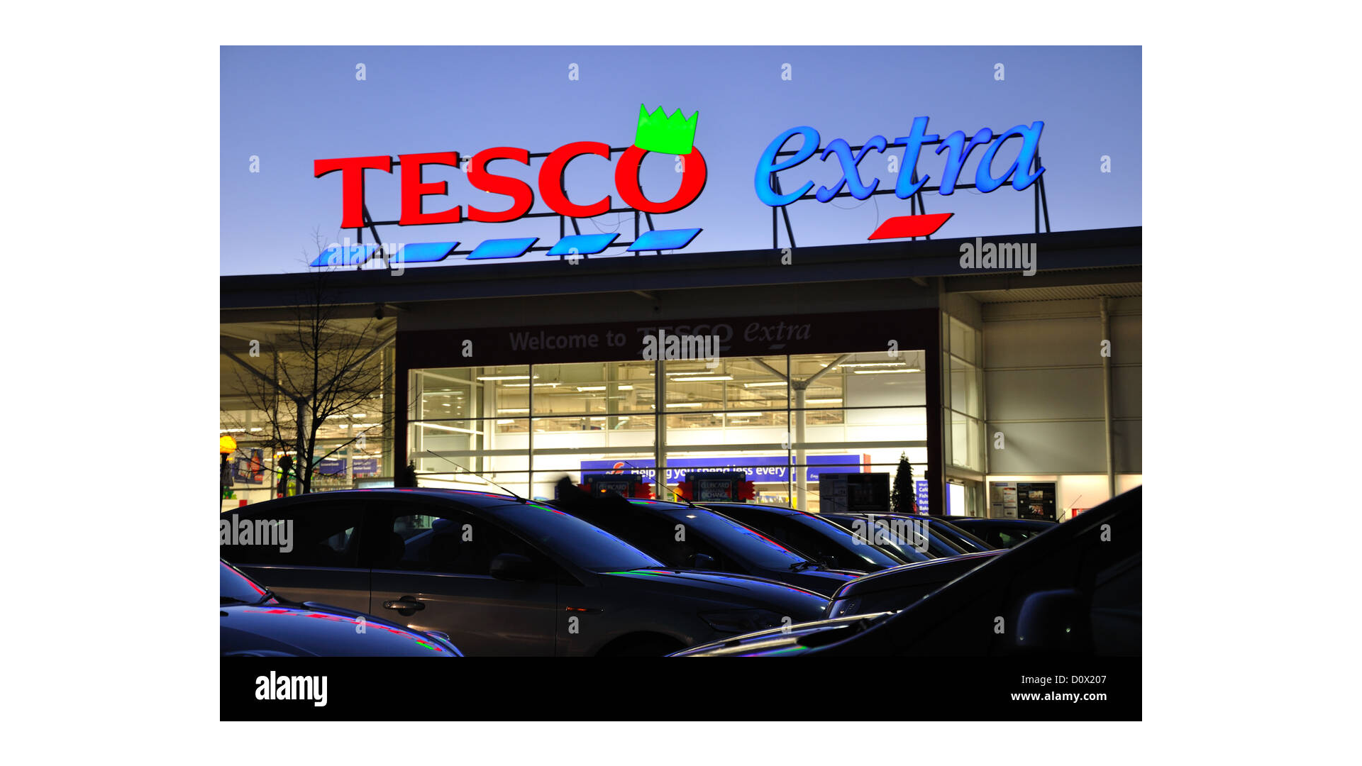
2012 came to an end with an extravaganza of green LED Christmas hats. They lit up over 200 Tesco Extras across the UK, certainly adding a touch of festive fun for last-minute turkey shoppers. The hats also appeared in shots of Tesco in their 2012 Christmas adverts, as a fun novelty for shoppers at the time, an excellent marketing decision in a year where even at Christmas, grocery demand was rapidly declining. I expect the Christmas party hats quickly righted that statistic for Tesco.
03. M&S Food
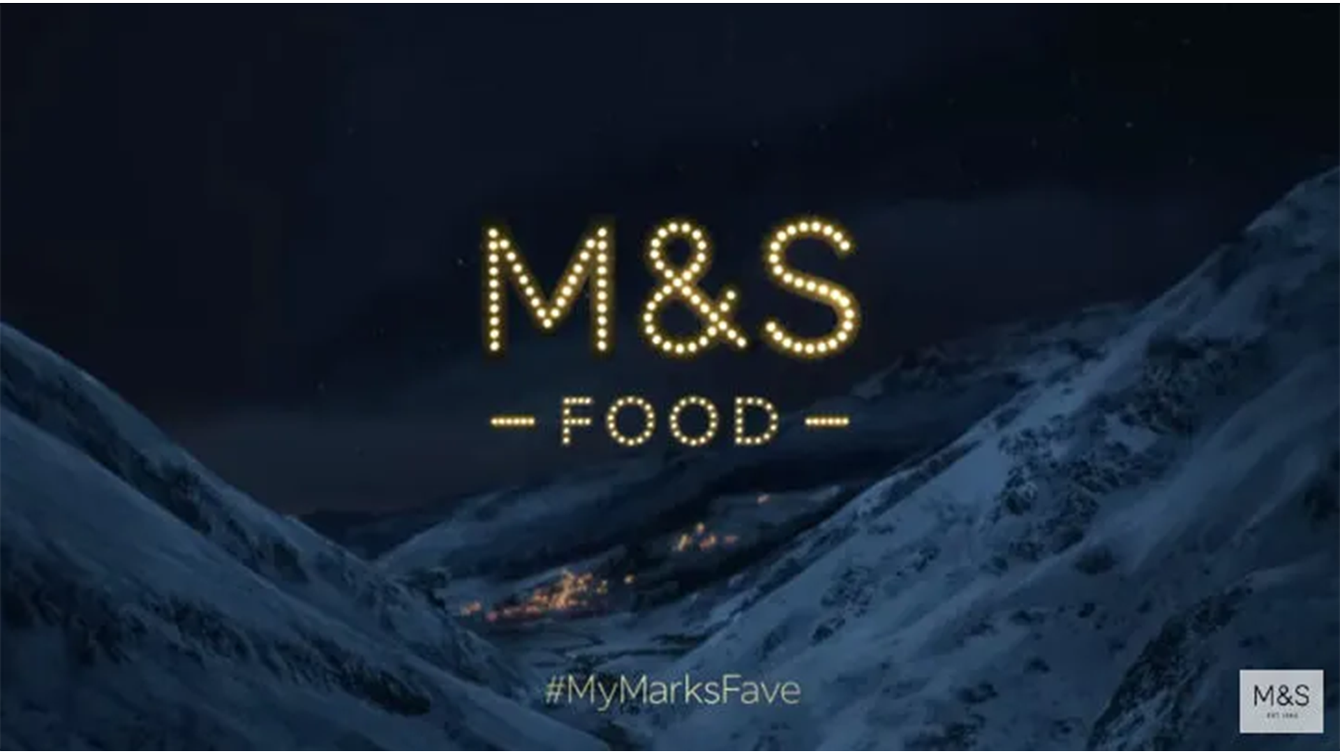
In a 2018 Christmas advert, M&S Food redesigned their logo as spelled out in fairylights to match the blue and snowy, Norwegian-esque design of the advert. This gold and glittery version of the logo featured in more of their Christmas branding that season, and I am a huge advocate for bringing it back. M&S Food have also added a gold shine to their logo at Christmas in recent years, but the letters spelled out in fairylights is a design that thrives in digital formats (and is also a personal favourite of mine) so I think it should become a much more frequently used design of the company’s Christmas branding.
04. Unilever
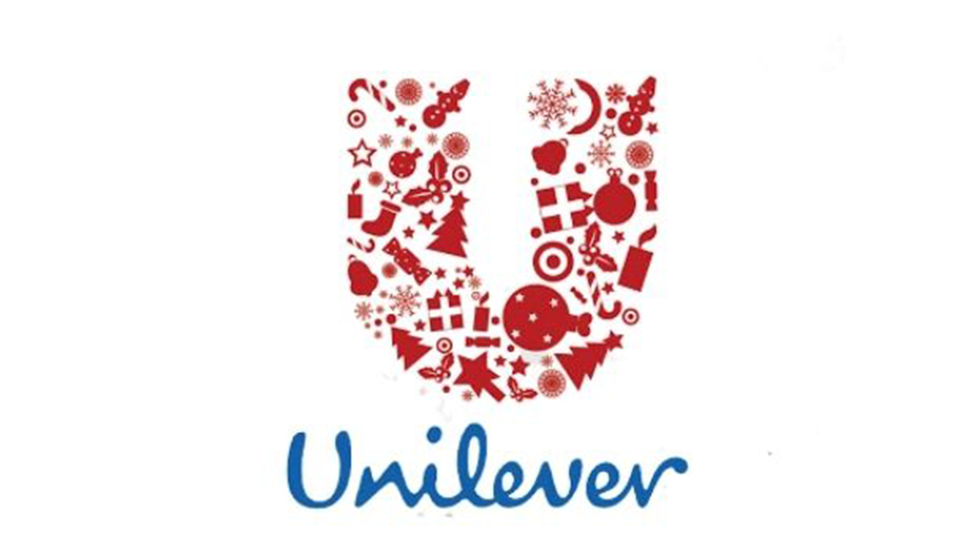
Unilever put their house illustrator to work with the Christmas version of their famously intricate logo. They swapped out their nature-inspired collection of birds and plants carefully placed in their brand’s title letter ‘U’, with an assortment of Christmassy items including baubles, presents, snowflakes and other winter-inspired objects. It’s a subtle and classy way to show the brand’s celebration for the festive season while reminding consumers of the message of Unilever’s iconic logo and the important message behind it.
05. Facebook
Staying on the politically neutral side, Facebook chose to err on the edge of ‘generally festive’ rather than specifically Christmas-focussed. It's unclear when Facebook opted for this design, and I am surprised the move is not more well-documented, or even used again by Meta. It swapped out its two letter ‘o’s for snowballs, a smoothly non-invasive seasonal touch. Nothing of the kind has yet been seen this year, but a wintry addition to everyday logos always brightens up the season, so I can only hope that Meta chooses to bring back a newly appropriate winter design to its various logos in 2025.
06. Target
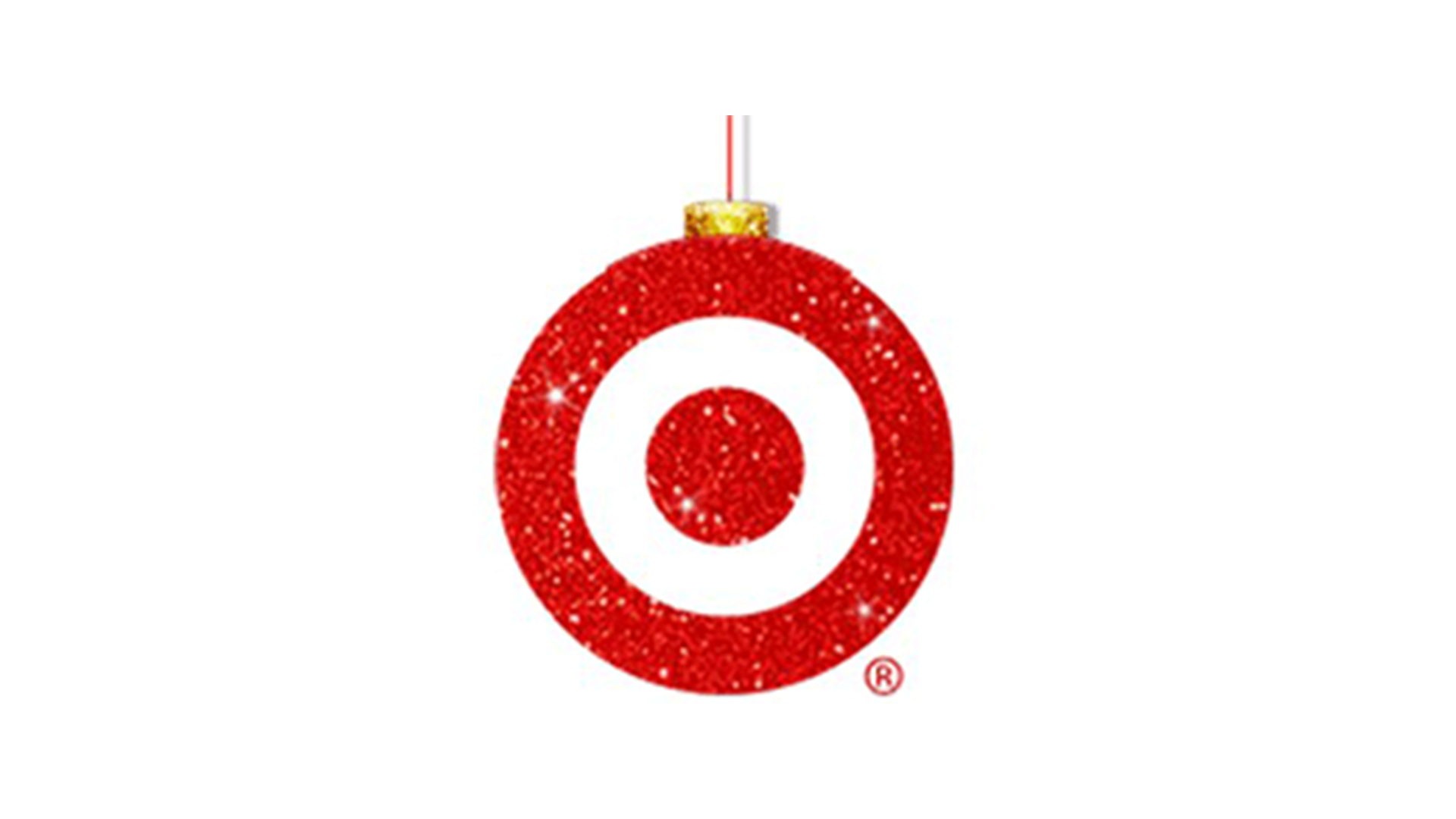
Back in 2020, Target joined the Christmas party of revamping their logo. They transformed their world-famous, literal ‘target’ symbol into a bauble concisely with just a piece of string and some glitter. They also added some sparkle to the stripes, conveniently already a festive red. Some renditions of the Christmas logo have used snow rather than glitter when designed for the company's banners. It’s a design that perfectly maintains Target’s succinct and eye-catching brand while simultaneously evoking the Christmas season.
To create your own designs, see our list of the best laptops for graphic design.

