The best animated magazine covers represent the best of a venerable industry embracing the digital age. Figuring out how to transition away from print has been a challenge for many publications, and some of the best success stories have come from those who have embraced the change wholesale and played to the strengths of digital formats. As we’ll see, this can mean more than just cover that moves, with publications using animation in all sorts of surprising ways.
Most of the principles of magazine cover design still apply of course; an animated cover still needs to be engaging and eye-catching, selling the content that’s inside. However, while print magazines have an extremely strict and inflexible aspect ratio, for digital covers it’s the reverse – an animated cover is going to be plastered all over different social media platforms, and so needs to be able to work in different sizes and configurations.
Here are our picks of the best animated magazine covers ever published, with insights from a few of the people who animated them. For more design inspiration, check out our rundowns of the best print ads and best billboard ads, and we also have a list of the best film posters.
01. TIME, April 10, 2017: The Infrastructure Issue

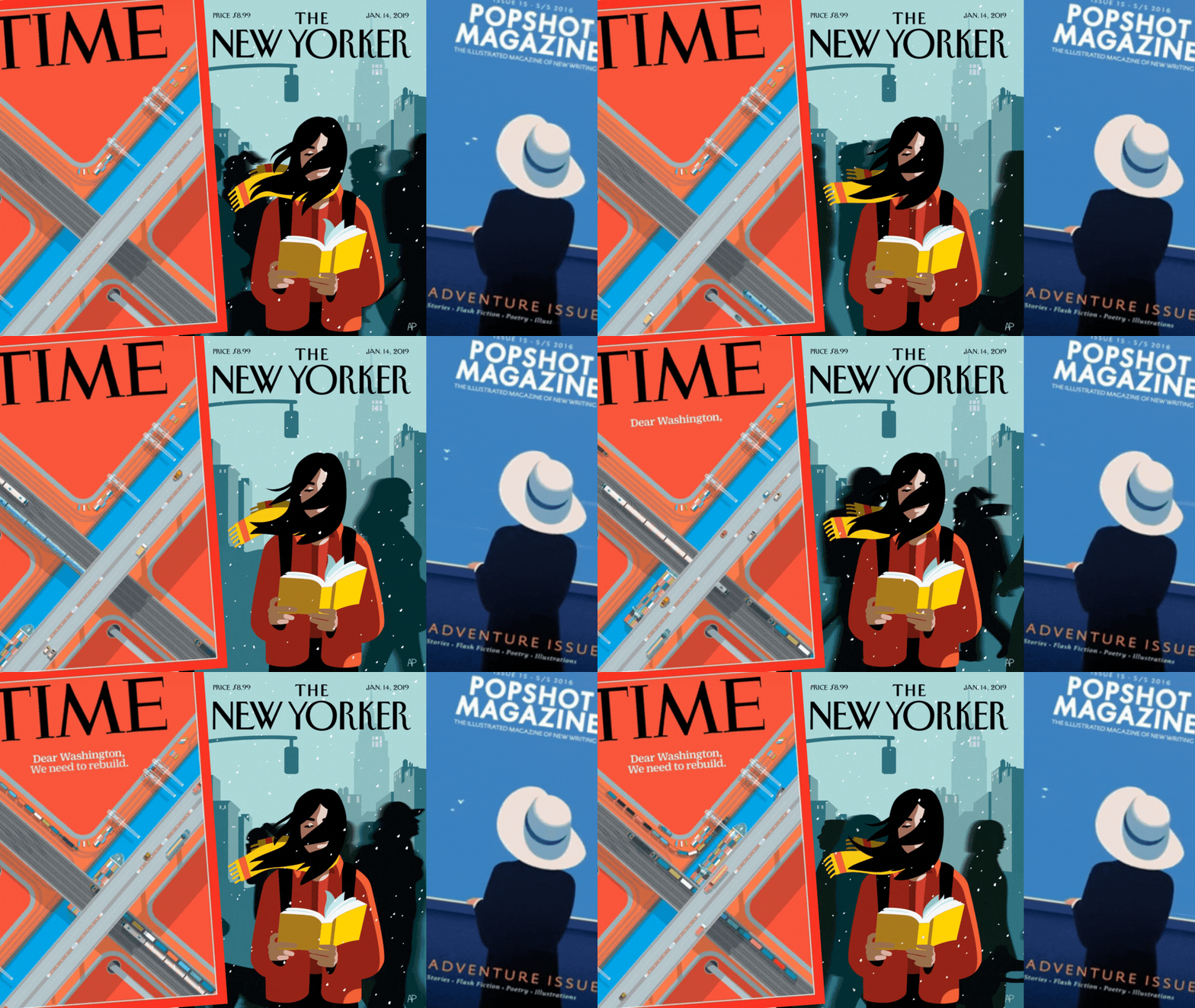
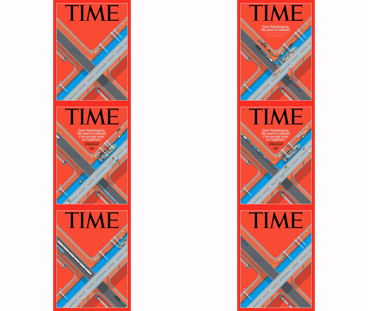
Animator Jeremy Rech has produced a number of animated covers for TIME magazine, any of which could have made it onto this list. We’ve gone for the cover for Time’s 2017 special issue on infrastructure, for which Jeremy had to animate a clever topographical illustration by Peter Greenwood.
We got in touch with Jeremy to ask about the experience of bringing this cover and others to life for TIME. One key thing he recalls is having to work to some seriously tight deadlines.
“I would receive the completed artwork the day before the new cover was going to be released publicly,” he tells us. “And most times the cover subject was always a surprise, it could be anything based on whatever the news stories were that particular week. I would always try to guess and prepare myself. And along the same lines, I wouldn't even know what kind of artwork or what style was coming along either.”
Like many animated covers, TIME’s were designed to work well on social media. “I tried to make the animations loopable to take advantage of that playback feature on most social platforms. That way the animations could play back continuously without having an abrupt jump at the end or the viewer having to hit play again,” says Jeremy.
02. The New Yorker, May 9, 2016: ‘On the Go’
The New Yorker has become known for its clever, creative animated covers – you can expect to see the title a few more times throughout this list. First up, this design by Christoph Niemann for the Innovators Issue. However, Christoph’s work isn’t just a moving magazine cover – it’s actually an augmented reality representation of a living cityscape.
By downloading the UNCOVR app and pointing their device at the magazine cover, readers would be able to see the city come alive in front of their eyes. By moving the device around the cover, they’d then be able to explore the cityscape, and potentially uncover its secrets. Playful and unique, the issue helped cement the New Yorker’s status as a true innovator in magazine design.
Describing his process behind making the cover, Christoph said: “In a drawing, the barrier between the real world and the made-up world is the surface, so at the very beginning I thought of an elevator with its doors closing. But then I realised that the subway is even better, because it really does take you to a different world. The closing doors are a flat surface that separates two worlds, and so are the covers of a magazine – separating before you read it and after you read it, what you know and don’t know, how your views change. So between the front and the back cover, and the experience created by the app, I like that we could show essentially two different angles on the same world. Like stepping through a mirror.”
03. Popshot, issue 15: The Adventure Issue
Popshot Quarterly is a literary magazine that publishes new writing, including short stories, flash fiction and poetry. For its sixteenth issue back in 2016, the magazine’s theme was Adventure, and to bring a little of that adventurous feeling to its cover, publisher and editor Jacob Denno enlisted the help of animator Christopher van Wilson. The result was a fantastic animated cover – subtle and chic.
“Jacob came to me with the ambition of animating the cover of issue 15, because he wanted to start promoting the magazine in new ways,” Christopher tells us. “The cover was already chosen, and I had to work with it. I did not have any contact with the illustrator, Thomas Danthony, but in my head the illustration was one of a lady travelling on a boat looking at the horizon. I thought that we could have some idea of movement and wind blowing through her clothes and almost blowing off her hat, and some wind effect and flying birds in the distance, giving more depth to the animation.”
Part of the reason the moving cover works so well is its pairing with the music – Catania City Blues by Italian ambient band The Dining Rooms. Van Wilson had spent the summer of 2016 listening to the band, and had the song in mind from the very beginnings of crafting the animation – as you can see by how well the two flow together!
04. The New Yorker, January 14, 2019: ‘A New Leaf’

This wintry animation for a January issue of The New Yorker is by artist Anna Parini. “The New Yorker does a great job with their animated covers,” says Jeremy. “They usually have a great illustration to start with of course, and illustration gives you great options and flexibility to work with.”
“The January 14th, 2019 issue with the girl reading the book is really well done. The animation is subtle and it loops perfectly. The hair is moving so smoothly and naturally, and the book pages shifting in the wind too is a great secondary touch.”
05. Empire, August 2024: Wildwood
This very recent Empire magazine cover is not just animated – it’s stop-motion animated! Created by Laika studios, it features the heroine of Tim Burton’s classic film Coraline introducing readers to Prue McKeel, heroine of the upcoming epic fantasy film Wildwood. A considerable undertaking, the cover took 120 days to make, with 160 LAIKA team members contributing to the final animation. And it shows!
06. Marie Claire, December 2010: Emma Watson
This Marie Claire cover certainly isn’t as intricate or detailed as some of the other animated covers on our list. However, it is notable in one key respect – it is the first designed for the magazine’s fledgling iPad edition, the cover featured the Harry Potter actress making a few simple movements, changing from one pose to another. It seems a little quaint now, but given that it debuted the same year the iPad did, you have to give the Marie Claire editorial team considerable props for wasting no time in embracing the opportunities of the digital age.
07. Empire, October 2016: Fantastic Beasts and Where to Find Them
In a nod and a wink to the famous moving photographs of the Harry Potter series, Empire magazine debuted its issue on the film Fantastic Beasts and Where to Find Them with a printed animated cover. A limited edition version, it was mocked up in the style of the wizarding world’s Daily Prophet, and when the activation button was pressed, a video trailer for the film would play. And if you really, truly couldn’t get enough of the effect, the magazine was even rechargeable via mini USB!
08. The New Yorker, June 22, 2020: ‘Say Their Names’ by Kadir Nelson

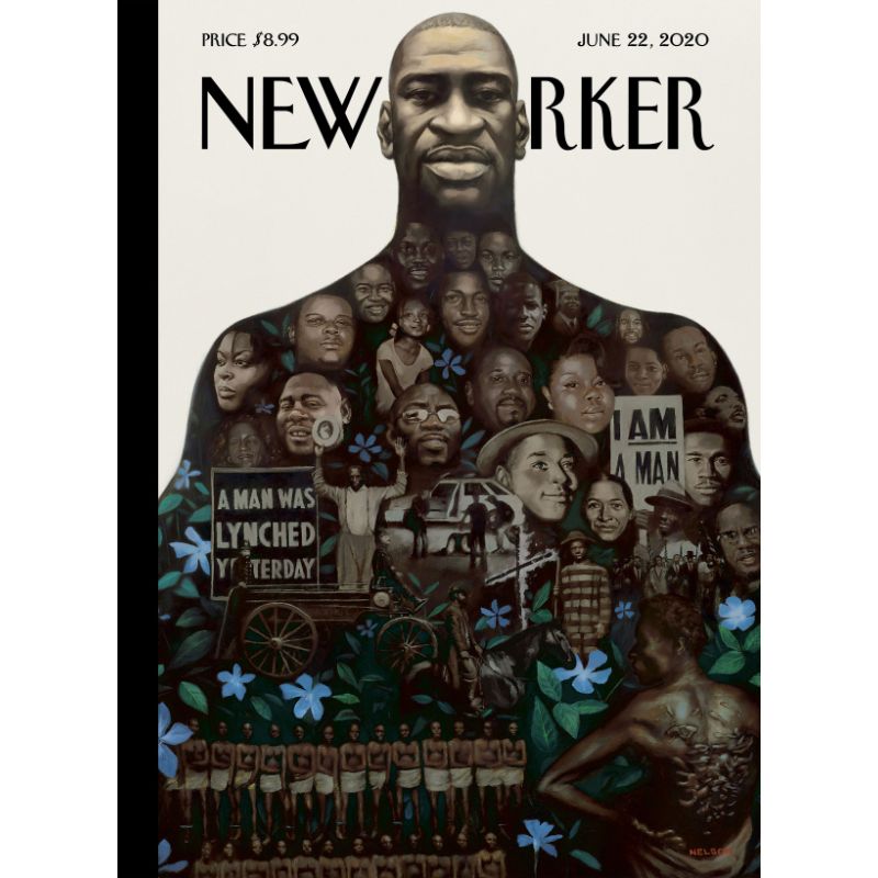
Finally, we have one more New Yorker animated cover, and this one works a little differently. Created by artist Kadir Nelson, the artwork is titled “Say Their Names”. At the top is a picture of George Floyd, whose killing by Minneapolis police officer Derek Chauvin sparked a seminal wave of Black Lives Matter protests throughout 2020 and beyond.
Contained within the illustration of Floyd are the faces of eighteen other black people whose killings – some by police officers, some not – had made headlines in the years leading up to Floyd’s death. Scroll down the page and the animation focuses on each in turn, giving their name, their age and the facts of their death. The illustration also encompasses leading lights of the civil rights movement such as Rosa Parks and Malcolm X.
Describing the cover, Kadir said it was, “[a] memorial to all of the African Americans who were and continue to be victimised by the long shadow cast by racism in America and around the globe.”
Seminal, stark and vital, the cover shows how digital design can be effectively used to convey a powerful message.
If you're inspired to create your own moving pictures, get started with the best animation software.


