It's been a big year for rebrands. We've seen everything from headline grabbing shake-ups of luxury car brands (you know the one we mean) to quietly effective new looks for smaller companies and charities. As ever, some updated visual identities have hit the spot, while others have been found wanting.
In this look back at the rebrands that have defined the year, we've picked out three favourites – and one that got everybody talking for all the wrong reasons. For more design inspiration, take a look at our guides to the best rebrands by decade.
The best (and worst) rebrands of 2024
01. Japan Airlines
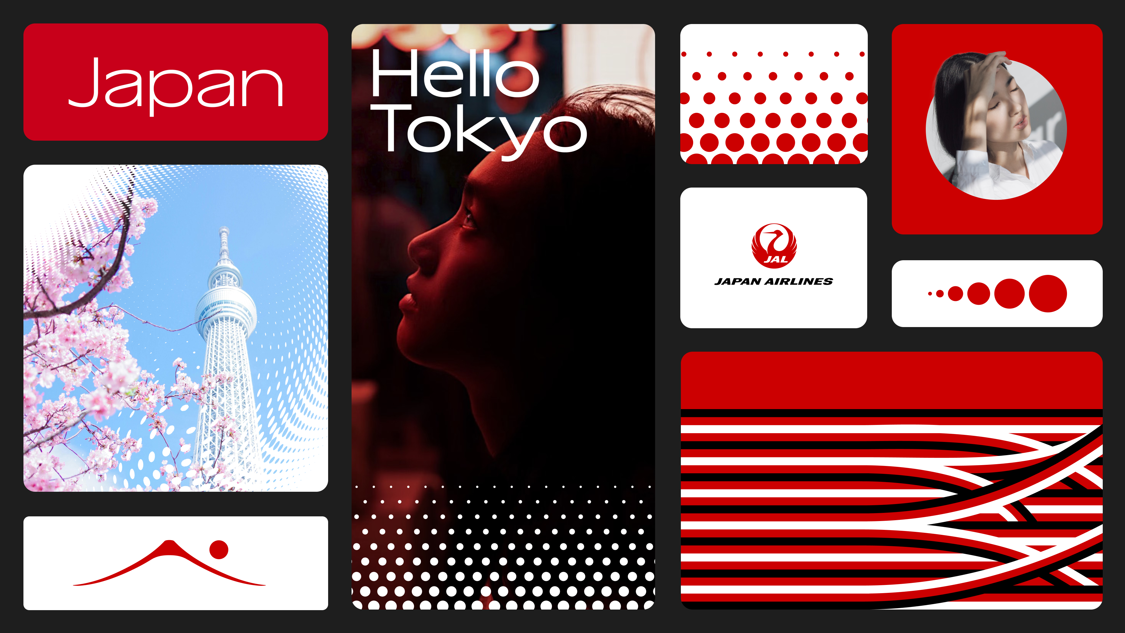
In November, Japan Airlines revealed a sleek rebrand with tradition and heritage at its core. With a refined colour palette, fresh typography and a new design system, the reimagined brand identity is a classy contemporary evolution.
Created in collaboration with Jellyfish, Japan Airlines' new look aims to bring its traditional roots to a global audience. Central to the rebrand is a new design system introducing the new Japan Airlines dot pattern inspired by the airline’s iconic logo. Acting as a "mnemonic device", the dot motif brings a sense of fluidity, acting as a dynamic graphic feature throughout the rebrand.
02. Aruba Conservation Foundation (ACF)
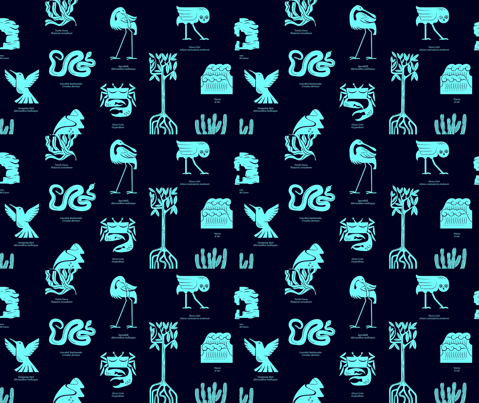
In May, The Aruba Conservation Foundation (ACF) underwent a stunning metamorphosis, debuting a stylish new brand identity that encompasses its dedication to preserving nature. Positioning itself as the 'Voice of Nature', the ACF embodies a sense of duty to the natural landscape – a theme that echoes through the design, from the organic logo to the earthy colour palette.
At the centre of the ACF's new brand identity is an innovative logo design that blends the three core components that bring Aruba to life. "The ACF team wanted a strong symbol - different to other parks and unique in the sector – that also represented elements of the park itself: namely waves (for marine), cacti (for terrestrial) and then three heads which could be seen as cacti flowers, but also humans - in order to represent collective action," Cat How, founder and creative director of design studio How&How, told Creative Bloq.
03. Kleenex
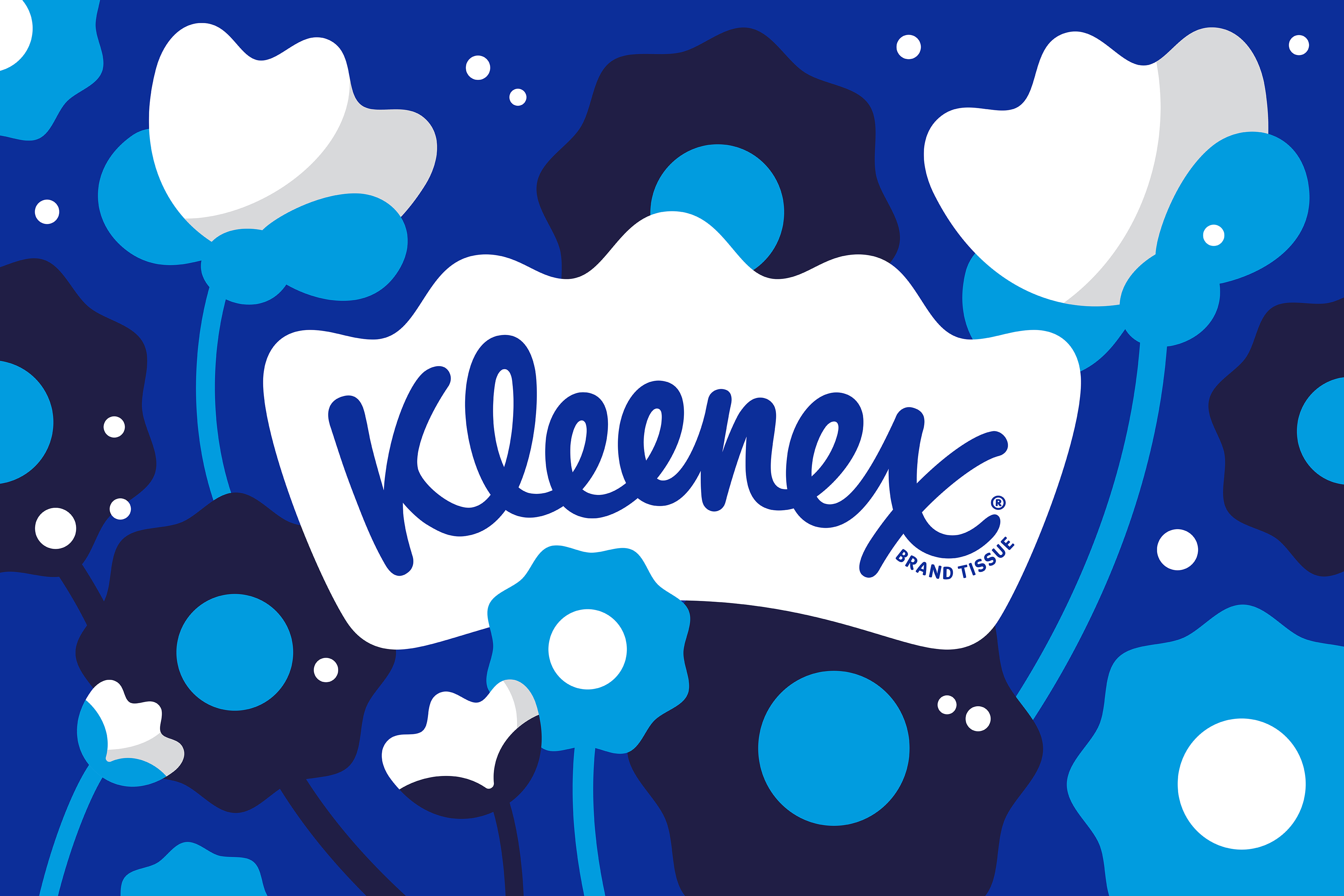
Evolutionary rebrands can be just as effective as revolutionary ones. To celebrate its 100th year, tissue brand Kleenex partnered with Turner Duckworth to reinvent its brand, futureproofing it for years to come while bringing cohesion to what had become quite a disparate brand – with different variations across markets.
The new logo centres around a crown, which houses the word 'Kleenex' (and positions Kleenex as a leader in this space). In terms of colour palette, there were also previously different colours for different markets. The new Kleenex Blue brings the brand together, making a bold and memorable statement. It might not mark a radical departure from the previous look(s), but by consolidating the brand, this is a rebrand that does its job effectively.
04. Jaguar

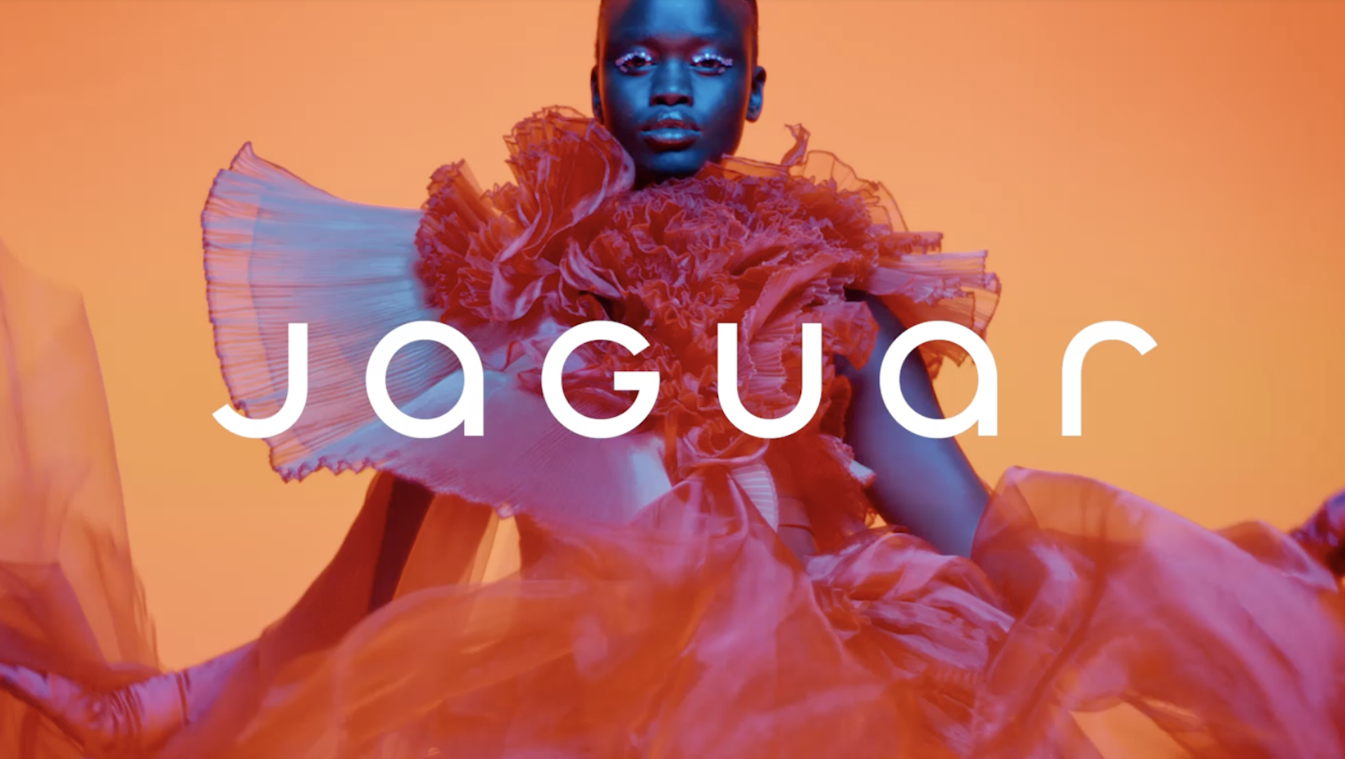
And now for the worst. What to say about this one that hasn't already been said? in five years of covering rebrands, I've never seen anything quite like the response to the new Jaguar branding.
With a minimal wordmark featuring a mixture of upper and lowercase letters, and cyperpunk-esque marketing imagery, this isn't what people expected from a car brand. While others are opting for a heritage look, Jaguar is leaning into 'modern'. And it's proven too much for many, with commentators across the whole of social media sharing their thoughts – including Elon Musk.
But it wasn't just the logo that drew ire. Te marketing imagery, with its diversity, colourful outfits and notable absence of a single car, was widely accused of 'woke-baiting'. And in a rare move, Jaguar itself waded into the discourse by, as the BBCreported, asking people to 'trust and reserve judgement' on the rebrand. Which is pretty unprecedented step – it's not like a luxury brand to acknowledge the unpopularity of one of its creative decisions


