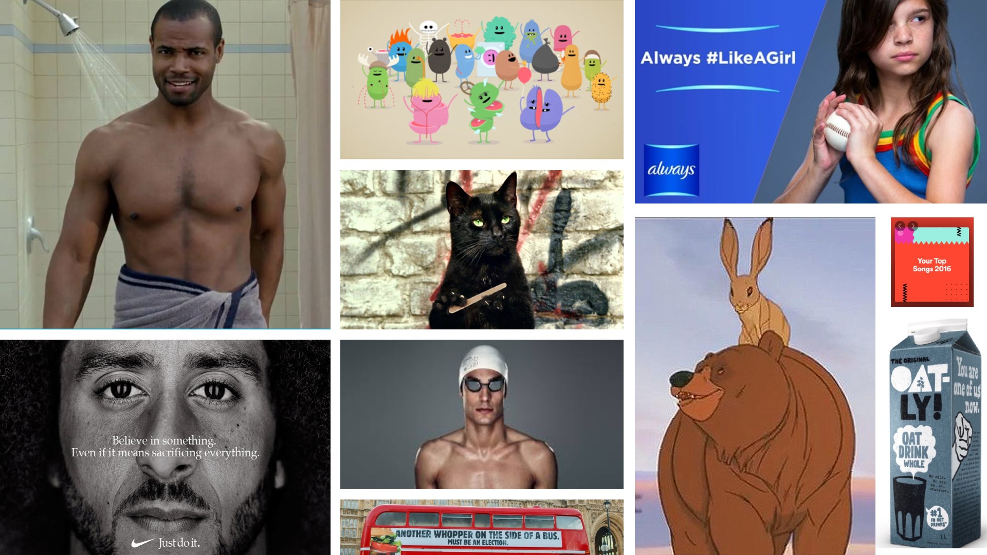
The 2000s had been dominated by the rise of the internet, but in that decade it was still very much desktop-based. In 2010s, though, the web went fully mobile, and helped usher in a new era for advertising in which traditional media such as billboards, print ads and TV commercials started to give way to new approaches such social media marketing, influencer marketing and viral video ads. At the same time, ads became increasingly global and there was a renewed focus on socially conscious messaging, too.
In such a fragmented and diverse landscape, choosing the best adverts by decade becomes quite a challenging task. So to draw up our list, we consulted with design experts, ad creatives, and marketing gurus from across the industry.
After poring through their insights and nominations, we've compiled this selection of standout ads from the era. Read on to find out what they are, why they worked so well, and why they're still considered important today. Meanwhile, for further inspiration from the last decade, check out our guide to the best logos of the 2010s.
01. Old Spice: The Man Your Man Could Smell Like (2010)
As the 2010s dawned, aftershave brand Old Spice was very much seen as a brand for old men, and urgently needed an update. Some companies might have worried about losing existing customers in the process of luring the young. But Old Spice didn't hold back, pivoting sharply towards millennials with a smart, funny and highly surreal advertising campaign led by Wieden & Kennedy.
The original ad featured actor and former NFL player Isaiah Mustafa, aka Old Spice Guy, delivering a bizarre and over-the-top monologue in which he made wild claims about Old Spice in a tongue-in-cheek manner. The commercial cleverly played on male insecurities and the idea that by using the product, a man could be as manly, suave and irresistible as the Old Spice Guy.
"These ads went viral by defying convention, with their surreal scenarios and rapid-fire absurdity," recalls Ash Miri, founder of Air Landline. "From riding a horse backwards to transforming a shower into a tropical paradise mid-commercial, each ad pushed the boundaries of traditional advertising with its unpredictable and outlandish humour.
"Through their witty scripts, imaginative visuals, and Mustafa's deadpan delivery, the Old Spice ads captured the attention of audiences worldwide, earning a place in history as some of the most brilliantly bizarre and memorable commercials of the decade."
And they still inspire advertising folk today. "At Air Landline, we've certainly taken a leaf out of their book," says Ash, "drawing inspiration from their bold approach to launch our own outrageous and funny adverts while ensuring they remain tasteful and engaging."
02. Panda Cheese: Never Say No to Panda (2010)
2010 was a vintage year for absurdity in ads, and here's another great example. It was made for Egyptian brand Panda Cheese by Advantage Marketing, and basically involved an office worker being attacked by a panda. It hit people's funny spots all over the world; demonstrating that sometimes breaking the rules can be a good thing.
"This is my favourite ad of all time, because it’s absurd, uses negative advertising successfully, and essentially does the opposite of every ad we usually think of as ‘good’," enthuses Sam Polti, senior strategic copywriter at ICHI Worldwide.
Traditionally, negative advertising has been a no-no when marketing products or services, he notes. "But this ad sells the product on the basis of: ‘Buy this cheese because if you don’t, the mascot will come to life and menace you in public.’ They’re not saying, ‘Buy it because it tastes great’ or because ‘it’s good value’, etc. They’re just resorting to threats."
On paper, then, the ad shouldn't have worked, but in practice it was hugely successful. "I love the audacity of this approach," says Sam. "It’s also incredibly funny and makes use of a retro music style I’m particularly fond of."
03. VW Polo: Unbelievable Value (2010)
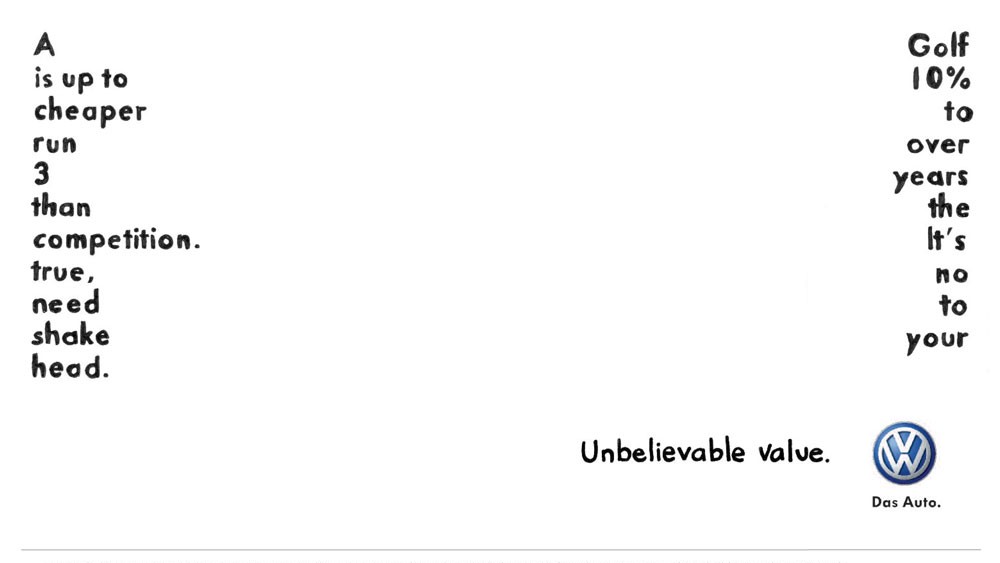
How many car ads can you think of that don't actually feature a car? Tricky, isn't it? Which is one reason why Ted Smith, head of design at BMB, was so impressed with this out-of-home ad for VW Polo.
"It's also very astutely designed," he adds. "The typeface is hand-script for a reason. Not only is it differentiating, but it subtly lets you know its playful intent. The layout is part and parcel of the message; forcing you to engage by visually unlocking the right order to read the words."
Once you’ve figured out how to make sense of it, you have to read until the end to complete the challenge, only to find at the very last word you have been played with. "But the play is all part of delivering a message with a product benefit. Placement is also key with this execution. Not only do you need the time to decode it, you need to be close enough for the physical element to work."
Overall, concluded Ted, "it’s an ad that engages you mentally and physically in a charming way, not only making it memorable, but likeable too. So even if you’re not looking to buy a car, you’ve had a positive experience with Volkswagen."
04. Cravendale: Cats with Thumbs (2011)
For those of us of a certain age, the year 2011 doesn't seem that long ago. Yet as Vicky Janaway, chief client officer at The Gate London, explains, it really was a different time.
"Social media was in its infancy, and we were only on the iPhone 4," she explains. "And if there was one thing to learn from the explosion of social media it was that people loved cats. Like REALLY. So enter Cravendale, who asked what would happen in a world in which cats evolved opposable thumbs."
The ad was part of a social campaign that was ground-breaking for the era; the cat even had its own Facebook page. "Yet at its heart was a beautifully simple insight and a charmingly slow-paced piece of filmmaking where a distinctive narrative was able to unfold," says Vicky. "What’s more, it delivered creatively and commercially, and our cat-loving nation voted it ITV’s Ad of the Year."
The campaign, led by Wieden and Kennedy London, made a big impact on Jess Dickenson, managing director at Precis, too. "It has to be up there with one of the most memorable ads of any decade," she says. "It had the right level of silliness and got the nation asking: what if cats had thumbs? This viral sensation led to a further sequence of ads depicting the cats’ mission to get the milk."
05. Metro Trains Melbourne: Dumb Ways to Die (2012)
In 2012, Creative Bloq was in our first year of existence, and we were on the hunt for interesting creative work from around the world to inspire people. Which means we were among the first to discover an ad for an Aussie train service that became one of the biggest viral hits of the year.
Created by Julian Frost and Cinnamon Darvall for Metro Trains Melbourne, Dumb Ways to Die centred around a group of fun cartoon characters who all end up killing themselves in gruesome yet hilarious ways. In an era where people were increasingly likely to watch ads on the internet rather than the TV, it quickly gained a cult global following
"The team behind the adorably morbid public service ad couldn’t have foreseen their tune joining iTunes top 10 chart that year," notes Francesca Knowles, creative strategist at Maverick Media. "And they're unlikely to have known that the game apps developed off the back of it would become the most downloaded game in over 22 countries."
They also might have expected that such an explosively viral hit would be quickly forgotten. "But instead, shortly after its 10-year debut, it reached a new milestone by taking over TikTok and Instagram," adds Francesca. "That wave peaked in February 2023 and if you were a user of either platform, you would have come across some video highlighting human error, overlaid with the text 'Dumb Ways to Die' and accompanied by the tune that we, as a collective, just can’t get enough of."
She concludes: "I think the best kind of ad is one that sticks around for a long time, sometimes even annoyingly so. Can you hear it? The little tune at the back of your mind singing along to “Duummmb ways to diiie, so many dumb ways to diiie ♫"
06. Converse: Shoes Are Boring, Wear Sneakers (2012)
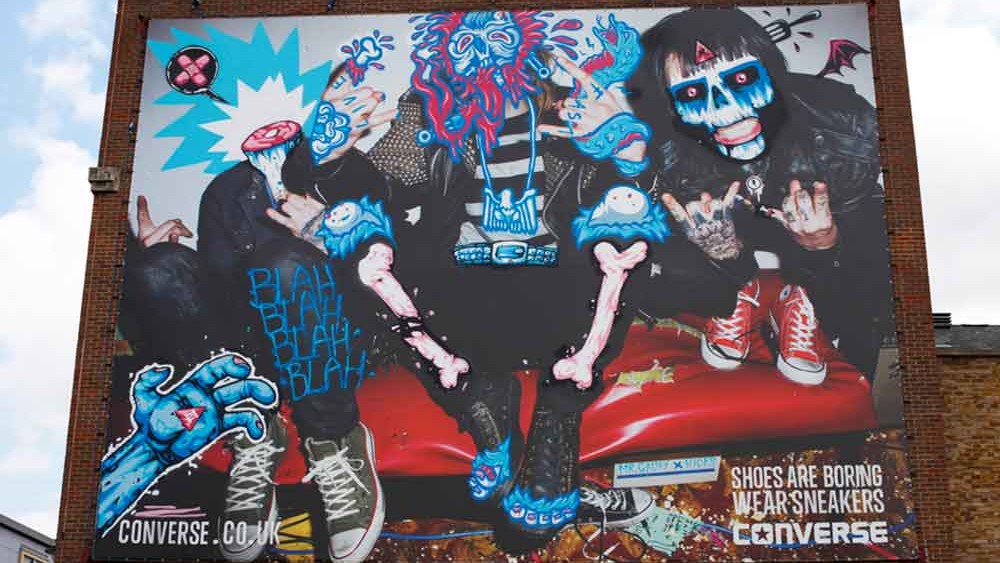
In the early 2010s, the advertising industry took full advantage of the popularity of the web, with motion graphics and animation becoming increasingly important to grabbing people's attention. And yet traditional static, 2D advertising still had the power to captivate audiences, especially if you did something a little different.
And that's exactly how Converse approached its 'Shoes Are Boring, Wear Sneakers' campaign, as part of which they commissioned artists to customise its ads using spray cans, markers and brushes
Kelly Patterson, marketing director, EMEA at Pipeline360, was living in Shoreditch in east London at the time. And she remembers seeing one of these advertising images, which had been spray-painted over by High Rise Murals, on the outside wall of a nightclub. "I walked past it every day on my way to work," she recalls, "and it garnered a lot of attention and acclaim for its bold and refreshing approach to marketing. It certainly captured my attention".
The campaign's brilliance, she explains, lay in its ability to challenge conventional perceptions and redefine the role of footwear. "Not only that, but they were also one of few brands really embracing OOH native advertising," she points out.
"I loved that their core audience were likely in and around Shoreditch at the time and they would likely resonate with an OOH campaign that was executed in spray paint. Boldly stating 'Shoes are boring, wear sneakers' using graffiti was a clever tactic to reinforce the campaign message.
"I also liked that the campaign's tagline, 'Wear Sneakers', served as a simple yet powerful call to action," she adds. "Finally, the use of vibrant and dynamic visuals, combined with diverse and alternative models, made the campaign relatable, engaging, and telling a story that not only captivated its target audience but could also be shared across multiple platforms, including OOH."
06. John Lewis: Bear and the Hare (2013)
On paper, the John Lewis Christmas advert is simply a TV advertising campaign to promote the department store in the run up to Christmas. In practice, it's become an integral part of British culture, and as central to the season as dressing the tree and putting up the decorations.
Technically, John Lewis started doing Christmas ads in 2007. But for our money the modern tradition of creating a big-concept, emotional short film with super-high production values and an attention grabbing soundtrack really took off in 2013, in this spot created by Adam & EVE/DDB.
The animated tale showed a bear hibernating for Christmas before its best friend, a hare, wakes it up on Christmas Day; all to the evocative sounds of Lily Allen singing 'Somewhere Only We Know' by Keane.
"Built on the theme of finding the perfect gift for the one you love, this ad essentially tells the story of friendship and doing thoughtful things for the people you love," explains Lauren Richardson, senior account executive at Marketing Signals. "These ads work because of their keen focus on consistent brand storytelling and evoking strong emotions. They also capture the public’s imagination with cute characters that people come to love.
"Of the John Lewis Christmas ads to date, the Bear and the Hare and 2014's Man on the Moon are my favourites," she adds. "Both featured great covers of popular songs, giving them an emotional twist, and both had excellent stories behind them."
07. Always: Like A Girl (2014)
Most of the time, when ads try to make a social or political point, it can be quite cringeworthy and miss the mark. But there are exceptions, and this ad for menstrual hygiene brand Always is one of the best, and was a true challenger in the world of period product branding.
Directed by Lauren Greenfield for Leo Burnett, it takes aim at the way we use the phrase 'like a girl' as a pejorative, and explodes it into a million pieces. All in a succinct, matter of fact way that gets across the point so instantly and effectively, it leaves you breathless.
The ad's target market might have been young girls, but it had an impact on people of all ages and genders. Take Michelle Craig, director and creative partner at UNIT9. "I was in my early 30s when this spot came out," she recalls. "I didn’t know how much I needed it.
"It wasn’t just a spot. It transformed a seemingly simple message into a powerful, engaging and inclusive rally cry that resonated deeply. It took a legitimate insult – one I remember being levied at me and my friends – and made it the secret nod we all needed, all wanted. It didn’t do it with frills and effects. It stared straight into the goddamn eye and dared you to look away.”
Mallory Hern, associate design director at Hook, tells a similar story. "The 2010s were a game-changer for ads, at least for me," she remembers. "This wasn’t your typical Super Bowl ad for Budweiser or the latest Apple device. It wasn’t just an ad: it evoked an emotional response, one that dug deep on a personal level.
"It used words meant to dim our light to ignite a flicker of defiance within each of us. It repurposed a single, well-chosen phrase, a phrase that continues to make us think, feel, and question the very core of how we use language to define ourselves and the world around us. The ad still packs a punch. It’s a reminder that the best ads aren’t just seen, they’re felt."
08. Sport England: This Girl Can (2015)
Fighting sexism isn't just about dismantling negatives, it's also about reinforcing positives. So the flipside to 'Like a Girl' can be seen in this ad from the following year, created by FCB Inferno and directed by Kim Gehrig for Sport England.
Subtly echoing President Obama's mantra of 'Yes we can', 'This Girl Can' did something that was very original, for the time: showing a variety of women, of all shapes and sizes, playing sport. Moreover, rather than remaining demure and elegant, as past generations expected them to, these women are shown sweating, grunting, groaning and tiring… just like in real life.
"Both the print and TV ad tore up stereotypes and embraced the reality of physical activity, putting all kinds of women at the forefront," recalls Matthew Hauke at Design by Structure. "It’s a simple campaign but with great photography and killer copy, it just exudes attitude and demands attention. Better yet, it actually worked, persuading millions of women to become more active over the years since its launch."
09. Oatly: It's Like Milk (2015)
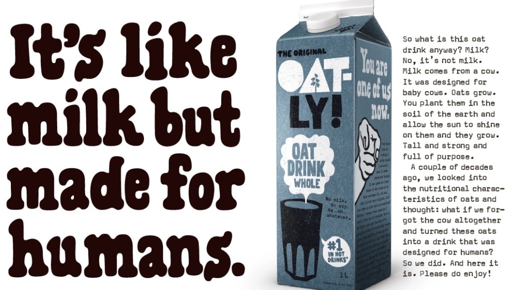
The 2010s were the decade in which veganism went from niche activity to mainstream. But with most people still clinging to their love of animal products, advertisers had to step a fine line; encouraging experimentation without being preachy or condemnatory.
Here's a great example of how to do it from Swedish oat milk brand Oatly. Its 2015 campaign, led by Alfred, was taglined 'It's like milk, but made for humans'. And it exemplified effective marketing for several reasons, believes Kelly.
"Firstly, its straightforward tagline was both memorable and impactful, conveying the brand's message while giving pause for thought," she says. "It arrived at a time when veganism was gaining momentum, and Oatly's bold tagline underscored the notion that animal-based products aren't inherently suited for human consumption.
"Secondly, what sets Oatly apart is its bold and irreverent tone, a contrast from traditional dairy milk advertising," she adds. "I love their ability to include humour into their marketing, a quality I feel the industry has somewhat lost over the years. What I liked most is that their humour wasn't limited to their tagline; it was also present in the accompanying blurb and on the packaging of their product."
10. Spotify: Spotify Wrapped (2016)
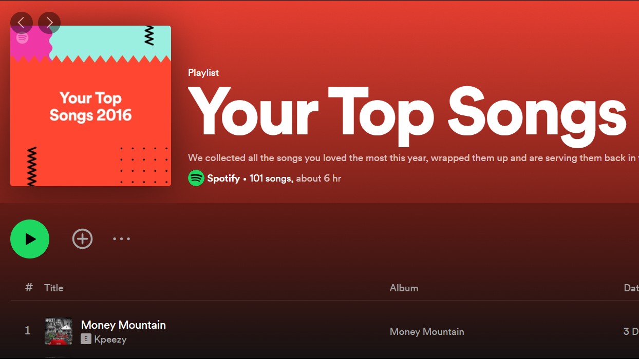
In the 2010s, the concept of what constitutes an ad began to morph into new and interesting directions. A great example is 'Spotify Wrapped', a viral marketing campaign that began in 2016, and has since become an annual event.
The campaign allows you to view a compilation of data about your activity on Spotify over the past year and invites you to share it on social media. Spotify Wrapped typically includes the five musicians you've listened to most often, the songs you've listened to most, and your favourite musical genres.
"Tech platforms hold a wealth of information about users, but this is usually locked up in operational platforms and surprisingly difficult to access by anyone in the marketing department," notes Stephen Jenkins, founder and managing director of Too Many Dreams. "Spotify Wrapped proved how powerful it can be when marketers are given access to these insights."
There are so many things to love about this campaign, he continues. "Spotify has been able to expose how much it knows about its customers, in a way that isn’t perceived as intrusive: this must be a boon for its ad-sales team. The campaign is integrated within the product itself, being launched in the app and now including custom playlists. This drives engagement and dwell-time.
"Better still, users now anticipate and look forward to the campaign; the hallmark of the best type of permission-based marketing. And look how much earned reach it generates: over 100 million Wrapped stories were shared on social media in 2022 and it generates thousands of column inches, stories and memes. It's reported that the 2020 campaign drove a 21% increase in new app downloads.
"There's so much that creatives and marketers can learn from this campaign, and this is probably why so many other brands have since launched their own versions of Wrapped," he concludes. "But I hope it also inspires business intelligence and operations teams within tech platforms to give the keys to the data vaults to the creatives. You never know what it might inspire, or how effective it could be."
10. Samsung: Blind Cap (2016)
Can advertising merely reflect current society, or does it possess the transformative power to shape it? The Blind Cap campaign by Cheil Spain and Samsung in May 2016 offers a strong case for the latter.
The spot features an innovative swim cap designed for blind Paralympic swimmers. The cap integrates a vibrating sensor and Bluetooth technology that lets visually impaired swimmers know precisely when to execute a turn, to enhance accessibility and inclusivity in sports. The ad won a Gold and a Bronze at Cannes Lions 2016.
Andrea Molina, senior digital designer at Cheil UK, describes it as "the ad that led to my career". She explains: "As a young woman and advertising student in the late 2010s, I was profoundly impacted by ads that evoke emotions and inspire contemplation. To me, advertising is not just a mirror but a driver of societal change, capable of steering us towards a brighter future.
"A few years later, inspired by the Blind Cap's impact, I shared my admiration for the project during my interview at Cheil. The involvement of two women, creative art director Ana del Valle and creative copywriter Mercedes Laso, in this ground-breaking initiative resonated with me deeply. Their success in a male-dominated industry motivated me to pursue meaningful work that makes a difference.
"The Blind Cap ad embodies innovation and empathy, reflecting the values I aim to incorporate into my own creative endeavours," she concludes. "This passion for impactful change led me to my current role, where I strive to harness advertising as a force for positive transformation."
11. Burger King: The Burger King Bus (2019)
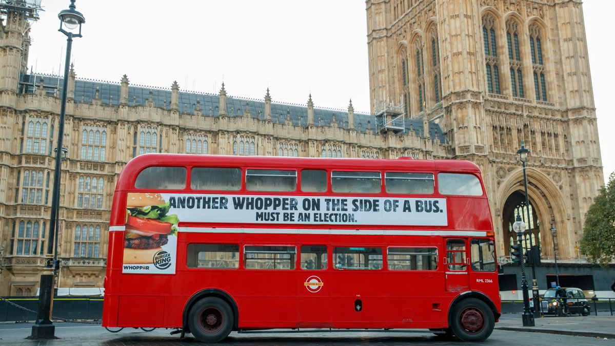
In the second half of the 2010s, there were two subjects no one could escape: Brexit and Trump. But while polarisation and political turmoil made a lot of people very angry, advertisers were often there to see the funny side.
We loved this Burger King bus stunt in London, conceived by BBH, which parodied the questionable claims on the side of a 'Leave' campaign bus some three years previously. And so did Emily Butcher, client services director at ICHI Worldwide, describing it as "an example of bold thinking, great messaging, and perfect timing".
She adds: "We don’t see brands enter the political space very often. So when this appeared on the eve of the general election, clearly mocking the biggest debate our country has seen this century, its relevance and stage setting was, to me, perfection. This simple execution was immediately shared virally to generate global publicity for Burger King. And all for the price of a single bus side. Relevant and memorable."
12. Nike: Dream Crazy (2019)
American football star Colin Kaepernick taking the knee at an NFL game in protest at police brutality was another landmark political event of the 2010s. And one of the best ads to reflect this growing movement was Nike's Dream Crazy, featuring the star himself.
Rather than focus specifically on the issue at hand, though, Nike's spot delivered a broader message about pursuing dreams in the face of doubters and critics. Lines like 'Believe in something, even if it means sacrificing everything' might have sound cheesy coming from someone else's lips. But narrated by the sporting icon, with visuals of a diverse range of people exhibiting a similar sense of defiance, it resonated strongly.
"This powerful ad sparked conversations around important social issues, standing out for its bold stance on activism and empowerment," enthuses business coach Jessica Crane. "By aligning with a controversial figure, Nike successfully connected with a younger, socially conscious audience while remaining true to the brand's central message of perseverance and determination."
For more great ads, explore the best adverts of the 80s, 90s and 2000s.


