
The 1950s were a huge contrast with the grim war years of the 1940s. As peace broke out, Western society saw a consumer boom that led to unprecedented levels of economic prosperity. The growth of suburban living, the rise in wages and the extra leisure time thanks to new household utilities meant that, for the middle classes at least, life got significantly better.
The market for goods and services then, expanded dramatically, but so did competition. So advertising, just like the best logos, was crucial if brands were to take advantage in this new era.
In this article, we revisit the best adverts of the 1950s, where innovation met imagination, and commercials became an artform in their own right. We also gather insights from advertising experts to explain why these ads worked so well. For a further dose of nostalgic inspiration, see our guide to logos by decade, which includes the best logos of the 1950s.
01. 7up
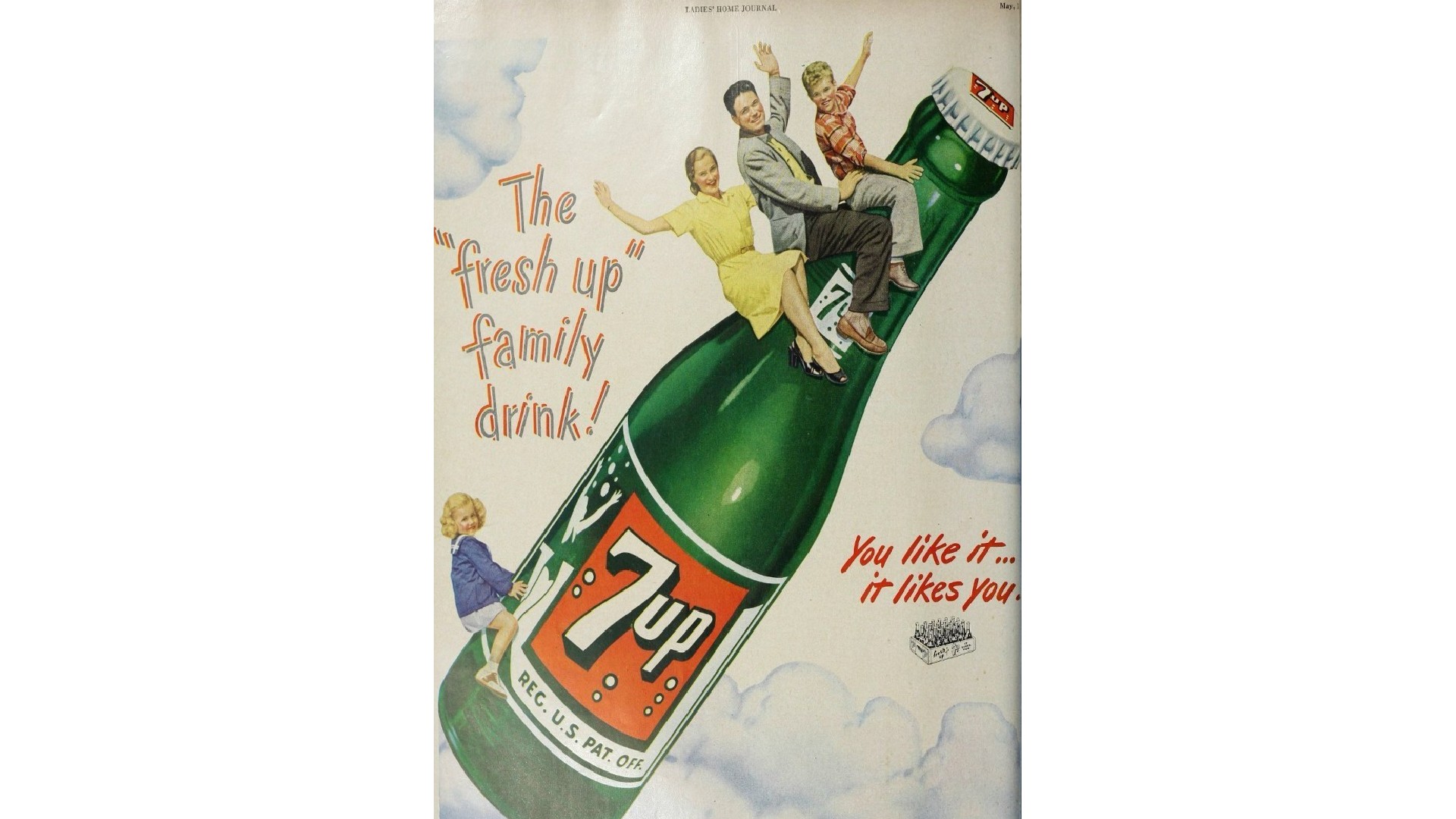
In many ways, the 1950s was a golden age for advertising: the decade when consumerism was firmly established as a driving force across the Western world. Gregg Lipman, managing partner of CBX, sets the scene.
"In these advertisements, the hope and optimism coming out of the 1940s went steroidal," he explains. "A proliferation of products came to market in the boom following the war. Refrigeration, plastics, and other technological advances helped create a new outlook on life for millions. Suburbia created a new idolised world of happiness and achievement. The advent of television broke it open. And the print ad came to life."
This ad for soft drink giant 7Up offers a clear example. "We've come out of the house and are on an aspirational rocket ship, on a great family journey," notes Gregg. "Our posterised illustrations are moving to photographic imagery and in contrast to the 1940s, the product and brand identity is not simply a sign off, but the key visual element of the concept. The product is taking you on an adventure. I do get the feeling that copywriters were wrestling with the difference of a headline and a tagline, but the concept is too strong to quibble."
02. Marlboro

One of the most iconic advertising figure of the 1950s is nowadays considered one of the most problematic. Making his first appearance in 1954, the Marlboro Man transformed the image of filtered cigarettes forever.
Marlboro cigarettes had initially been marketed as a mild and filtered cigarette aimed at women, but sales were disappointing. And so in the early 1950s, Leo Burnett decided to reposition Marlboro as masculine, rugged and outdoorsy.
The subsequent campaign featured images of a rugged, stoic cowboy depicted in various outdoor settings, typically with a cigarette dangling from his lips or hand. These advertisements also appealed to the American ideals of freedom and rugged individualism.
"Its genius is in its simplicity," says Matt Hopkinson, creative director at Initials CX. "How do you market a 'healthier' filtered cigarette traditionally associated with women to men? Well, first of all you don’t mention health at all. You in fact double down on what America considers to be the manliest type of man there is – rugged, strong, quiet, dependable. This image has lasted for decades and another example of tobacco’s legacy on our society’s culture."
The Marlboro Man image continued into the 21st century in countries such as Germany, Poland and the Czech Republic. It last appeared as late as 2012 in Indonesia. Health activists won't miss him, but from the point of view of advertising strategy, there's still a lot to learn from him today.
As Alex Robinson, founder at Novus Digital, explains: "The Marlboro Man wasn't just incredibly successful; it was a dextrous personification of a product; a method that has retained popularity to this day. There is absolutely no shortage of anthropomorphised items or services in the 2020s, from Geico’s Gecko to the notorious M&M characters." (See our piece on brand mascots for more on the subject.)
03. Ronrico Rum
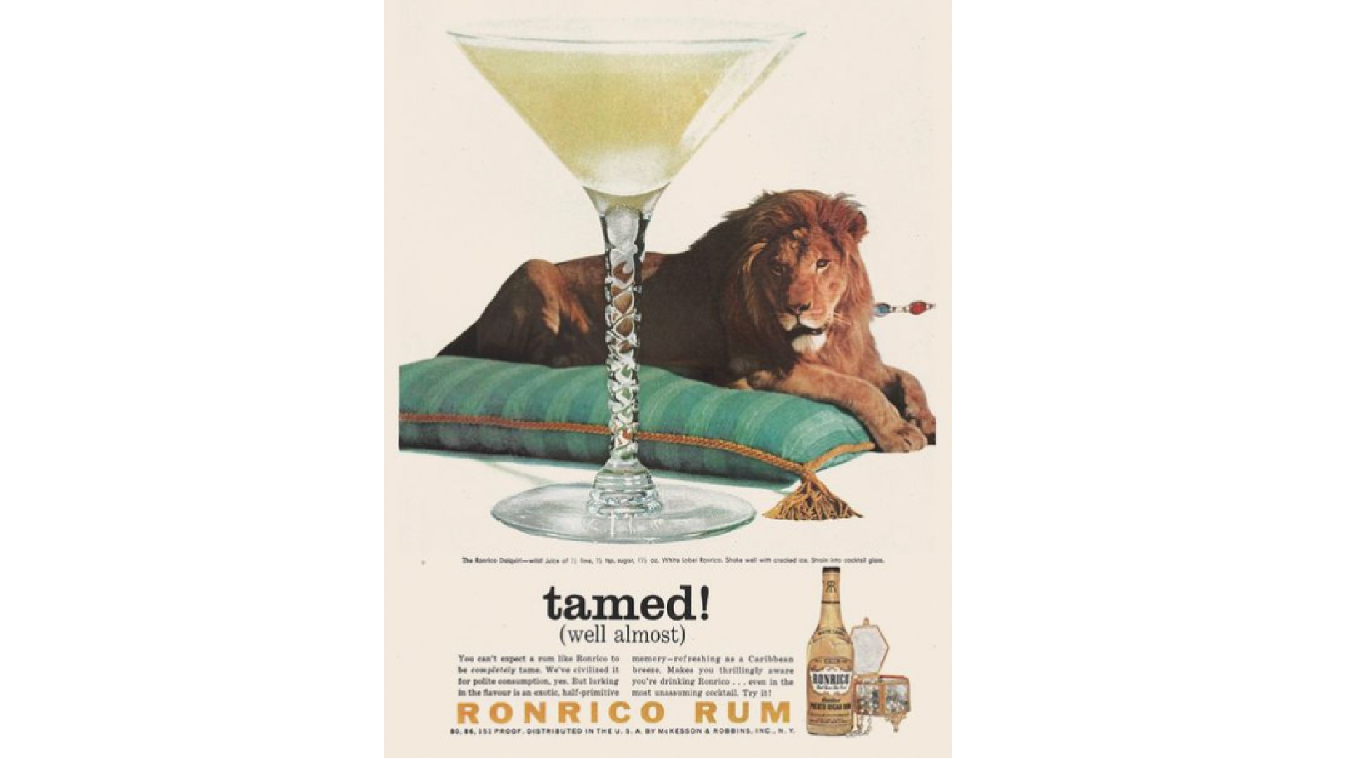
Along with cigarettes, booze was central to Western society in the 1950s, and with no restrictions on either, advertising execs had free reign to run with their imaginations. Here's a great example promoting Ron Rico rum, a Puerto Rican brand founded in 1935 which had considerable success selling in the continental United States.
"Maybe I’m just a sucker for a scrapbook style layout," says Miranda Harle, associate director, creative strategy at Whalar. "But this Ronrico ad from 1958 has fun on so many levels. The visuals perfectly align to the tongue-in-cheek opulence of the brand voice, and you feel immediately transported to a bar, Martini glass in hand, being the irreverent self you never knew you could be.
"As we know, it’s tricky with alcohol brands to walk the line of suggesting a fun time without crossing over into over-consumption territory," she adds. "But here Ronrico unleashes fun through suggestion, and the perfect imagery."
04. Rebel without a Cause
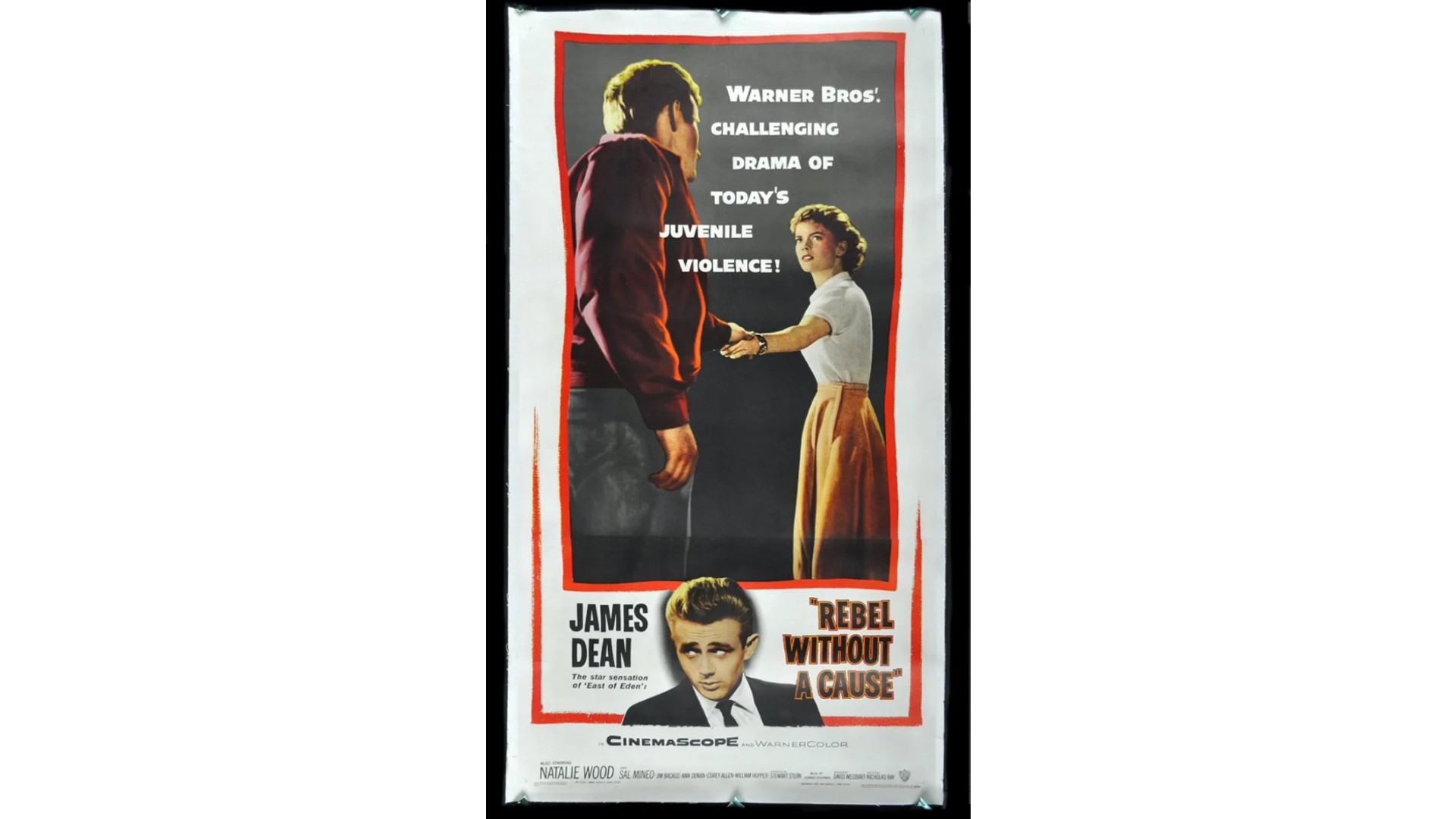
When it comes to 1950s ads, we naturally think of print ads for consumer products. But this decade was also a golden age for the movie poster, spearheaded by designers like Saul Bass. And here's a great example, picked by Matt Charlton, CEO of Brothers & Sisters.
"The best ads of the 1950s in my opinion were for movie posters, not physical products," he says. "Advertising at the time still culturally lagged behind movies in terms of impacting popular culture, and mostly fell into various cliches. But when I see this dark, brooding poster for Rebel Without a Cause, the art direction and grittiness of it feels like it comes from a totally different place."
It didn't put a smile on everyone's face at the time, though. "The film's star, James Dean, terrified parents who had only just finished defeating Hitler," Charlton points out. "And now they had to deal with confrontation from their kids, rebelling to have their own identity. Stick that up on a wall!"
05. Rowntree's
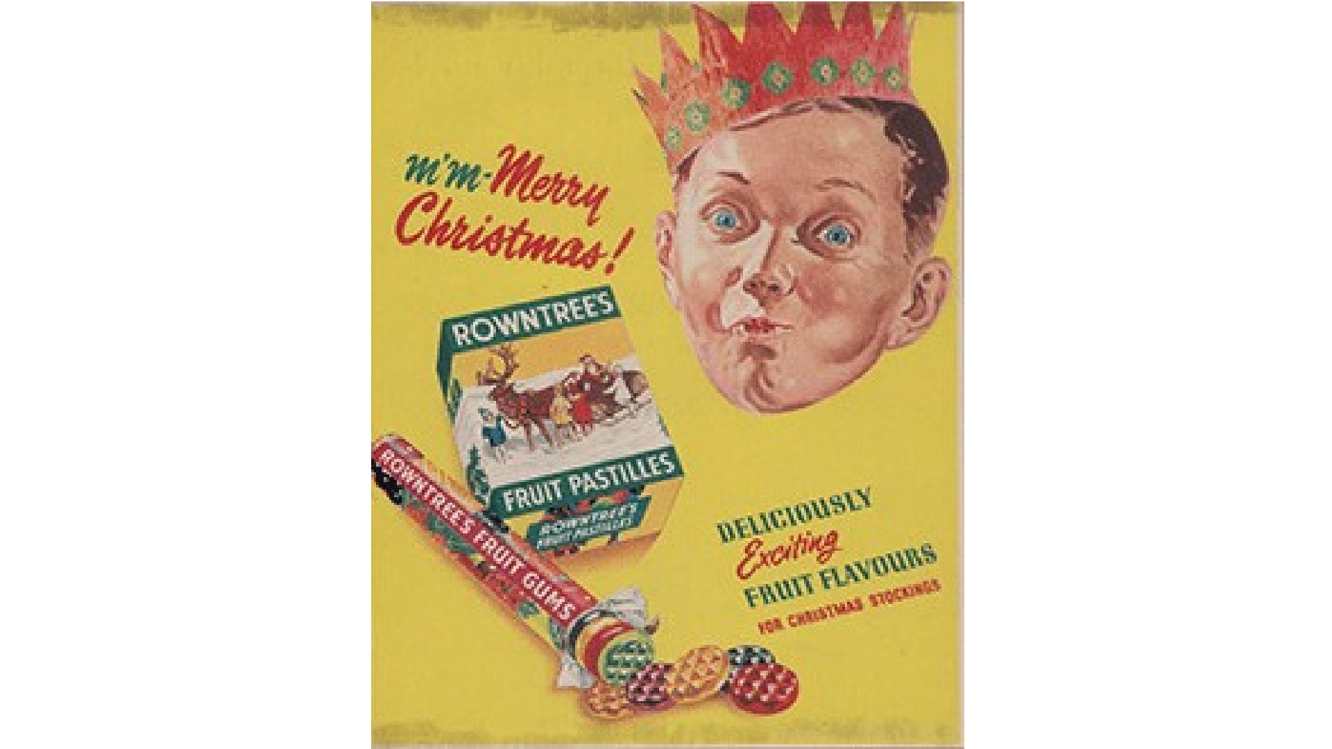
If there's one word that sums up the spirit of 1950s advertising, it's "colour". After the drabness of the war years, and the continuation of rationing in Britain until 1954, the public was crying out for some visual joy, and the advertising industry was ready and keen to supply it.
This ad for confectionary brand Rowntrees is a personal favourite of Jay Short, co-founder and client services director at Solarflare Studio. "This campaign ticks two important boxes for me: visually impactful and highly memorable," he explains. "Every advert explodes with colour, and I can imagine the tagline got the taste buds tingling; a sweet success story.
"The beloved British brand nails storytelling with shapeshifting tropical fruits," he continues, "bursting off the page to provoke such a strong sensory and emotional response. You’re tempted to chomp through the poster!"
06. Levi’s
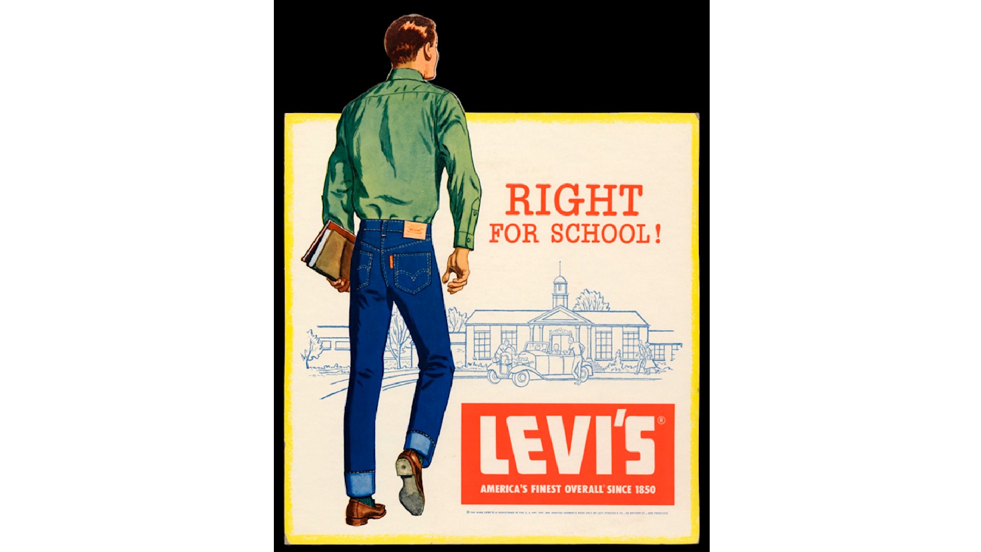
Founded in 1853, Levi's made hardwearing jeans that for around 100 years were largely worn by working people in the western United States: cowboys, lumberjacks, railroad workers and the like. In the 1950s, however, the company made a bold move; pivoting to youth culture adoption with the rise of rock and roll, and the rapid opportunities that emerged in post-war America.
"By sidelining the cowboy image and spotlighting middle-class America, the brand provided a prime example of reframing what owning a pair of Levi's meant," explains Tim Hyland, associate director, creative strategy at Whalar. "In an era where wearing jeans to school was considered quite edgy, this poster felt true to the spirit of rock and roll, teenage rebellion, and the forthcoming counter-culture movements. Levi’s embracing their wear in the classroom underscored this shift."
07. Volkswagen
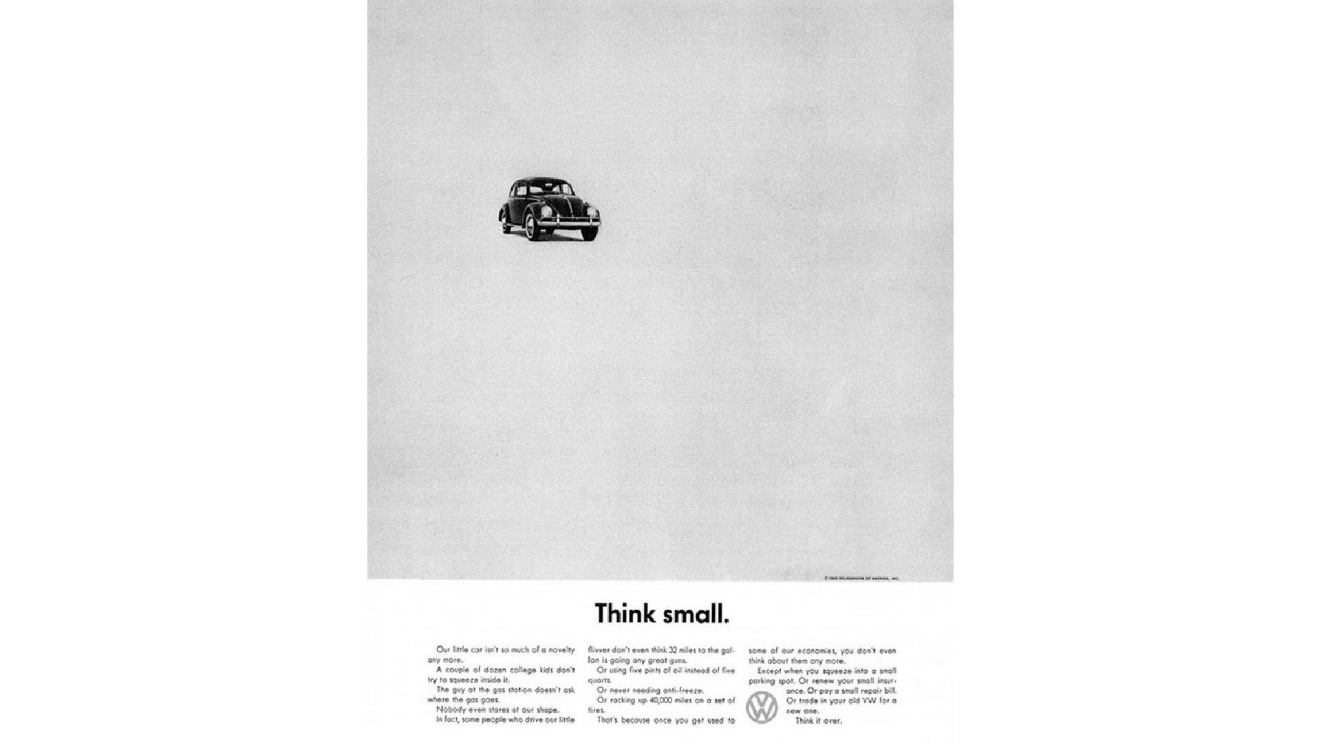
In general, 1950s advertising is remembered for being big, bold, colouful and in your face. But it wasn't all like that… and there's no better example of the counter-trend than this iconic ad for Volkswagen Beetle by BBH.
"Think Small is arguably the ad that changed advertising," says Richard Fenn, creative director at House 337. "Addressing the small size of the car at a time when American cars were getting larger was a challenging proposition. As was marketing a German car to the American public in the aftermath of the Second World War.
But BBH managed to square the circle. "The clever and straightforward approach of this campaign made it stand out amongst the sea of sameness of the idyllic post-war illustration style. When I studied graphic design, this was always a stand-out example of simplicity and effective communication: a delight to examine due to its nuanced yet thoughtful details."
"While other car ads at the time were all about showing off luxury and size, this campaign turned the script on its head by focussing on the compact size and simplicity of the VW Beetle," adds Alex Robinson, head of motion graphics at Waste Creative. "They did it with minimal design and writing. What made 'Think Small' stand out was how real and relatable it felt, breaking away from the typical car ad format.
"It’s clearly no accident that Apple's 'Think Different' campaign, said to be inspired by old VW ads, followed the same path of shaking things up and looking at things differently. Even today, 'Think Small' could still hit the mark with consumers who dig genuine and down-to-earth vibes in advertising."
Karim Salama, director at e-innovate, is also a fan. "While it went against the prevailing cultural trend of the time, it allowed the marketer to adopt minimalist techniques to bring more attention to the brand itself," he notes. "Some of the most popular advertisements simply featured a blank background with a small monochrome stencil of the beetle. The ostensibly honest associations with the 'think small' tagline also gave an impression of humility to the brand."
He adds that one of the most long-lasting effects of this campaign was the implicit focus on individualism. "Volkswagen managed to put the spotlight on personal preferences and pragmatics in consumer spending, all while using slightly contradictory soundbites in its adverts," he points out. "This shift in focus has remained to this day, with many people lauding simple, minimalist, and individualistic marketing approaches for modern products."
08. Bird’s Eye
When trying to assess the importance of 1950s ads, the power of the oral tradition and family storytelling can be as useful as formal research in the archives. As that's largely what inspired this next pick by Matt Hopkinson.
"When speaking to an elderly relative, this advert consistently came up," he explains. "An ad that debuted as the frozen food market was taking off, ‘the Bird’s Eye Shop’ became a stage for storytelling where different families visit, pick up the latest item on offer, demonstrate how to use it and then give the all-important nod of approval."
He adds some context to explain why the ad worked so well. "Consider the decade. It was a new category so familiarity plays well. It could be refreshed every time a new product debuted. Additionally, it used testimonials to drive up belief in taste and usage in an era where communication points were fewer, and recommendation was everything.
"Fast-forward to today where we have content houses on TikTok, testimonial campaigns are commonplace and new product demos are everywhere you look – sound familiar?"


