In the past, web designers put a particular focus on showing off their skills and portfolios by packing sites with flashy illustrations and animations. Skeuomorphism was everywhere, with textured designs mimicking real-life materials. But then along came flat design.
Flat design favours a more simplified, digital aesthetic. And while this user-centric web design style has been around for many years now, it's still as relevant and popular as ever, and has heavily influenced logo design over the last few years (although we're now starting to see the pendulum swing back towards old-fashioned styles). Here's everything you need to know about flat design.
What is flat design?
Flat design is a minimalistic design approach that emphasises usability. It features clean, open space, crisp edges, bright colours and two-dimensional illustrations.
Microsoft was one of the first to apply this design style to its interface, seen by some as a backlash against the popular skeuomorphic design that Apple kicked off with its iOS interface. Instead of converting a real-life object, such as a calendar, into a tiny realistic illustration, advocates of flat design identify apps with simple, icon-like images.
Rather than bringing aspects of real life to an interface, this illustrates a clear separation between technology and tactile objects.
Minimalist doesn't mean boring
In flat design, ornamental elements are viewed as unnecessary clutter. If an aspect serves no functional purpose, it's a distraction for the user. This is the reason for the minimalistic nature of flat design.
However, just because it lacks any flashy design doesn't mean this style is boring. Bright, contrasting colours make illustrations and buttons pop from backgrounds, easily grab attention, and guide the user's eye. The purpose of minimalistic imagery also contributes to flat design's functional character.
Flat design is often simplistic

Simple images convey messages more quickly than detailed illustrations. Images like icons can indicate universal actions or purposes so that everyone can easily understand them.
It's easy to see an immediate difference between a skeuomorphic and a flat design. Notice how bigger, solid colour blocks are more attention-grabbing and the meaning of the icons can quickly be perceived.
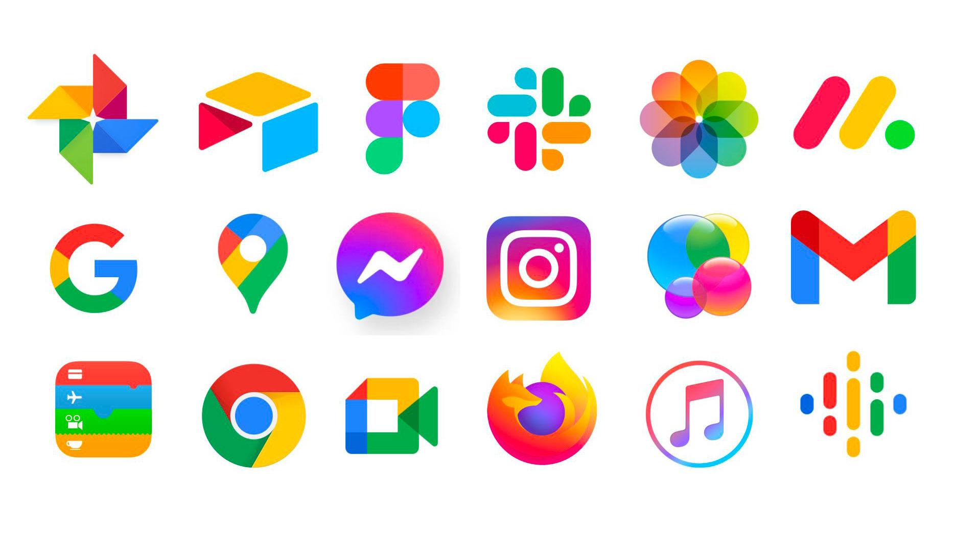
The icons above show just some of the icons in use in 2021, including last year's controversial Google icon rebrand. The danger here is that because they are all following the flat design trend, and using bright colours to elevate their designs, they are almost becoming too similar (as we explored in this piece). This just goes to show that there's a fine line between following trends such as flat design, and standing out from the crowd.
What you can learn from flat design
Flat design reverts back to the basics of design as a functional tool. A website is designed and judged by how well it works, as opposed to what it looks like.
This raw functionality forces a site's focus to be on user experience, so websites that employ this design style successfully are likely to receive positive feedback as being user-friendly.
How to create flat design
To design an effective flat site, all design elements must be centred on this idea of simplicity. Solid, vivid colours give aspects the emphasis needed to set them apart in place of illustrative detail; sans-serif typography provides a clean, crisp supplement to illustrations; text is concise and to-the-point; UI elements like buttons and links are clear and noticeable.
Everything should be designed with the same goal in mind to create a cohesive visual and functional web design. Below are some great examples of flat design...
Flat design examples: Tripfinder
This trip planning app design by Indonesian user interface designer Bady makes it extremely easy to book a flight based on packages and budgets. Everything is clear and understandable, and the design relies mostly on colours and icons to give meaning. The copy is concise, and the UI aspect of searching for an ideal flight is obvious.
Flat design examples: Burger King website

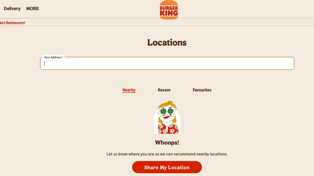
Burger King rebranded at the start of 2021 to much acclaim, and its new logo is a masterclass of flat design. Its website has been redesigned to match, and uses simple illustrations and icons to guide users around the site. The app also adopts a similarly streamlined approach.
Flat design examples: Weather app
This weather app UI design shows that flat design can be successful even without the use of bright colour. The crisp iconography and large typography draw attention to the most important aspects of the weather, which is what the user is looking for.
When exploring flat design in your work, make sure to design every aspect with a minimalistic and user-centric perspective to ensure a unified interface. Once you've successfully done this, your users will appreciate the functional nature of your website.


