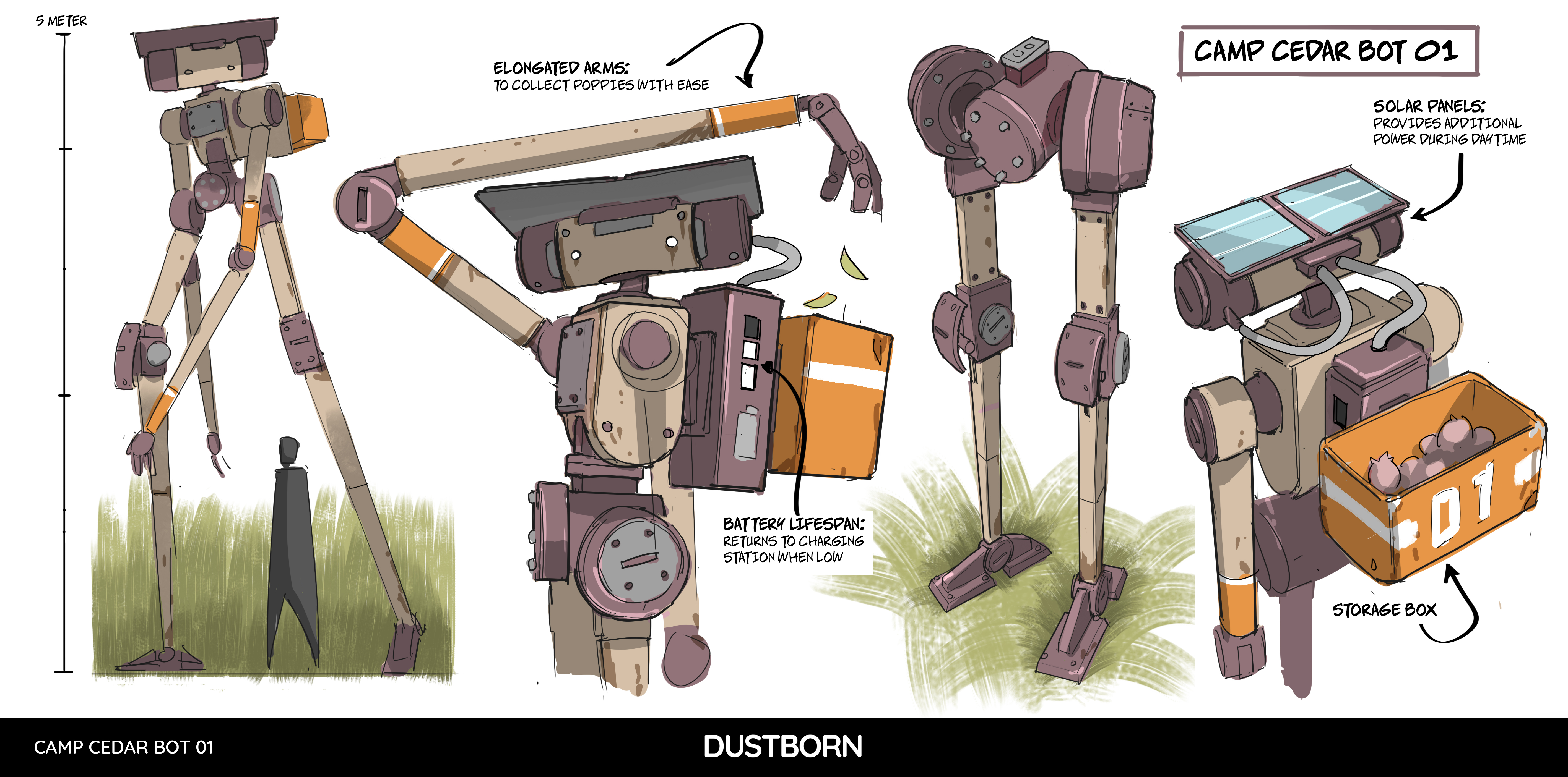
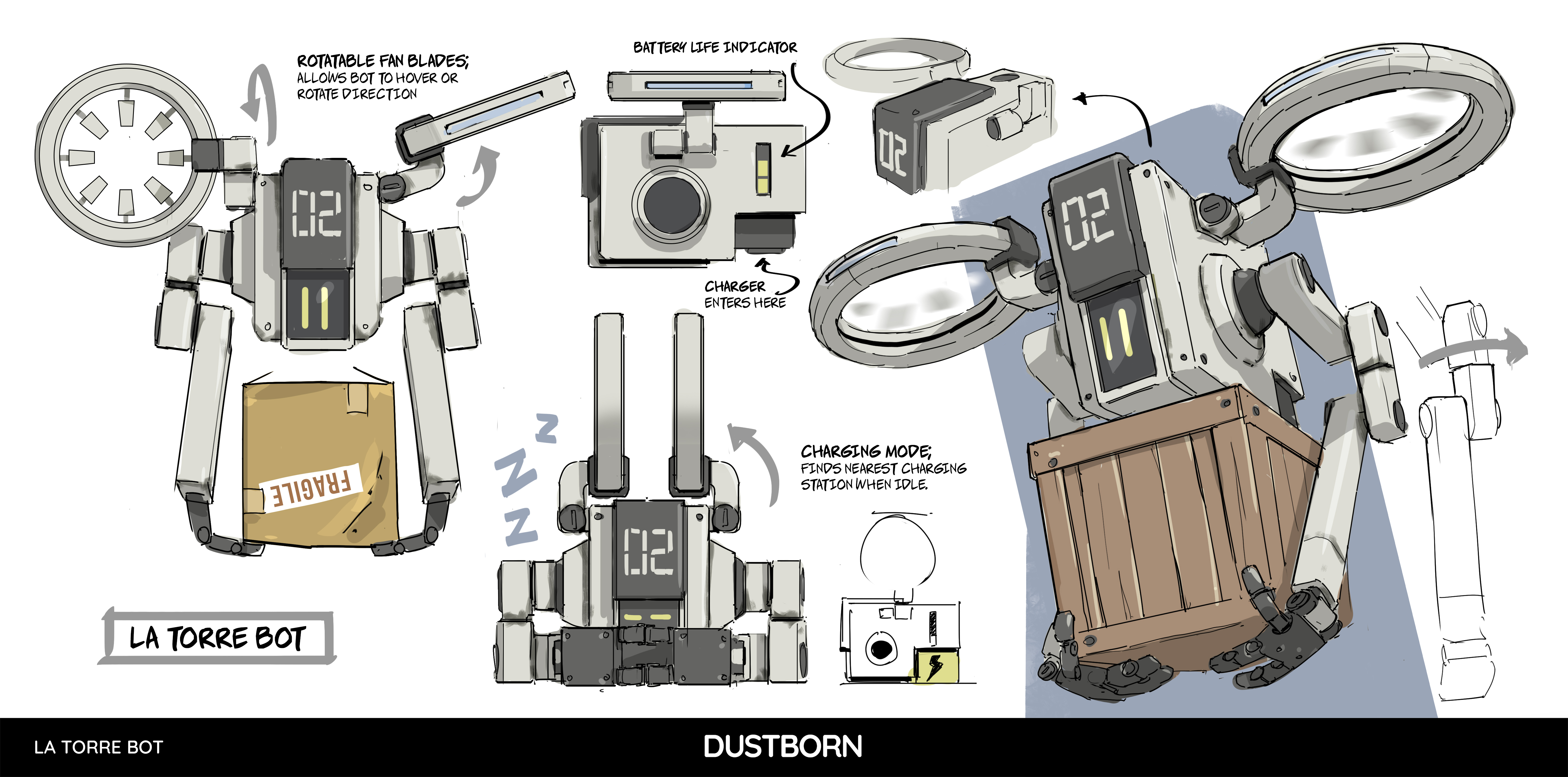
Dustborn is a game about disinformation and very modern problems set in an alternate US where a group of misfits flee the police after stealing an 'important package'. A glimpse at social media suggests many people have already made up their minds about a game where you can weaponise language to 'cancel' and 'trigger' people into doing your bidding. It's on the nose for sure.
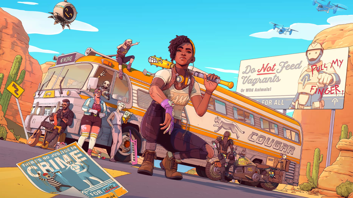
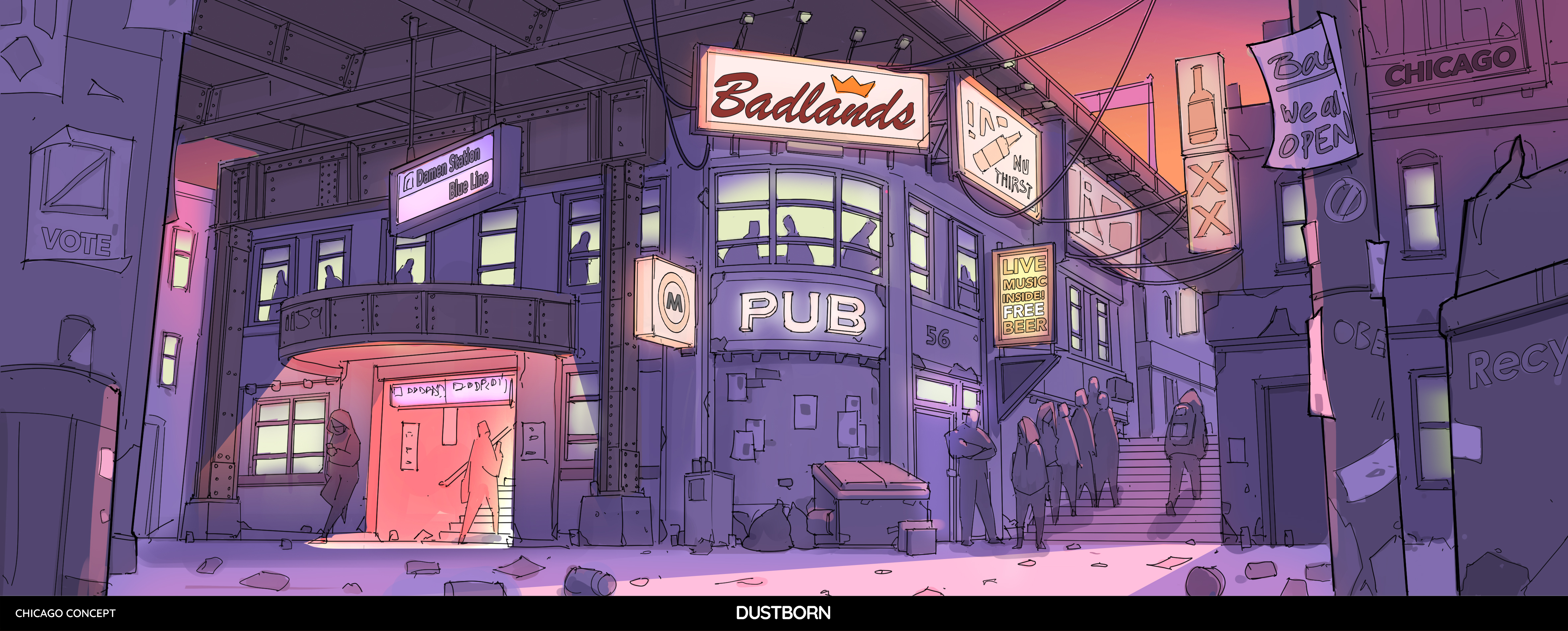
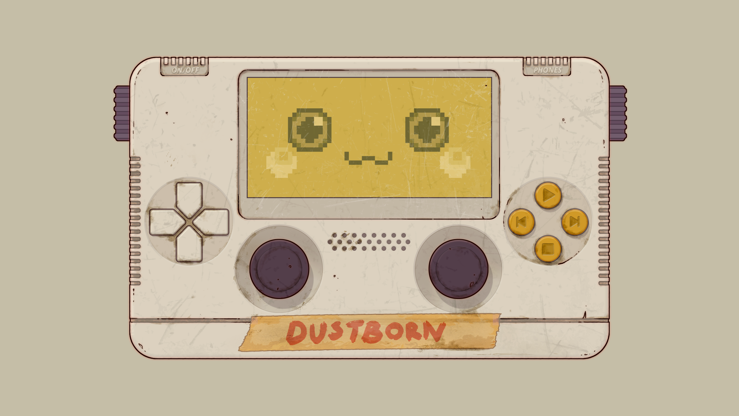
Made in Unity, Dustborn is also smart, satirically astute and weird in all the right ways, not least the 'living comic' art style and stylisation that brings to life the game's mix of complex characters, travelling undercover as a touring punk-rock band, and sand-swept Californian-like, Western-influenced landscapes.
Whether you've connected with a game that enables you to 'wake people up' from their authoritarian mind virus or not, there's no doubt the visual design of Dustborn impresses. Below I chat to art director Christoffer Grave from developer Red Thread Games about what it took to make Dustborn's sharply observed visual design.
Dustborn is out now for Steam, Epic Games Store, PS5, PS4, Xbox One & Xbox Series S/X, and if you enjoy this feature and feel inspired, then read our guide to the best laptops for game development or our guide to the best digital art software and start creating your own worlds.
CB: What were the influences behind the game's setting?
Christoffer Grave: The setting of Dustborn is influenced by a variety of sources, ranging from the current political climate, which can sometimes feel dystopian, to the iconic American road trip. We wanted to explore themes of community in a fractured world, drawing from the romanticised vision of the open road.
Additionally, our love for comics played a huge role in shaping the game's aesthetic, giving it that "comic come to life" feel, which aligns perfectly with the game's themes.
CB: Are there any art movements or real world locations that have inspired the game's art and design?
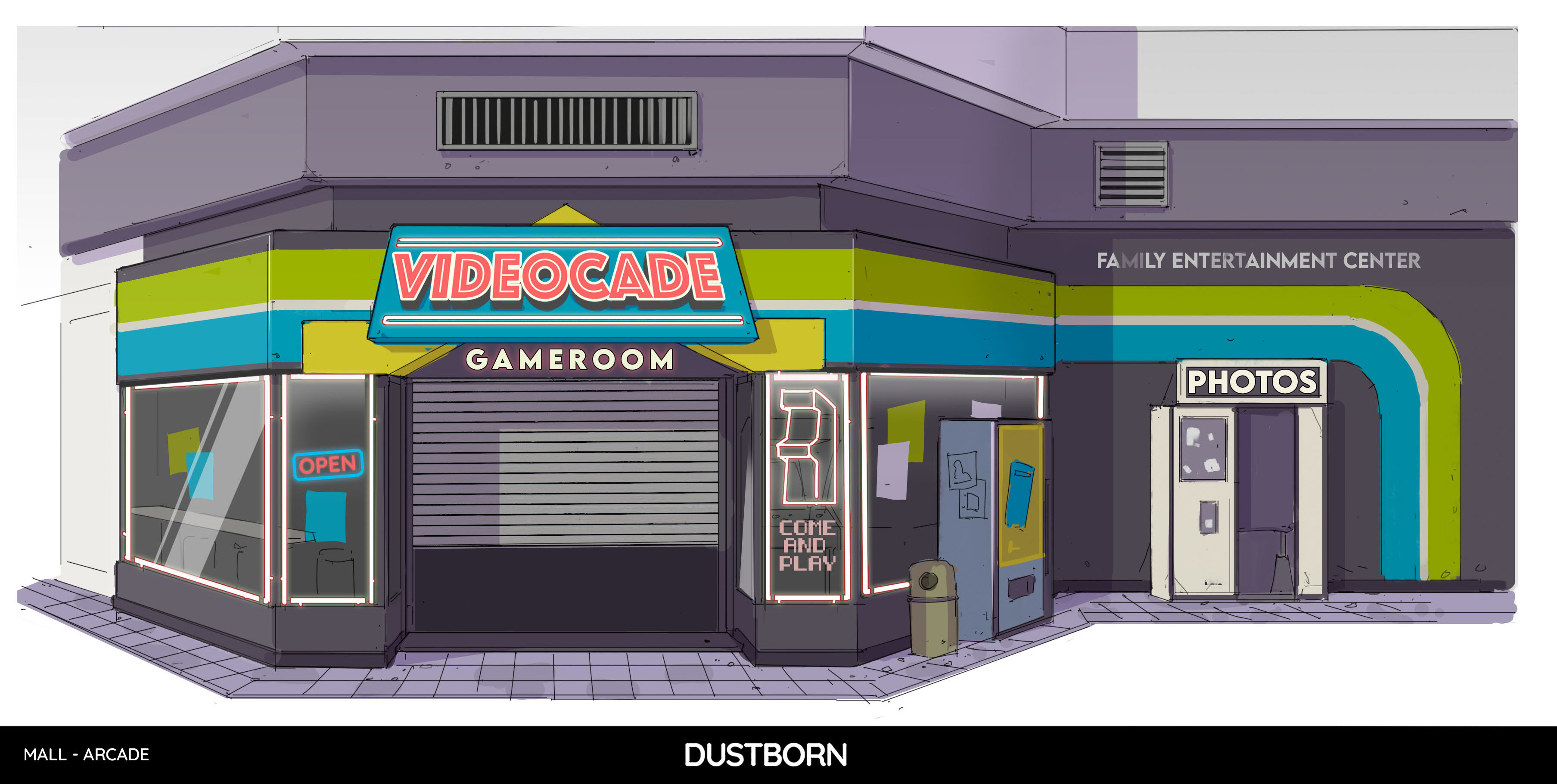
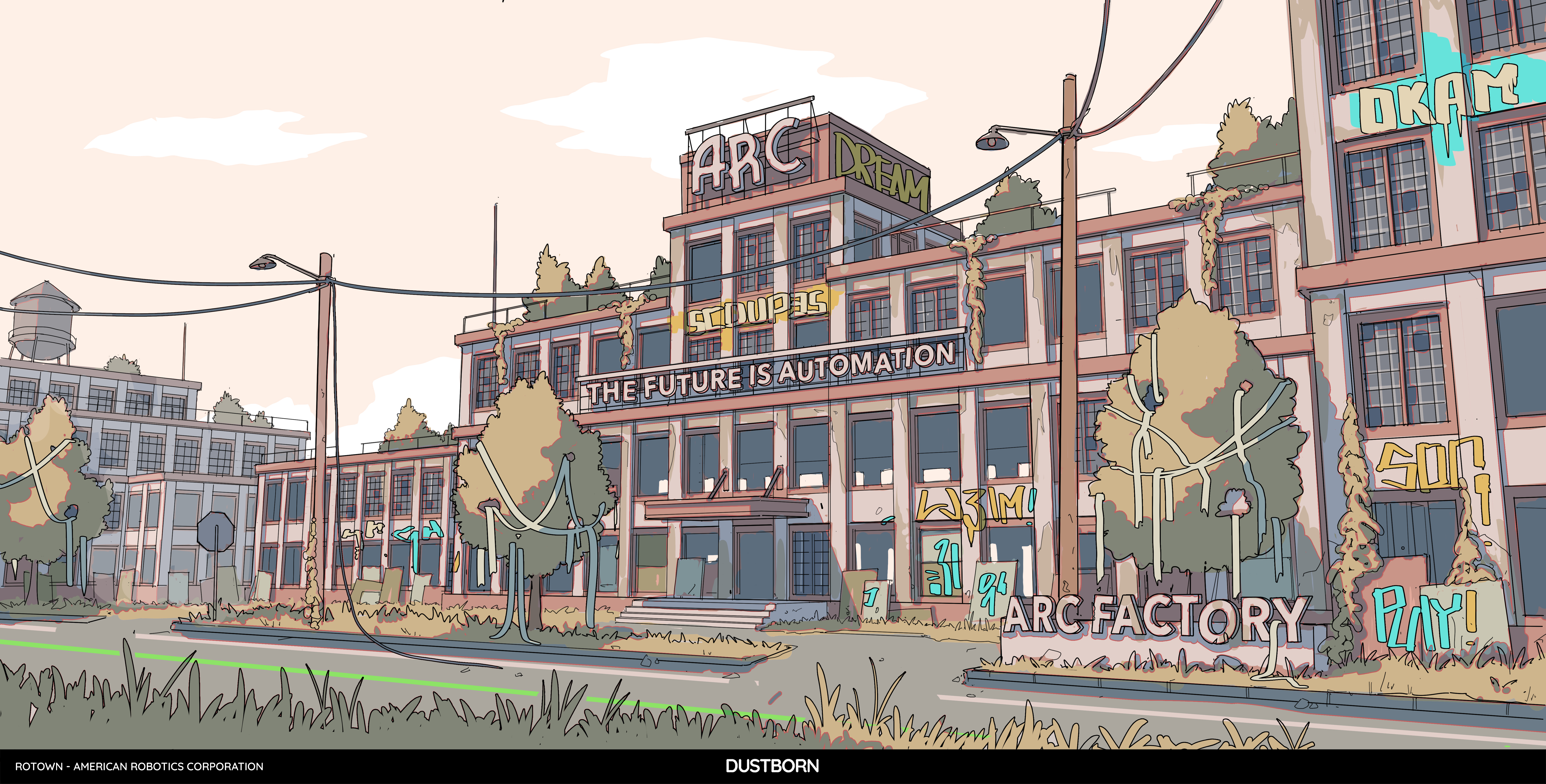
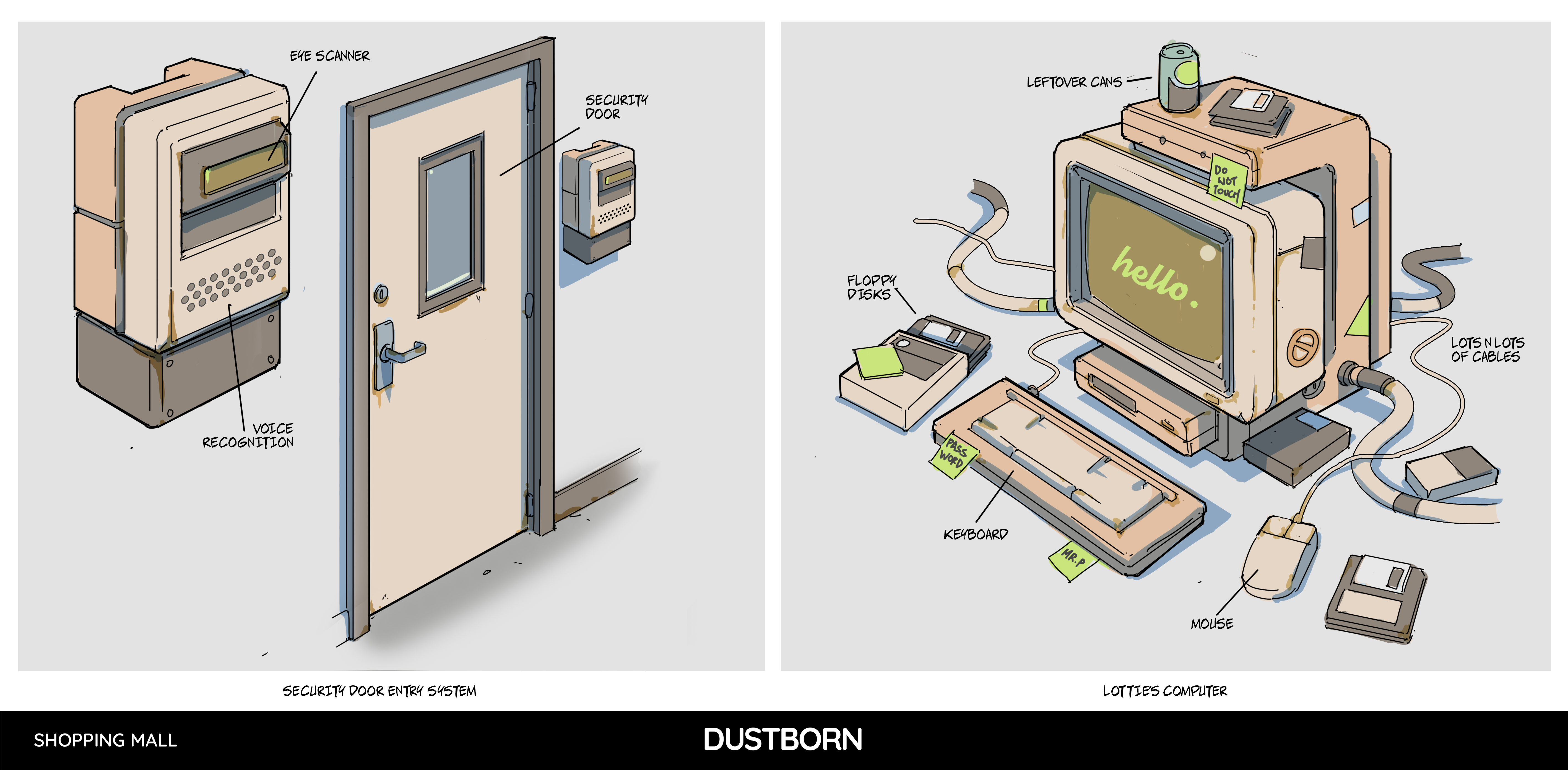
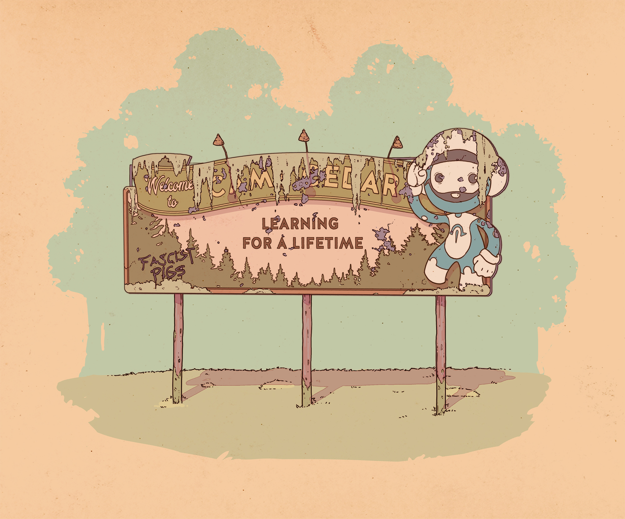
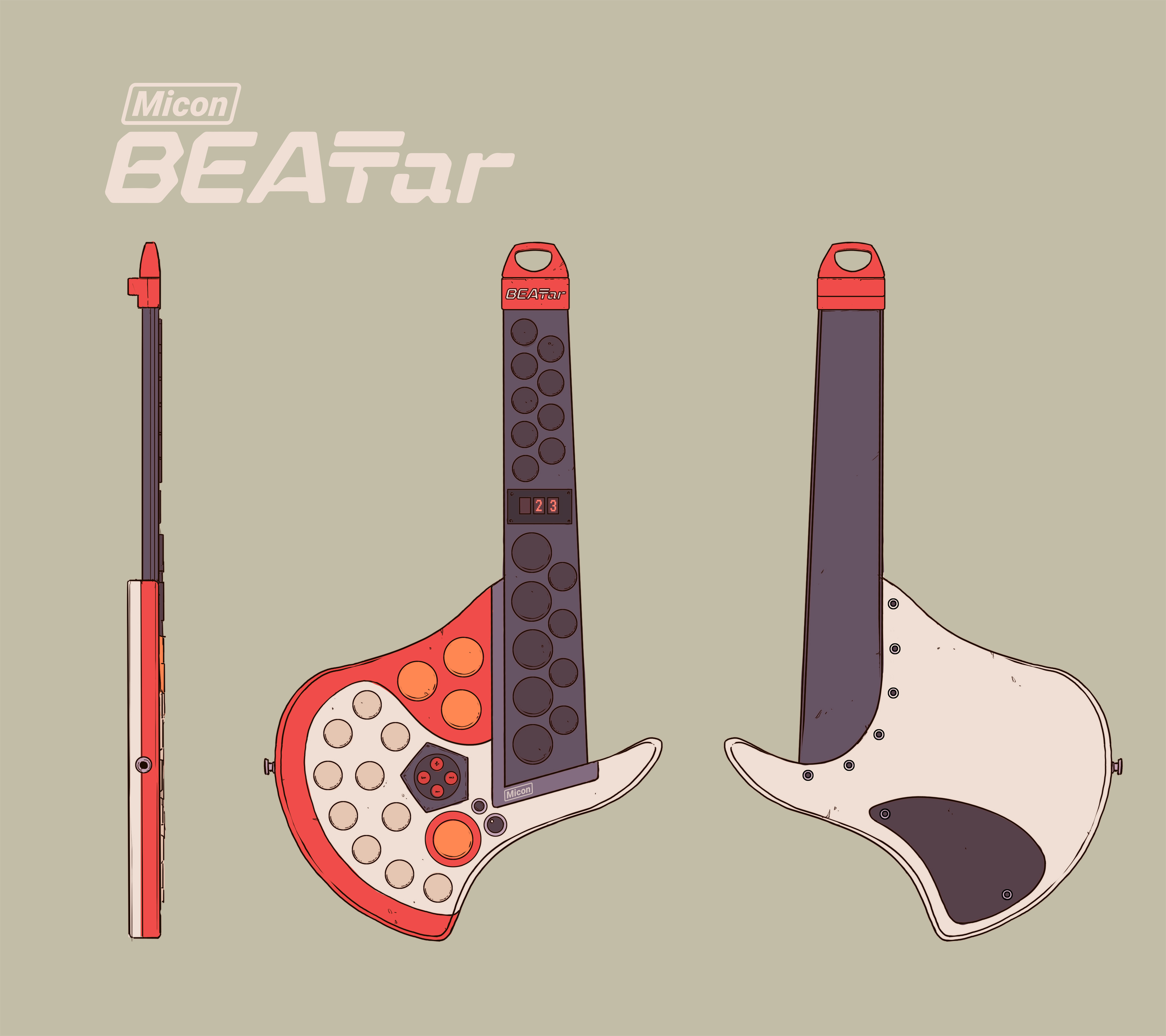
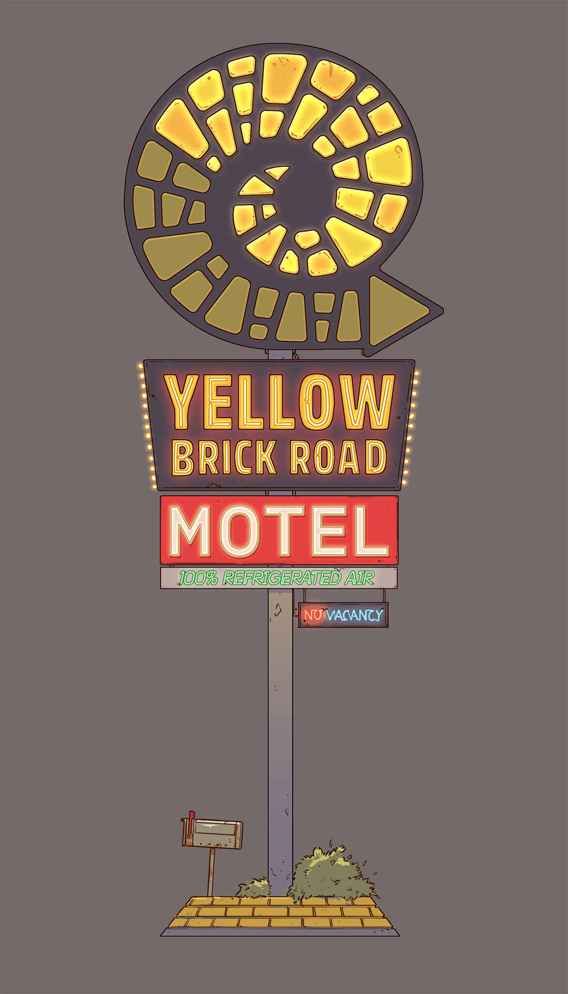
CG: Absolutely. The road trip aspect inspired us to include staples of American culture, like diners, service stations, and campsites. While we weren’t inspired by any specific art movement, the dystopian elements were definitely influenced by propaganda, which has a strong visual language. We also embraced a retro-futuristic aesthetic, blending different influences from various eras to create a melting pot of inspiration that feels both familiar and fresh.
CB: How did you balance the traditional Western motifs and the futuristic aesthetic?
CG: Dustborn isn’t strictly defined by traditional Western motifs, but these elements do appear, especially in the open landscapes like the Nevada desert. However, the game’s journey spans various biomes across the U.S., from deserts to snowy mountains, reflecting a diverse American landscape.
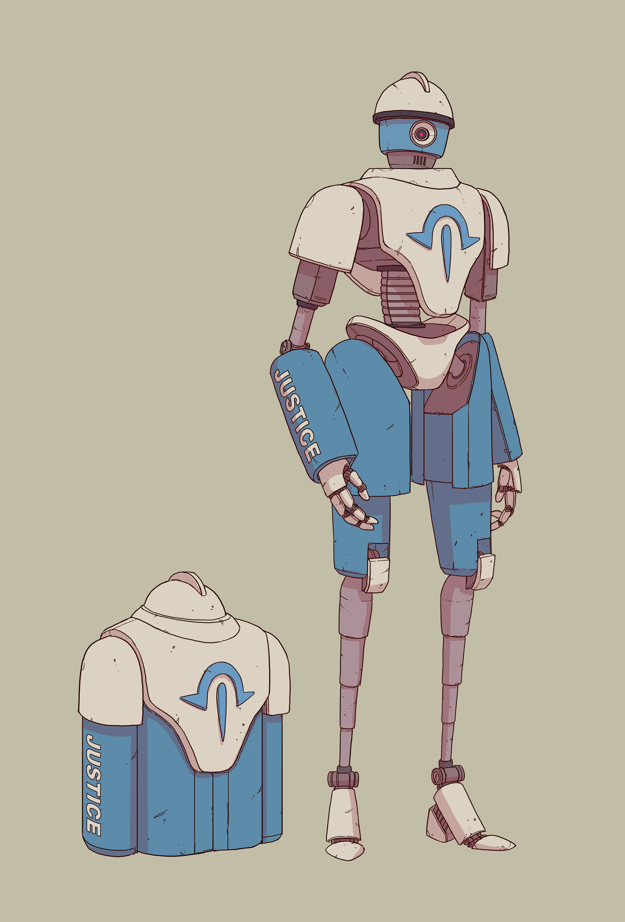
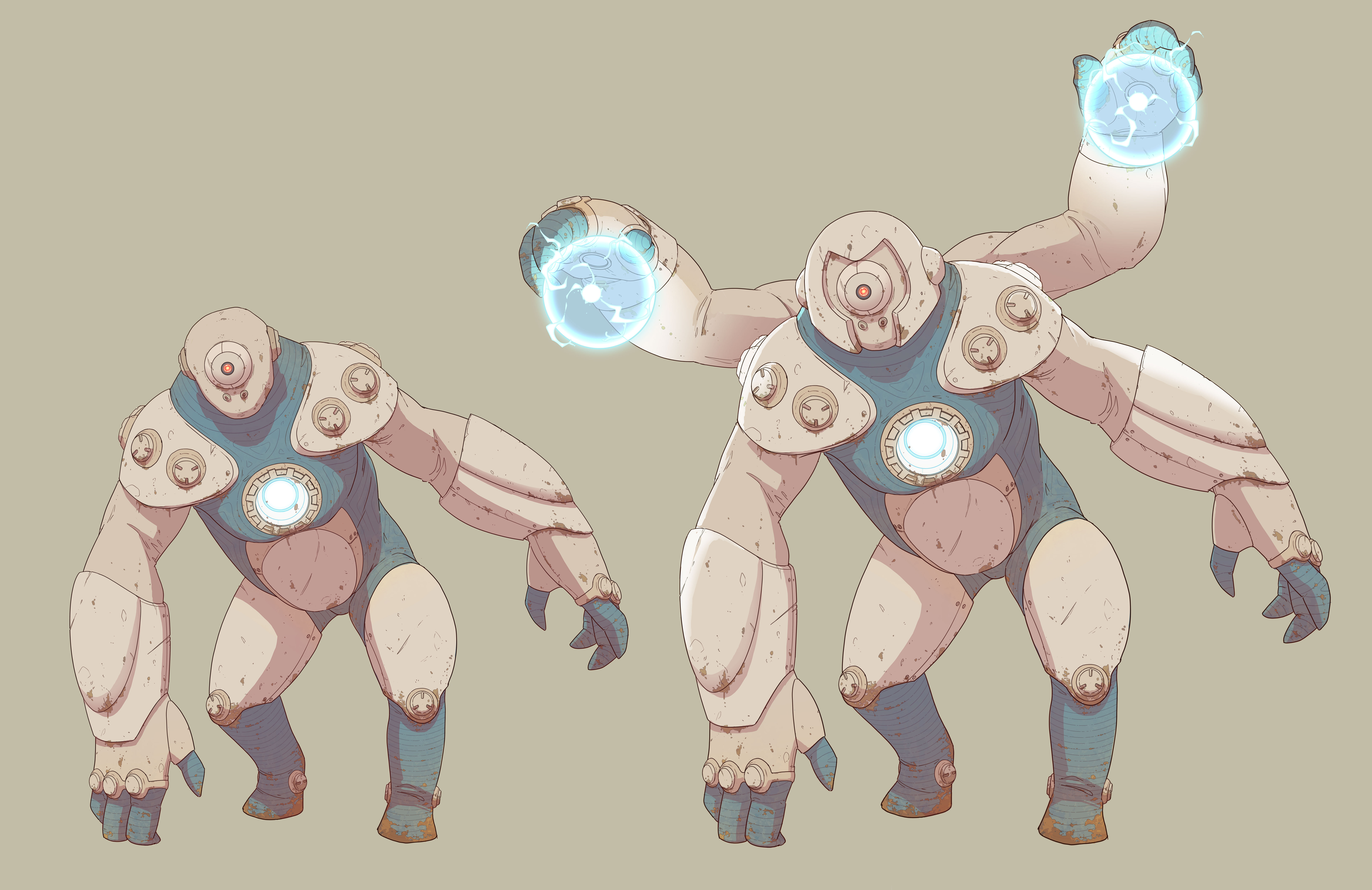
Balancing these elements with a futuristic aesthetic involved blending new and the old. Set in a near-future world, Dustborn imagines a divided America, where the Republic represents a society a bit frozen in time. This influenced the design of the game’s technology, which has a worn, retro feel – a mix of advanced but stagnated tech.


CB: Can you talk about the colour palette choices for the landscapes? How do they contribute to the game's atmosphere and storytelling?
CG: It’s hard to just talk about the colour palette of the landscapes, as it all goes together. Generally speaking, the colour palette in Dustborn plays a crucial role in shaping the game’s atmosphere. While the landscapes are clean and simple, they vary greatly in mood and biome to convey a sense of travel and exploration. We wanted the palette to reflect themes of hope and joy, offering a contrast to the darker aspects of the world.
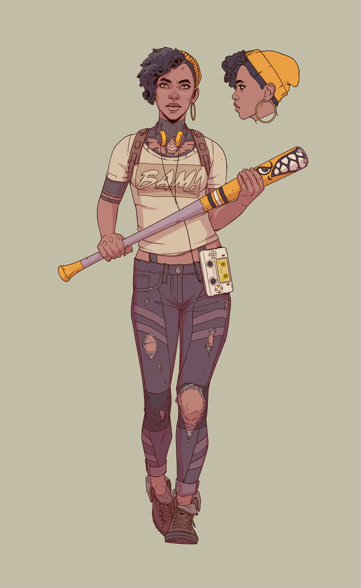
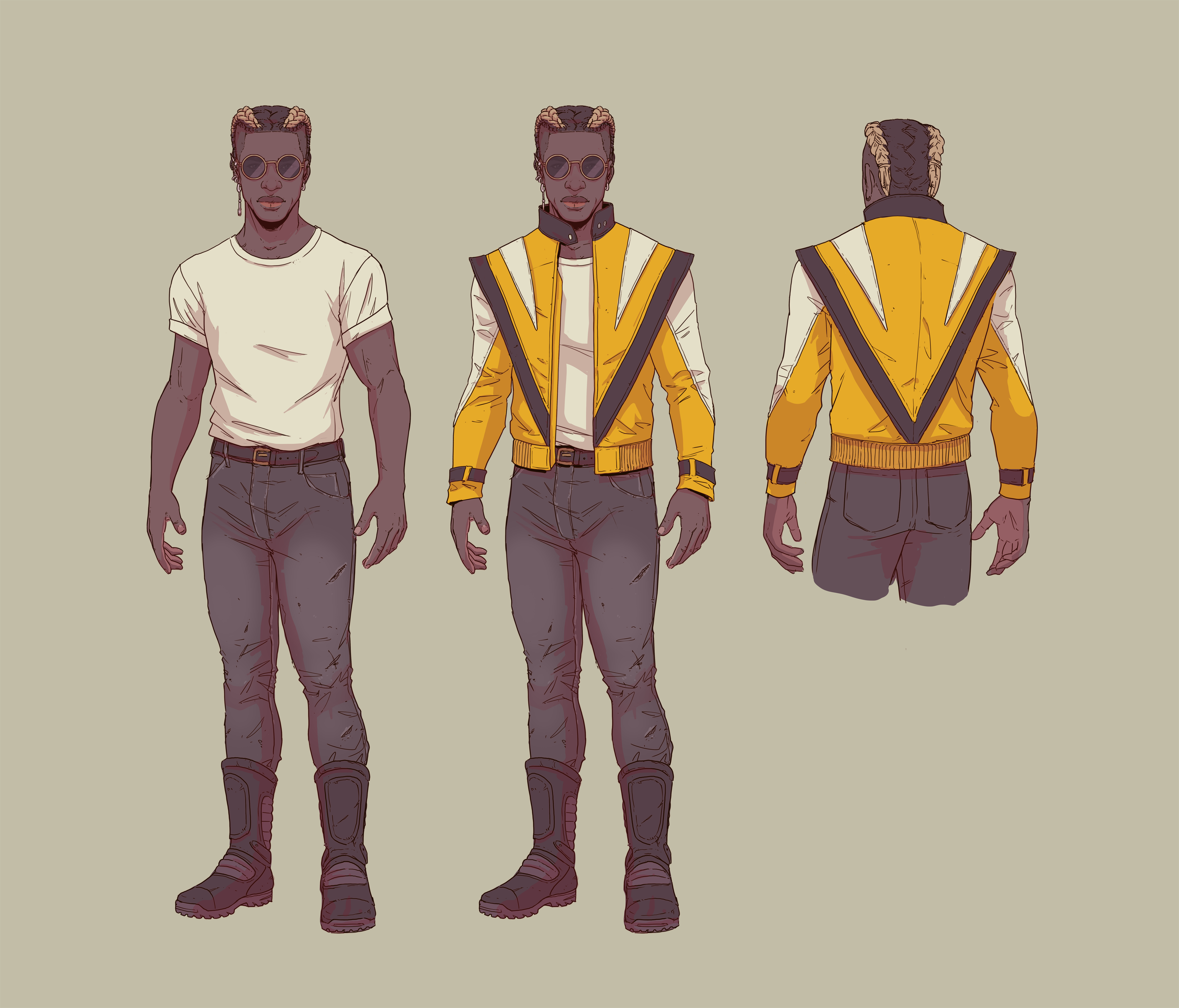
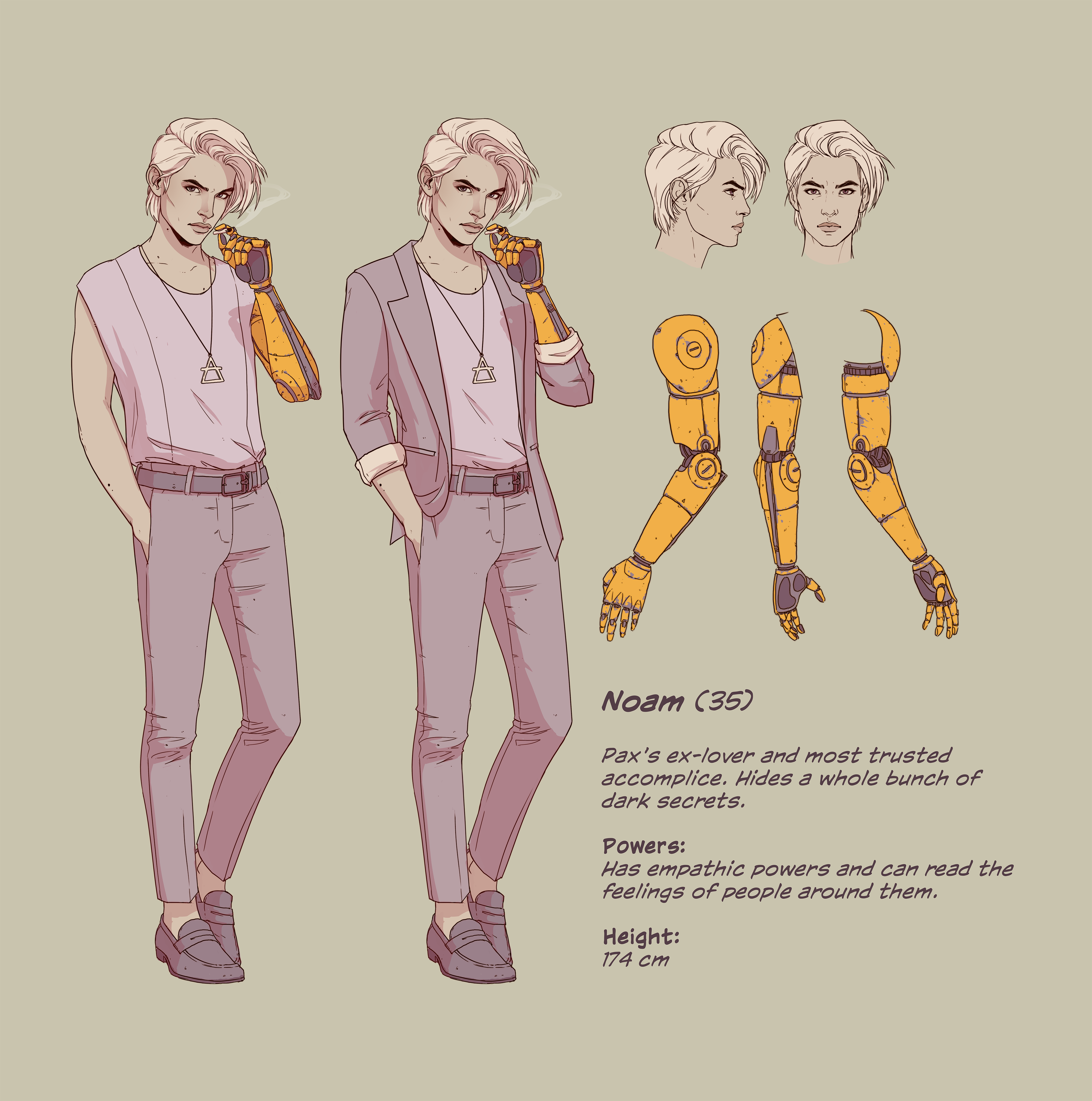
To achieve this, we opted for a light, clean, almost pastel-like palette, with bursts of brighter colours like “Dustborn yellow.” This yellow became a signature colour – vibrant and attention-grabbing – used sparingly across the game. It ties the main crew together visually, symbolising their bond as a found family.
Overall, the color choices were designed to keep the world visually engaging, while also reinforcing the underlying themes within the narrative.
CB: How does the art design enforce the atmosphere and storytelling?
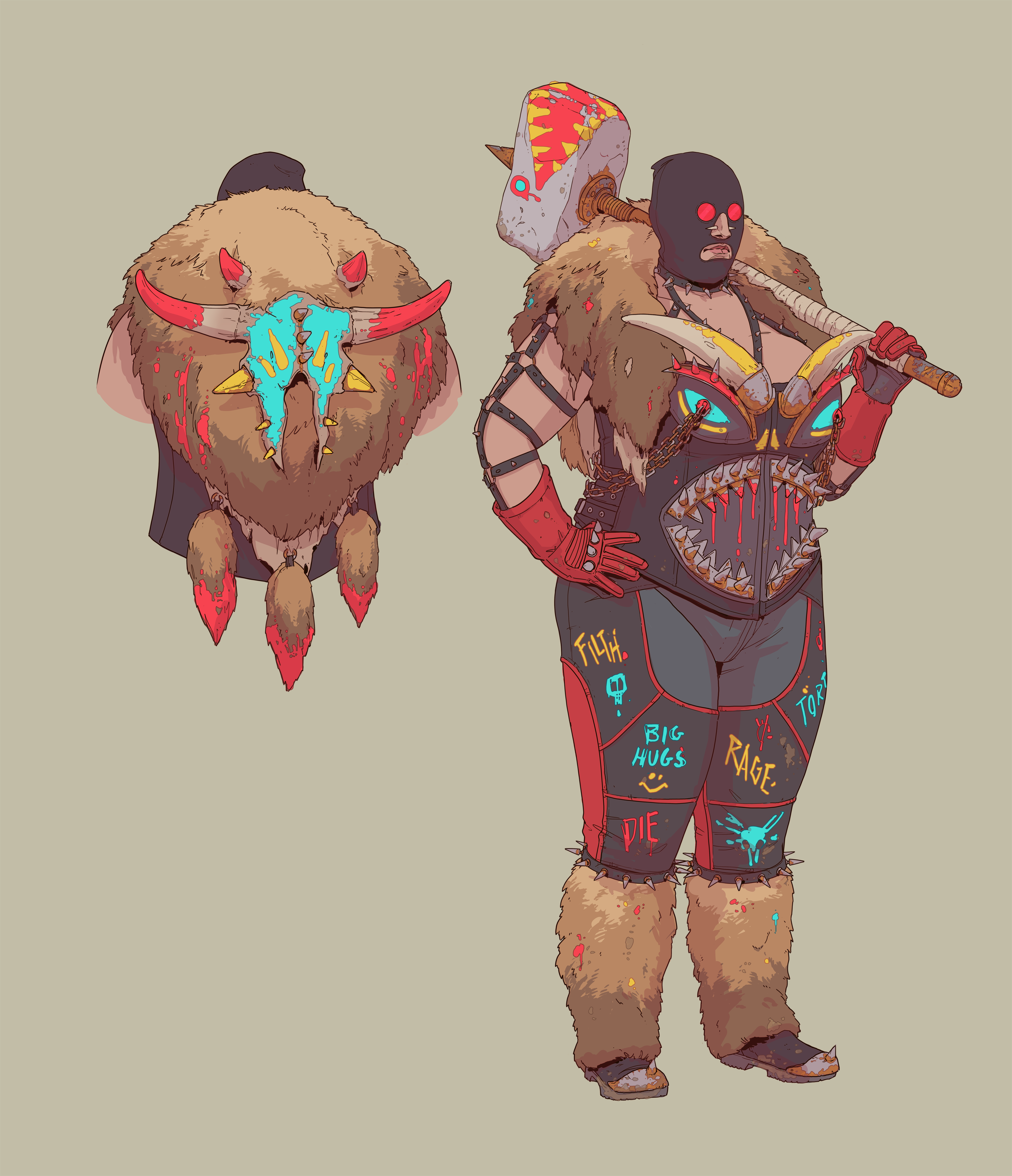
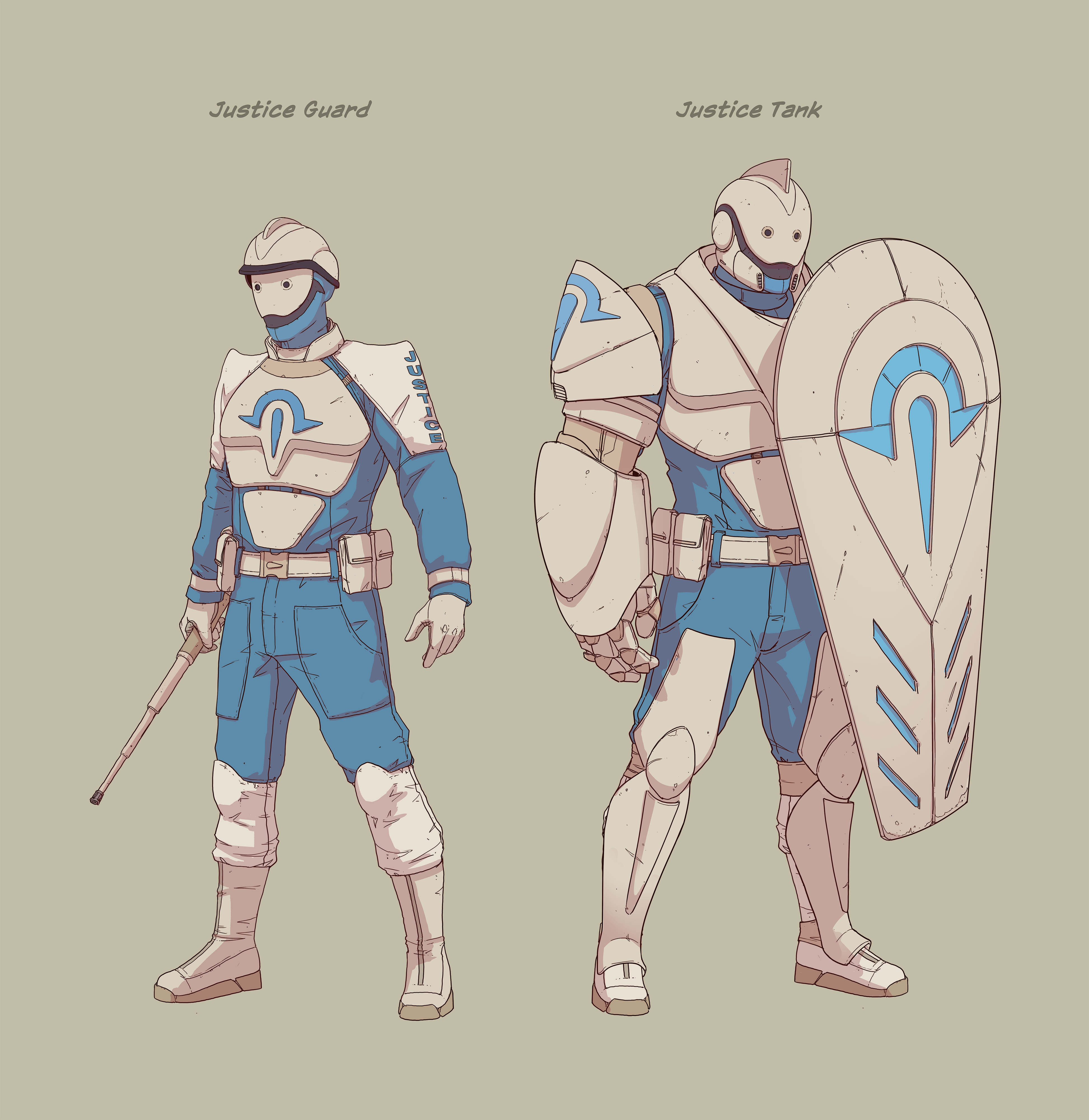
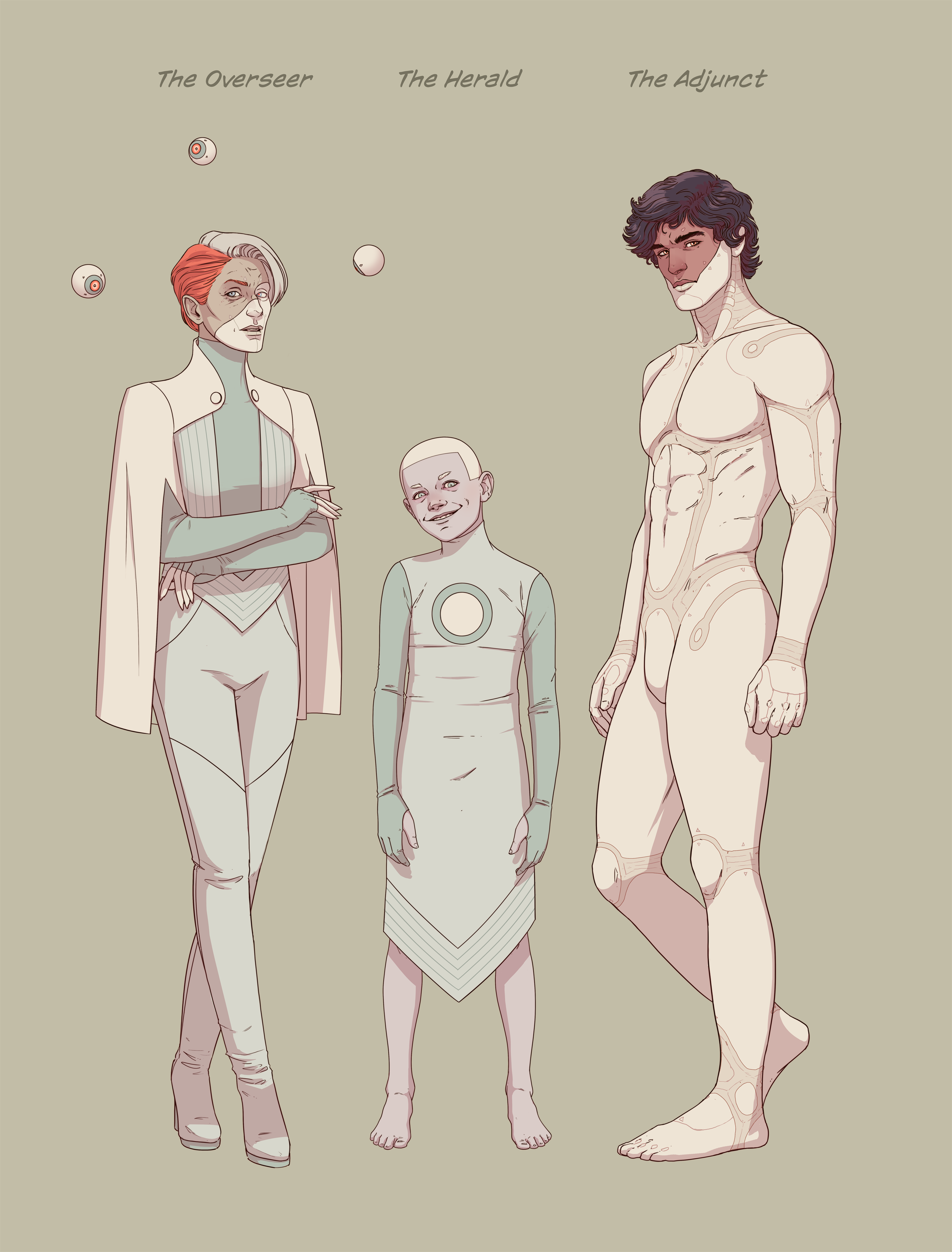
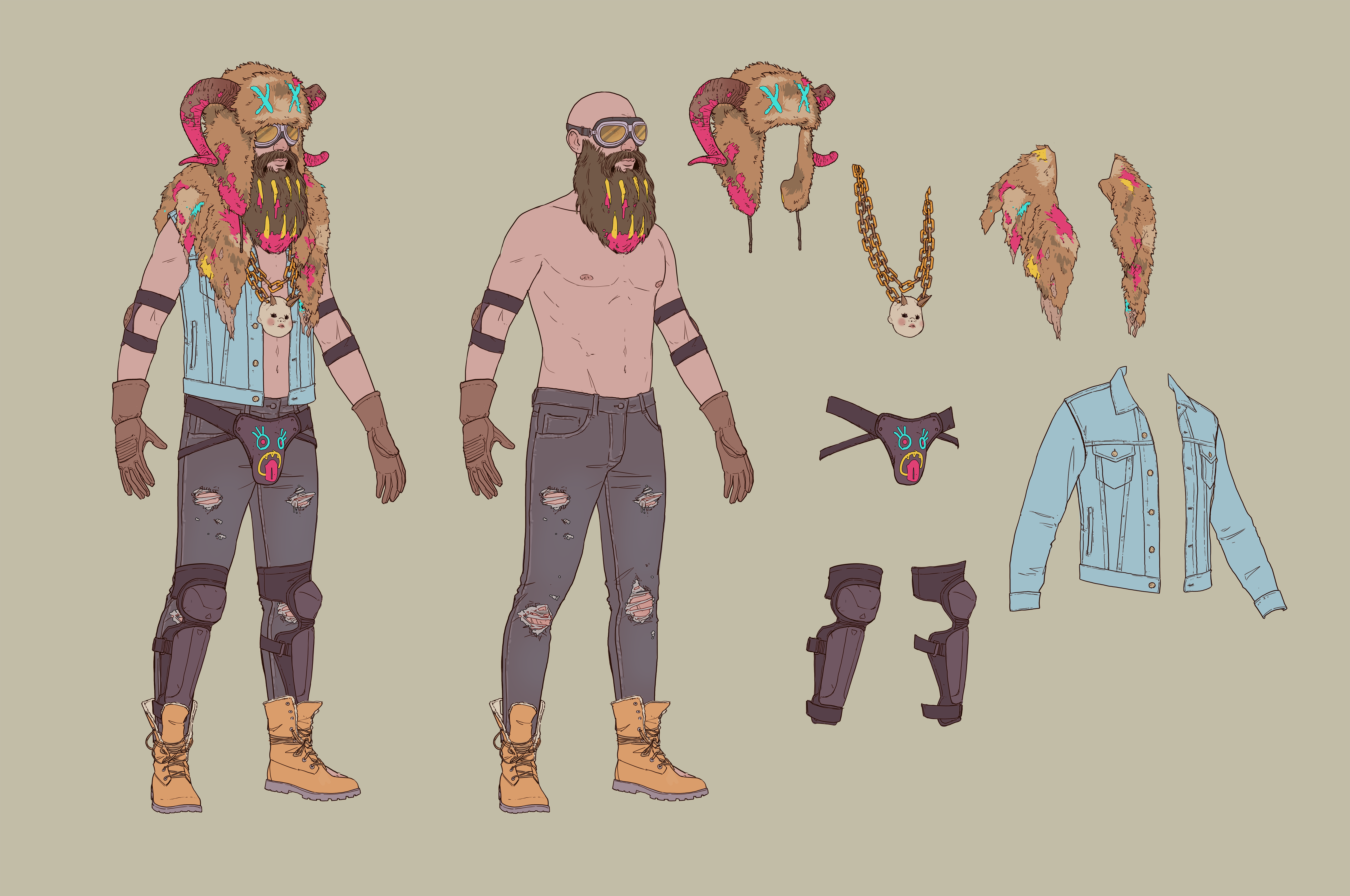
CG: The art direction in Dustborn is central to creating the game's atmosphere and enhancing its storytelling. The distinct comic book style, with its bold outlines and vibrant aesthetic, doesn't just make the game visually unique—it also serves as a powerful narrative tool. This style allows us to exaggerate key moments, characters, and emotions in ways that feel larger-than-life, mirroring the heightened reality of the game’s world.
The comic book approach also enables us to frame the story in a way that feels episodic, almost like turning the pages of a graphic novel. This format helps in pacing the narrative, where each chapter, or "issue," has its own mood and thematic focus. The visual language of comics – such as using panel-like frames, dynamic angles, and expressive character designs – amplifies the emotional weight of the story and makes the player's journeys more engaging.
CB: What challenges did you face when creating the vast, open landscapes typical of Westerns?
CG: Most of the US is very much the “open road”, but the environment is not the main character in the game. It’s just a simple and clean backdrop for us to tell our story. It was important to try to match the actual environments and biomes as much as possible, while still taking some creative freedom. I think the Art Direction itself, with it’s colours and take on the comic aesthetic really did help to make it feel fresh and different.
CB: What technical or creative challenges did you face?
CG: We faced plenty of challenges, both technical and creative! Translating a 2D comic book art style into a 3D environment was particularly tough. The limitations of Unity, our game engine, added to the complexity, especially with the cel-shaded style we wanted. On top of that, creating a game of this scope with a small art team required a lot of resourcefulness and creativity to bring our vision to life.
CB: How did the art style complement the player experience and gameplay design?
CG: The art style and gameplay design go hand in hand. The comic book aesthetic enhances the feeling of playing through a living comic, which perfectly aligns with the game's narrative and themes. Once we committed to the comic style, it shaped the game's identity. We used comic-inspired elements like framing each chapter as an "issue" with its own cover and presenting the story in a comic format at the end of each chapter. This not only reinforced the theme but also made the game feel unique and engaging for players.

CB: How did the 'end-of-the-world' theme shape the world’s visual design?
CG: Interestingly, Dustborn doesn’t have a traditional end-of-the-world theme. Instead, it focuses on life after a world-changing event that happened 30 years ago. The game explores how people continue to live and find their place in this altered world. Each area in the game has a distinct feel, with some, with one area, the Exclusion Zone, leaning more into an apocalyptic aesthetic. We used the visual design to reflect the themes and moods of each chapter, ensuring that every "issue" of the game felt unique and resonant.
CB: How did you use lighting and weather effects to enhance the mood and tone of different scenes in the game?
CG: Lighting and weather effects play a crucial role in setting the mood for each chapter of Dustborn. Although there are limitations with cel-shaded styles, we worked hard to use lighting and weather to reflect the themes and gameplay of each "issue." By varying the biomes and incorporating different weather conditions, we aimed to evoke the feeling of a road trip through an ever-changing landscape, enhancing the overall experience and atmosphere.

CB: How does the game's art style contribute to the overall identity of Dustborn?
CG: The art style is at the heart of Dustborn’s identity. It’s what sets the game apart and gives it a unique personality. The comic book aesthetic, blending American and European influences, perfectly captures the game's themes of rebellion, survival, and community.
This distinctive visual approach not only supports the storytelling but also ensures that Dustborn leaves a lasting impression on players. The combination of realism and stylisation in the art makes the characters and world instantly recognisable, helping the game stand out in both its visual appeal and narrative depth.