A sports team's logo can make or break a fanbase, so when an update is due it's got to score with supporters. Hockey team the Anaheim Ducks have hit the back of the net with their latest update, going back to the team's Orange County roots in a classic yet stylish new brand evolution.
Considered by fans to be one of the best sports logos (although I do sense a little bias at play), it was a smart move to revive the classic design. With a new vibrant and energised flair, the updated look has a contemporary edge while honouring the original logo beloved by fans. The Ducks prove that sometimes it's okay to stick to the classics – if it ain't broke, don't fix it.
Unleashing the latest logo design to fans via an announcement on the NHL website, the team's owners Susan and Henry Samueli shared: "The Ducks are a symbol of Orange County, and our pivot to orange with an updated, iconic logo encompasses our past, present and future.” The zesty new shade gives the team a revitalised sense of identity, tapping into its heritage while giving players a punchy new authority.
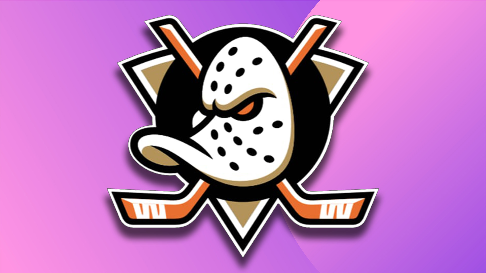
The star of the show is the return of the classic duck hockey mask logo that was last seen in 2006. The original design has been redressed with new colours to complement the refreshed orange theme, while the eyes of the mask have been augmented with a menacing red, giving the logo an intensified fierce appeal.
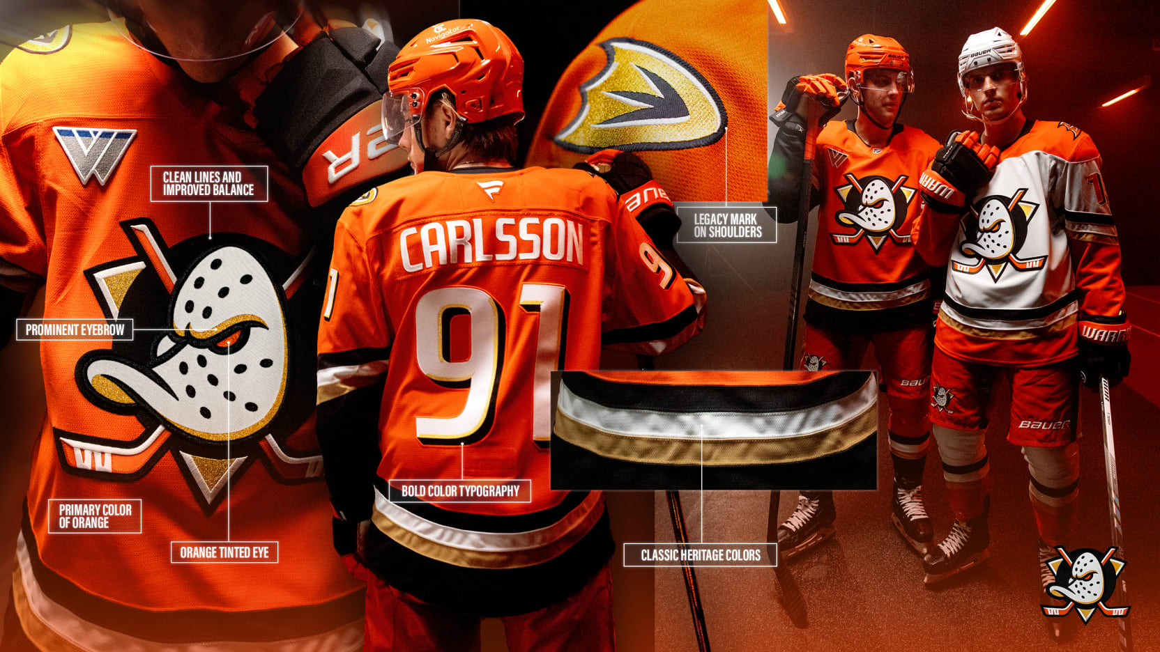
"The Ducks’ identity evolution honours Anaheim's unique citrus heritage and the enduring spirit of hard work it symbolizes," the logo announcement reads. "It holds within it the mischievous spirit and bravery that characterises the Ducks. Look closely and you'll see the fine balance between tradition and modernity, simplicity and significance," it continues.
Fans were delighted to see the return of the original design, with one Reddit user commenting "Excellent! The alterations they did are subtle, and work really well!" Another admired the improved design, writing "Love how the triangle has depth. The mitred points give it a shield look instead of just a triangle," while another fan added, "That was a dangerous game they played, and they did well. It's a really good update. Dare I even say, they improved it."
The @AnaheimDucks have brought back their original logo and I couldn’t be more happier! Makes me proud as hell to see this brought back, and this wave of nostalgia never gets old! #quackquack #flyingv 🦆 pic.twitter.com/i69JFDoQsDJune 26, 2024
New Anaheim Ducks logo is sick and a great modernization of the old logo! I saw some people say they prefer the eggplant color scheme more, so I edited it. Personally I like the orange/brown colors WAY MORE, but to each their own. pic.twitter.com/oIZJFkRWHtJune 27, 2024
If you're after more logo stories check out the old Red Sox logo which was once one of the most disturbing sports logos in history. For more creative inspiration take a look at the sleek design of the National Football Museum's new logo.