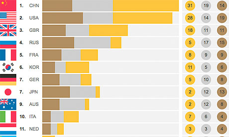
The Royal Statistical Society and the Datablog teamed up with four statisticians at Imperial College, London, to help us work out how key factors might change the Olympic league table. By 'weighting' the medals, what happens to the results?
And we have a winner: Russia.
The team, Christoforos Anagnostopoulos, Giovanni Montana, Axel Gandy and Daniel Mortlock, looked at previous olympics and traditional indicators such as the output of a country's economy (GDP), the size of its population - and also ways to weight the score by the size of each country's Olympic team.
The figures so far were based on separate rankings for GDP, population and team size. What the team has done now is combine them all into one index.
Says Anagnostopoulos:
The more objective view which we propose here attempts to explain as well as possible the number of medals won per country on the basis of its population and GDP per capita. We employ GDP per capita rather than GDP, since we are already taking population into account in this approach.
Each country is then scored based on the number of extra medals it would win if those medals were weighted according to our new ranking - this is known as a residual in statistical jargon).
"We propose this as a purer measure of athletic skill. For countries that underperformed, this number can be negative," says Anagnostopoulos.
So, the final ranking is:
1. Russia
2. UK
3. China
4. Hungary
5. South Korea
6. Ukraine
7. Australia
8. Cuba
9. Jamaica
10. Belarus
In 2008, it looked like this: China, Russia, Australia, US, UK, Cuba, South Korea, Ukraine, Belarus, Kenya. So Team GB has moved way up the table.
As we know, the UK is ahead of Russia on golds, but it did better on other medals. If this statistical model only measured gold medals, Team GB would come top.
And Anagnostopoulos poses some words of warning for UK celebrants:
Although the UK has every right to be proud of its performance, this enthusiasm must be somewhat moderated against the fact that past Olympics have shown a clear presence of a home advantage effect.
In 2008, the home team came top. In 2004, Greece ranked 12th according to this model. "A far superior performance to both before and after it hosted the Olympics."
Which was the best indicator? Says Anagnostopoulos:
The team size indeed proved to be a fairly good predictor of performance in the Games. However, we do not allow this factor to affect a country's ranking here, since in principle a poor, small country can still produce a relatively large team size, and should not be penalized for that.
The full data is published below. What can you do with it?
Download the data
• DATA: download the full spreadsheet
More data
More data journalism and data visualisations from the Guardian
World government data
• Search the world's government data with our gateway
Development and aid data
• Search the world's global development data with our gateway
Can you do something with this data?
• Flickr Please post your visualisations and mash-ups on our Flickr group
• Contact us at data@guardian.co.uk
• Get the A-Z of data
• More at the Datastore directory
• Follow us on Twitter
• Like us on Facebook


